Chart Overview
Overview
The AIV dashboard gives you complete control over how you see your data. You can use different types of charts to visualize your data in any way you want. Charts are a great way to show trends in your data, and the app offers a wide variety of them, like Column, Bar, Area, Line, Pie, and many more. With these charts, you can easily understand and analyze your data to make better decisions.
Advantages of Charts:
- Charts help you see trends, patterns, and important points in data more easily. This can help you find important information that you might have missed otherwise.
- Charts change numbers and words into pictures that you can customize. These pictures make presentations more interesting and help explain key points.
- You can easily pick out specific information you need with charts.
- With charts, you can keep an eye on a lot of data at once, and it’s easy to understand and share.
- Charts help make data understandable for everyone, even if they’re not experts in numbers or analysis.
- Pictures of data are more interesting and easier to remember than just looking at numbers or words.
- Charts help you tell a good story with your data.
- Interactive charts let you explore data in different ways, like zooming in on details or ignoring things you don’t need.
- Seeing data as pictures helps you remember it better than just reading it.
- Using the same types of charts and ways of showing data makes it easier to compare different sets of information.
- Pictures of data can start conversations and get feedback, which helps people work together better when analyzing data.
The charts example used in AIV
Column Chart
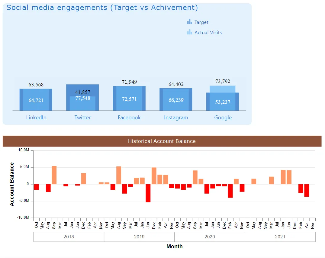
Column charts use columns to show data trends. In this chart, you can see how Social Media Engagements compare to the target and achievements.
Above Chart Description:
This chart displays the Account Balance on a month-by-month basis. It’s easy to see when the balance goes below zero, as those values are shown below the zero line.
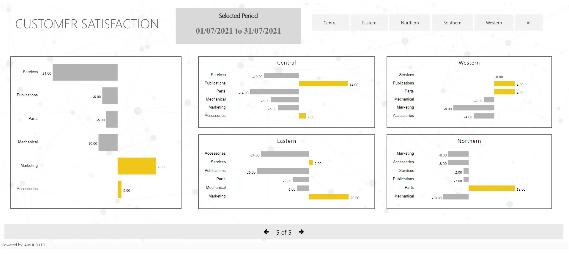
Bar chart
Bar charts function similarly to column charts. The main difference lies in the direction of data visualization. While column charts display data with vertical columns, bar charts use horizontal bars to represent the same information.
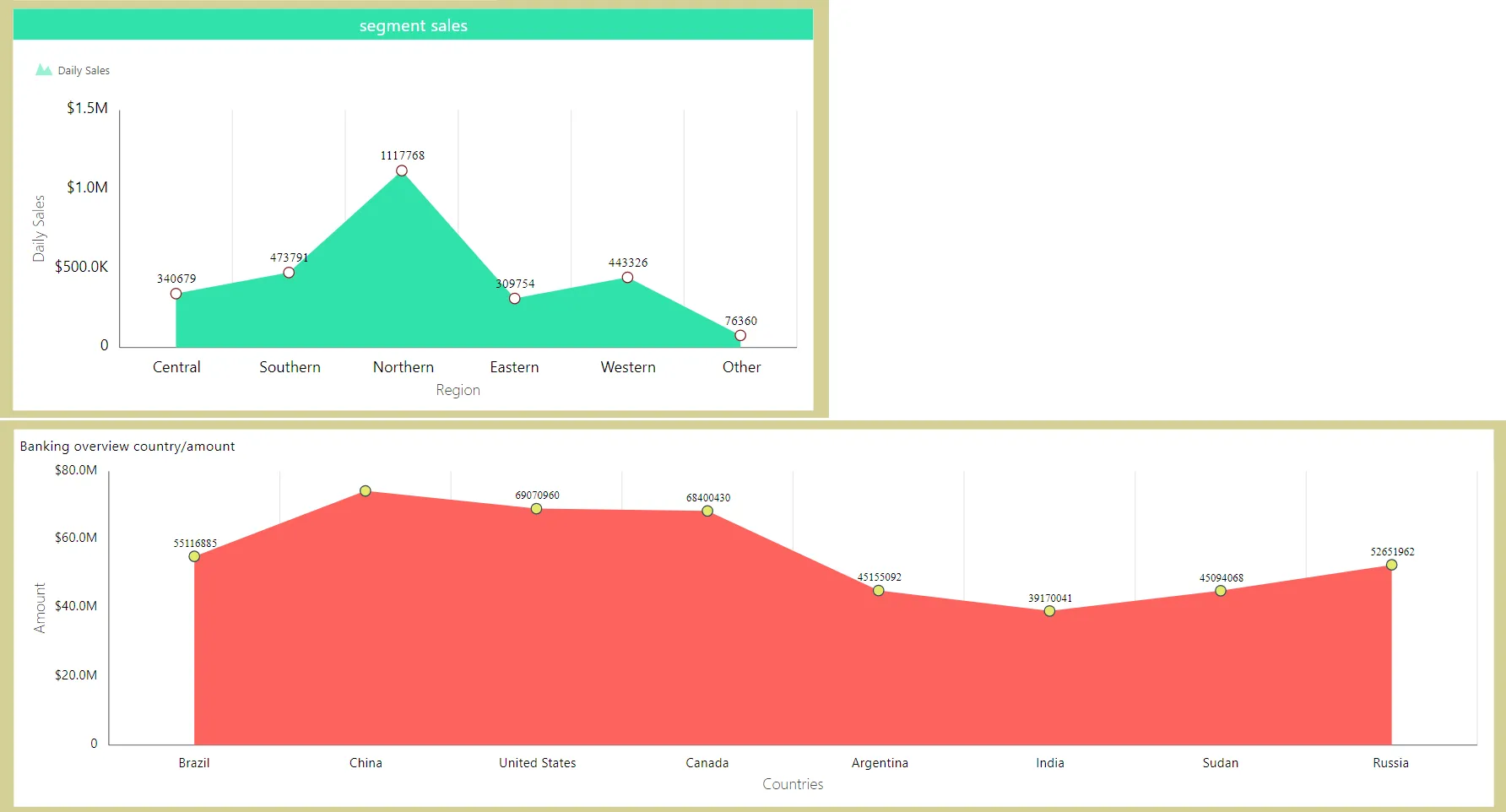
Area chart
Area charts are like line charts, but they show data with filled-in colors underneath the lines. This helps you see how things add up over time or in different groups. For example, you can use them to see how sales change over months or compare the popularity of different products.
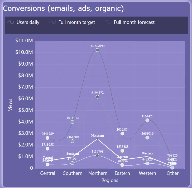
Line chart
Think of a line chart like connecting the dots on a graph. Each dot represents a piece of information, and the lines connect them to show how things change over time or in different groups. For example, you might use a line chart to track how your savings grow each month or to compare the temperature in different cities throughout the year.
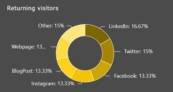
Pie chart
A pie chart is a circular graph that represents data as slices of a pie. Each slice corresponds to a category or proportion of the whole data set, and the size of each slice shows the relative importance or percentage of that category.
Learn to create charts:
Create Column-Bar Chart
Create Line-Area Chart
Create Pie-Donut Chart
Create Funnel Chart
Create Pyramid Chart
Create Candle Stick Chart
Create OHLC Chart
Create Radar Chart
Create Variable Radius Radar Chart
Create TreeMap Chart
Create Circular Gauge Chart
Create Heat Map Chart