Optional Grouping Colors
Overview
This document contains information on a feature Optional Grouping Colors. In AIV, the user can add multiple Series when required. Optional Grouping color will be enabled when we are using Optional Y Series Grouping property.
In this scenario, we are using a Stacked Column Chart widget with two series that have different value columns and Year in the Optional Y Series Grouping. To enable the Optional Grouping Color, navigate to Formatting tab → General tab → Color & Theme Properties. When Year is selected in the Optional Y Series Grouping for both series, the Optional Grouping Color option becomes available, ensuring that the same year shares the same color across both series.
Optional Grouping Colors: This video explains how the Optional Grouping Colors feature works in the AIV dashboard.
Steps to learn how to use Optional Grouping Colors:
-
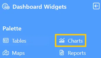
Click the Charts icon from the left vertical menu, as shown below:
-
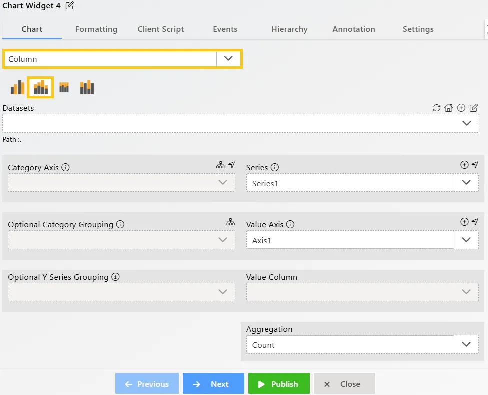
The Chart Edit menu box will appear, and by default, the Clustered Column chart will be selected. So select the Stacked Column chart, as shown below:
-
Enter the following details for the Stacked Column Chart Widget:
-
Datasets (ds): Sales.ds
-
Category Axis: productLine
-
Optional Y Series Grouping: year
-
Value Column: extendedPrice
-
Aggregation: Avg
-
-
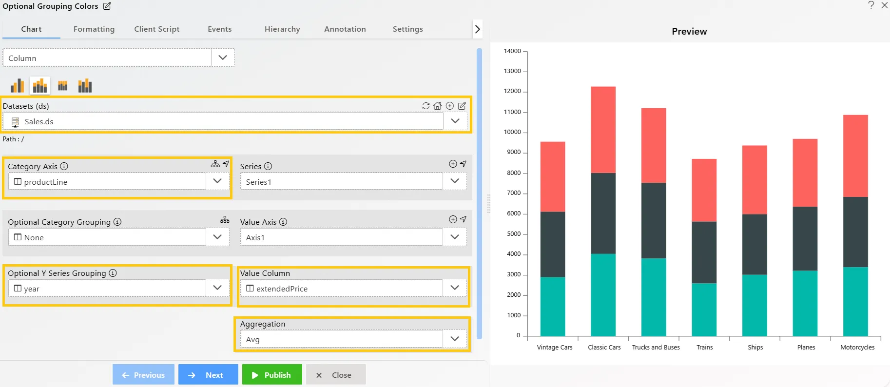
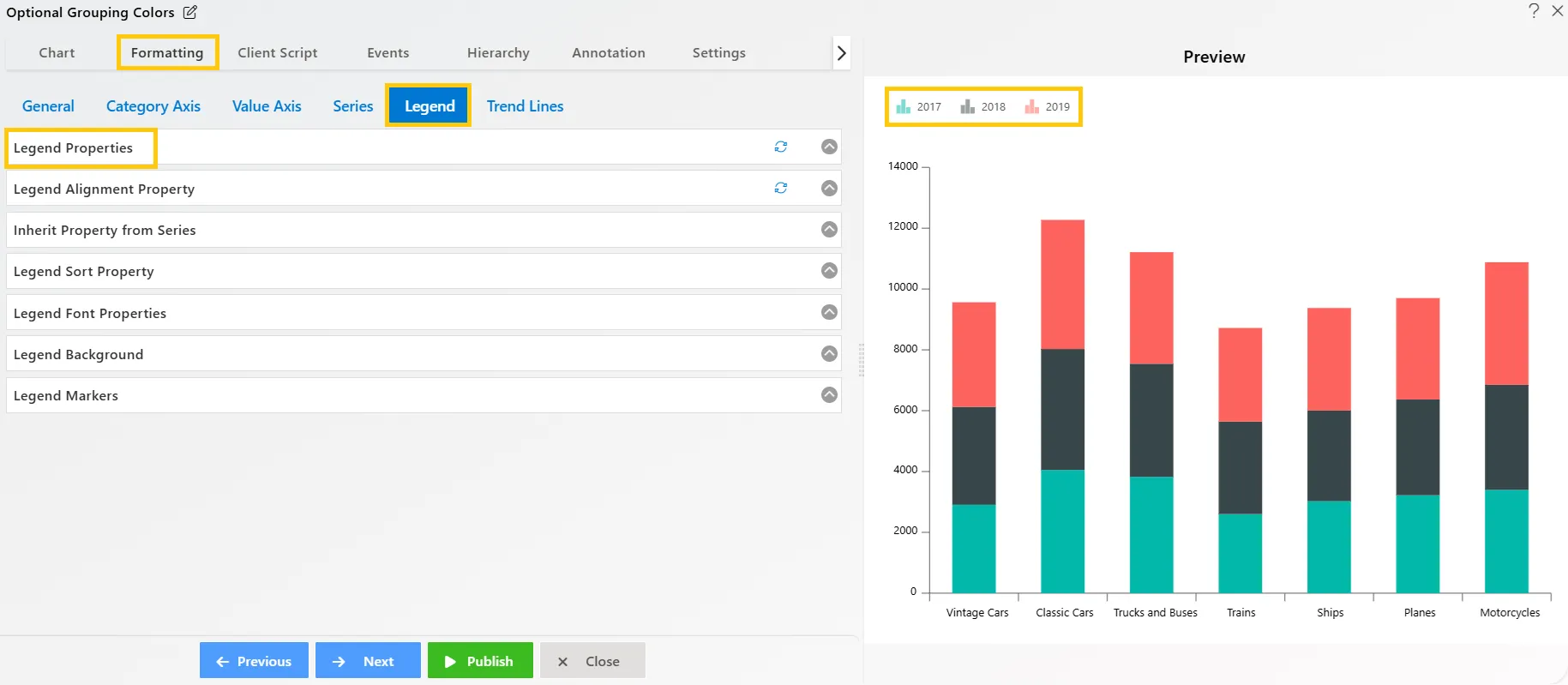
The chart is grouped by year with each column having three colors. To identify which color represents which year, edit the chart by going to the Formatting tab, navigating to the Legend option, and enabling the legend from the Legend properties list. This will display the corresponding year for each color, as shown below:
-
Click on the
 icon beside the Series to add a new series.
-
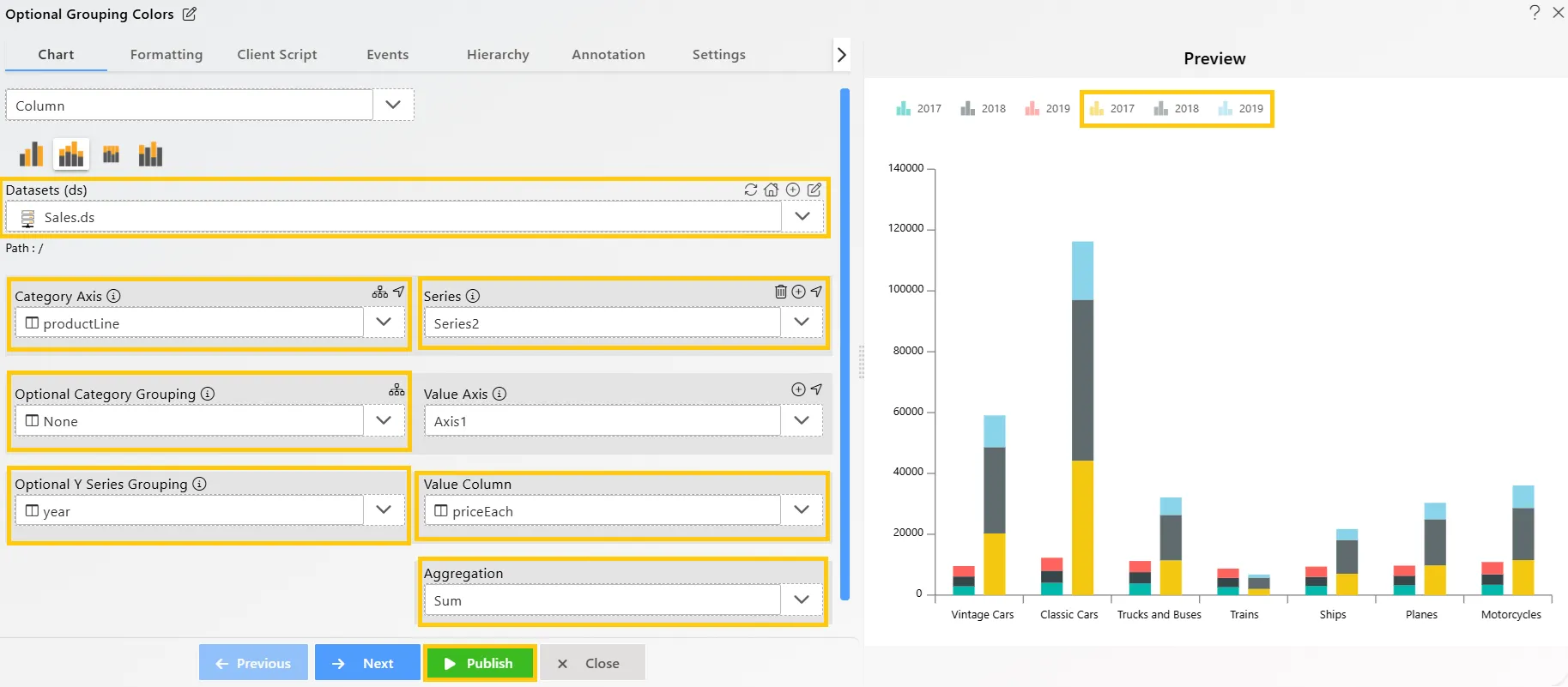
In Series2, add the following details for the Stacked Column Chart Widget:
-
Datasets (ds): Sales.ds
-
Category Axis: productLine
-
Optional Y Series Grouping: year
-
Value Column: priceEach
-
Aggregation: Sum
-
-
Click on the Publish button.
-
Here, you can see that the year grouping color differs for both series. In the first series, the 2017 value is green, while in the second series, it is yellow. To ensure consistency across widgets, use the Optional Grouping Colors setting.
-
Now, edit the widget by clicking the
 icon in the top-right corner. In the Edit menu, go to Formatting Property → General Tab → Color & Theme Property, and toggle the Optional Grouping Color button, as shown below:
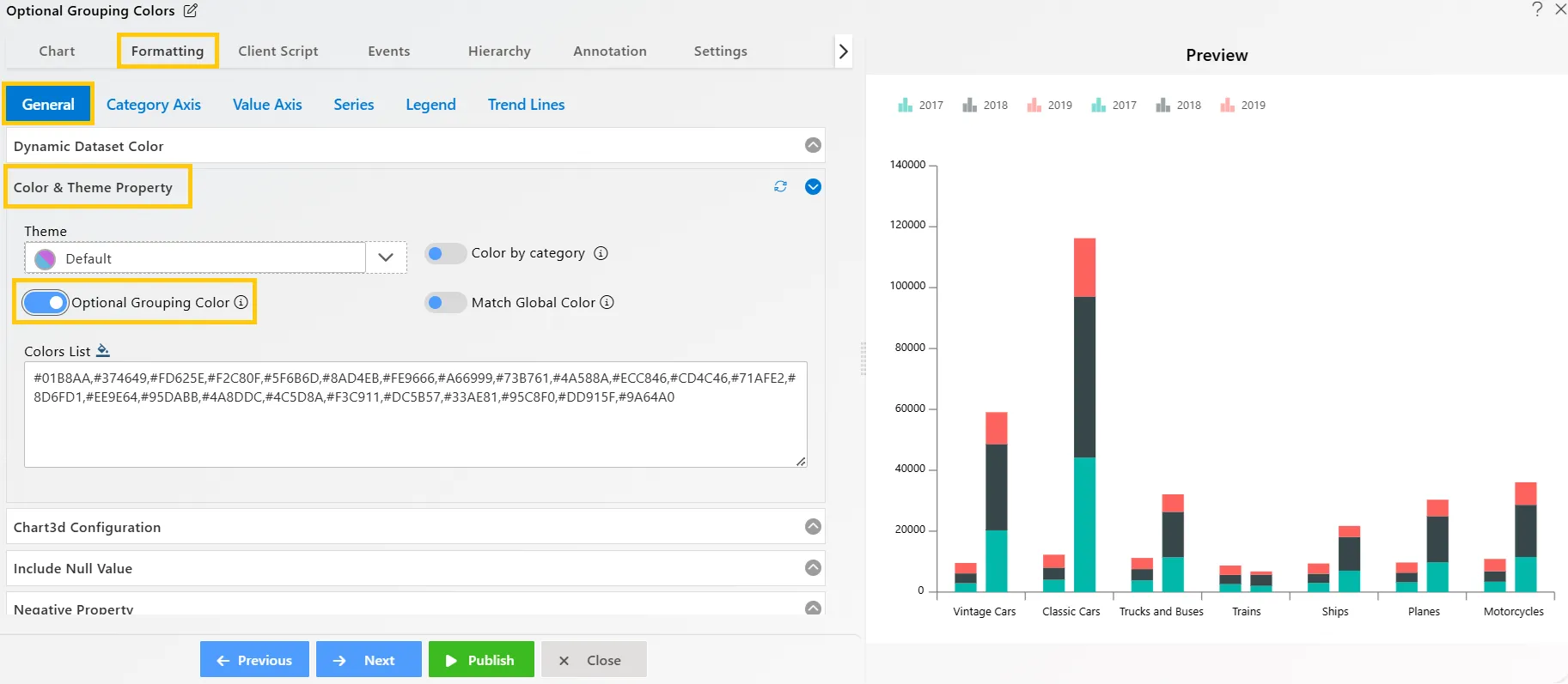
-
Click on the Publish button, then the Preview icon, and finally click on the SAVE AND EXIT button to view the Stacked Column Chart, as shown below:
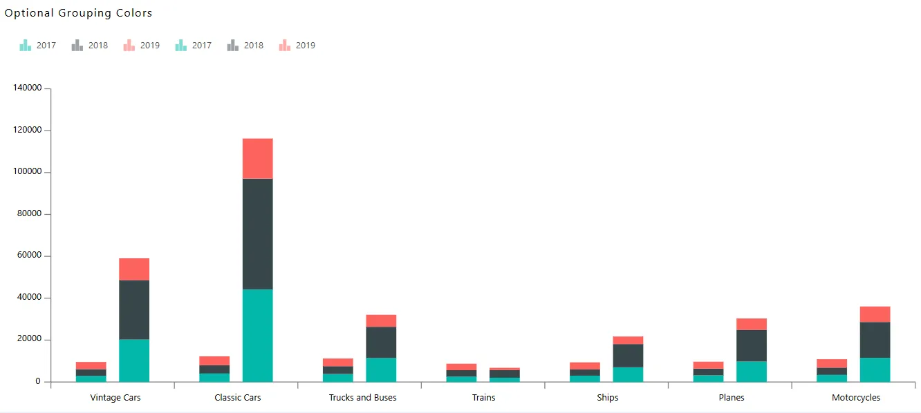
In this way, you can create charts with Optional Grouping Color in the AIV application.