Formatting Trend Line Column/Bar Chart
The Trend Line feature allows users to add trend line to the chart area. Users have the flexibility to include additional fields to display data beyond the category axis and value axis, enabling customization according to their requirements.
The Trend Line properties are as follows:
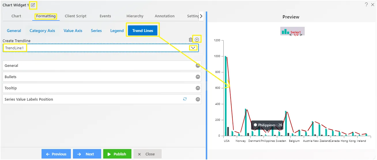
Create Trend line:
To begin, users must add a trend line to the chart. This is achieved by clicking on the plus icon. Once added, the trend line becomes visible on the chart, enabling users to analyze trends and patterns within the data.
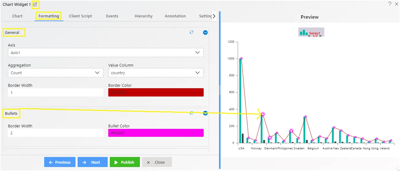
Trend Line - General
Overview: The general properties contains the Axis selection, Aggregation, Value column, Border Width and color, where user can choose and find the best way to visualize the trend line.
Description:
-
Axis Selection: Users can select the axis (X-axis or Y-axis) on which they want to apply the trend line. This allows for focused analysis based on specific variables.
-
Aggregation: Aggregation options allow users to summarize data points within the selected axis before plotting the trend line. Common aggregation functions include sum, average, maximum, and minimum, among others.
-
Value Column: Users can specify the column or field containing the values used to calculate the trend line. This flexibility enables users to analyze different aspects of their data and derive meaningful insights.
-
Border Width: Users can adjust the width of the trend line border, controlling its prominence on the chart. This property allows for customization of the trend line’s visual appearance.
-
Border Color: Users can select the color of the trend line border, further enhancing its visibility and distinction from other chart elements. This property facilitates customization to match the overall aesthetic of the visualization.
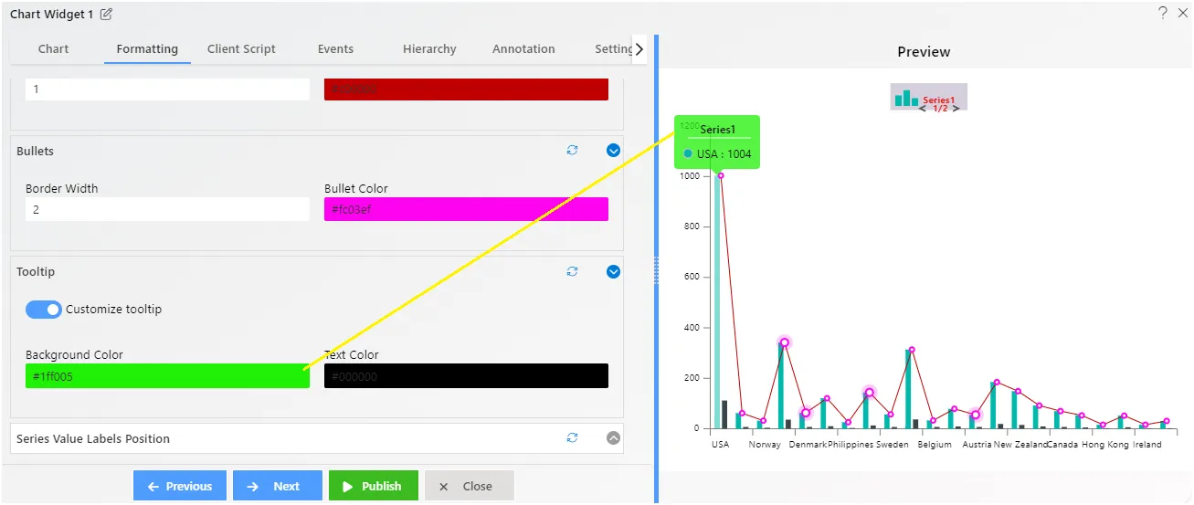
Trend Line - Bullets
Overview: In our trend line overview, the ‘bullets’ aren’t just shapes; they represent different elements placed along the line. These could be text, shapes, controls, or even other charts. Each ‘bullet’ highlights important insights, making the data easier to understand.
Description: The bullets are displayed by default if the user has enabled the legend properties at the very first step where we click on the plus icon to add the trend line. Users can add the border width and color to customize the appearance of these bullets.
Trend Line - Tooltip
Overview: The tooltip feature lets you customize tooltips in your chart. You can change the text color, and background color to suit your preferences.
Description: To customize tooltips, users need to follow these steps:
- Click on the toggle button to enable the tooltip feature.
- Choose the background color and text color for the tooltip.
- Once customized, the tooltip will be visible on the chart when users hover their mouse over the trend line.
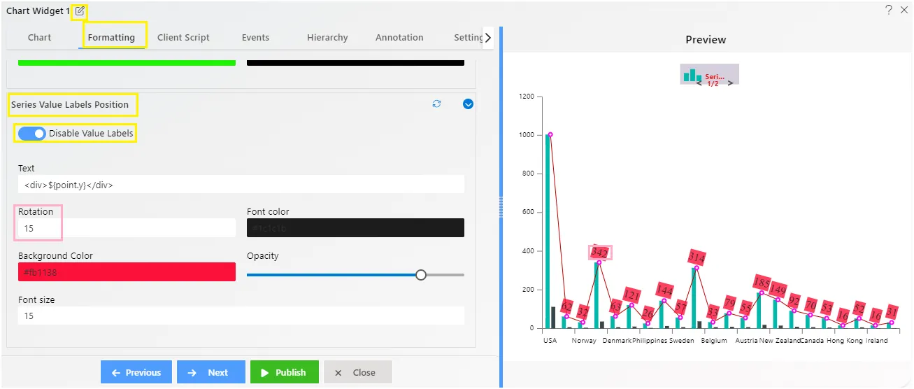
Trend Line - Series Value Labels Position
Overview: The Series - Value Labels Position feature enhances chart readability by allowing users to customize the position and appearance of value labels on the trend line.
Description: The Value Labels feature ensures clear data presentation on the chart plot. Users can easily customize label position, text display, rotation, and aesthetics. Options include adjusting font properties, background color, opacity, decimal places, padding, and text alignments for enhanced clarity and visual appeal.
To know more about other formatting properties click on below links:-
General Properties
Category Axis Properties
Value Axis Properties
Series Properties
Legend Properties
Trend Line