Formatting Value Column/Bar Chart
The Value Properties are as follows:
Select Axis dropdown
The Axis dropdown property provides users with the ability to select the axis for customization. When a user selects an axis, the entire menu is applied exclusively to that particular value axis.
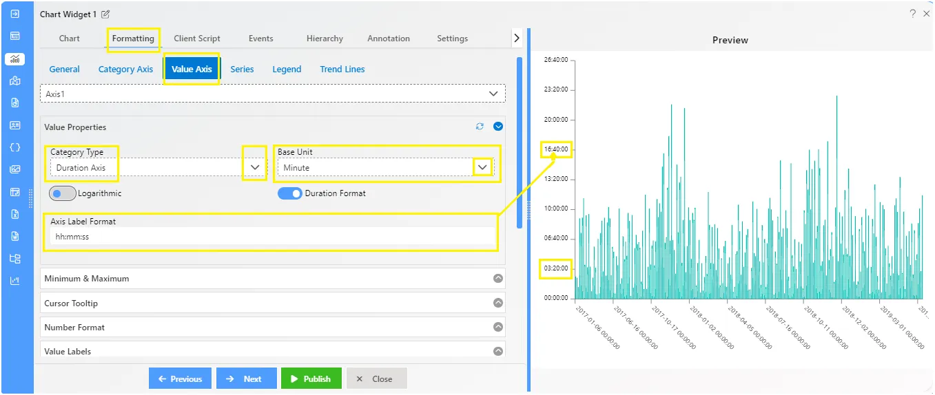
Value - Value Properties
Overview: The Value Properties feature enables users to incorporate a duration axis onto the chart plot. This axis facilitates the addition of logarithmic data on the y-axis, Users can specify the base unit of the duration axis, choosing from options such as Hour, Minute, or Second. Additionally, users can customize the duration format, such as hh:mm:ss format, to suit their specific requirements.
Description: To utilize the Value Properties feature, users can follow these steps:
- Add Duration Axis: Users can enable the duration axis on the chart plot to accommodate logarithmic data on the y-axis.
- Select Base Unit: Users have the flexibility to choose the base unit of the duration axis, selecting from options like Hour, Minute, or Second.
- Customize Duration Format: Users can specify the duration format according to their preferences, such as hh:mm format, for clear and consistent data representation.
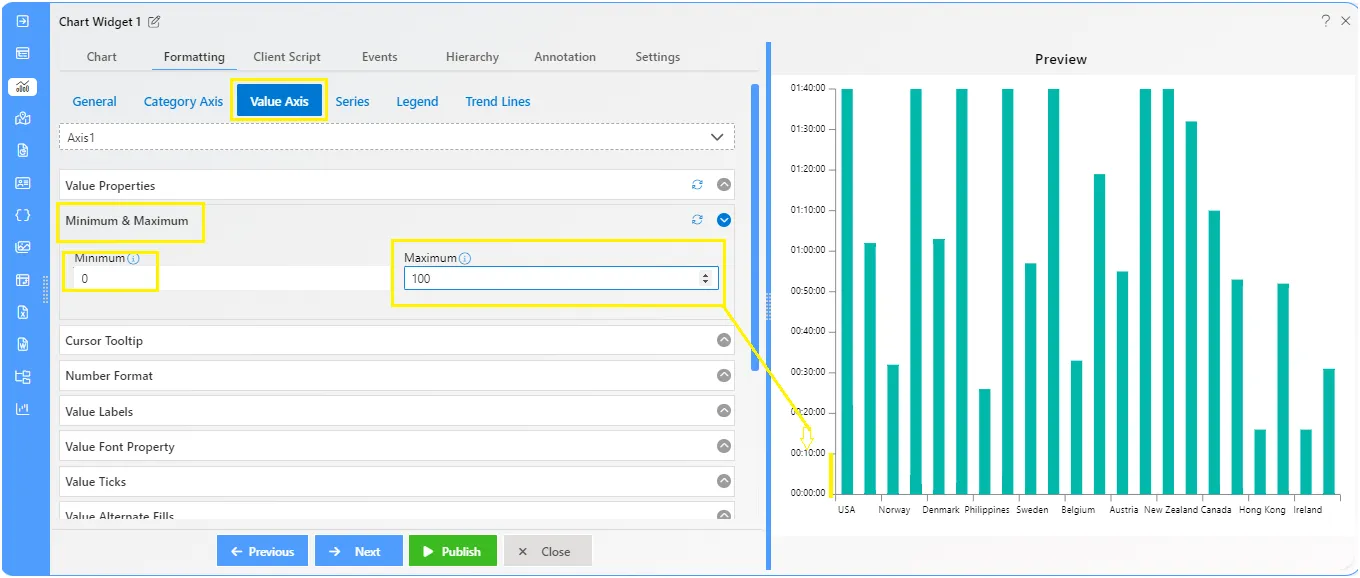
Value - Minimum and Maximum
Overview: The minimum and maximum properties allow users to specify the lower and upper bounds of the value axis on a chart plot.
Description: These properties enable users to define the minimum and maximum values displayed on the axis scale. The ”Minimum” property sets the lowest value visible on the axis, while the ”Maximum” property determines the highest value. By adjusting these properties, users can control the range of values shown on the axis, providing clarity and context to their data visualizations.
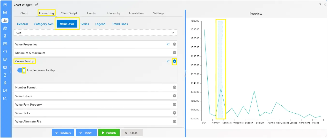
Value - Cursor Tooltip
Overview: The Cursor Tooltip feature enables the display of tooltips on the value axis cursor by toggling the button. When activated, the chart provides details about data points when the mouse hovers over them. By default, the tooltip is disabled. You can enable it by setting the enable property to true.
Description: Click the toggle button to set it to true, then hover your mouse over the value cursor. The tooltip will appear as you hover on chart.
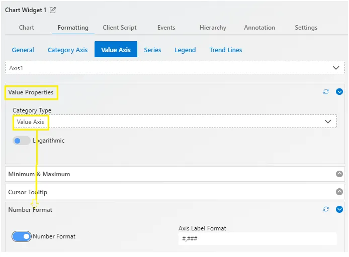
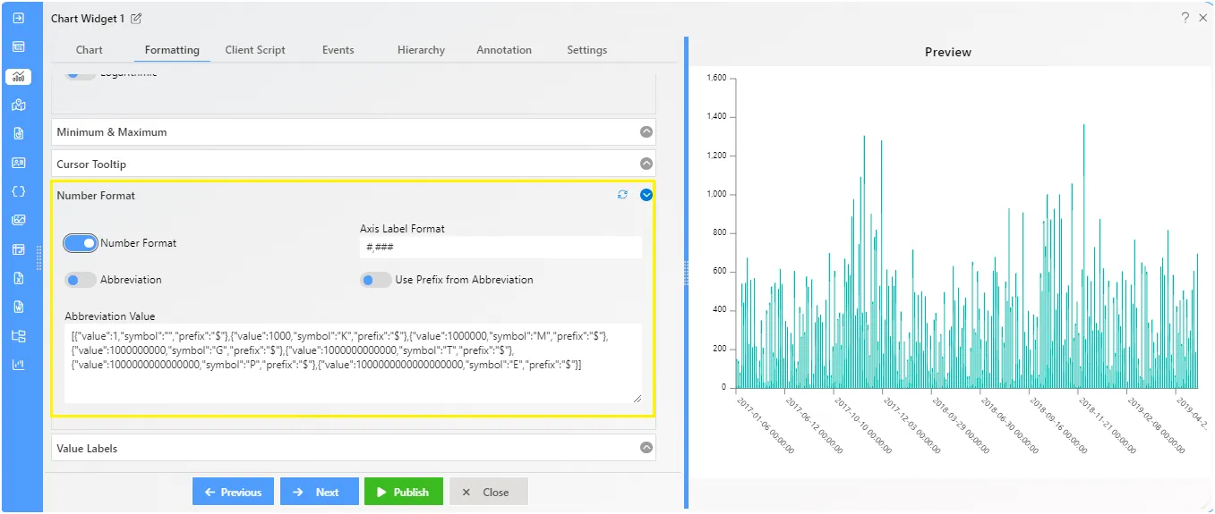
Value - Number Format
Overview: Number formatting enables users to customize the appearance of value labels, including formats such as #,###, Abbreviation, Prefix from Abbreviation, and Abbreviation Value.
Description: Number formatting options are contingent upon the selected value properties. If the user opts for the Duration Axis within the Value properties, access to number formatting controls will be disabled. To activate these controls, users can toggle the button to true, prompting the appearance of formatting options.
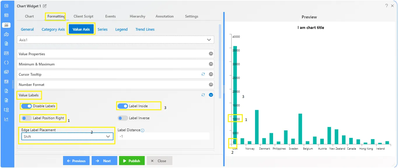
Value Labels
Overview: Value labels can be added to a chart series by enabling the visible option in the Value Labels. By default, the labels will arrange themselves smartly to avoid overlapping.
The Label properties allows users to change Label Position Right, Set Label Inside, Set the Label Inverse and Edge Label Placement.
Description: The label toggle is enables by default.
The Label properties overview as follows:
- Label Inside: Indicates whether Axis’ labels and ticks should be drawn inside plot area.
- Label Position Top: Indicates whether Axis should be drawn on the oppisite side of the plot area then it would normally be drawn based on chart’s settings.
- Label Inverse: Indicates whether Axis’ labels and ticks should be drawn inside plot area.
- Edge Label Placement: The first label after 0 in value axis will be hidden.
- Label Distance: Minimum distance in pixels between grid elements, Default value is -1.
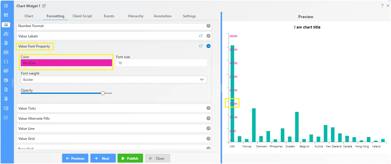
Value Font Property
Overview: This control allows you to make font-related changes. You can adjust the Font color, Size, Weight, and Opacity from here. overall font properties are controled from here.
Description: Insert the required Font color, Font size, Weight and Opacity levels on font.
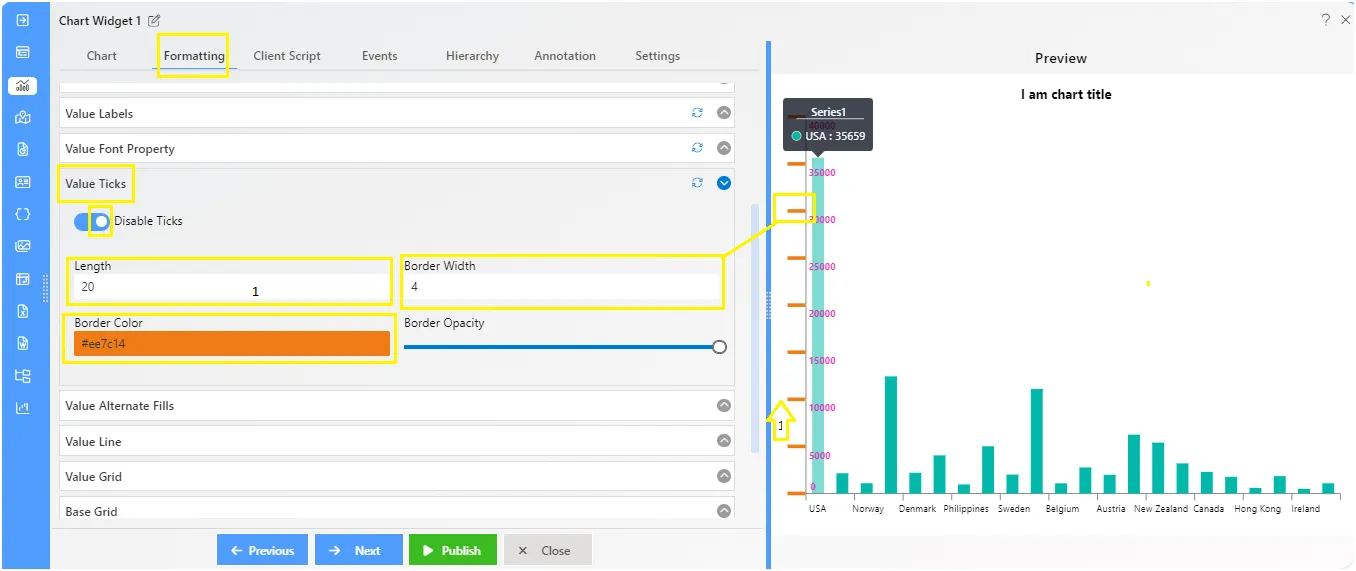
Value Ticks
Overview: Value ticks represent the intervals or divisions along the value axis of a chart. These ticks help in visually organizing and presenting data points. Adjustments such as width along with length, color, and opacity of value ticks.
Description: Ticks are automatically enabled by default on the Value axis. Within the controls, users can find options to customize the appearance of ticks. These include numeric controls for adjusting the width and length of ticks, as well as cosmetic properties such as color and opacity.
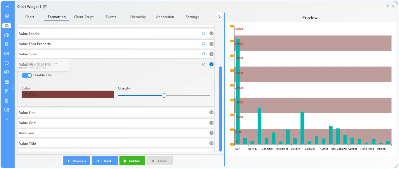
Value Alternate Fills
Overview: Value Alternate Fills are involve applying background colors alternately to different values on a chart’s axis. This helps visually distinguish values and improve chart clarity. Users can customize colors and patterns for these fills.
Description: Fills are added horizontally to the chart background area. By default, this feature is off. Users can activate it to add fills to the chart, then easily adjust fill opacity and color using simple controls.
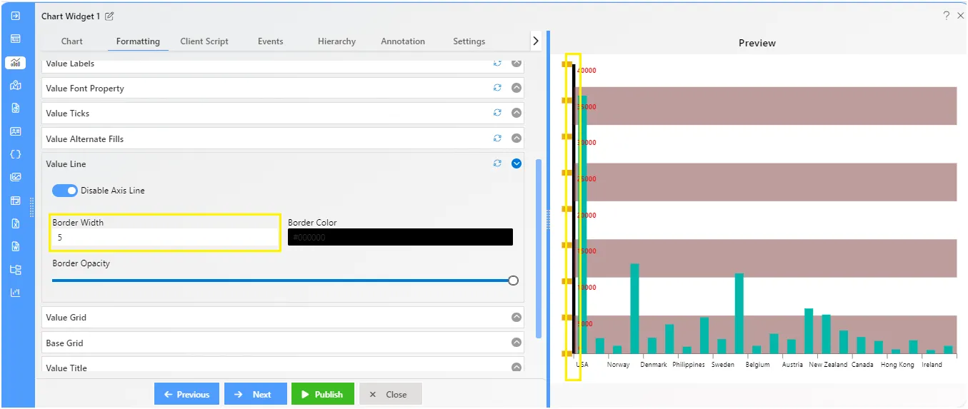
Value Line
Overview: Value lines are automatically visible in charts by default. They play a crucial role in making chart presentations more relevant by neatly separating the value titles from the chart plot.
Description: This property enables users to customize the value line by adjusting its border width, border opacity, and color.
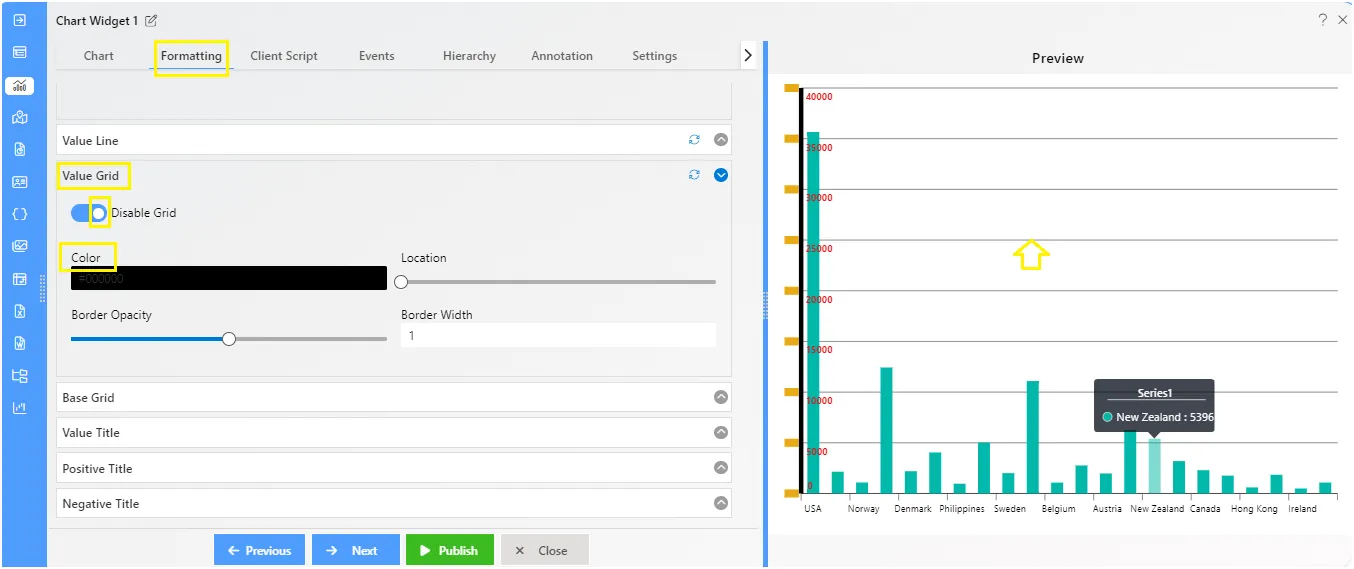
Value Grid
Overview: In charts, the value grid consists of lines in the background. These lines help organize the chart by providing a visual reference for the data.
Description: The chart grid is an additional line that appears in the background of column charts. Users can customize this line by choosing the color, adjusting the opacity levels, and setting the border width.
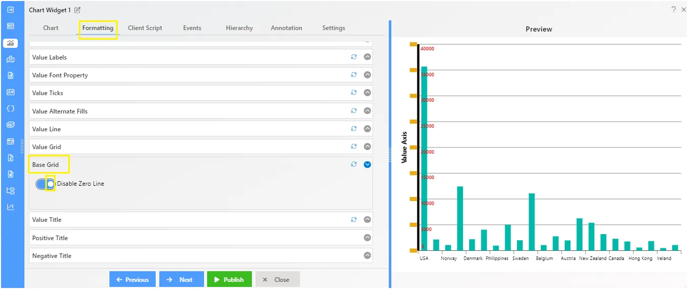
Value Base Grid
Overview: The Value Base Grid feature is activated when a user includes a negative chart in the dashboard. the zero line of the negative chart serves as the base grid.
Description: To make the base grid work, prepare one negative chart and then enable the base grid from the value formatting, the zero line will added in the chart.
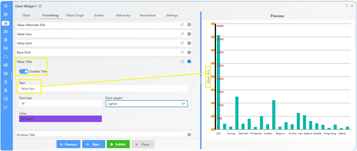
Value Title
Overview: The value title in charts functions as a label identifying the data values or groups represented along the chart’s axis.
Description: This property is initially disabled, requiring users to enable it by toggling the switch to “true.” Once activated, users can personalize the value title using the following options:
- Text Area: Enter the desired title text.
- Font Size: Specify the font size for the title.
- Font Weight: Choose from options such as bold, bolder, lighter, etc., to adjust the weight of the title font.
- Color: Select the color of the title text.
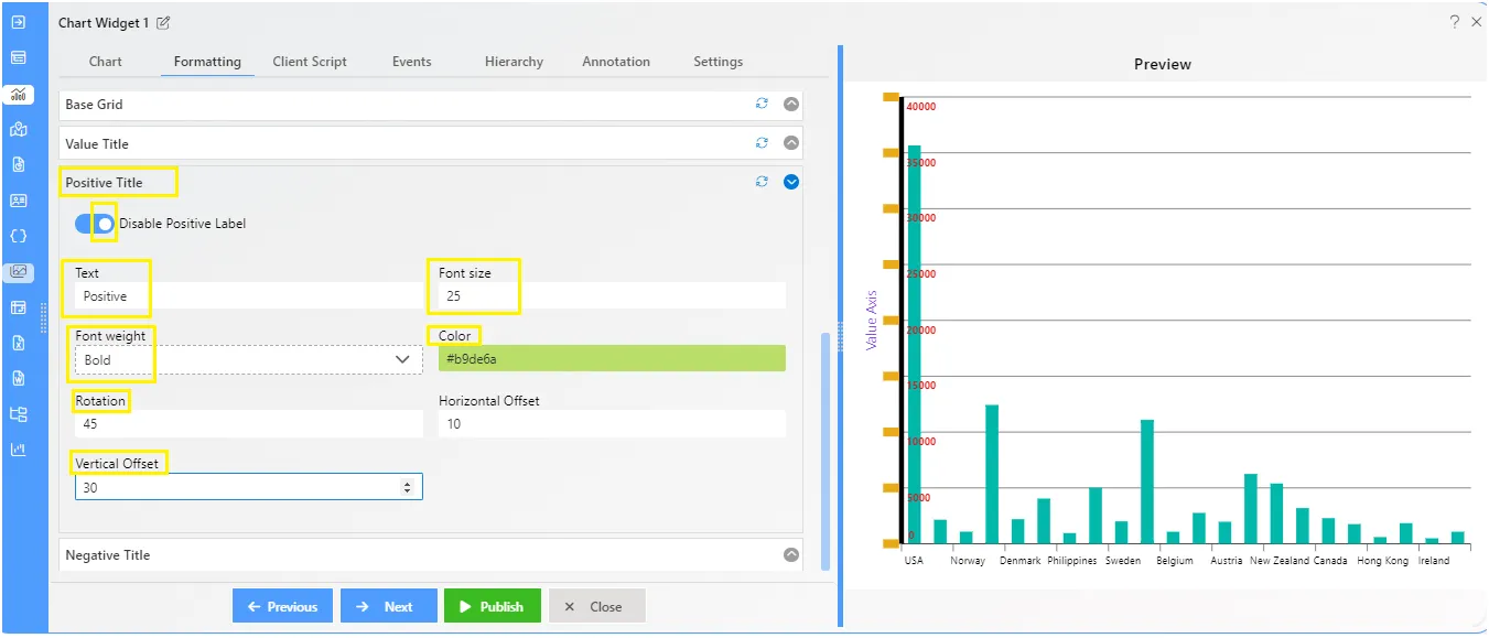
Value Positive Title
Overview: The Value Positive Title feature allows users to include a title on the y-axis of the chart. Users have the flexibility to customize the title according to their preferences, including options such as font size, weight, color, rotation, horizontal offset, and vertical offset.
Description: To display the positive title on the chart, simply click the toggle button. Once enabled, you’ll find the following options in the control box:
- Text: Enter the desired title text here.
- Font Size: Adjust the size of the font for the title.
- Font Weight: Choose the thickness of the font (e.g., bold, normal).
- Color: Select the color for the title text.
- Rotation: Rotate the title text as needed.
- Horizontal Offset: Set the horizontal position of the title.
- Vertical Offset: Adjust the vertical position of the title.
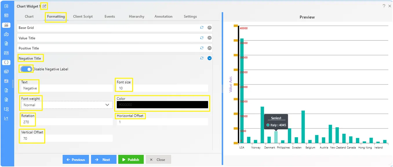
Value Negative Title
Overview: The Value Negative Title allows users to add a title to the x-axis of the chart. They can customize it with options like font size, weight, color, rotation, horizontal offset, and vertical offset.
Description: To display the negative title on the chart, simply click the toggle button. Once enabled, you’ll find the following options in the control box:
- Text: Enter the desired title text here.
- Font Size: Adjust the size of the font for the title.
- Font Weight: Choose the thickness of the font (e.g., bold, normal).
- Color: Select the color for the title text.
- Rotation: Rotate the title text as needed.
- Horizontal Offset: Set the horizontal position of the title.
- Vertical Offset: Adjust the vertical position of the title.
To know more about other formatting properties click on below links:-
General Properties
Category Axis Properties
Value Axis Properties
Series Properties
Legend Properties
Trend Line