Dynamic Dataset
Line Chart > Dynamic Dataset Color

- Click on hamburger icon.

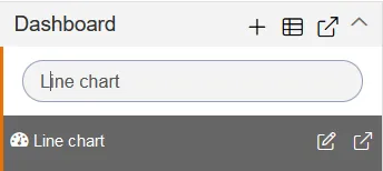
- Click on dashboard tab and open Line Chart in edit mode.
-
The Edit menu box appears as you click on Line chart icon. And a widget gets added in content place automatically in dashboard.
-
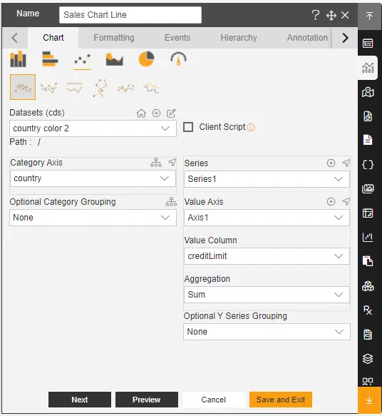
Enter Following details in chart controls:
- Datasets: Country Color 2.cds
- Category Axis: country
- Value Column: CreditLimit
- Aggregation: sum
- Fill above details in edit box, As Shown in figure.
-
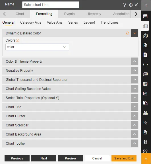
In Formatting click on General. In General click on Dynamic dataset color
-
Dynamic dataset color: colors
-
Click on Publish button.
-
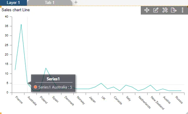
Now, match your Line chart with the below example, it should look like the figure below: