AIV Dashboard Buddy
The AIV Dashboard Buddy enhances dashboards by leveraging AI agents to generate widgets based on natural language prompts. The tool automatically analyzes user input and generates the necessary SQL queries, executes them, suggests suitable widgets based on the data, and creates the HTML or JavaScript code required for those widgets.
Key Features
-
Automatic Widget Generation: Simply describe the widget you need in plain English, and AIV Dashboard Buddy will generate it for you. Whether you need tables, charts, pivots, KPIs, or maps, the system takes care of everything, from understanding your requirements to creating the widget configuration.

-
Speech-to-Text Integration: Use your voice to describe the widget you need. The system transcribes your speech and generates the corresponding visualization, making the process even more intuitive.
-
Suggested Widget Selection: The system analyzes your data and recommends the most suitable widgets, which you can add manually based on your preference.
-
Effortless Integration: Seamlessly add dynamic widgets to your dashboards. AIV Dashboard Buddy handles all the complexities, enabling you to focus on insights rather than setup.
-
Time-Saving Automation: From generating SQL queries to configuring widgets, the buddy automates the entire process, significantly reducing the time required to build visualizations.
-
Personalized Flexibility: Easily adapt visualizations to changing requirements by providing simple natural language adjustments.
-
User-Friendly Interaction: Designed for users of all experience levels, AIV Dashboard Buddy makes creating and managing dashboards effortless through clear, conversational prompts.
Steps to Utilize the Dashboard AI Buddy:
-
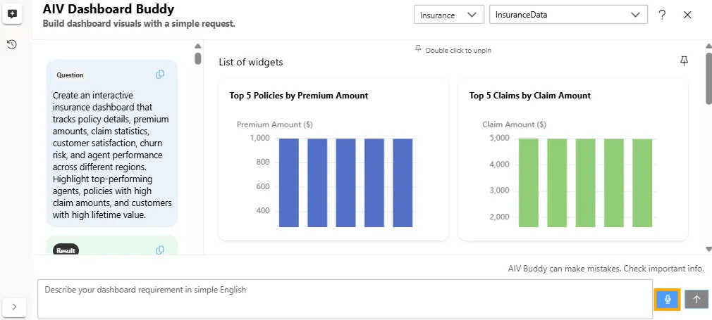
Go to the Dashboard section and create a new Viz. This action will redirect you to the Viz landing screen. Click the Generate with AI button at the top-right corner of the screen.

-
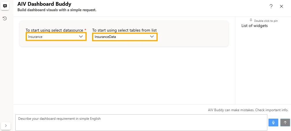
When you click the Generate with AI button, the AIV Dashboard Buddy dialog box will appear. Select a Datasource from the dropdown menu (e.g., Insurance) and choose a table from the table dropdown menu (e.g., InsuranceData).
-
Enter your prompt in the text box. Then click the
 button to generate the dashboard layout based on your input.
Example:
-
Datasource: Insurance
-
Table: InsuranceData
-
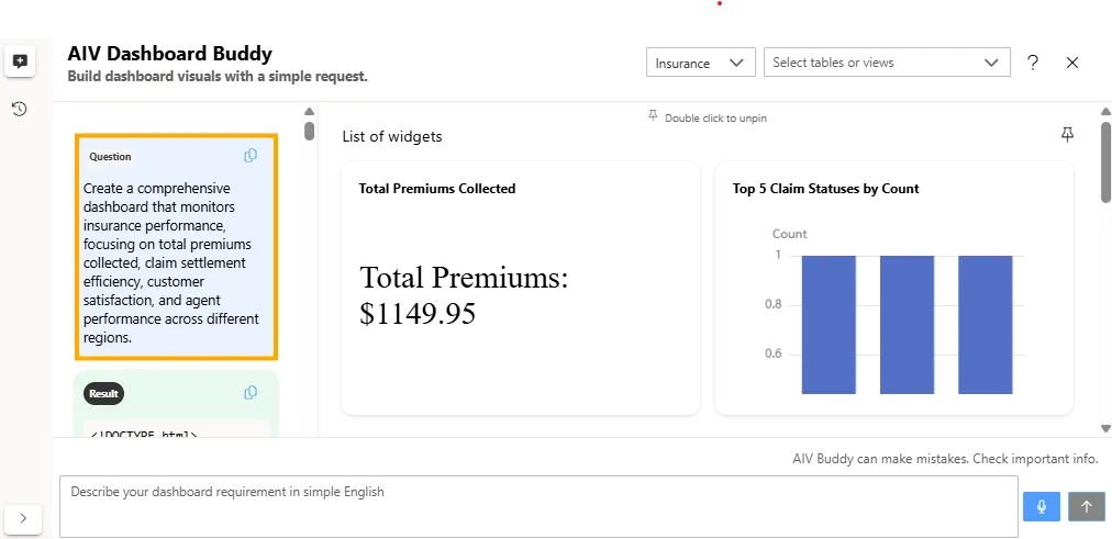
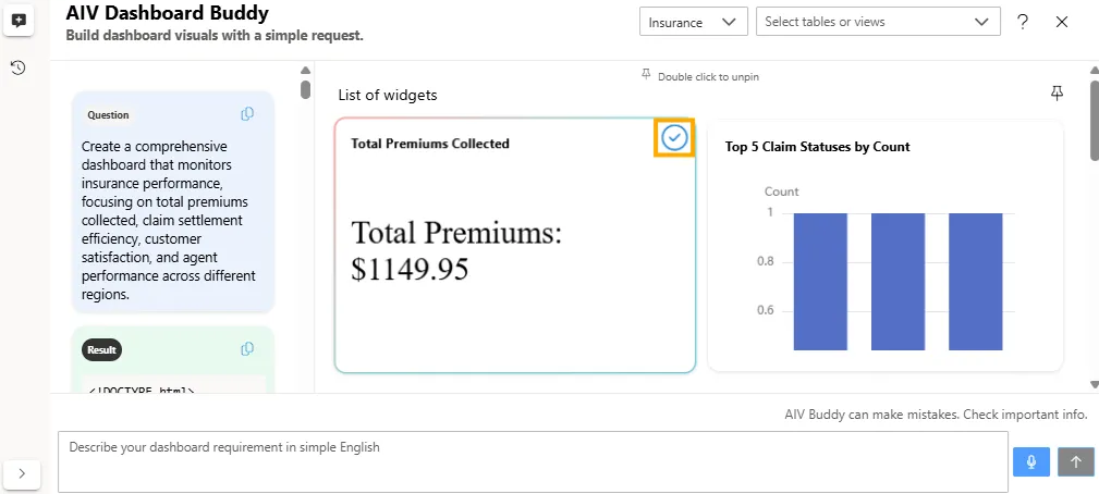
Prompt: Create a comprehensive dashboard that monitors insurance performance, focusing on total premiums collected, claim settlement efficiency, customer satisfaction, and agent performance across different regions.
-
-
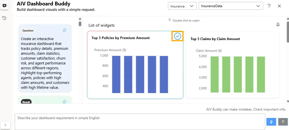
A list of widget views will be generated based on your prompt. Review and select the visualizations that best fit your dashboard requirements.
-
To add a widget to your dashboard, click the checkbox in the top-right corner of the desired widget. Once finalized, the selected widgets will be added to your dashboard.
-
As you select a widget, it will be automatically published to the dashboard, and the dataset will be generated dynamically.
-
If you enter a prompt that falls outside the scope of the selected dataset, the system will display an error message. The message will inform you that the dataset does not contain relevant information for your request and will also suggest alternative prompts based on the available data.
Example:
-
Datasource: Insurance
-
Table: InsuranceData
-
Prompt: Create an interactive hospital dashboard that tracks daily patient admissions by department, average length of stay, bed occupancy rate, readmission rate, and doctor performance. Highlight departments with the highest occupancy and longest stays.
-
Error: The request to ‘Create an interactive hospital dashboard’ is outside the scope of this insurance database. This database stores data about insurance policies, claims, and customer information. Available tables include: InsuranceData. Try a different scenario based on insurance data, such as: Show me the top 5 policy types by premium amount, or Create a dashboard showing claim status distribution by region.

-
In this way, the AIV Dashboard Buddy simplifies and accelerates dashboard creation. It allows you to add widgets without coding, automatically selects the best visualization for your data, and saves time by generating configurations automatically. You can easily customize visualizations using natural language and streamline tasks with intuitive, user-friendly prompts.