Create Column or Bar Chart
Overview
Column and Bar charts are types of visualizations that display data using bars, with vertical bars in a column chart and horizontal bars in a bar chart. These charts are ideal for representing and comparing data across different categories, making trends and patterns easier to understand. In this document, you will learn how to create both column and bar charts on the dashboard.
Create Clustered Column or Bar Chart: This video explains how to create clustered column or bar charts in the AIV application.
Create Stacked Column or Bar Chart: This video explains how to create stacked column or bar charts in the AIV application.
Steps to Create a Column or Bar Chart in Dashboard:
-
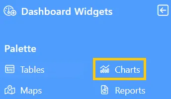
Click the Charts icon from the left vertical menu, as shown below:
-
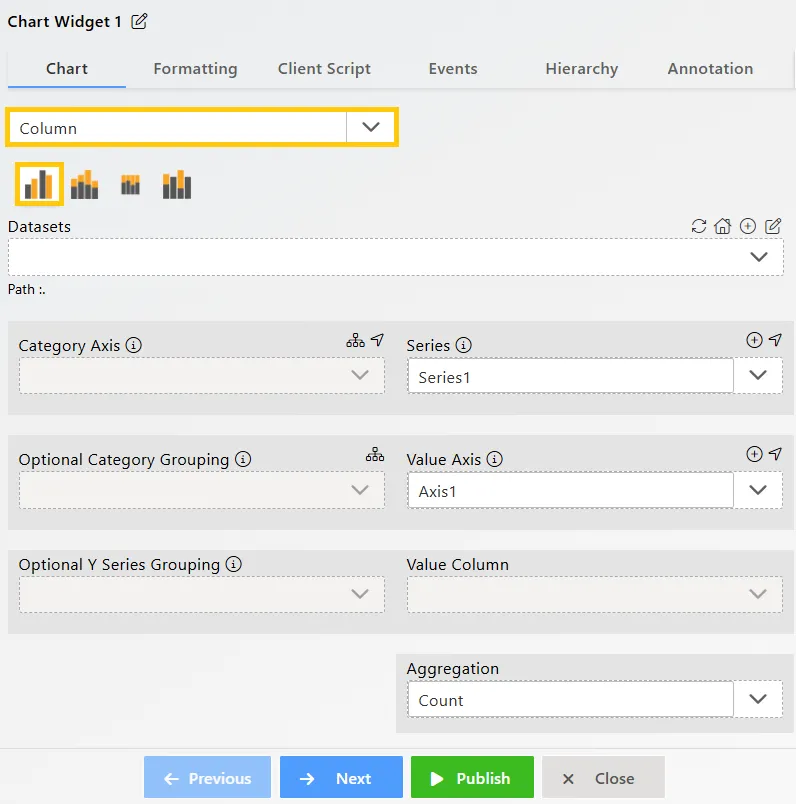
The Chart Edit menu box will appear, and by default, the Clustered Column chart will be selected, as shown below:
-
Click the
 icon in the Widget Title box to modify the widget name.
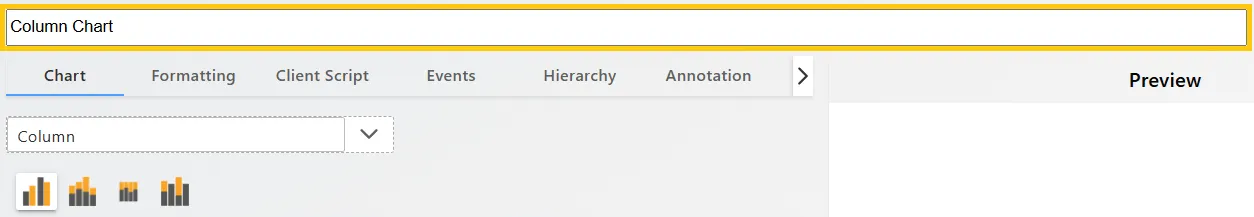
-
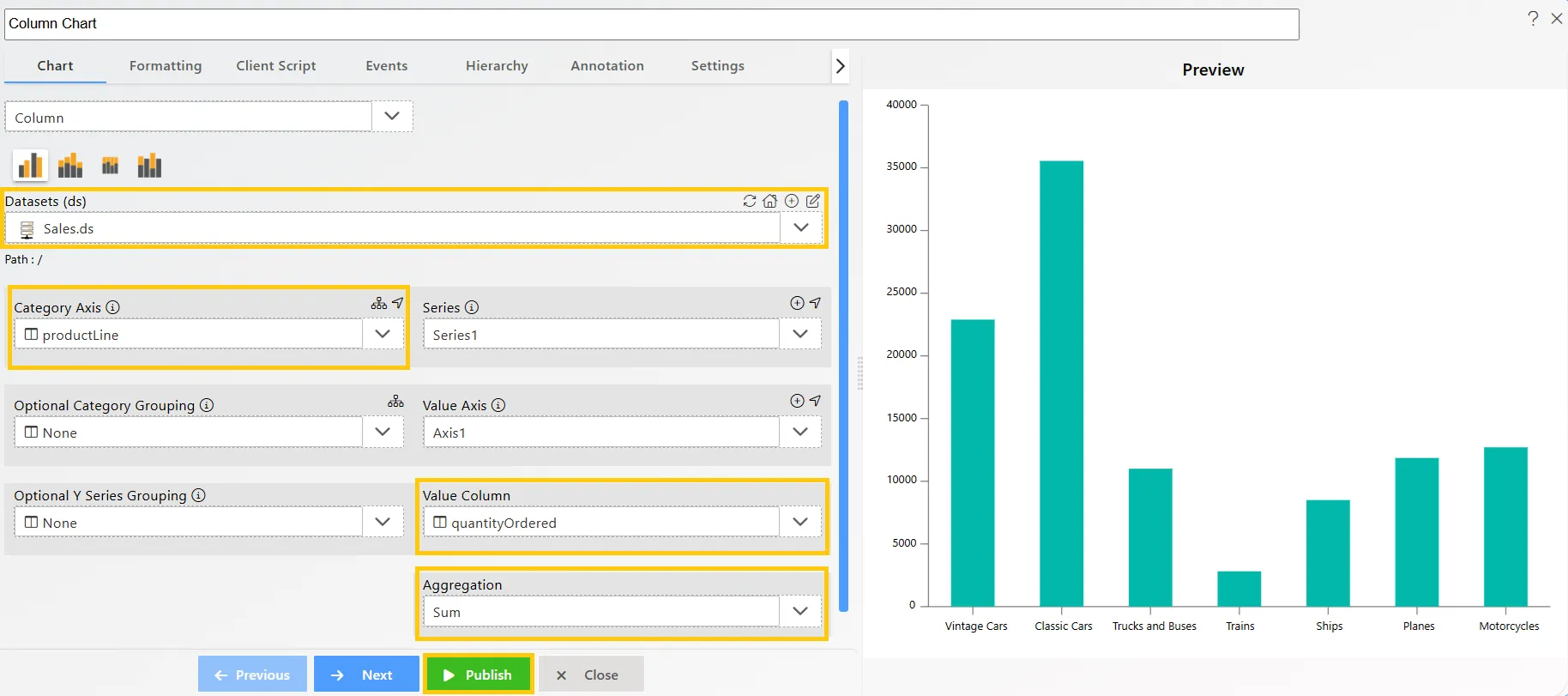
Enter the following details for the Column or Bar Chart Widget:
-
Datasets (ds): Sales.ds
-
Category Axis: productLine
-
Value Column: quantityOrdered
-
Aggregation: Sum
-
-
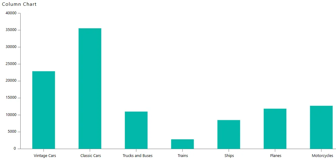
Click on the Publish button, then the Preview icon, and finally click on the SAVE AND EXIT button to view the Column Chart as shown below:
In this way, you can create both column and bar charts in the AIV application.