Formatting Category Column/Bar Chart
The category properties are as follows:
Category Type
Overview: Customize how dates are displayed in your chart when your data includes date-type information. Use the Date Format box to select your preferred date format, enhancing the clarity and presentation of your chart, especially when working with date data.
Description: To set the category type as a date, click on the Category Type dropdown and select Date Axis. Once selected, the date axis will appear in the control box, and the Date Format option will become visible next to the dropdown. You can adjust the date format as needed using the Date Format textbox. The default format for the date axis is yyyy-MM-dd.
Output: 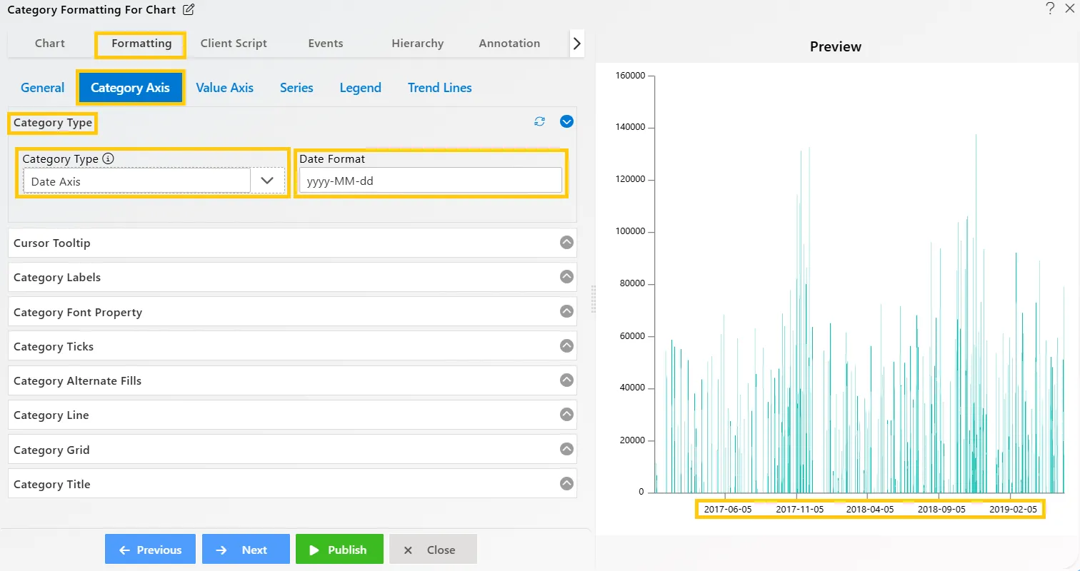
Cursor Tooltip
Overview: The Cursor Tooltip feature displays tooltips along the category axis cursor, providing additional information about data points when hovering over the chart. By default, this feature is disabled but can be activated for enhanced data exploration..
Description: To activate the Cursor Tooltip, toggle the enable button. Once enabled, hover your mouse over the category cursor, and the tooltip will display relevant data details at the hovered position, enhancing data interaction and visualization.
Output: 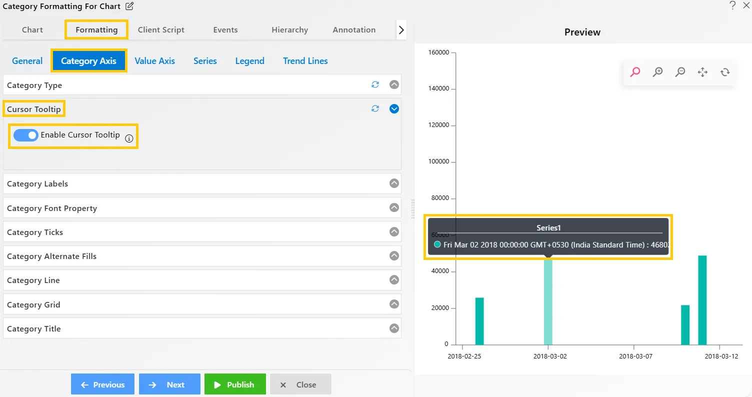
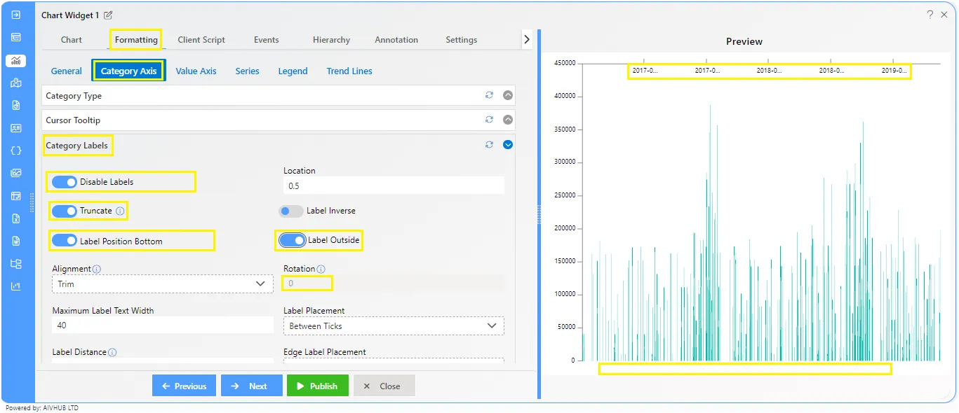
Category Labels
Overview: Category Labels can be added to a chart series by enabling the toggle button in the category label. The labels automatically arrange themselves to prevent overlapping and offer options to truncate text, adjust positions, choose alignments, apply rotation, set maximum text length, and control label placement.
Description: The label toggle is enabled by default. The text formatting options beside the toggle buttons indicate the actions users can perform, such as truncating text or adjusting its position. Users can choose text alignment from the dropdown list. The Rotation property allows rotation of the text from 0 to 360 degrees and works only when Alignment is set to None.
The Label properties overview as follows:
- Label Enable/Disable: Makes the label visible on the chart using the toggle button.
- Location: Sets the relative location of a label on the chart, with a range from 0 to 1.
- Truncate: Allows text to be truncated if it doesn’t fit within the designated space, overriding alignment properties to manage text overflow.
- Label Inverse: Reverses the order of the labels on the chart, displaying them in reverse sequence.
- Label Position Top: Positions the axis labels on the opposite side of the plot area from their default location.
- Label Inside: Label Inside: Displays axis labels inside the plot area, which can be useful for charts where outside labels may clutter the visualization
- Alignment: Controls the alignment of chart labels, ensuring they are positioned correctly based on the user’s formatting preferences.
- Rotation: Rotates the element in degrees (0-360). This feature works only when alignment is set to none.
- Maximum Label Text Width: Sets the maximum width for labels in pixels, preventing them from exceeding the defined space and ensuring they fit within the chart
- Label Placement: Determines where labels will be placed on the category axis, offering two options: Between Ticks or On Ticks. This allows users to control the label layout for better customization.
- Edge Label Placement: Hides the first label after 0 on the category axis, preventing overlapping or cluttering of labels at the axis edge
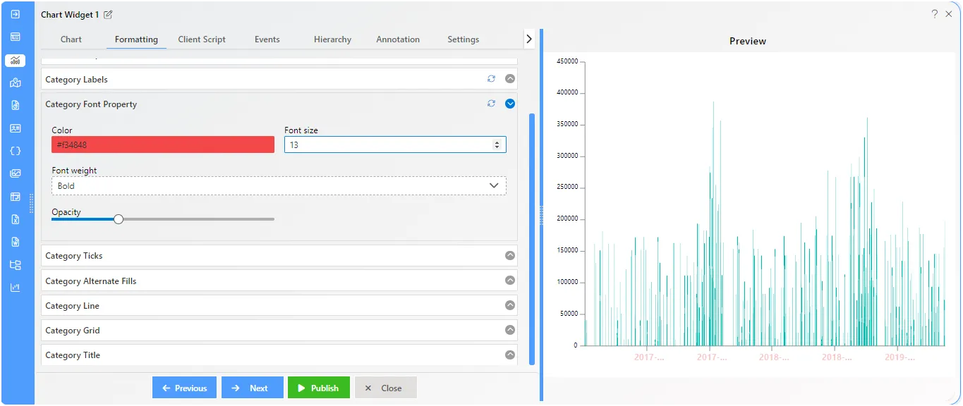
Category - Category Font Property
Overview: This control allows you to make font-related changes. You can adjust the Font color, Size, Weight, and Opacity from here. overall font properties are controled from here.
Description: Insert the required Font color, Font size, Weight and Opacity levels on font.
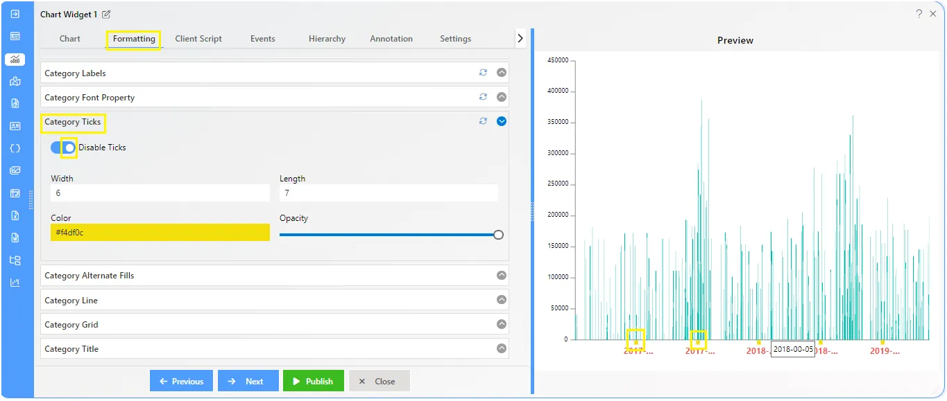
Category - Category Ticks
Overview: Category ticks represent the intervals or divisions along the category axis of a chart. These ticks help in visually organizing and presenting data points. Adjustments such as width along with length, color, and opacity of category ticks can enhance the clarity and readability of the chart.
Description: Ticks are automatically enabled by default on the category axis. Within the controls, users can find options to customize the appearance of ticks. These include numeric controls for adjusting the width and length of ticks, as well as cosmetic properties such as color and opacity. These controls allow users to tailor the appearance of ticks to suit their preferences and enhance the overall visual presentation of the chart.
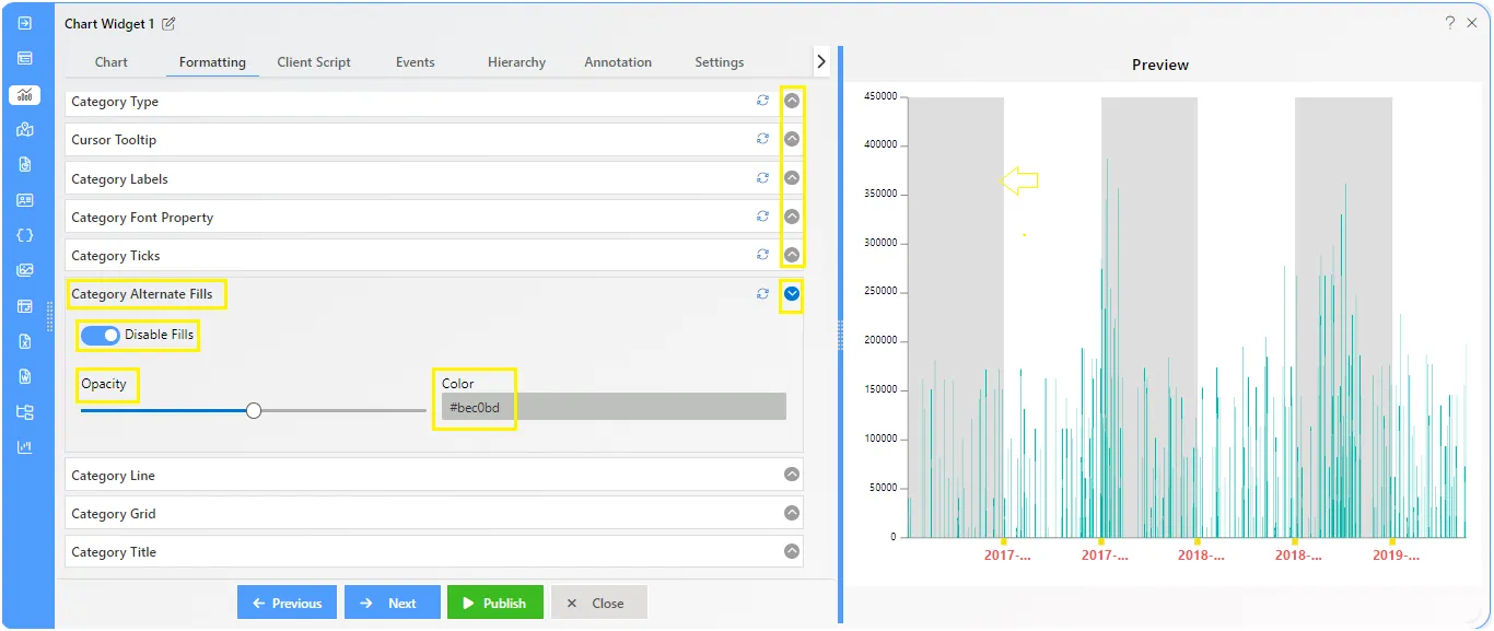
Category - Category Alternate Fills
Overview: Category alternate fills refer to the background colors applied alternately to different categories on the axis of a chart. These fills help visually distinguish between categories and improve the overall clarity of the chart. Users can customize the colors and patterns of alternate fills to suit their requirement.
Description: By default, the category alternate fills property is turned off. Users can enable it to add fills to the chart. Once enabled, they can adjust the opacity and color of the fills using simple controls
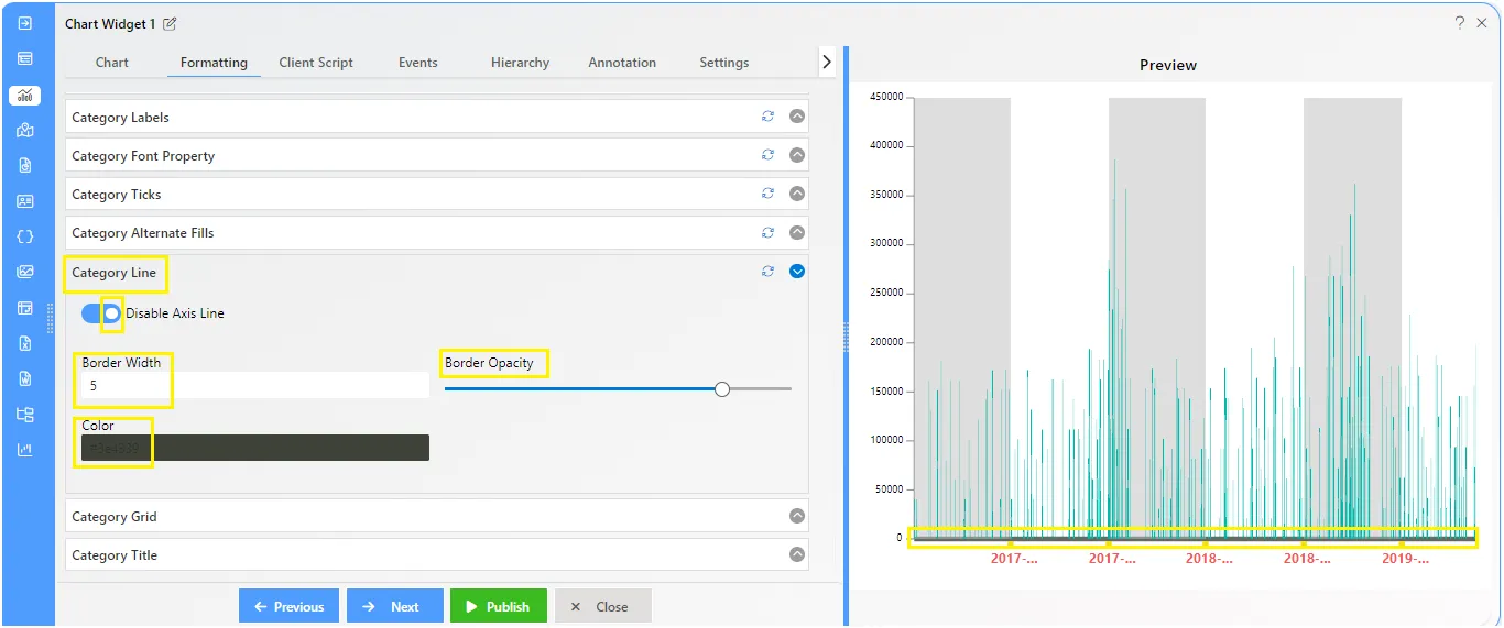
Category - Category Line
Overview: Category lines are automatically visible in charts by default. They play a crucial role in making chart presentations more relevant by neatly separating the category value titles from the chart plot.
Description: This property enables users to customize the category line by adjusting its border width, border opacity, and color.
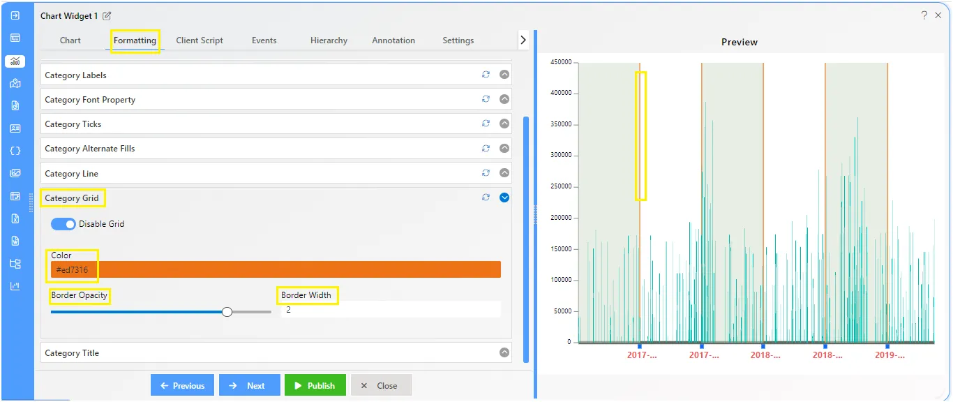
Category - Category Grid
Overview: In column charts, the category grid consists of lines in the background. These lines help organize the chart by providing a visual reference for the data.
Description: The chart grid is an additional line that appears in the background of column charts. Users can customize this line by choosing the color, adjusting the opacity levels, and setting the border width.
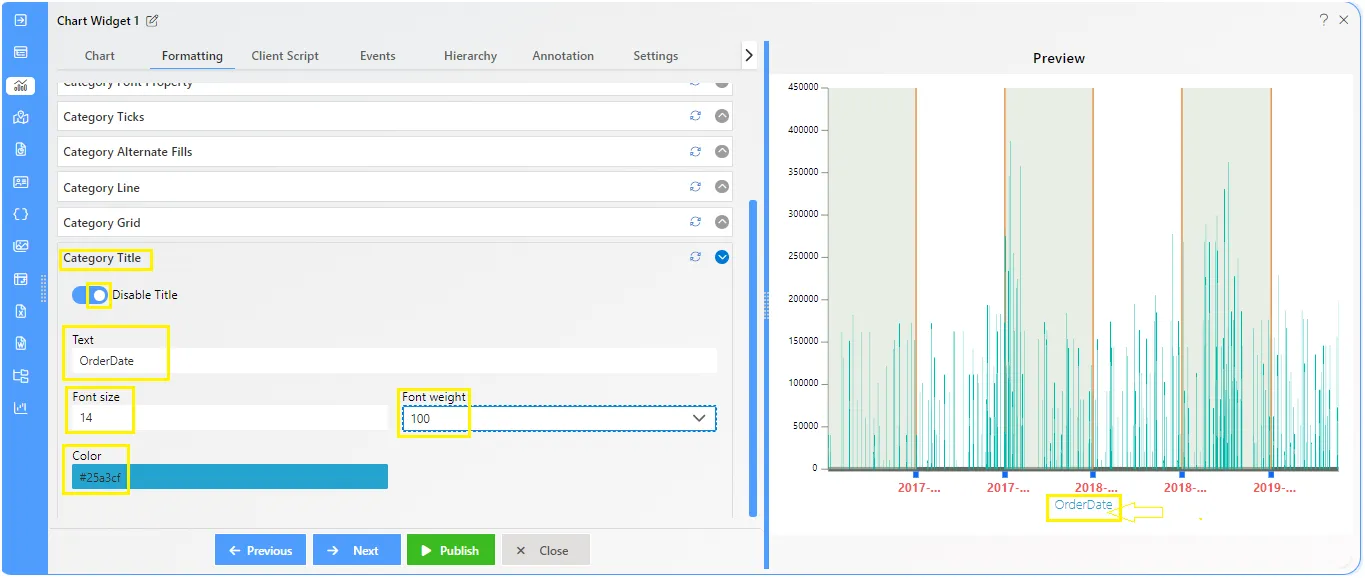
Category - Category Title
Overview: The category title in charts serves as a label identifying the data categories or groups represented along the chart’s axis.
Description: This property is disabled by default, requiring users to enable it by clicking on the toggle button to set it to “true.” Once enabled, users can customize the category title using the following options:
- Text Area: Users can enter the desired title text here.
- Font Size: Users can specify the font size for the title.
- Font Weight: Users can choose from options such as bold, bolder, lighter, etc., to adjust the weight of the title font.
- Color: Users can select the color of the title text.
To know more about other formatting properties click on below links:-
General Properties
Category Axis Properties
Value Axis Properties
Series Properties
Legend Properties
Trend Line