Formatting Legend Column/Bar Chart
The legend Properties are as follows:
The legend properties let users customize how legends appear in charts. This includes adjusting alignment, sorting, font, background, and markers. It gives users full control over how legends are displayed, making charts easier to read and visually appealing.
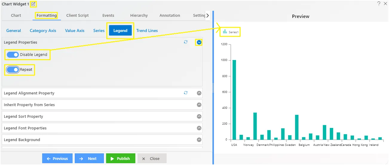
Legend - Properties
Overview: The legend property allows users to toggle the visibility of the legend on the chart. When enabled, users can customize various aspects of the legend to suit their preferences.
Description: To make adjustments to the legend, users need to click on the toggle button to make it visible on the chart. Once enabled, users can customize properties such as alignment, sorting, font, background, and markers to enhance the appearance and organization of the legend. If the legend property is not enabled, the legend will not be displayed on the chart.
Legend - Alignment Property
Overview: The legend alignment feature lets users customize the alignment of the legend in the chart.
Description: Users can adjust the content alignment, position, width, and height of the legend for optimal placement within the chart area. Users can customize:
- Content alignment: Ensure the text is properly aligned.
- Position: Specify where the legend appears on the chart.
- Width and height: Adjust the size of the legend for optimal placement.
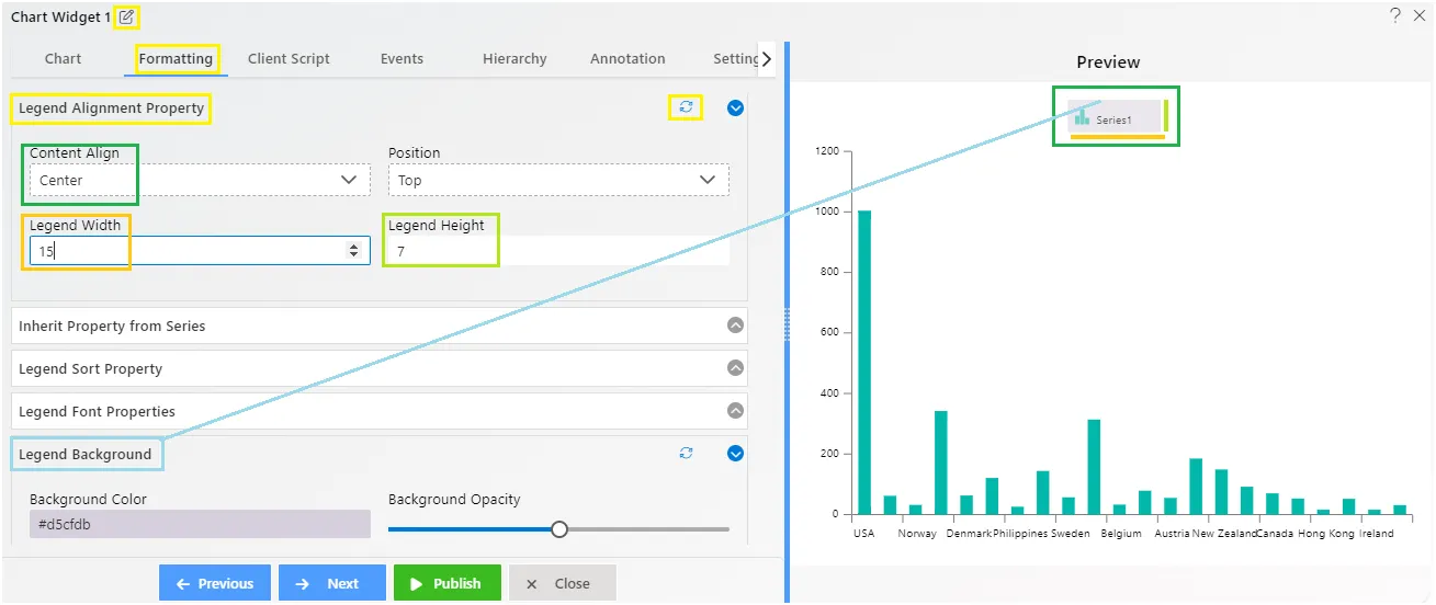
To see Legend allignment property properly.we had to do legend background enable so we can see how legend alignment works.
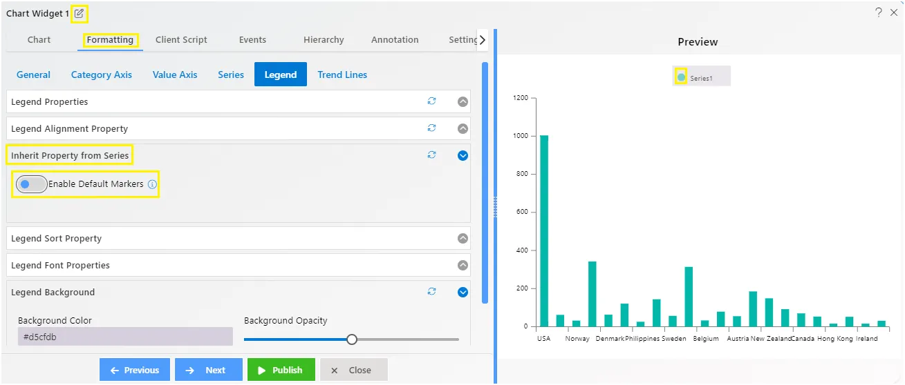
Legend - Inherit Property From Series
Overview: The “Inherit Property From Series” feature allows the legend shape to match the type of chart. For example, a column icon appears on a column chart legend, while pie icons show on a pie chart legend.
Description: When enabled (set to true), the “Inherit Property From Series” feature ensures that legend shapes resemble their related chart elements. For instance, a line series will display a line with the same thickness and color, and will use the same bullets if applicable.
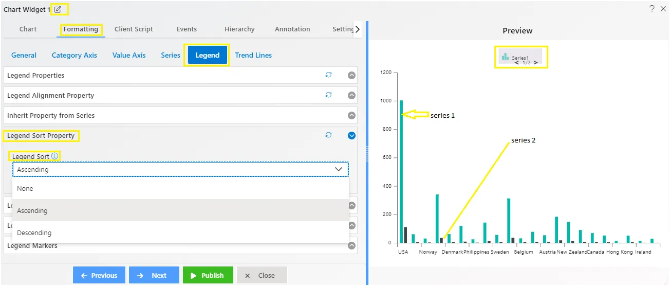
Legend - Sort Property
Overview: The Legend - Sort Property allows users to alphabetically sort the legend on the chart.
Description: To use this feature, simply toggle it on and select your preferred sorting order from Ascending to Descending using the dropdown menu. Remember, this property only works when the legend is active and sortable.
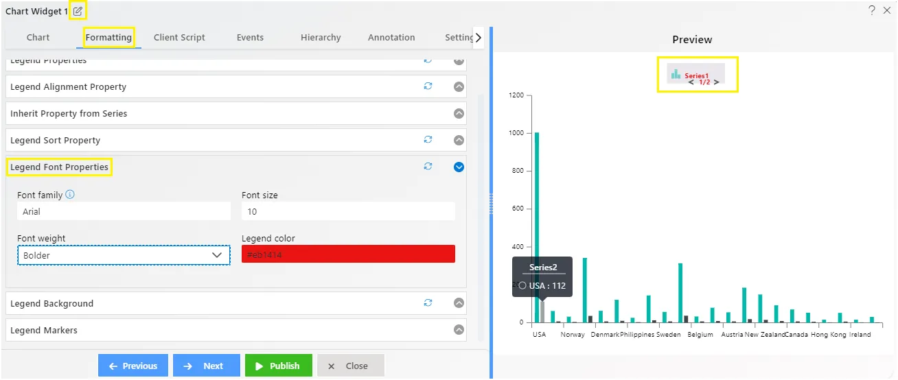
Legend - Font Properties
Overview: The Legend Font Properties allow users to customize the appearance of the font used in the chart’s legend.
Description: Users can adjust various font properties such as font size, font weight, font color, and font style to tailor the legend’s text to their preferences. These settings enable users to enhance the readability and visual appeal of the legend.
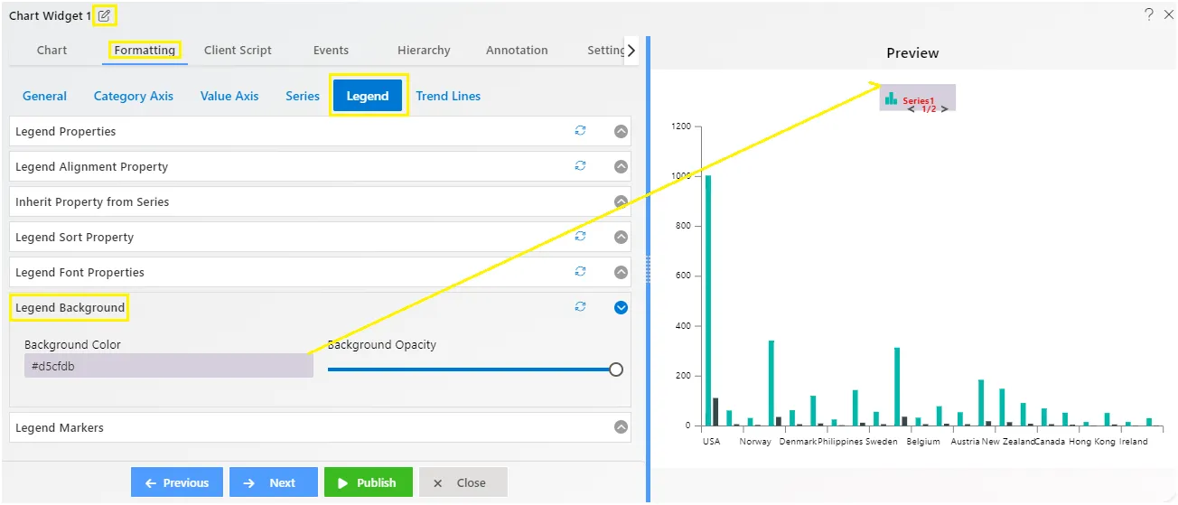
Legend - Background
Overview: Background property controls the background of the legend area in a chart. This feature allows users to customize the background behind the legend items, including adjusting opacity.
Description: To modify the legend background, users can set the desired opacity level. This property affects the area directly behind the legend items, enhancing their visibility and making them stand out against the chart background.
- Background Color: Users can specify the color of the background behind the legend items.
- Opacity: Users can adjust the opacity level of the legend background, controlling its transparency.
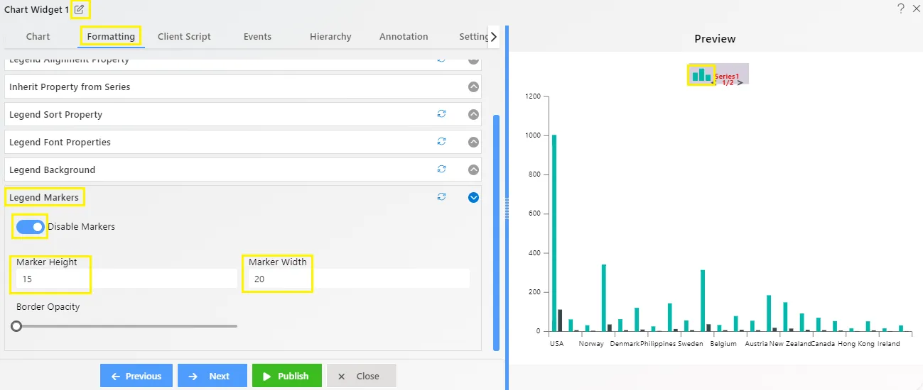
Legend - Markers
Overview: Markers property deals with the icons displayed in the legend. Users can adjust the size and appearance of these icons to better fit the chart and enhance its meaning.
Description:
- Marker Height and Width: Users can specify the dimensions of the markers in pixels by entering numerical values.
- Border Opacity: Users can adjust the opacity of the marker borders using a slider control.
To know more about other formatting properties click on below links:-
General Properties
Category Axis Properties
Value Axis Properties
Series Properties
Legend Properties
Trend Line