General Formatting for Column/Bar Chart
This versatile application provides users with a wide range of customization options for charts. Users can easily adjust dataset colors and select themes to match their preferences. It also allows for the management of negative values and sorting of charts to organize data effectively. Personalization extends to chart titles, scrollbar settings, and background areas. Tooltips can be customized for better clarity, and users can even create back-to-back charts for more comprehensive data visualization. These features combine to offer a dynamic and highly flexible charting experience.
General Formatting for Column/Bar Chart: This video contains how to format Column/Bar Chart in AIV.
The general properties are as follows:
Dynamic Dataset Color
Overview: To utilize the dynamic color feature, ensure your dataset contains a color code or color name column. In this example, the dataset includes columns for Country, Color Code, and Extended Price. When you select the Dynamic Dataset Color option and choose the Color Code column, the chart elements will be dynamically colored based on the country’s assigned color code. If you select columns such as Country or Extended Price, the chart will default to black. This feature provides the ability to dynamically assign colors according to the selected dataset column’s values.
Description: To apply dynamic colors to the chart, follow these steps:
- Ensure your dataset includes a Color Code or Color Name column.
- Select the Dynamic Dataset Color option.
- Choose the column containing the color code (e.g., Color Code).
- The chart will now display colors based on the values in the selected column.
- If you choose columns like Country or Extended Price, the chart will default to black color. This feature enables flexibility by allowing dynamic color assignments, improving data visualization and making the chart visually intuitive.
Output: 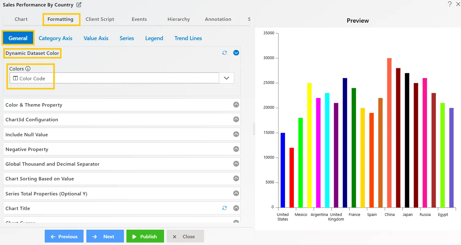
Color and Theme Property
Overview: Users can select colors and themes to customize their charts. They can apply colors based on categories, group values, or global settings for selected widgets. Additionally, users can customize colors from a color list according to their preferences.
Description: Users can easily customize their charts by adding colors and predefined themes. These can be applied by category, globally, or to specific groups for enhanced personalization.
- Theme: Select from a list of available themes to apply to your chart.
- Color by Category: Toggle to apply distinct colors based on different categories.
- Optional Grouping Color: Choose to apply specific colors to grouped values.
- Match Global Color: Use the predefined global colors from the Dashboard Global Theme settings to maintain a consistent color scheme across selected widgets, simplifying color application.
- Color List: Personalize your chart colors by selecting combinations from a customizable color list.
Output: 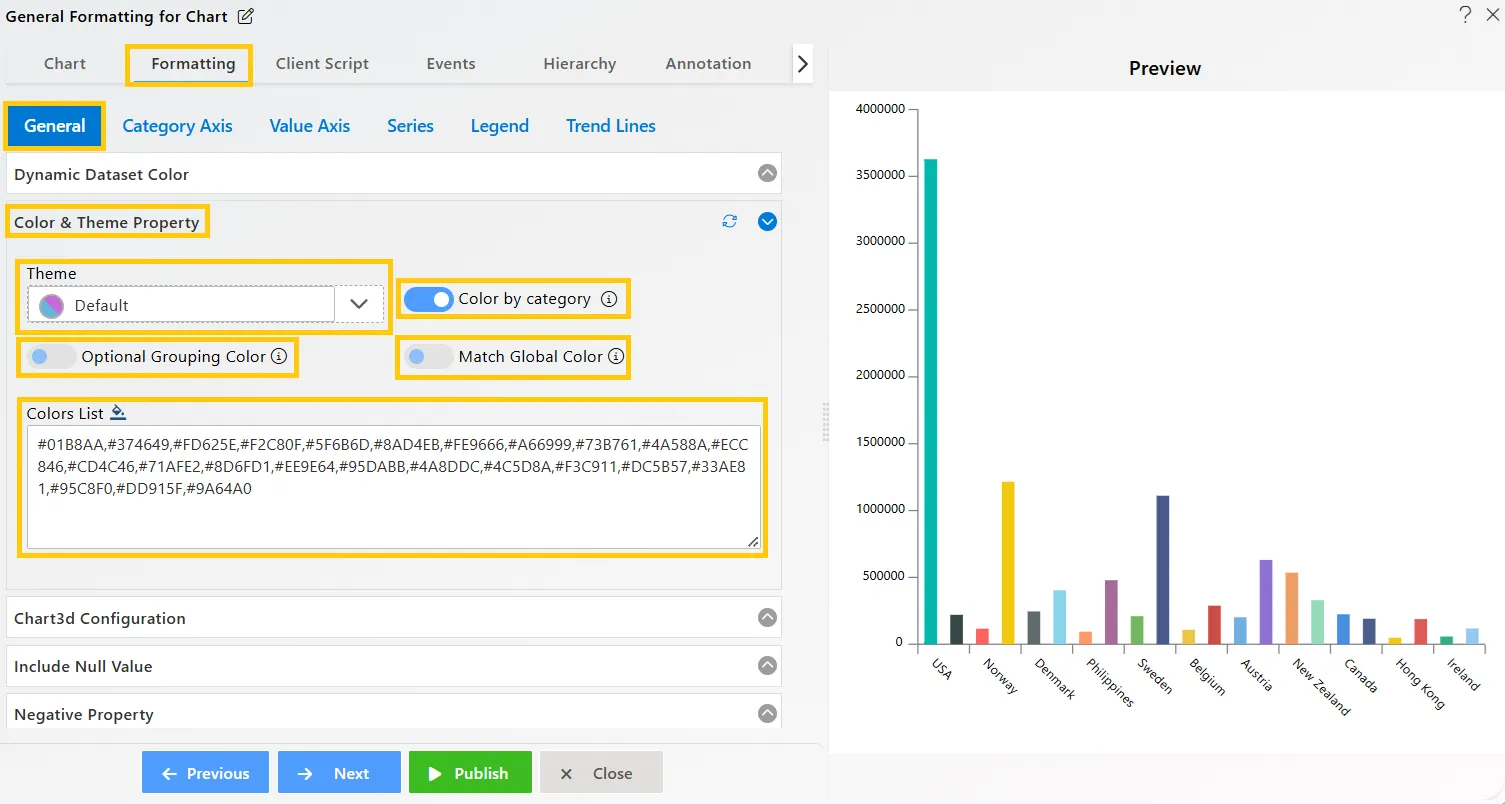
Chart3D Configuration
Overview: The Chart3D Configuration transforms a standard column chart into a 3D format, allowing users to modify the plot’s angle, depth, rotation, and wall color for enhanced visual impact and customization.
Description: To enable the 3D chart configuration, toggle the option to activate Chart3D settings. Users can customize the following aspects of the chart:
- Plot Depth: Adjusts the chart’s depth based on the entered value, adding dimension to the visualization.
- Plot Angle: Changes the angle of the plot according to the value entered, providing different perspectives.
- Rotation: Rotates the entire chart, allowing users to view the data from various angles.
- Wall Color: Customizes the color of the chart walls by selecting a preferred color or entering a color code.
Output: 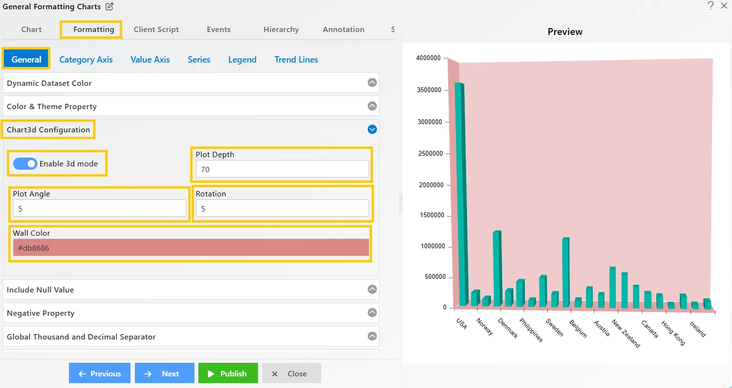
Include Null Value
Overview: This feature enables the inclusion of null values in charts, ensuring comprehensive data representation. It helps users visualize data gaps seamlessly, facilitating accurate analysis and informed decision-making.
Description: By toggling the Include Null Value option, users can display null values directly on the chart. This enhances data visibility, providing a clearer understanding of missing data and enabling more thorough analysis and insights.
Output: 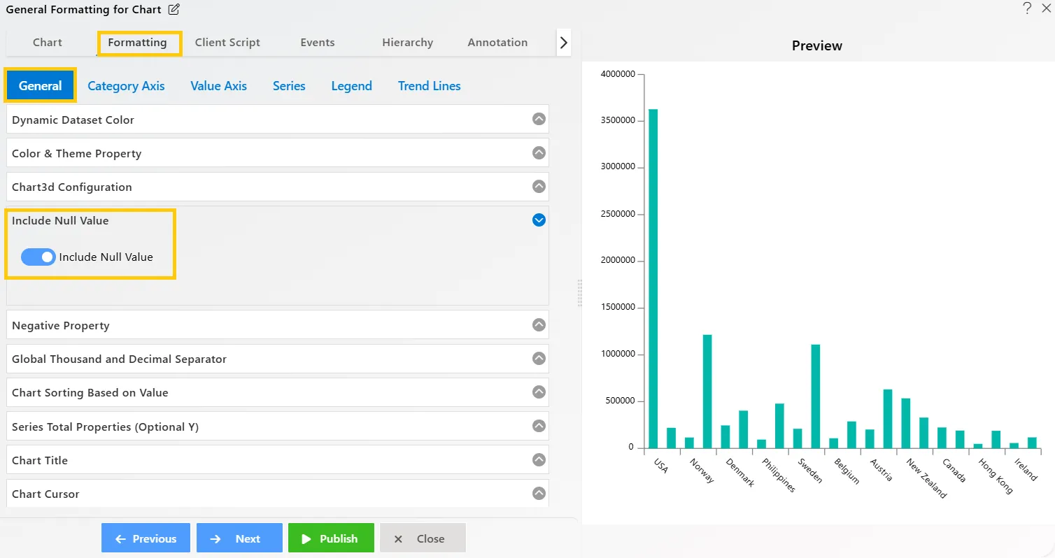
Negative Property
Overview: The Negative Property allows users to visualize values below zero on charts, enhancing the comprehensiveness of data representation. This feature ensures that negative values are clearly displayed alongside positive values.
Description: To visualize negative values, users can input values as negatives. Enable the toggle button to activate this function for the entire widget, allowing negative values to be displayed on the chart.
Output: 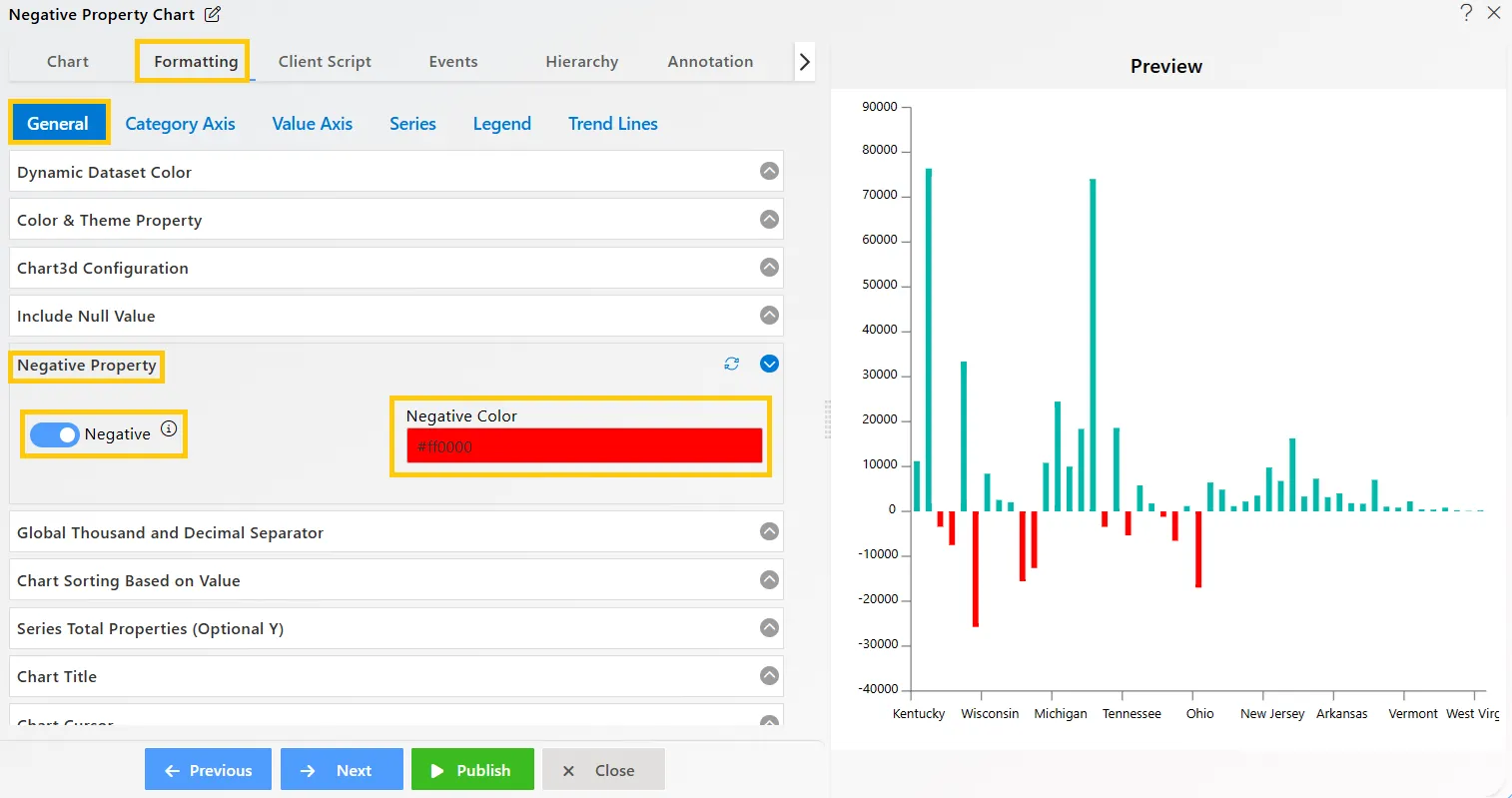
Global Thousand and Decimal Separator
Overview: Adding decimal and thousand separators improves the readability of numerical values, making them easier to interpret and understand at a glance.
Description:
- Decimal Separator: The decimal separator is applied globally when number formatting is enabled for the value axis, ensuring consistency in displaying decimal values.
- Thousand Separator: The thousand separator can be used for large values, enhancing readability. Users can also customize the separator as needed. Enable the toggle button to activate this feature.
Output: 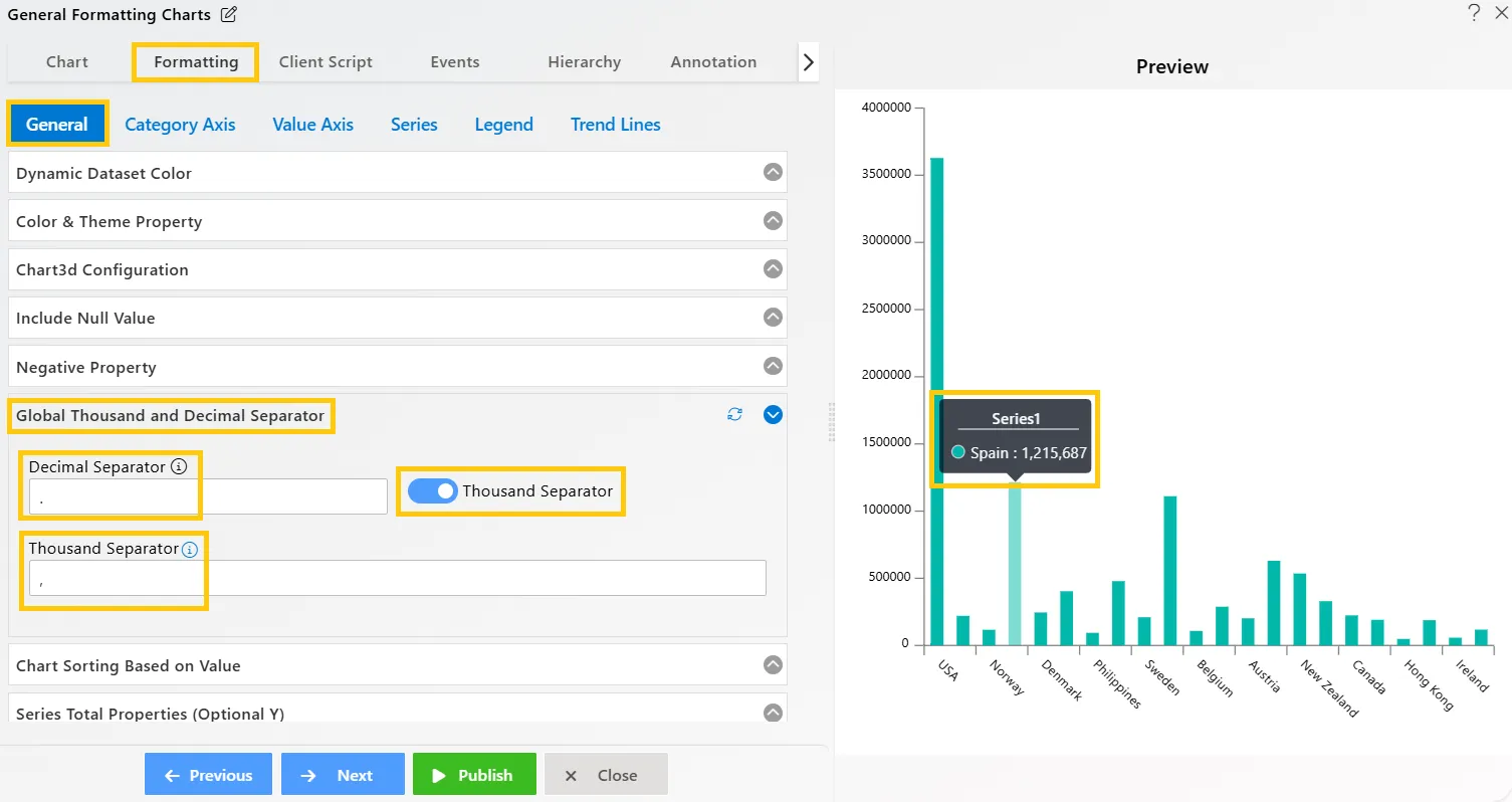
Chart Sorting Based on Value
Overview: The sorting functionality allows users to organize chart values in either ascending or descending order, making data interpretation more intuitive.
Description: This feature sorts chart values based on the selected dimension when Optional Category Grouping is set to None. Users can choose Ascending or Descending order to better prioritize and analyze key values.
Output: 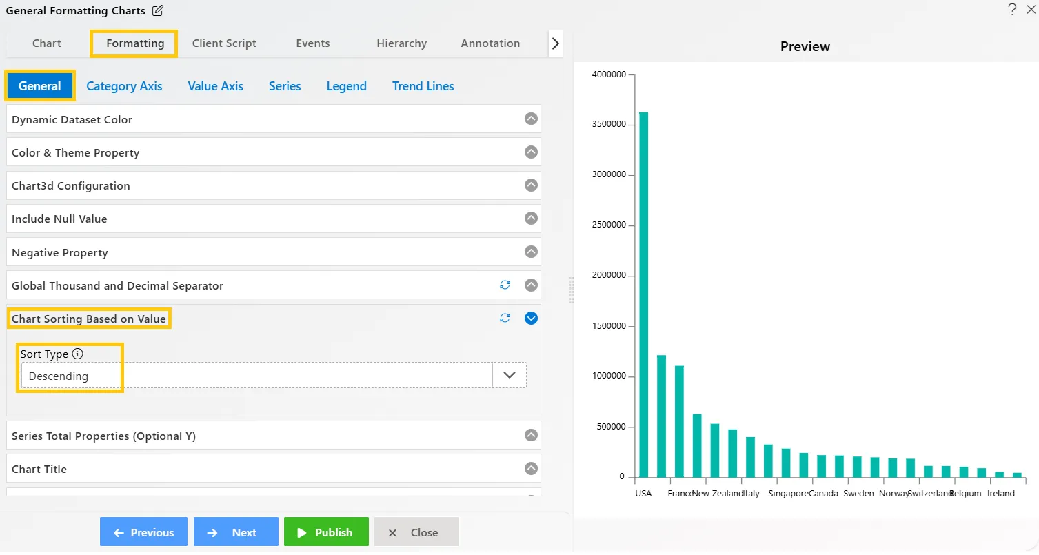
Series Total Properties (Optional Y)
Overview: The Series Total feature allows users to display the total value of specific columns on top of the bars in stacked charts, providing a clear overview of the total value for each category.
Description: To enable this feature, users should use a Stacked Chart with Optional Y Grouping and toggle the Series Total property on. This will display the total values at the top of the bars in the chart, enhancing data visibility and comparison.
Output: 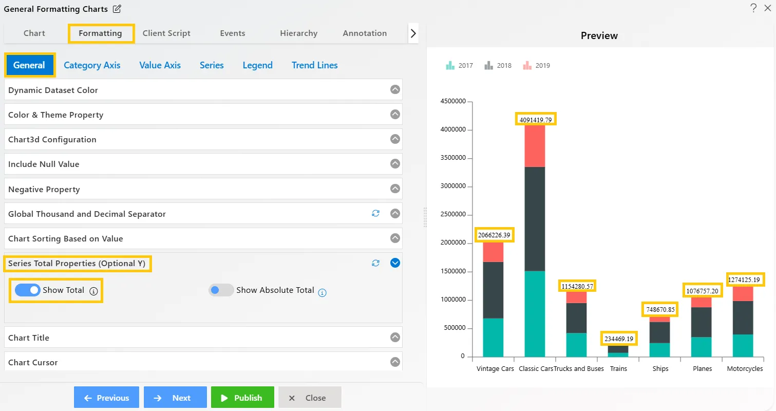
Chart Title
Overview: Users can add a title to their chart to provide context and enhance its clarity using the chart title feature.
Description: The chart title properties are as follows:
- Text: Enable the chart title and input the desired text in the textbox.
- Font size: Adjust the font size by entering a numeric value.
- Font weight: Select the desired font weight (e.g., Normal, Bold, or other available options).
- Color: Choose a color for the title text by specifying a color code.
- Align: Align the title text to the left, center, or right as needed.
- Background: Set a background color for the title by using a color code.
- Background Opacity: Adjust the background opacity to control the visibility of the title against the chart.
Output: 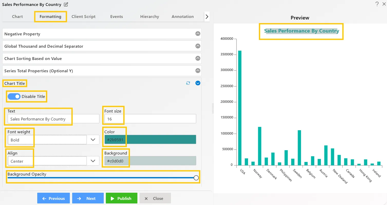
Chart Cursor
Overview: The cursor line on the chart helps users track and locate the cursor position. By using the cursor properties, users can adjust the cursor line width to suit their preferences.
Description: To make the cursor line visible on the chart, the user needs to enable the Line X and Line Y options. This will display the cursor line on the X-Axis and Y-Axis of the chart, allowing for better visualization of the cursor’s position.
Output: 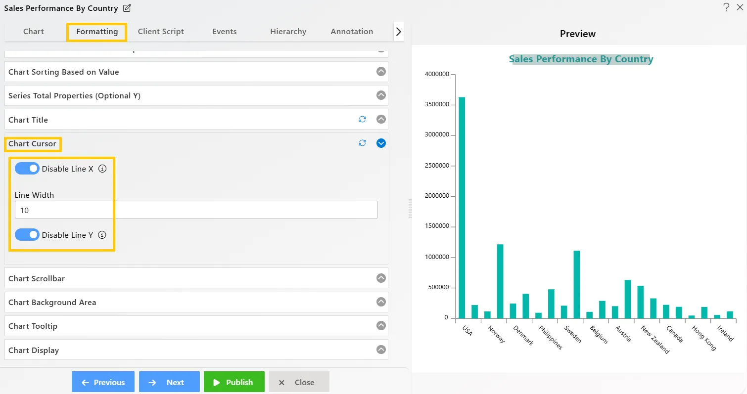
Chart Scrollbar
Overview: Chart scrollbars enable users to zoom in and out of the chart, as well as navigate horizontally (X-axis) and vertically (Y-axis). This enhances data exploration and allows users to focus on specific data points with ease.
Description: To enable the scrollbar, select the Category Scrollbar or Value Scrollbar from the dropdown options. The following actions are available:
- Zoom In: Magnifies the chart, making the columns appear larger.
- Zoom Out: Reduces the chart size, displaying a smaller, more compact view.
- Pan: Clicking the pan icon allows users to move the chart left or right without changing the zoom level.
- Reset: Clicking the reset icon reverses all zoom and pan changes, returning the chart to its original state.
Output: 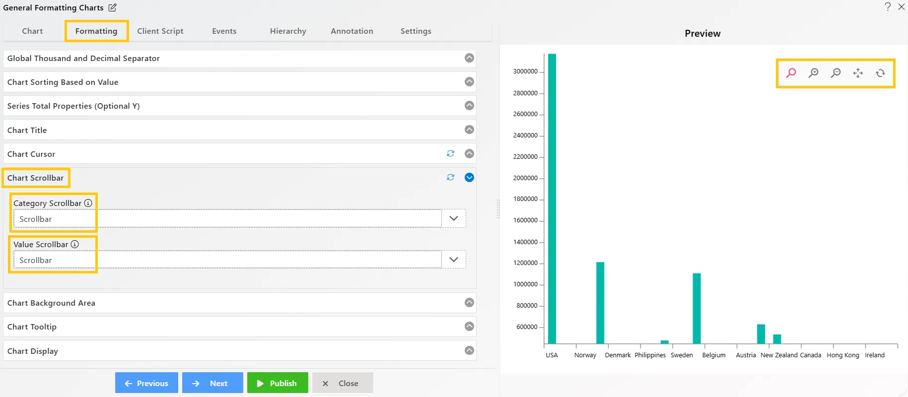
Chart Background Area
Overview: The Chart Background Area feature allows users to apply a background color to the entire chart. Users can customize the appearance by specifying the desired color using a color code or selecting from a color palette.
Description: Users can add a background color to the chart by either selecting a color from the palette or entering a specific color code. Additionally, the opacity of the background color can be adjusted using a slider control, allowing for fine-tuned transparency to suit visual preferences.
Output: 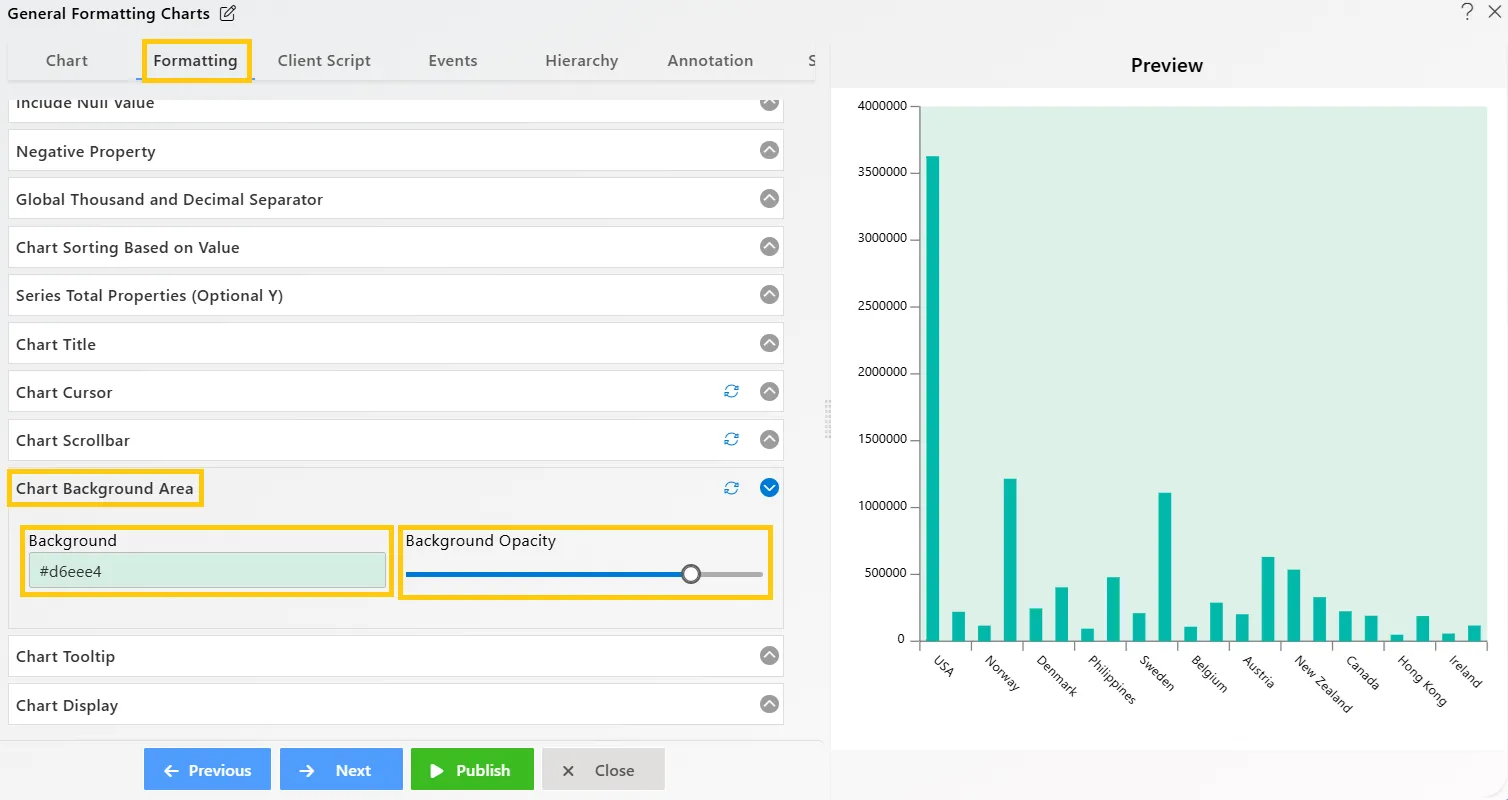
Chart Tooltip
Overview: Tooltips provide users with additional information when hovering over chart elements, enhancing data interpretation and interaction.
Description: To enable tooltips, toggle the tooltip option. Users can customize the tooltip content by modifying its syntax, offering flexibility in how data is displayed within the tooltips.
Output: 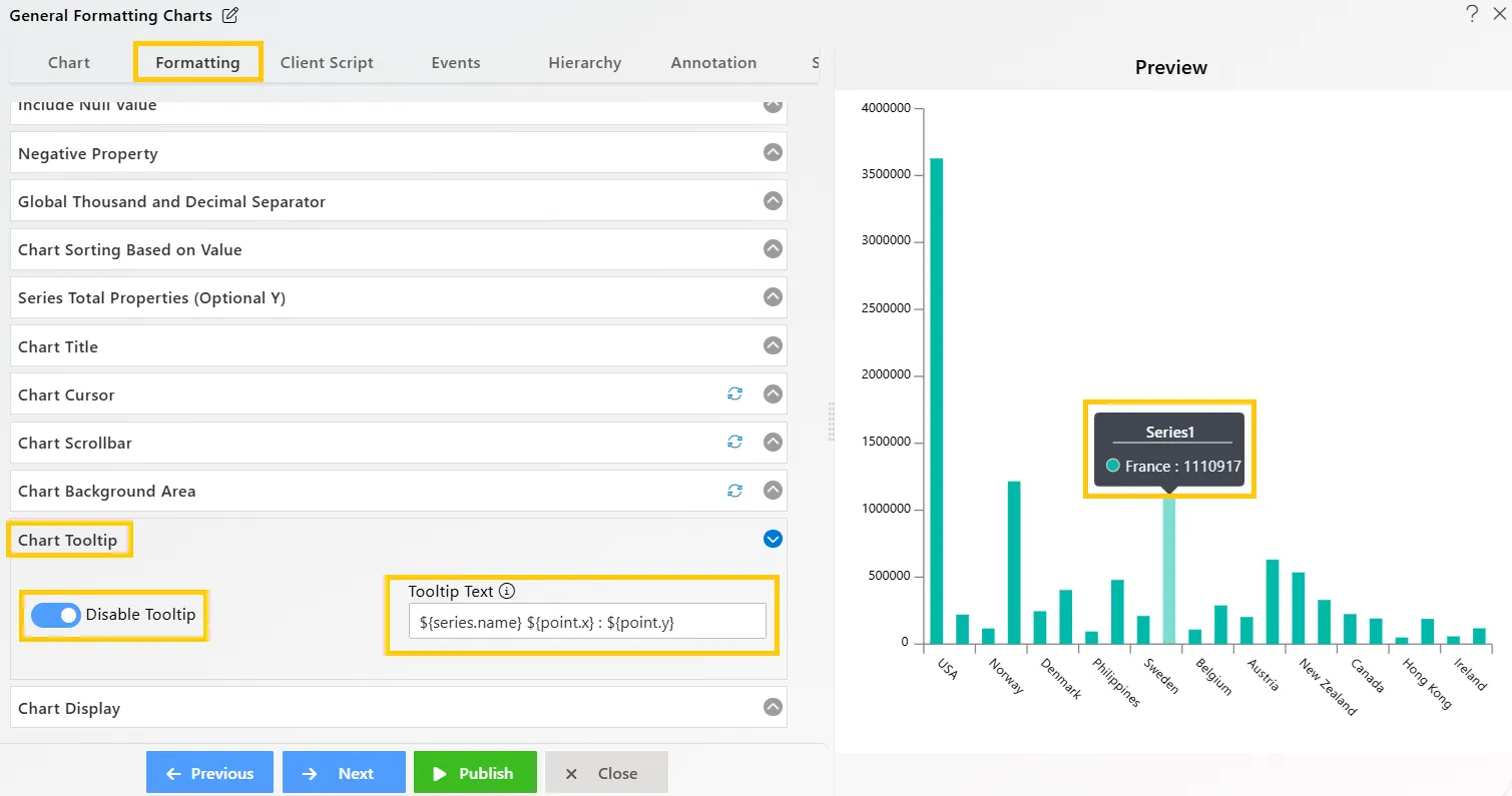
Back to Back Chart
Overview: Back-to-back charting enables users to compare bars displayed consecutively, one behind the other. Activate this feature by toggling the option, allowing bars to appear back-to-back. This is available for column or bar charts with multiple series when stacking is disabled.
Description: This feature functions when the column or bar chart is not stacked and contains more than one data series.
Output: 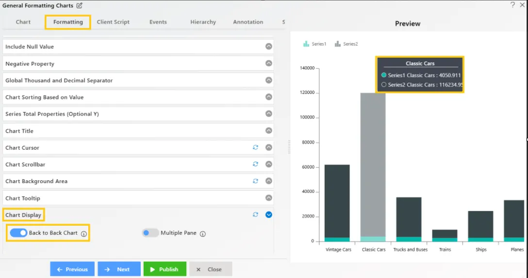
Multiple Pane Chart
Overview: Multiple Pane charting displays multiple data series in separate panes within one chart, enhancing the clarity of comparisons between related datasets.
Description: Each data series appears in its own pane. This feature works when the chart has multiple series and two axes, allowing for better analysis of individual series. Stacking is not supported.
Output: 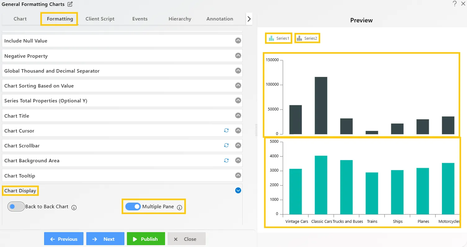
To know more about other formatting properties click on below links:-
General Properties
Category Axis Properties
Value Axis Properties
Series Properties
Legend Properties
Trend Line