X-Axis Alignment
Overview
This function in AIV6 allows users to adjust the alignment of category labels. Options include Hide, Trim,Wrap, Multiple Rows, Rotate45, and Rotate90, enabling customization based on specific requirements.
X-Axis Alignment: This video explains how to use X-Axis Alignment in AIV.
Steps to apply X-Axis Alignment:
-
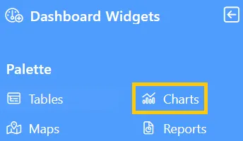
Click the Charts icon from the left vertical menu, as shown below:
-
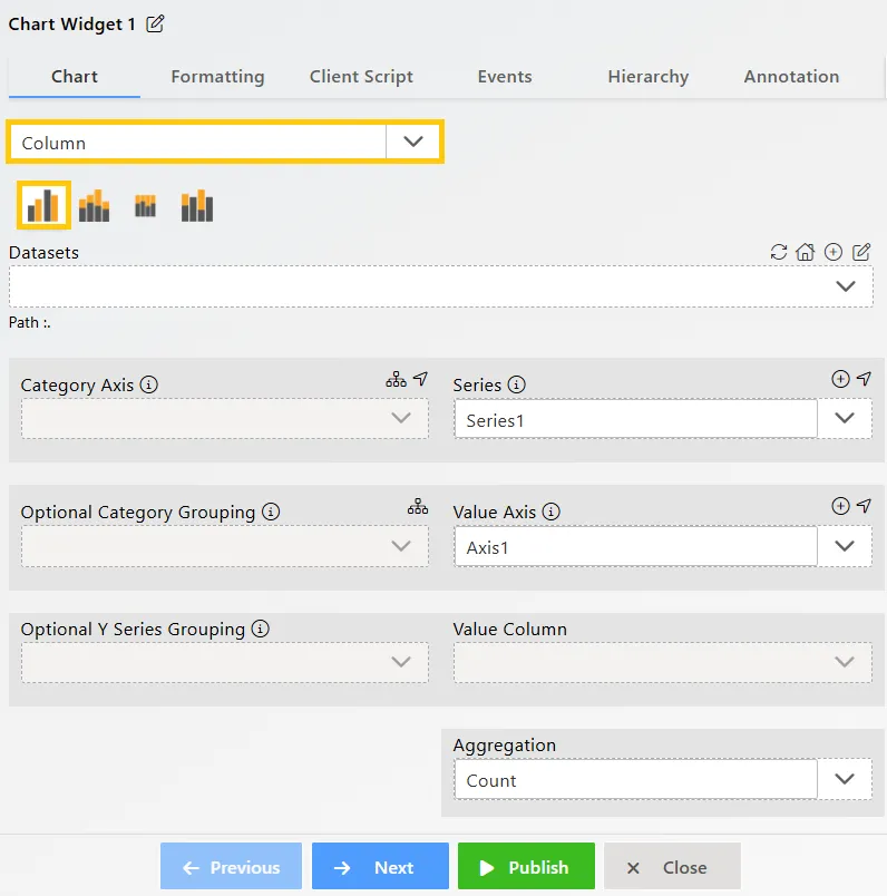
The Chart Edit menu box will appear, and by default, the Clustered Column chart will be selected.
-
Enter the following details in the Clustered Column Chart Widget:
-
Datasets (ds): Sales.ds
-
Category Axis: country
-
Value Column: extendedPrice
-
Aggregation: Sum
-
-
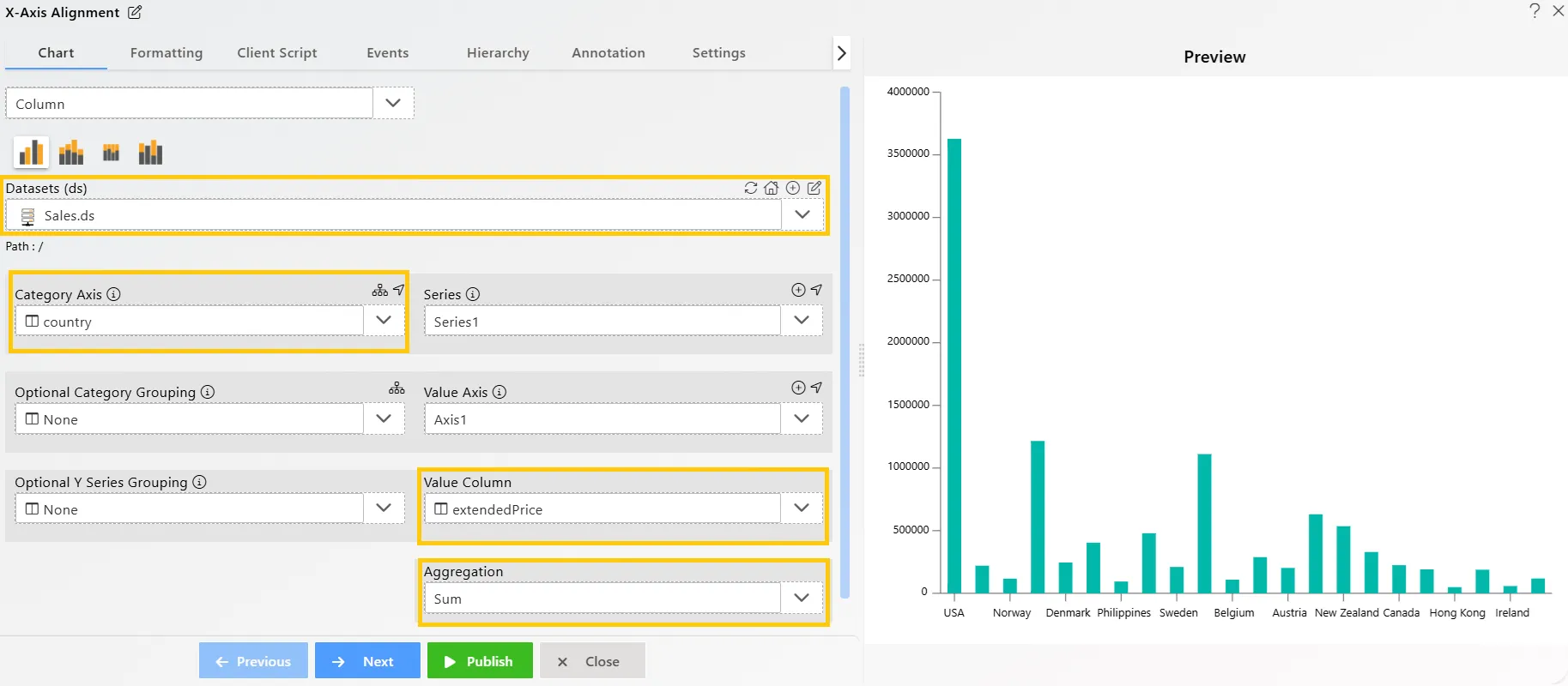
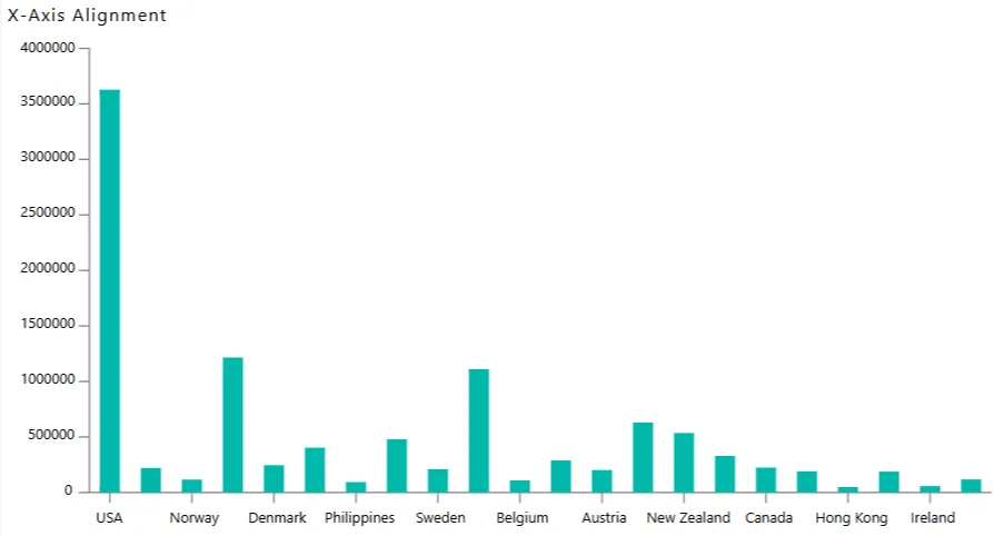
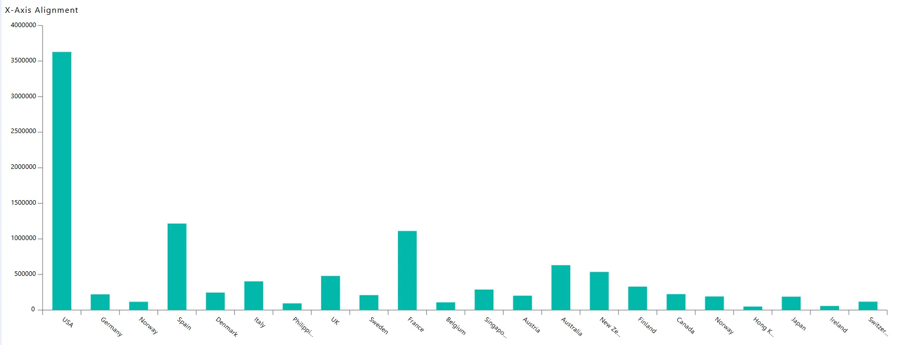
Click on the Publish button, then the Preview icon, and finally click on the SAVE AND EXIT button to view the Clustered Column Chart, as shown below:
-
Edit the chart by clicking the
 icon located in the top-right corner. In the Edit Menu, go to Formatting Tab → Category Axis → Category Labels, and enable the label. By default, Rotate45 will be selected in the Alignment option, as shown below:
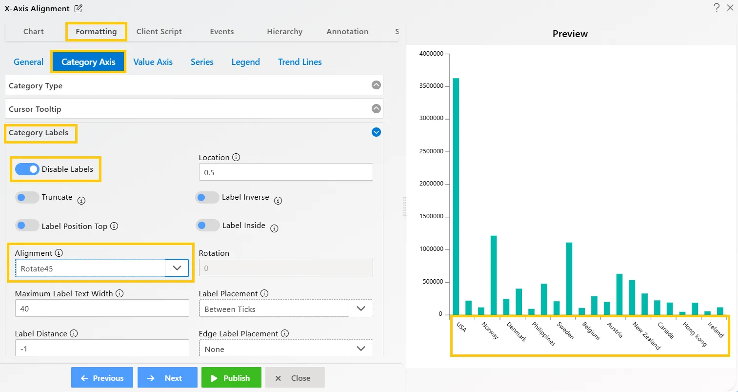
-
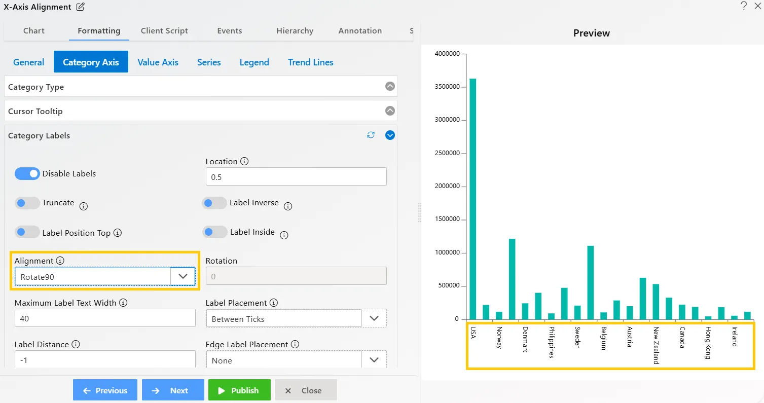
Select Rotate90 in the Alignment option. Your widget will appear as shown below:
-
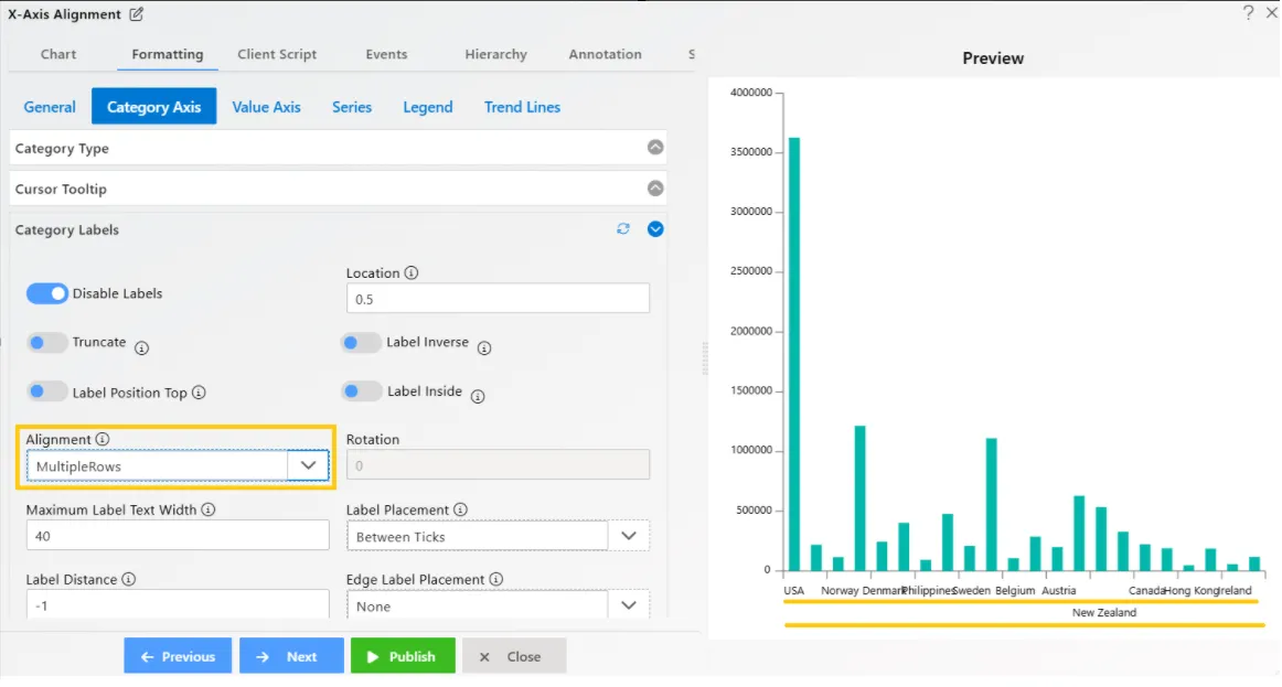
Select Multiple Rows in the Alignment option. Your widget will appear as shown below:
-
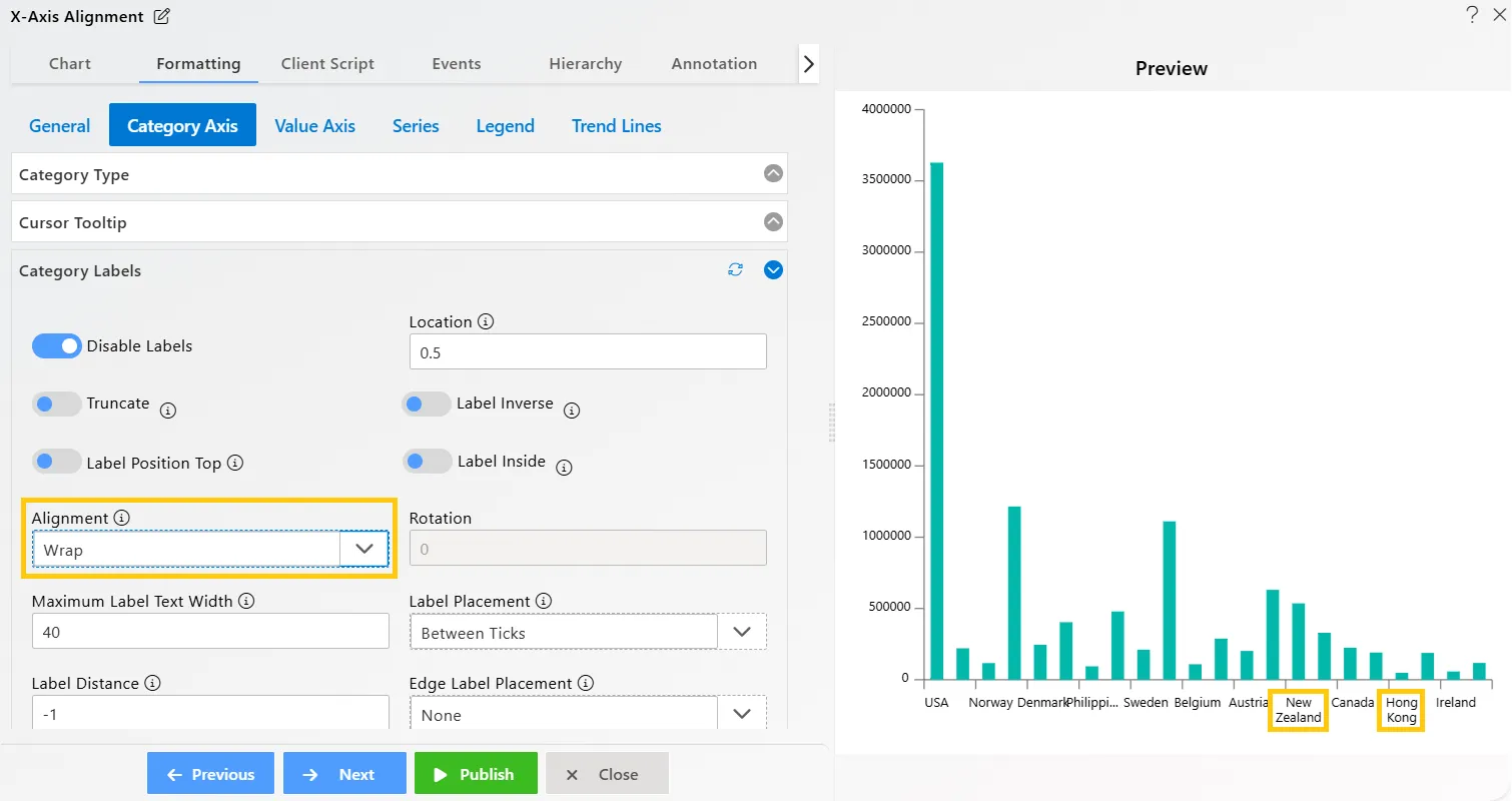
Select Wrap in the Alignment option. Your widget will appear as shown below:
-
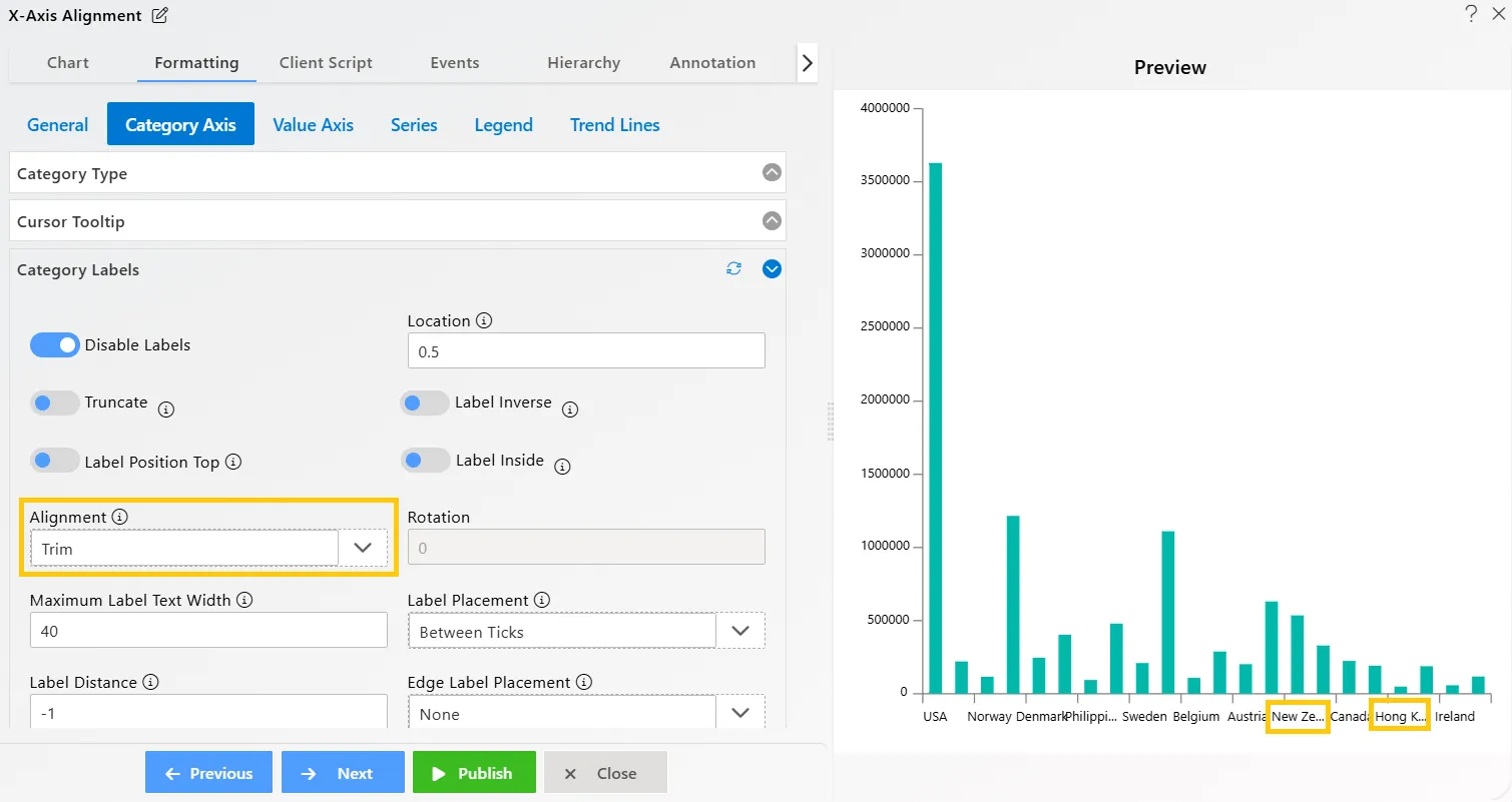
Select Trim in the Alignment option. Your widget will appear as shown below:
-
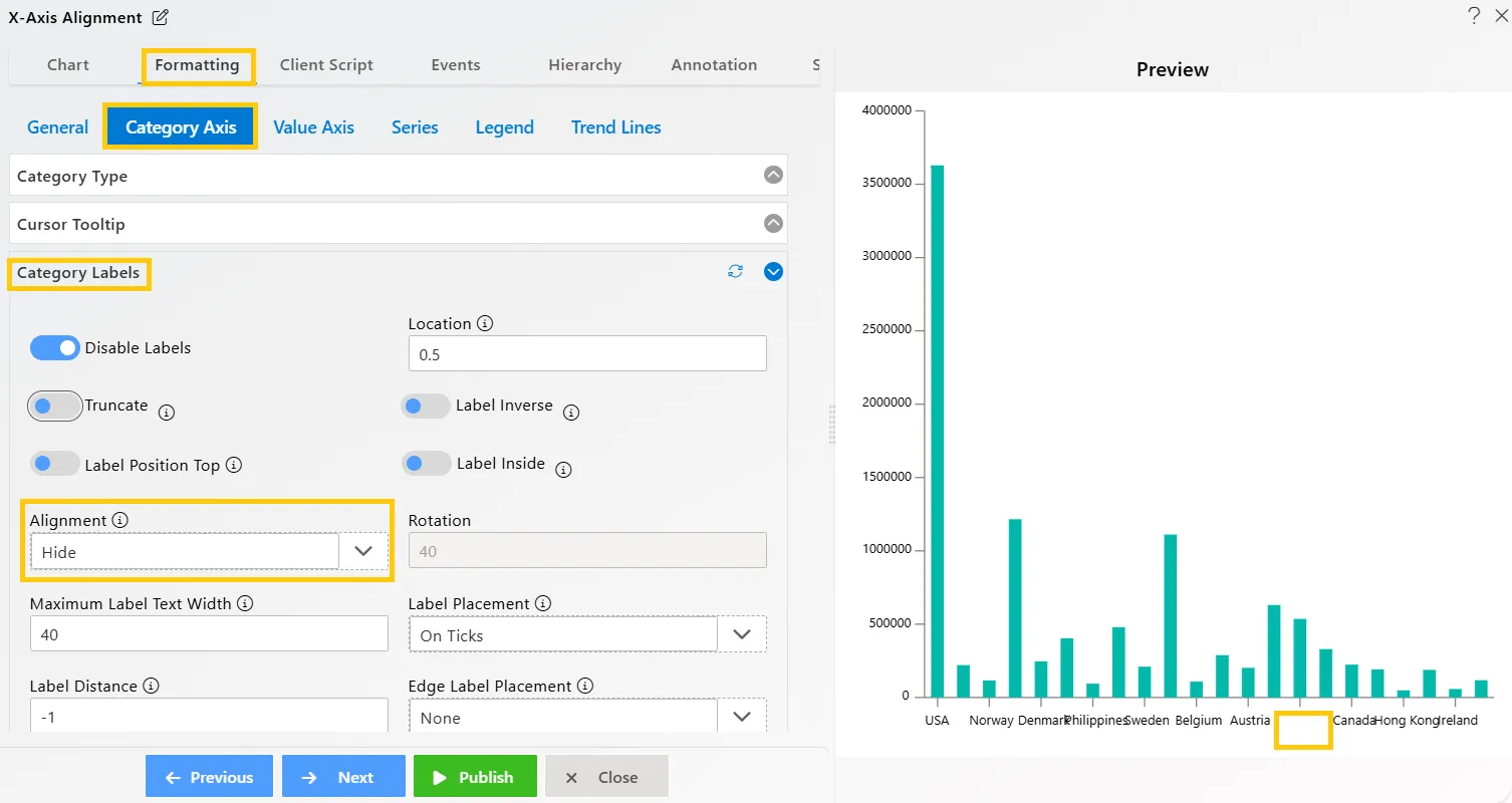
Select Hide in the Alignment option. Your widget will appear as shown below:
-
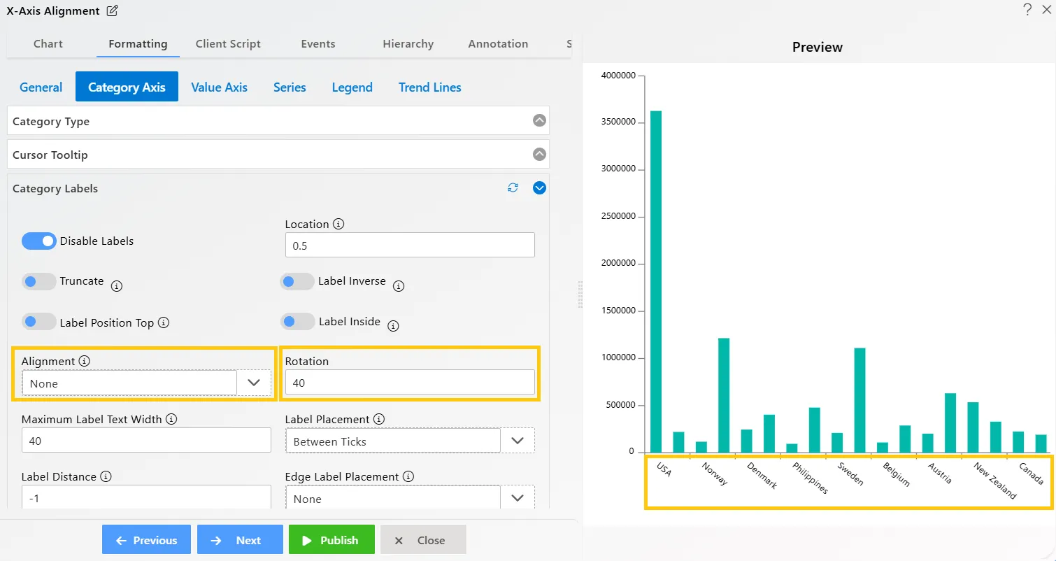
Select None in the Alignment option and enter 40 in the Rotation option. Your widget will appear as shown below:
-
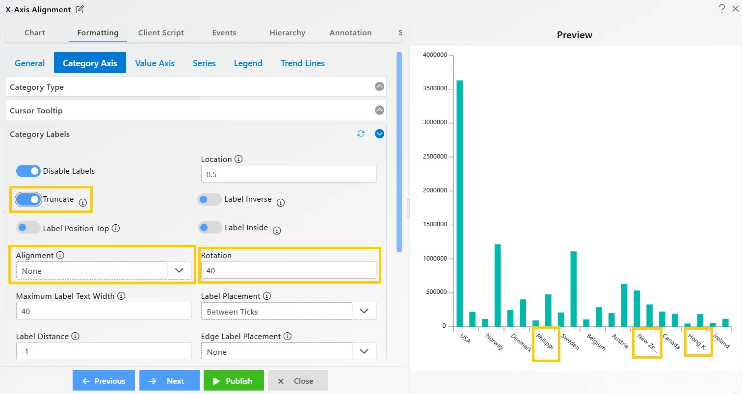
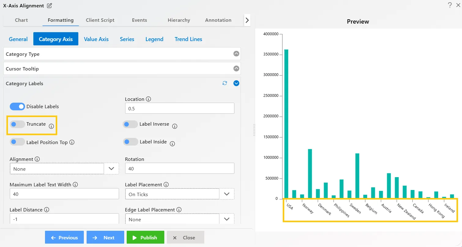
After that, enable the Truncate option, and your widget will look as shown below:
-
Click on the Publish button, then the Preview icon, and finally click on the SAVE AND EXIT button to view the Clustered Column Chart, as shown below:
-
After that, navigate again to Formatting Tab → Category Axis → Category Labels.
-
Then, go to the Label Placement option and select On Ticks from the dropdown, as shown below.
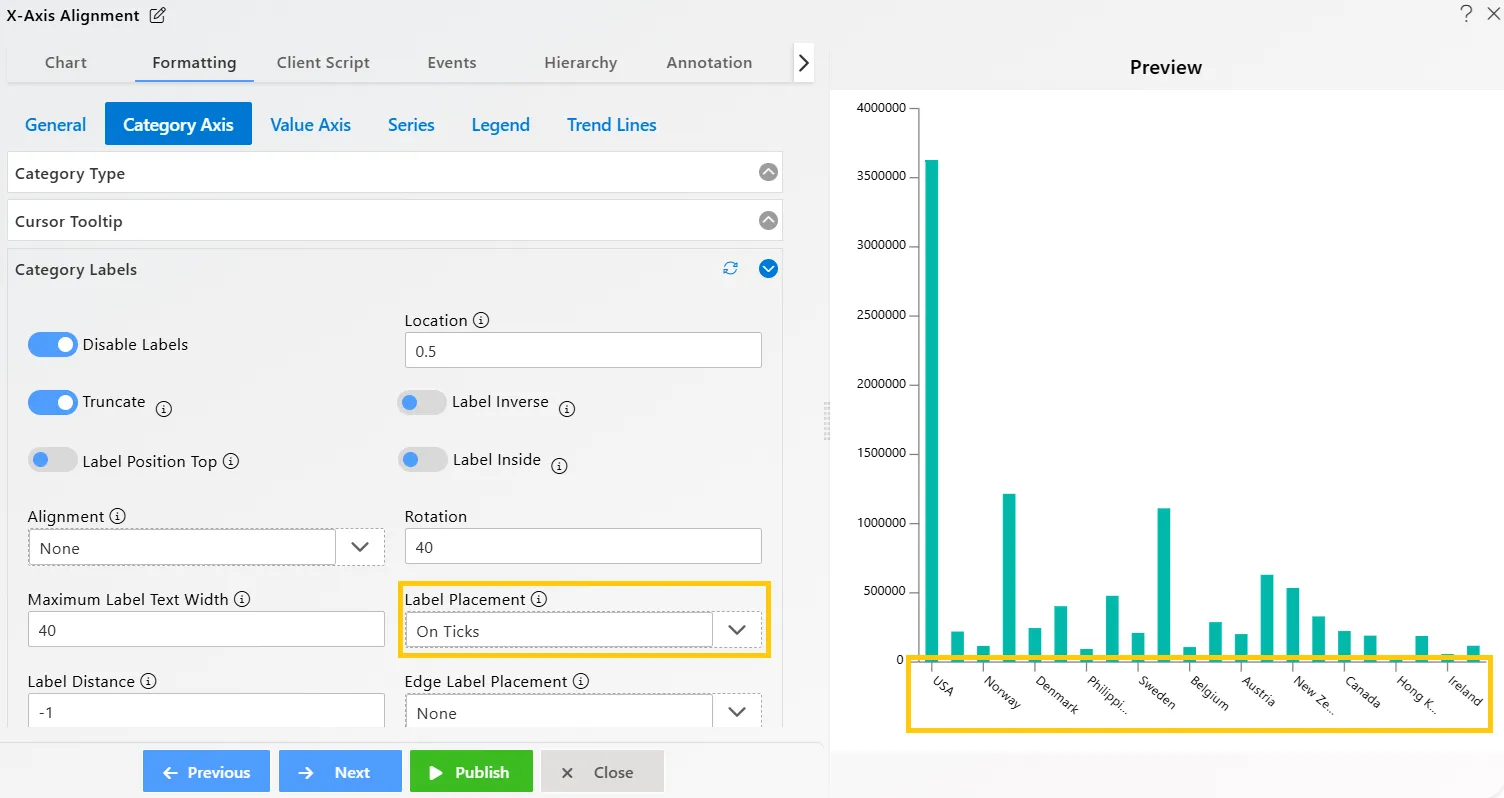
-
Next, disable the Truncate option. Your widget will appear as shown below:
-
Click on the Publish button, then the Preview icon, and finally click on the SAVE AND EXIT button to view the Clustered Column Chart, as shown below:
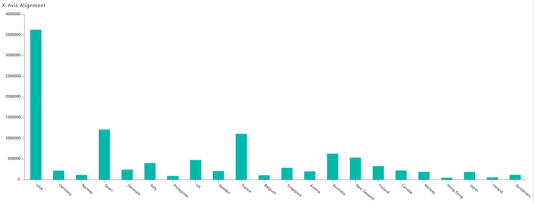
In this way, you can customize X-Axis alignment in the AIV application.