Circular Gauge Chart
Overview
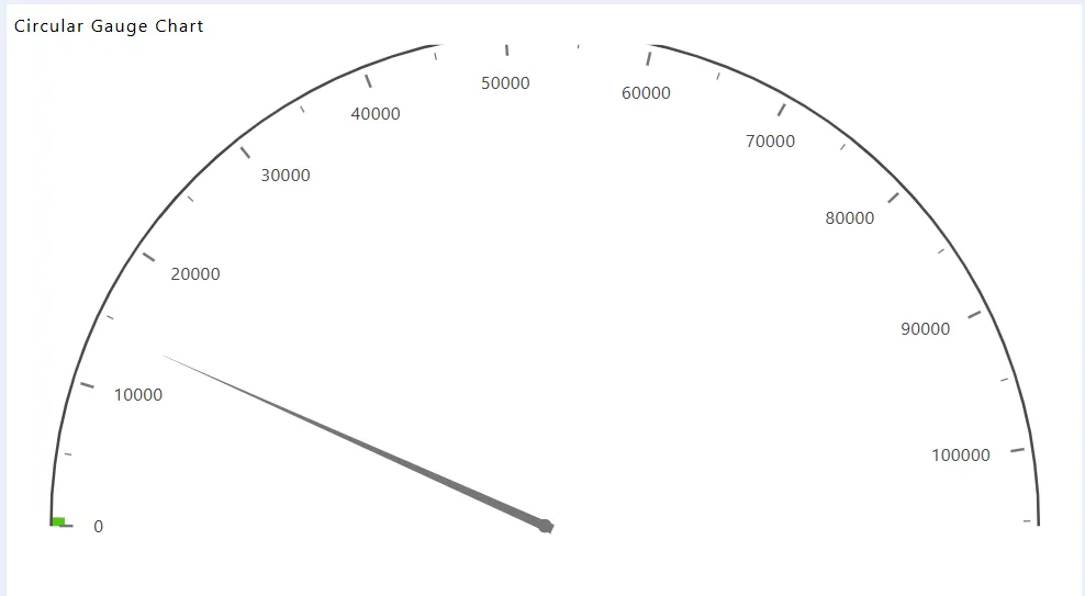
A Circular Gauge Chart displays data on a radial axis spanning from 0 to 360 degrees, with a pointer indicating the value on the scale. This chart is ideal for comparing values across a few variables using needles on the gauge.
Create Circular Gauge Chart: This video explains how to create a Circular Gauge Chart in AIV.
Steps to Create a Circular Gauge Chart:
-
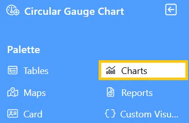
Click on the Charts icon from the left vertical menu, as shown below:
-
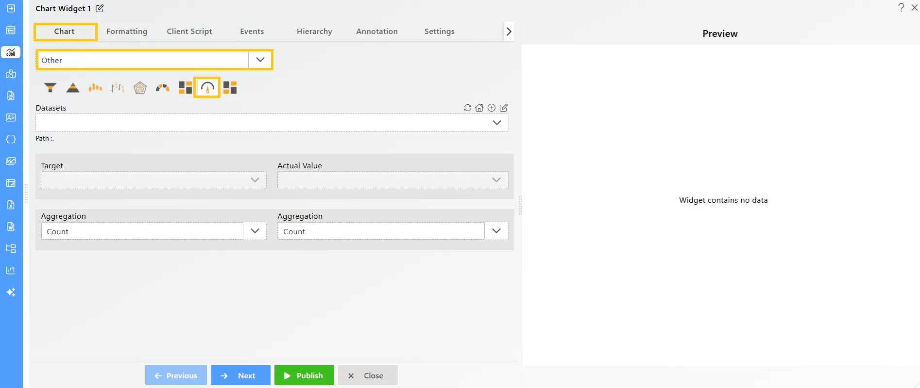
The Chart Edit menu box will appear. Select Other from the available options, then choose Circular Gauge Chart, and a widget will be automatically added to the dashboard content area.
-
Click on the
 icon in the Widget Title box to modify the widget name.
 -
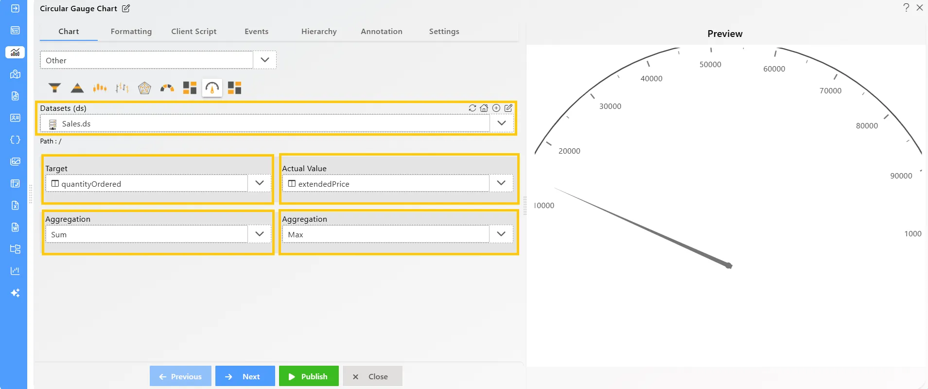
Enter the following details in the chart controls for the circular gauge chart:
-
Datasets (ds): Sales.ds
-
Target: quantityOrdered
-
Aggregation: Sum
-
Actual Value: extendedPrice
-
Aggregation: Max
-
-
Click on the Publish button, then the Preview icon, and finally click on the SAVE AND EXIT button to view the Circular Gauge Chart as shown below: