Heat Map Chart
Overview
A Heatmap Chart is a graphical representation of two-dimensional data where values are depicted using color variations, either gradient or solid. The data points are rendered as Heatmap cells using Scalable Vector Graphics (SVG) or canvas-based UI rendering. This chart type is ideal for visualizing data across two categories simultaneously.
In this document, we will demonstrate how to create a Heatmap Chart widget under the “Other Charts” section. Heatmaps are particularly useful for illustrating relationships, such as sales values across different countries and product lines.
Create Heatmap Chart: This video explains how to create a Heatmap Chart in AIV.
Steps to Create a Heatmap Chart:
-
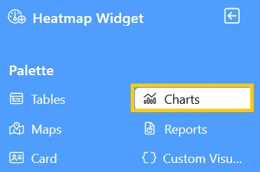
Click on the Charts icon from the left vertical menu, as shown below:
-
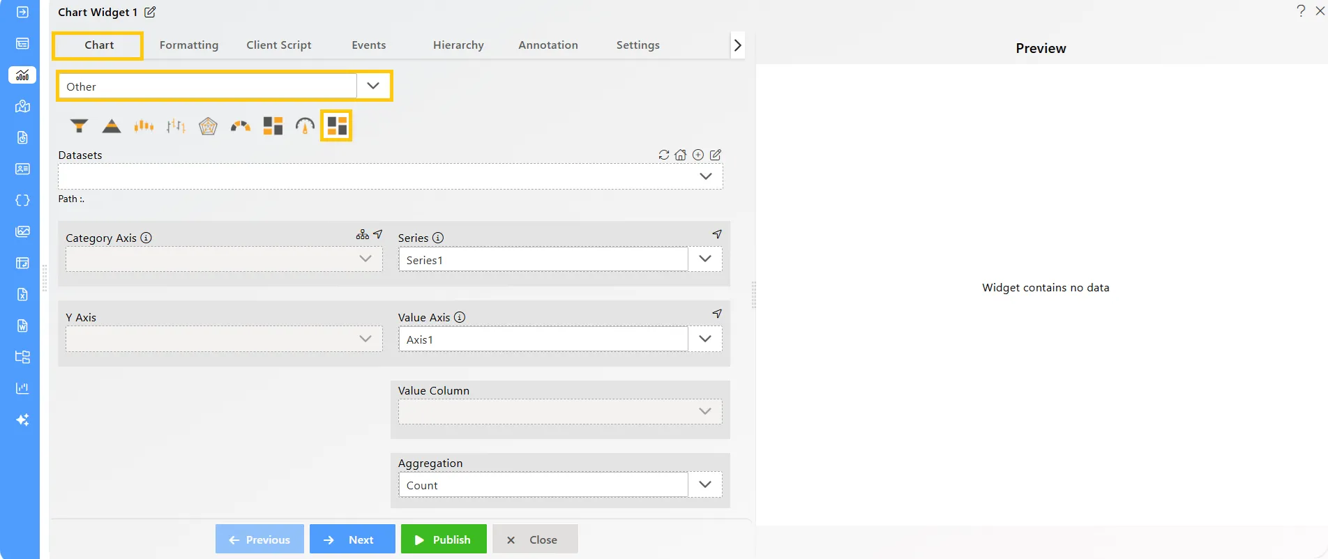
The Chart Edit menu box will appear. Select Other from the available options, then choose Heatmap Chart, and a widget will be automatically added to the dashboard content area.
-
Click on the
 icon in the Widget Title box to modify the widget name.
 -
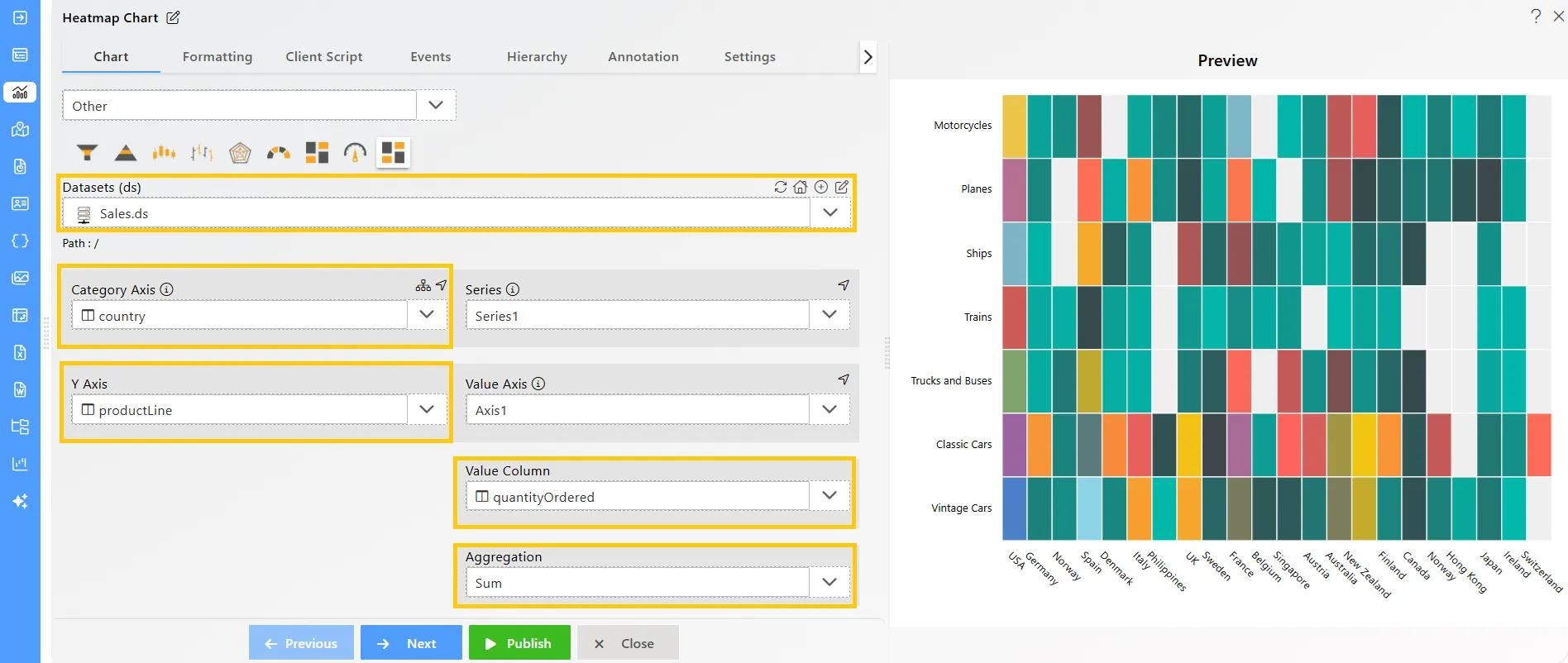
Enter the following details in the chart controls for the heatmap chart:
-
Datasets (ds): Sales.ds
-
Category Axis: country
-
Y Axis: productLine
-
**Value Column:**quantityOrdered
-
Aggregation: Sum
-
-
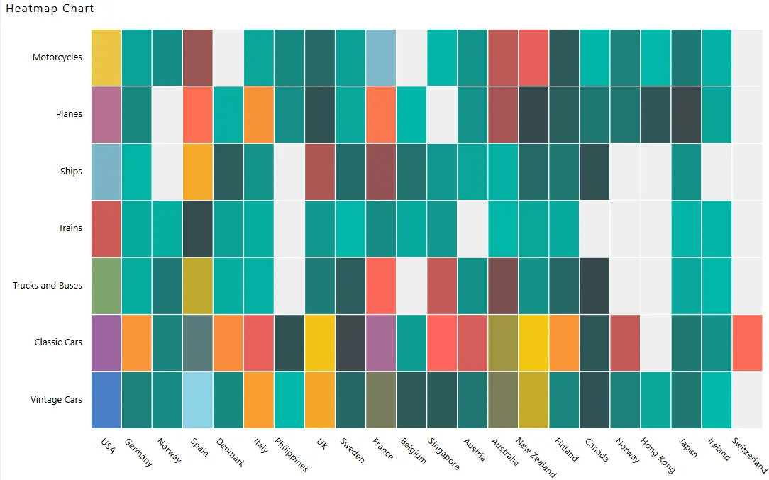
Click on the Publish button, then the Preview icon, and finally click on the SAVE AND EXIT button to view the Heatmap Chart as shown below: