Dashboard Setting
Dashboard Settings provide global control over all dashboard tabs and layers. These settings allow users to adjust various configurations to tailor the dashboard to their needs. While some options are available in preview mode, full access to all settings is provided in the dashboard’s edit mode.
Dashboard Settings provide the following options:
Refresh Dashboard
The Refresh Dashboard feature allows users to set automatic refresh intervals, ensuring that the data displayed is always up-to-date without the need for manual updates. Users can specify the refresh interval in seconds, minutes, or hours.
To set up the dashboard refresh time, follow these steps:
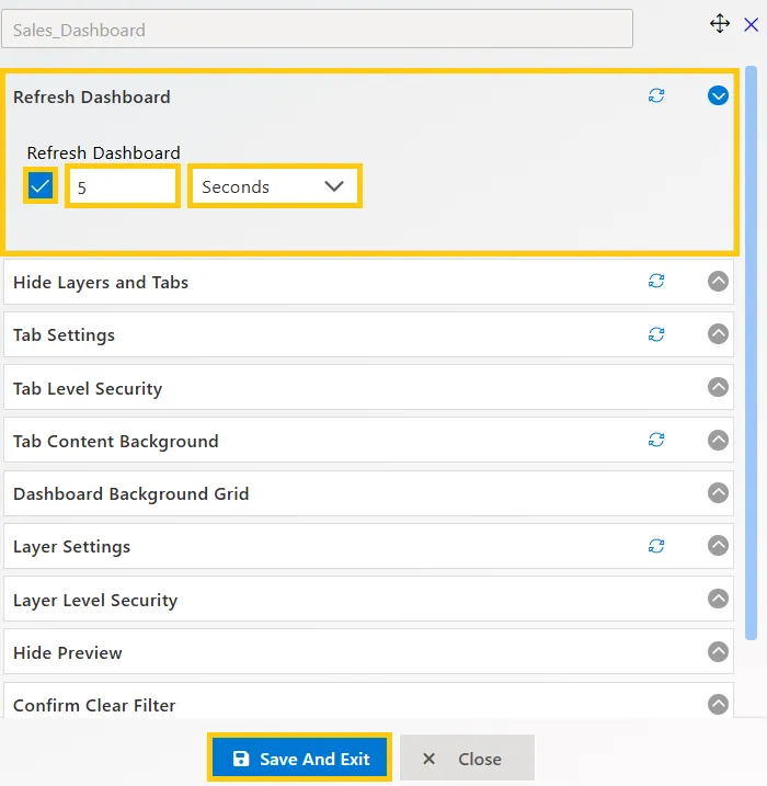
- Enable the Dashboard refresh feature to set the refresh interval for the dashboard (in seconds, minutes, or hours). Example: If set to 5 seconds, the dashboard refreshes every 5 seconds.
- Click on the refresh Dashboard bar to open the edit box.
- Enable the refresh dashboard function by clicking the checkbox. It will apply to the whole dashboard.
- Set the time in the textbox. Next to the textbox, select Seconds, Minutes, or Hours from the dropdown.
- The number you enter in the textbox will be considered as seconds, minutes, or hours based on your selection.
- After enabling the refresh settings, click the “Set to Default” icon in the edit box heading to set these settings as default.
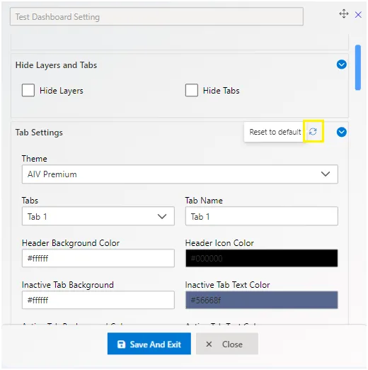
Hide Layers and Tabs
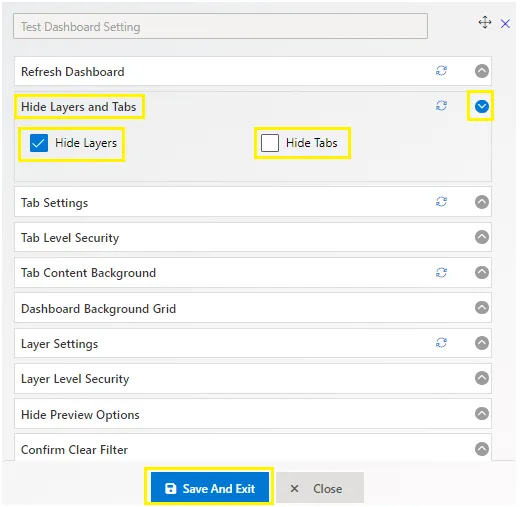
The Hide Layers and Tabs feature allows users to control the visibility of tabs and layers in the dashboard. By default, only tabs are shown, and layers are hidden.
Checkbox to hide and show tabs and layers in the dashboard. Tabs and layer visibility can be controlled from this setting. By default, only tabs are shown, and layers are hidden.
To enable or disable the visibility of layers and tabs:
- Open or create a dashboard and click on the settings icon at the top right corner next to the save button.
- Expand the “Hide layer and tab” list, where you will see checkboxes like the image below:
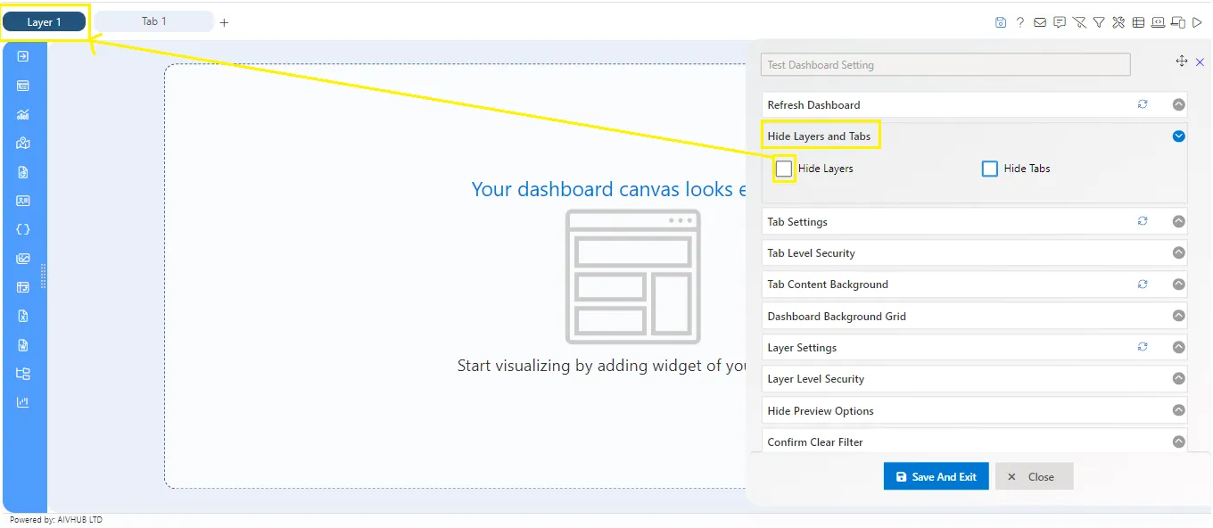
- Clicking on “Hide Layer” will hide the layers for the dashboard. The same property is applied for tabs.
- User can set defaults for every setting in the dashboard by clicking on the “Set to default” button, as shown in the image below:
Tab Settings
Tab Settings allow users to customize the appearance of tabs in the dashboard, ensuring a personalized experience. Users can adjust various aspects such as tab names, colors, widths, and icons to suit their preferences and improve dashboard aesthetics.
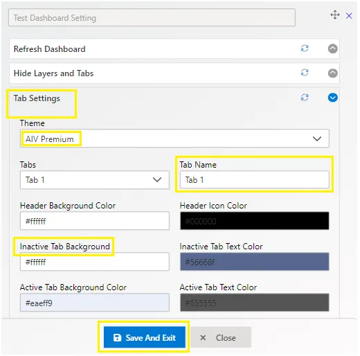
Tab settings are used to control the appearance of the selected tab in the dashboard.
- Tabs Control: Use the tabs dropdown to select the tab you want to make changes to.
- Tab Name: Users can edit the selected tab’s name.
- Header Background Color: By adding the color code user can apply the required header background color.
- Header Icon Color: user can apply the icon color as per need by just adding the color code.
- Inactive Tab Background: Set the appearance of inactive tabs.
- Inactive Tab Text Color: Choose the text color for inactive tabs.
- Active Tab Background Color: Set the background color for active tabs.
- Active Tab Text Color: Choose the text color for active tabs.
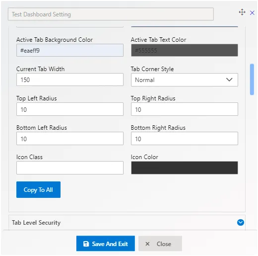
- Current Tab Width: Adjust the width of the current active tab.
- Icon Class: Add an icon to the tab. Select an icon from the dropdown, and it will be automatically added before the tab title.
- Icon Color: Set the color of the icon in the active tab.
- Copy To All Button Control: Copy the current tab’s settings to all available tabs in the particular layer. Clicking on “Copy To All” transforms it into a revert button, which reverts all applied settings to all tabs.
Tab Level Security
Share tabs of a dashboard with selected users or roles with this setting. Tab and Layer Level security used to share the Tabs and Layers to selected users, if Admin doesn’t share any particular tab or layer to a user, then that user does not have authorized access for that tab/layer and user can’t access that tab/layer.
In order to go to Tab Level Security, click on setting icon available on the top right corner along with save button. Open Tab Level Security List as below image:
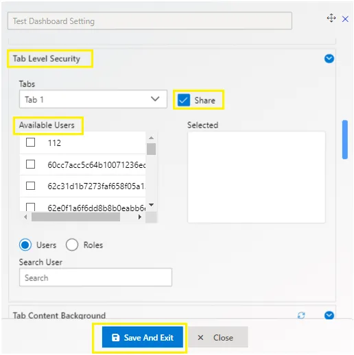
To enable tab/layer security in dashboard, go to dashboard settings and select Tab Level Security, as shown in figure below: Image Here!
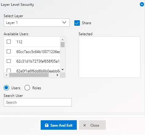
Here in above image Admin has selected the chart tab and enabled share toggle, then selected the user: user1 from the user’s list. when User1 logged open this dashboard, he can see the chart tab from its particular layer. The User or Roles radio buttons are existing in bottom of menu, by using those radio buttons the Admin can change the list from users to roles.
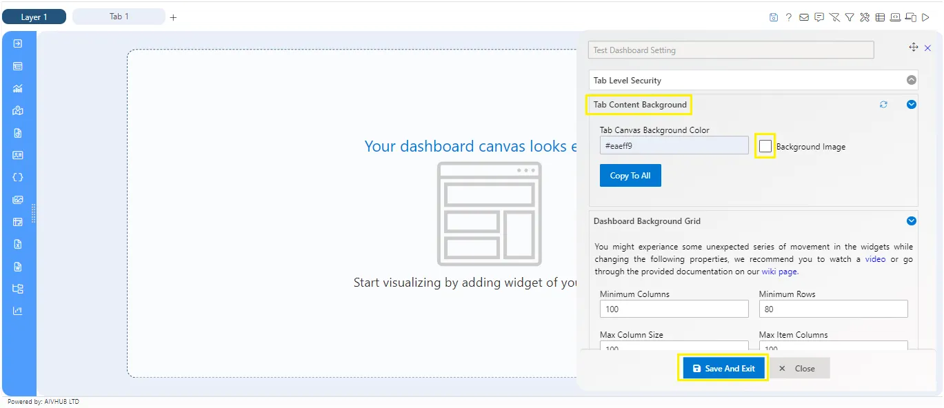
Tab Content Background
Tab Content Background feature enables users to customize the background color and image of tabs in the dashboard. Users can choose from a variety of background colors, upload custom images, and adjust settings such as background position, size, repeat, and attachment to create a unique dashboard layout.
Tab Content Background properties:
- Tab Canvas Background Color: Set the color of the dashboard canvas background.
- Add a background image to the dashboard canvas by toggling the Background Image button.
- Background Position: Change the position of the background image. Options include Center, Right, Left, Top, Bottom.
- Background Size: Adjust the size of the background image. Options include Auto, Length, Cover, Contain, Initial, Inherit.
- Background Repeat: Control the repetition of the background image. Options include Repeat, Repeat-X, Repeat-Y, No-Repeat, Space, Round, Initial, Inherit.
- Background Attachment: Select the background attachment state. Options include Scroll, Fixed, Local, Initial, Inherit.
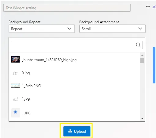
The image box displays default background images. Click the browse button in the top left corner to upload a custom image for the background. Once uploaded, the image will be added to the image box, and you can choose it by clicking on it.
Dashboard Background Grid
Increase and decrease number of grid in order to get required accurecy in widget resize. The Dashboard Background Grid is the Area which contains all the widgets in dashboard, it’s invisible until you click on the corner of any widget to resize it and change widget’s size.
To see the grid, click on the corner of widget as shown in figure below:
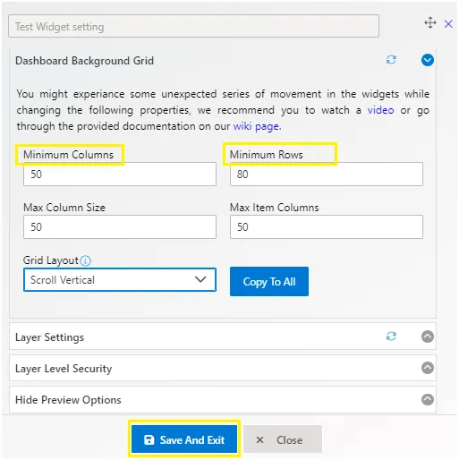
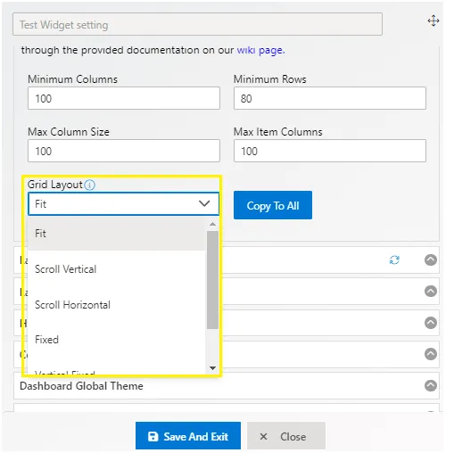
The background grid contains Rows and Columns of specific sizes, and from the Dashboard Background Grid Settings you can change those values.
Now user changes the Minimum Column and Minimum Rows Value as shown in figure below:
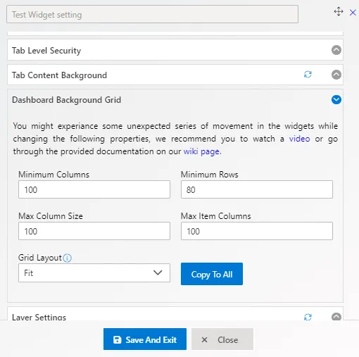
Maximum Column Size is used to add total numbers of columns in dashboard. The Max Column Size is depending on the Minimum Columns in Dashboard Background Grid.
The Grid Layout allows you to change the grid into different types:
- Fit: Fits the items in the container.
- Scroll Vertical: Fits on width, and the height of the items will be the same as the width.
- Scroll Horizontal: Fits on height, and the width of the items will be the same as the height.
- Fixed: Sets the rows and columns dimensions based on fixedColWidth and fixedRowHeight options.
- Vertical Fixed: Sets the rows to fixedRowHeight, and the columns width will fit the available space.
- Horizontal Fixed: Sets the columns to fixedColWidth, and the rows height will fit the available space.
Layer Settings
Layer Settings let you customize the view of the active layer in the dashboard. You can control the appearance of the layer, including its name, background color, font color, and width. Plus, you can easily add new layers to keep your dashboard organized.
Layer Settings properties are as follows:
- Default Layer: Used to set the default layer of the current dashboard.
- Active Layer Name: Alter the name of the Active layer.
- Layer Background: Add a color to the layer background in the dashboard, applied to all layers in the dashboard.
- Font Color: Add font color to the layer’s title.
- Width: Adjust the width size of the layer in the dashboard.
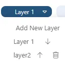
If you want to add multiple layers to the dashboard, click on the current layer title from the edit view. Then you will find the (+) Add New Layer button as shown in the following figure:
Layer Level Security
Layer Level Security allows you to selectively share dashboard layers with specific users or roles. This feature ensures that only authorized users can access certain layers, enhancing security and control over dashboard content.
Benefits:
- Control who can view specific dashboard layers.
- With layer level security, choose which users or roles can access each layer in your dashboard.
- To set this up, go to dashboard settings and select “Layer Level Security.” Then, pick the layer you want to restrict access to and choose the users or roles allowed to view it.
- Once configured, only selected users or roles will see the designated layer.
Don’t forget to save your changes!
For more details, access Layer Level Security in dashboard settings.
Hide Preview Options
Control which dashboard setting icons are displayed in preview mode. To access Hide Preview Options, open or create a dashboard and click on the settings icon in the top right corner, next to the save button.
-
Enable the toggle button next to the option you want to hide in the preview dashboard mode.
-
For example, to hide the ‘Email’ option, click on the ‘Hide Email’ toggle. This will remove the email icon from the dashboard preview screen. Image here!
-
You can adjust the hide properties according to your requirements.
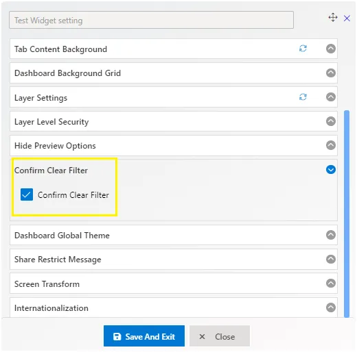
Confirm Clear Filter
Enable second level of confirmation when click on clear filter. if this option is emabled, user can prevent accidentl clear filter operations as it will ask to confirm clear filter as second level of security.
While applying a filter and to clear the filtered value in dashboard, if user click on clear filter then the filter gets back into raw data visualization.
Find Confirm Clear Filter in the top right corner along with save button. Open Confirm Clear Filter List as below image:
To enable the Confirm Clear Filter click on the toggle button shown in above image. save the changes.
Now, if user click on clear filter from dashboard then the clear filter validation will take place in-between of the clear filter property. As shown in following figure:
Dashboard Global Theme
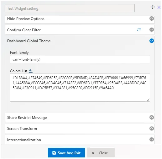
The Dashboard Global Theme feature simplifies the process of applying predefined colors to all widgets within the dashboard. Instead of manually adjusting colors for each widget, users can easily apply a set of predefined colors to the entire dashboard with just one click. This streamlines the design process and ensures consistency across the dashboard interface.
Share Restrict Message
The Share Restrict Message feature enables users to display custom messages when attempting to access restricted tabs or layers within the dashboard. This functionality works alongside tab and layer security features, providing an additional layer of communication for unauthorized access attempts. When users without proper permissions try to view restricted content, they are presented with a custom message, enhancing clarity and reinforcing security measures.
Open Share Restrict Message List as below image:
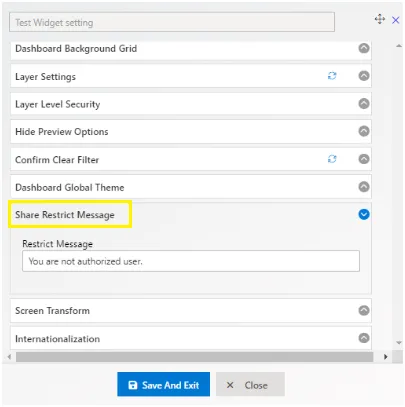
This is displayed when user has applied tab or layer level security for users and unauthorized user try to see tab or layer data. For example, there are 3 Tabs: Tab 1, Tab 2 and Tab 3. Tab 2 is only shared with User 2 and tab 3 is shared with User 3 and Tab 1 is default tab so it will be available to all users Now there is an event in tab 1 chart widget that will redirect to Tab 2 on click of the chart. It will work for User 2 but as User 3 has no access to Tab 2 and when User 3 click on chart of Tab 1 then this message will be displayed to that User and Tab 2 will not Open.
Screen Transform
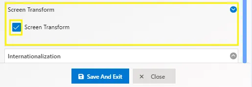
Maintain a consistent view across all screen sizes with the Screen Transform feature.
This feature ensures that the application’s aspect ratio is preserved, providing a uniform viewing experience regardless of screen size. Whether you’re using a small monitor or a large display, the application will adjust to fit the screen while keeping the same proportions, ensuring that the layout and design remain unchanged.
With Screen Transform, users benefit from a seamless and predictable interface, enhancing usability and visual consistency across different devices.
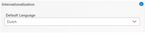
Internationalization
The Internationalization Keyword Translation feature allows users to manually translate keywords and add languages directly within the application. This ensures that when the application language is changed, the translated keywords are visible on the dashboard. Administrators can easily manage translations for different languages, making the dashboard accessible to a wider audience.
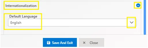
Users can go to the Dashboard Internationalization section to add the required language and keywords, along with their translations, as shown in the figure below:
one image of the dashboard internationalization section.