Card Widget
Overview
The Card widget provides information from the dataset in numeric visuals. In simple terms, we can say that the card widget is useful when users need to add numeric information to the dashboard widgets. It’s really easy to visualize the numbers by using aggregations like count, sum, average, etc.
The Card widget offers features like adding percentages by comparing values, text styling, number formatting, card titles, and adding images to card widgets. KPI provides interpretation and communication of meaningful patterns in data right into your dashboard.
Card Widget Introduction: This video contains overview of card widget.
The Card widget contains the sections to understand before making the Card widget
1. General Tab
2. Target Tab
General Tab overview
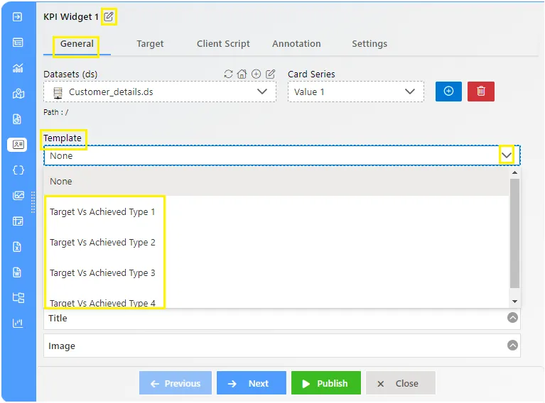
Datasets (ds)
Users can select the desired dataset and choose values from the column list.
Card Series
Users can display series values on the widget and edit specific series from the whole edit box. Here, users can add more than one series to visualize the data.
Template
This offers various templates for creating Target VS Achieved information cards, providing different types of templates.
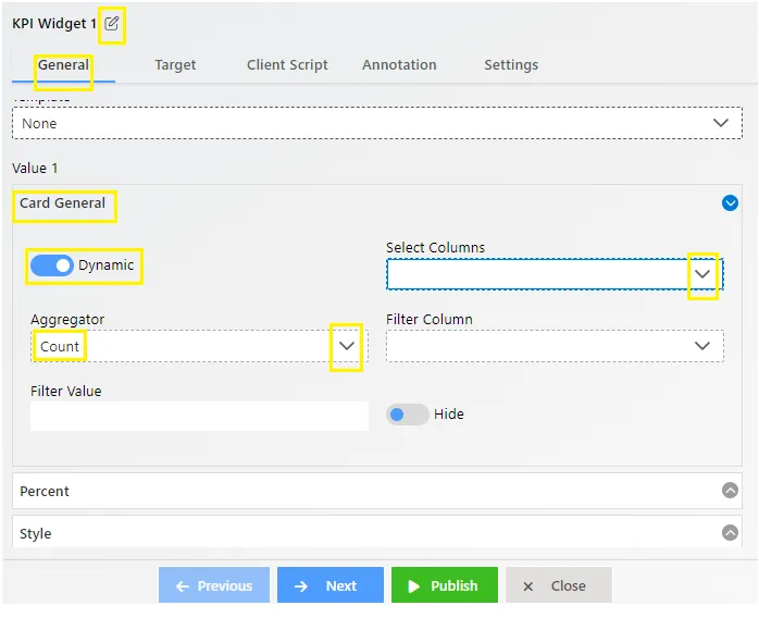
Card General
With general properties, users can create both static and dynamic card widgets. Users need to select the column value from the “Select Column” dropdown. To get appropriate values, users need to set the aggregator as per requirements. The filter column is used when users need a particular value from a specific column.
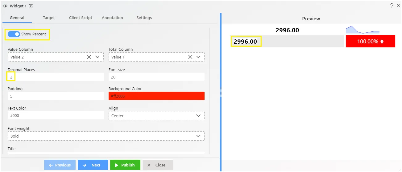
Percent
Percent works on a simple formula of Actual value/Total value x 100. It provides dropdowns to add the Value column and Total Column, where users can add values by selecting from the dropdown. Additionally, users can apply decimal places, font size, padding, text/background color, etc.
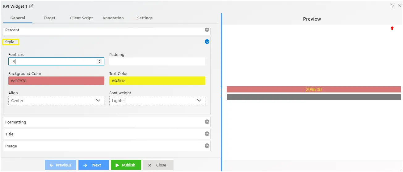
Style
The style simply allows users to add Font size, Padding, Background/Text color, Align, Font weight on text.
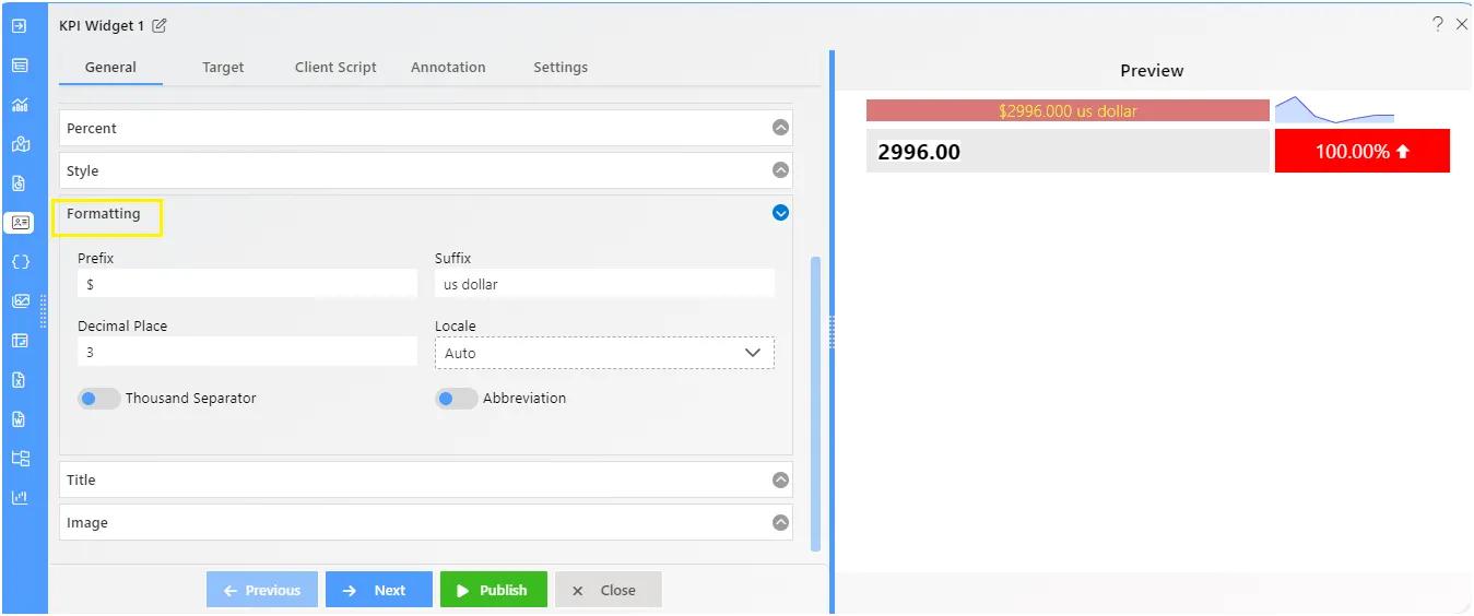
Formatting
Formatting allows users to add the Prefix and Suffix on the numeric values. Users can also add Decimal Place, Locale with Thousand Separator, and Abbreviation on text.
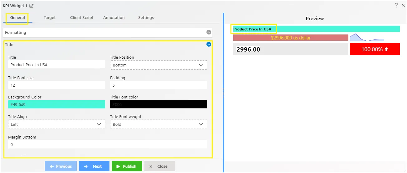
Title
Using title properties, users can add the Title with required position from Top, Bottom, Left, Right. Title Font size, Padding, Background color, Font Color, Title Align, Font weight, Margin Bottom.
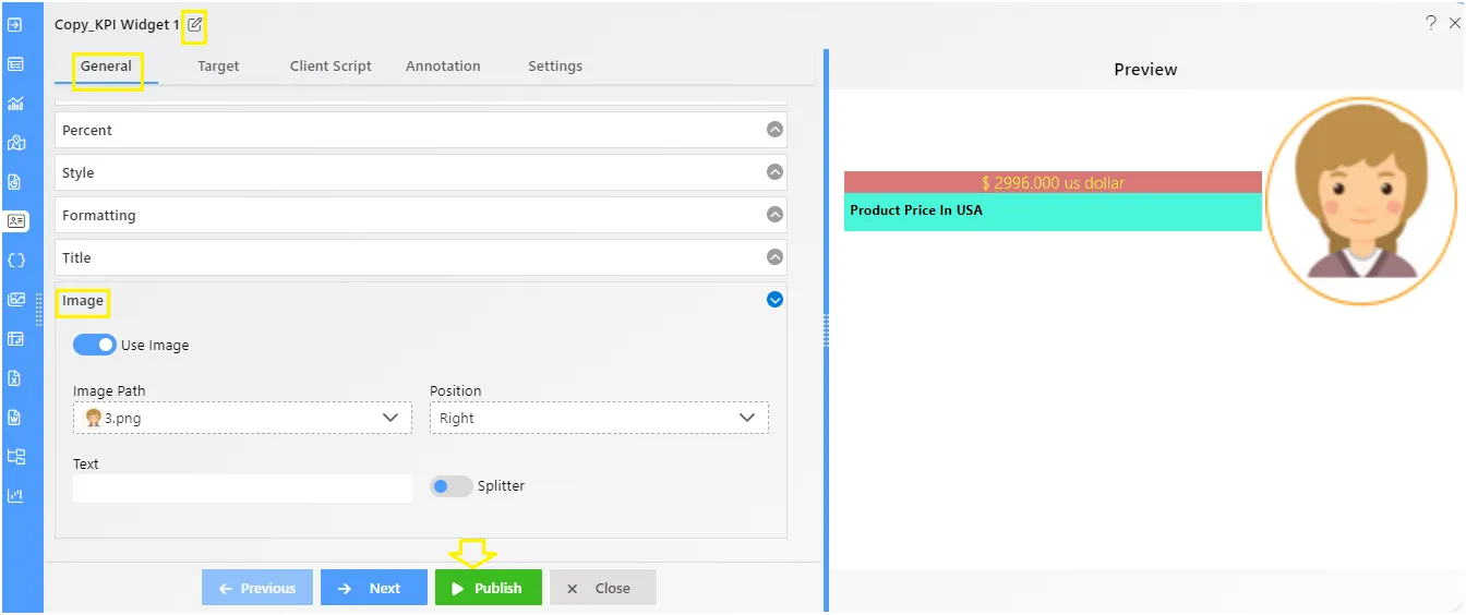
Image
It allows users to add an image on the card widget. Users can select the image by name, add the Position, Text, and lastly a splitter if required.
Target Tab overview
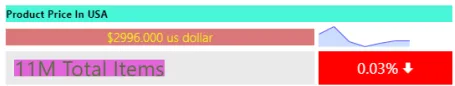
The Target value in the Card widget serves as the second value of the card. When users need to compare two values, they can add the Target value alongside the Achieved value (the first value users add in the General Tab).
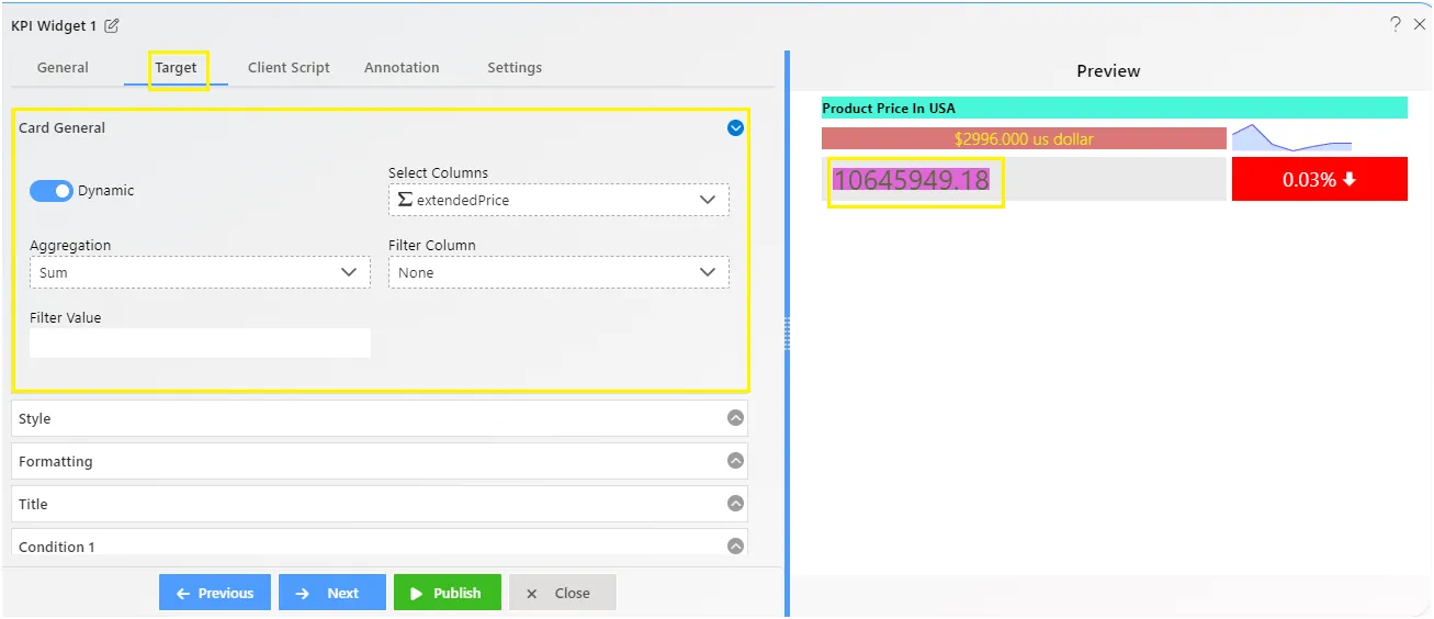
Card General
The General card properties enable users to incorporate target data into the card. Here, users can add the aggregation as well as the filter column and values.
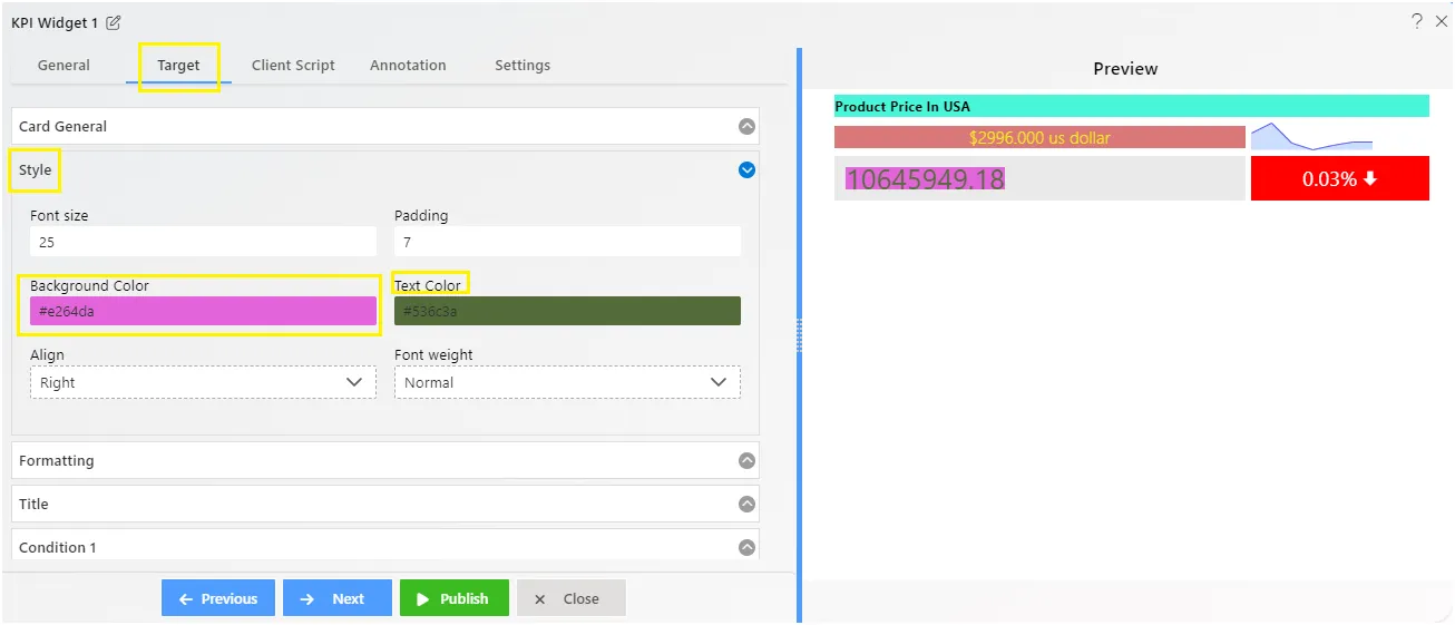
Style
The style feature empowers users to enhance text appearance by adjusting Font size, Padding, Background/Text color, Alignment, and Font weight.
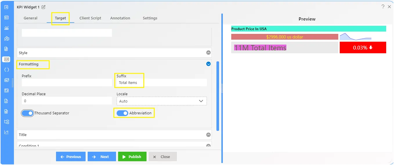
Formatting
Formatting helps users make numbers look better by adding elements before or after them, such as prefix and suffix. Users can also adjust the number of decimals, use commas for thousands, and employ abbreviations for text.
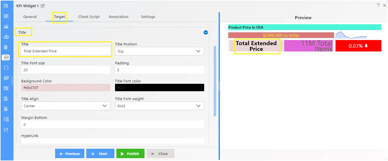
Title
Adding a title to the card is easy with title properties. Users can place it wherever they like: top, bottom, left, or right. They can also customize its appearance by adjusting the font size, padding, background color, font color, alignment, font weight, and bottom margin.
Condition
The condition feature provides percentage values on the card widget, representing values based on conditions like Equal to, Greater than, Less than, Greater than or Equal to, etc.
Following features of condition:
- This percentage can also represent a line chart on the card widget.
- Users can include a particular icon or image on the card.
- It also supports user-selected background color and icon color.