Widget Settings
Overview
Widget settings allow users to customize the appearance of individual widgets, enhancing the look and feel of the dashboard. These properties are specific to each widget, ensuring tailored customization and an improved user experience.
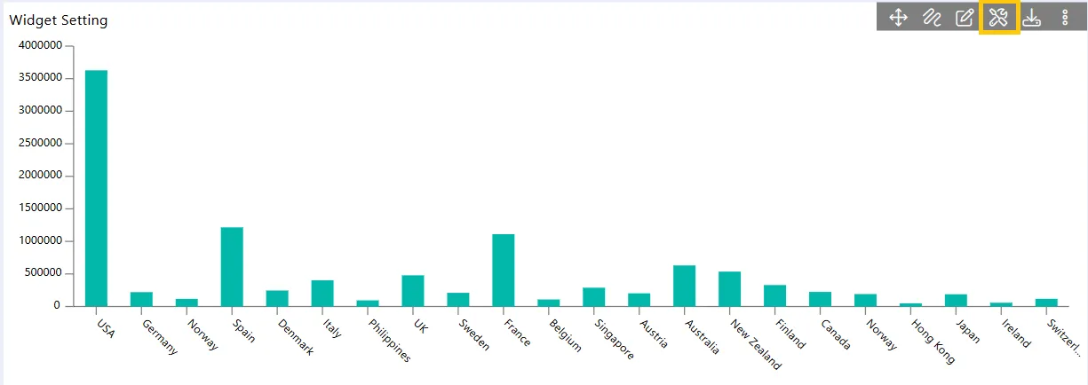
To access the widget settings on the dashboard, click the Widget Settings button, and the settings will appear on the screen.
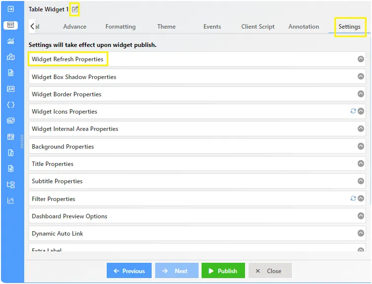
The Widget Settings Properties Are As Follows:
Widget Refresh Properties
The Widget Refresh Settings feature allows users to set automatic refresh intervals for dashboard widgets in seconds, minutes, or hours. This ensures that the data within each widget is updated at the specified intervals, improving real-time data accuracy and enhancing the user experience. By enabling and configuring this setting through the widget’s properties, users can keep information up-to-date without manual intervention, resulting in a more dynamic and responsive dashboard.
The Widget Refresh Settings feature allows users to set automatic refresh intervals for dashboard widgets in seconds, minutes, or hours. This ensures that data within each widget is updated at the specified intervals, enhancing real-time data accuracy and user experience. By enabling and configuring this setting through the widget’s properties, users can maintain up-to-date information without manual intervention, benefiting from a more dynamic and responsive dashboard.
Widget Box Shadow
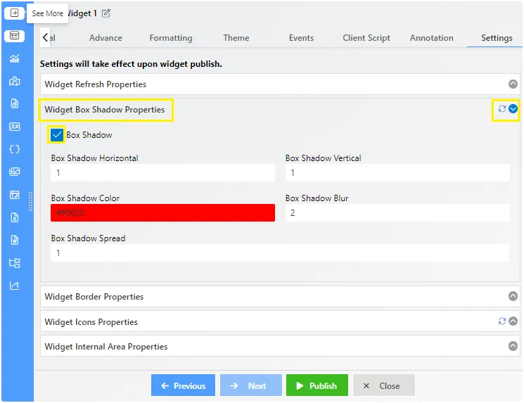
Widget Box Shadow settings allow users to add shadows to the borders of widgets, enhancing visual depth. These settings can be accessed in edit mode by clicking on the widget settings icon and selecting “Widget Box Shadow Properties.”
Steps to Add and Format Box Shadow
- Enable Box Shadow: Check the box to enable box shadow for the widget. A default red shadow will appear.
- Horizontal and Vertical Offset: Adjust the horizontal and vertical offset values to position the shadow. Positive values move the shadow right and below, while negative values move it left and above.
- Shadow Color: Set the shadow color and its opacity. You can also enter a specific color code.
- Blur Radius: Adjust the blur radius to control the shadow’s blur level. Higher values increase blur.
- Reset to Default: Click the reset button to revert to default shadow settings.
Widget Border Properties
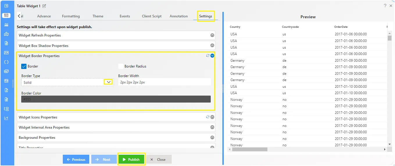
Widget Border Properties allow users to add and customize borders for widgets, enhancing their visual appeal. There are two main functionalities under border properties in AIV.
Steps to Format Widget Border Properties
-
Enable Border Functions: In edit mode, click on the widget settings icon and select “Widget Border Properties.” Enable the border functions by checking the border checkbox.
-
Border Type, Width, and Color:
- Border Type: Choose from various styles such as dotted, dashed, solid, double, groove, ridge, inset, outset, none, or hidden.
- Border Width: Set the width for the top, bottom, left, and right sides of the widget (e.g., 2px 2px 2px 2px applies a 2px width on all sides).
- Border Color: Select the border color and adjust its opacity. You can also enter a specific color code.
- Box Radius: Customize the radius for widget corners to round them. Set the radius for top-left, top-right, bottom-left, and bottom-right corners individually.
These settings allow for detailed customization of widget borders, contributing to a more polished and visually appealing dashboard.
Widget Icon Properties
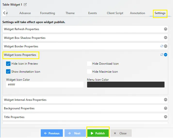
Widget Icon Properties allow users to manage the visibility and functions of icons within widgets.
Steps to Format Widget Icon Properties
-
Access Widget Icon Properties: In edit mode, click on the widget settings icon and select “Widget Icon Properties.”
-
Default Settings: By default, all preview icons are disabled. The “Hide Icon in Preview” option is checked. To view widget icons in dashboard preview mode, uncheck this box.
-
Icon Visibility Options
- Hide Icon in Preview: Hide all icons on the preview side of the widget.
- Hide Download Icon: By default, the download icon is hidden. To show it, uncheck the “Hide Download Icon” box.
- Show Annotation Icon: The annotation option allows user to add the annotations like texts, images, icons, symbols and download. click here to learn more.
- Hide Maximize Icon: Hide the icon that maximizes the widget to fullscreen by checking this box.
- Change Icon Colors:
- Widget Icon Color: Change the color of the widget icons.
- Menu Icon Color: Set the color for the menu icons.
These settings enable users to customize widget icons, enhancing the functionality and appearance of their dashboards.
Widget Internal Area
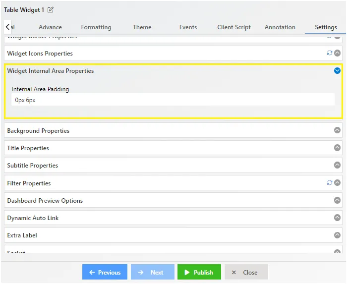
The Widget Internal Area property allows users to adjust the padding within a widget, creating space around the content.
Steps to Format Widget Internal Area
-
Access Widget Internal Area Settings: In edit mode, click on the widget settings icon and select “Widget Internal Area.”
-
Set Padding: Use the provided textboxes to set padding for the Top-Bottom and Left-Right directions. For example, entering “20px 5px 5px 20px” sets the padding to zero on all sides.
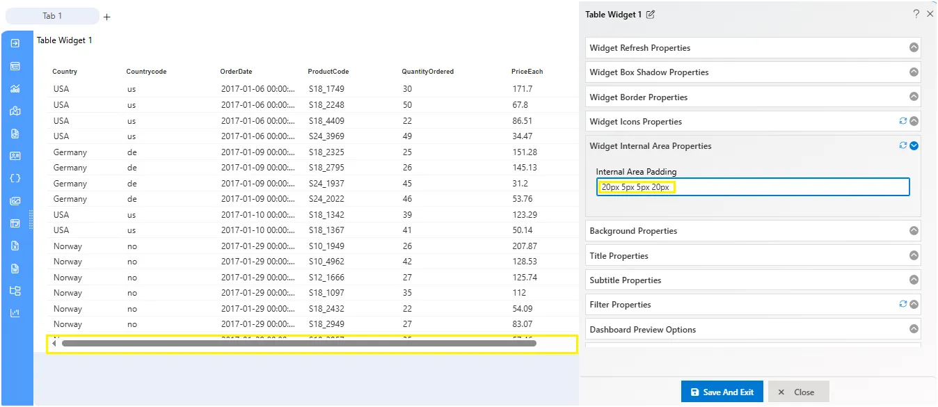
- Effect of Padding:
-
Before Adding Padding: The widget content touches the edges.
-
After Adding Padding: The widget content has space around it, enhancing the visual layout.
This feature helps in improving the appearance and readability of the content within the widget by adding the necessary spacing.
Background Properties
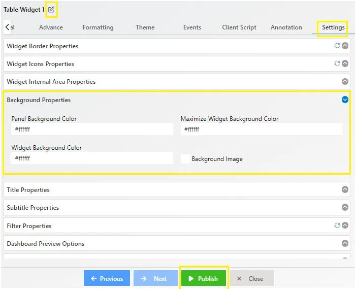
The Background Properties feature in AIV application enables users to customize the background appearance of widgets.
Overview
The Background Properties include options to set background colors and images for widgets, enhancing their visual appeal and customization.Key Features
- Panel Background Color: Fill the widget’s content background panel with the chosen color, either by selecting from a palette or entering a color code.
- Widget Background Color: Customize the background color of the widget.
- Background Image: Add images to the widget background, providing visual interest and context. Toggle the function menu to manage image settings.
- Background Position: Control the position of the background image within the widget.
- Background Size: Adjust the size of the background image to fit the widget.
- Background Repeat: Specify how the background image should repeat or tile within the widget.
- Background Alignment: Align the background image to fill the widget background with different types and appearances.
Image Management:
The image box at the bottom allows users to view and manage all uploaded images for the background. Simply use the upload button to add images to the image box, facilitating easy customization.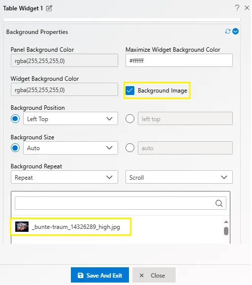
Title Properties
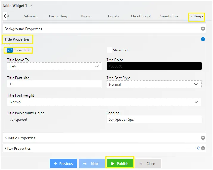
The Title Properties feature in AIV application allows users to customize the appearance of widget titles, enhancing the overall look and feel. Users can utilize the Title Properties to modify various aspects of widget titles, including visibility, icon display, position, color, font size, style, family, weight, background color, and padding.
Key Features
- Show Title: Toggle the visibility of the widget title. By default, the title is displayed unless unchecked.
- Show Icon: Add an icon before the chart title for visual enhancement. Users can select from a list of supported icon classes and customize the icon color.
- Title Move To: Adjust the position of the title, choosing from Left, Right, or Center alignment options.
- Title Color: Customize the color of the widget title using a color palette.
- Title Font Size: Increase or decrease the font size of the widget title to suit preferences.
- Title Font Style: Change the font style of the title from the available list of options.
- Title Font Family: Select a font family for the title from the available list of fonts.
- Title Font Weight: Apply font weight, such as bold or lighter, from the drop-down menu.
- Title Background Color: Set the background color of the widget title to enhance visibility and aesthetics.
- Padding: Add padding to the widget title, specifying values for Top, Right, Bottom, and Left sides in pixels.
Image Management
The feature includes interactive screenshots and color palettes for easy selection and customization, ensuring a seamless user experience. By leveraging the Title Properties, users can tailor widget titles to match their design preferences and optimize dashboard presentation.Filter Properties
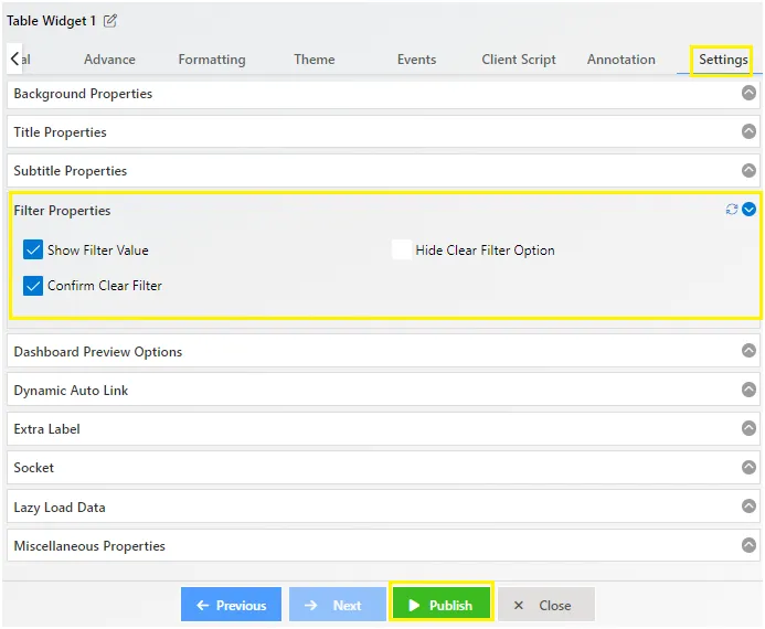
Filter Properties in the AIV application allow users to manage how filters are displayed and applied on widgets. These settings enhance control and prevent accidental changes.
Key Features
-
Show Filter Value: Displays the filter values on the widget after a filter is applied, providing clear visibility of the filtered data.
-
Hide Clear Filter Option: Hides the clear filter option on the widget, useful when users need to prevent the removal of applied filters.
-
Confirm Clear Filter: Adds a confirmation step before clearing a filter, preventing accidental changes and ensuring data integrity.
These properties enable users to customize the filtering functionality of their dashboards, improving usability and control.
Dashboard Preview Options
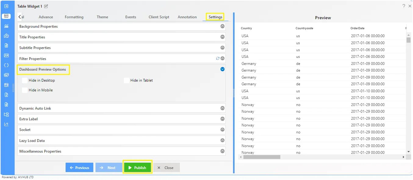
Dashboard Preview Options let you control which widgets appear on desktop, tablet, and mobile views. This helps create a better user experience by showing only the necessary widgets for each device.
How to Use
-
Access Settings: Click the widget setting icon in edit mode.
-
Hide Widgets: Select the views (desktop, tablet, mobile) where you want to hide the widget.
-
Check Changes: Switch to the desired view to ensure the widget is hidden.
This feature makes your dashboard more flexible and user-friendly across different devices.
Dynamic Auto Link
Dynamic Auto Link automatically links widgets using the same dataset in AIV. When you click on one widget, it filters other linked widgets.
How to Use
-
Create Widgets: Add widgets to your dashboard using the same dataset (e.g., a donut chart, a table, and a pivot widget).
-
Enable/Disable Auto Link: By default, this feature is enabled. To disable it, go to widget settings and uncheck the Dynamic Auto Link option.
Extra Label
The Extra Label feature in AIV adds a label at the bottom of a widget, which can redirect to an external link or detailed data. Users can customize the label’s text, appearance, and icon.
How to Use
*Enable Extra Label*: Click on the widget settings icon in edit mode and check the Extra Label option.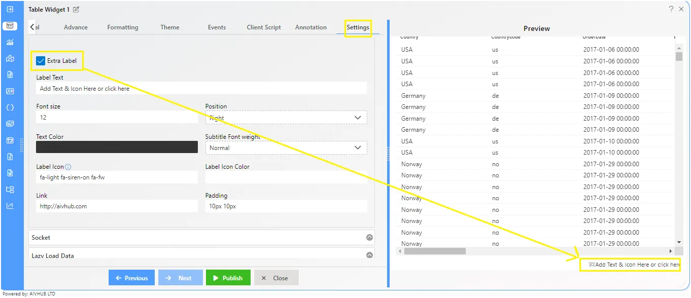
Fill in the following settings:
- Label Text: Enter the label text.
- Font Size: Set the font size.
- Position: Choose the position (left, right, center).
- Text Color: Select the text color.
- Font Weight: Set the font weight.
- Label Icon: Add an icon before the label.
- Icon Color: Choose the icon color.
- Link: Add a URL to redirect when the label is clicked.
- Padding: Adjust the padding.
Example
*After Adding Extra Label*: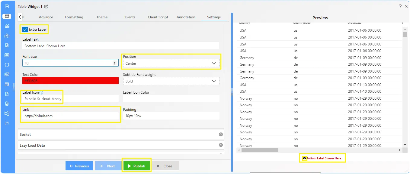
When you click on the label (e.g., “AIVHUB LTD”), it redirects to the specified link, such as aivhub.com.
Socket
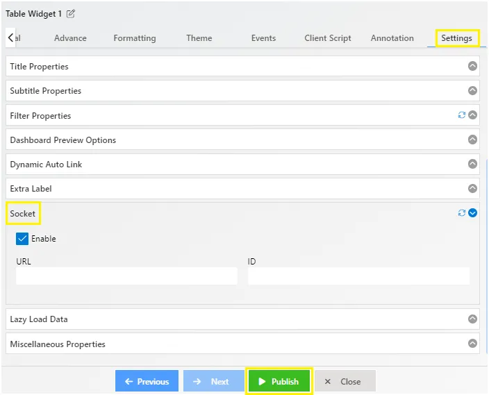
A socket is one endpoint of a two-way communication link between two programs running on the network. A socket is bound to a port number so that the TCP layer can identify the application that data is destined to be sent to.
For detailed explain click here
Lazy Load Data
Overview: Limit and Offset in Widget Settings
This document outlines the new feature that allows users to set limits and offsets in the widget settings, providing control over the amount of data fetched and enabling lazy loading for enhanced performance.
Feature Description
Introduction
The Limit and Offset feature allows users to specify the maximum amount of data to be fetched and control the starting point of data retrieval. Additionally, the Lazy Load Data option enables users to load data incrementally, improving widget performance.
Widget Settings
In the widget settings, users will find two additional parameters:
-
Maximum Data Limit: Users can set the maximum amount of data to be fetched per server call. This limit helps in optimizing performance and managing resources efficiently.
-
Offset: Users can set the offset to determine the starting point of data retrieval. This is particularly useful for scenarios where users want to paginate through large datasets.
-
Lazy Load Data: This feature is disabled by default. Users can enable it on a per-widget basis to load data incrementally by clicking the “Next 500” button at the bottom of the widget.
Usage
To leverage the Lazy Load Data feature:
-
Navigate to the widget settings panel.
-
Set the Maximum Data Limit to the desired value (e.g., 5000 records).
-
Adjust the Maximum Amount of Data per Server Call to specify the chunk size (e.g., 500 records).
-
Enable the Lazy Load Data option to activate incremental data loading.
-
Clicking the “Next 500” button at the bottom of the widget will fetch the next set of records based on the specified parameters.
Benefits
-
Lazy loading enables users to load data incrementally, reducing initial load times and enhancing widget responsiveness.
-
Users can control the amount of data fetched and load additional data on demand with the click of a button.
-
Tailor data retrieval based on specific needs, ensuring only relevant information is fetched.
Dashboard Setting: Lazy Load Data
The Lazy Load Data feature is disabled by default for all widgets. Users can enable it on a per-widget basis to take advantage of the incremental data loading capability.
Example Scenario
Consider a scenario where a user sets the Maximum Data Limit to 5000 and the Maximum Amount of Data per Server Call to 500. By enabling the Lazy Load Data feature, the user can click the “Next 500” button at the bottom of the widget to fetch additional sets of data, providing a seamless and efficient data exploration experience.
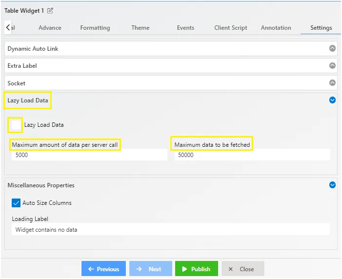
Miscellaneous Properties
Miscellaneous Properties in AIV offer extra functionalities for widgets. Depending on the widget type, you’ll find different options here.
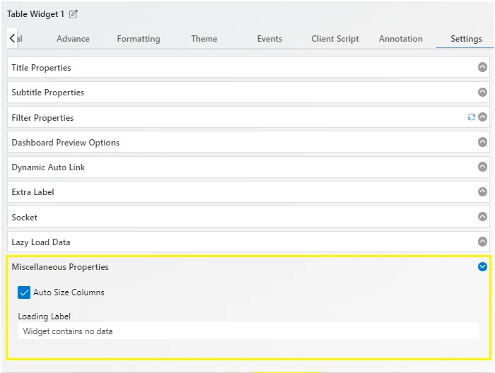
Options
Loading Label: Lets you add a custom message when the widget has no data.