Themes
Themes allow users to customize the look and feel of their dashboards by applying a consistent color scheme across all widgets, the canvas, and tab elements.
This feature enhances the visual appeal, improves readability, and ensures a clean and consistent user interface throughout the dashboard.
Apply a Global Theme
To get started, open a dashboard that you created or have editing permissions for. Then follow the steps below:
-
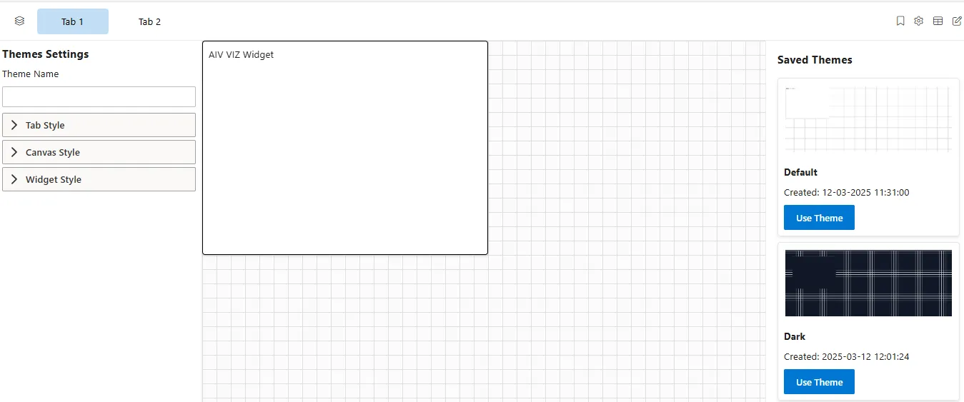
Open the Theme Settings: Navigate to the Viz Dashboard and click on the Themes icon to access theme customization options.

-
Use the Theme Settings Panel: A panel appears that lets you modify various style elements of your dashboard, such as:
-
Tab Style
-
Canvas Style
-
Widget Style
-
Customize Tab Style
After opening the Theme Settings panel, you can personalize the appearance of your dashboard tabs. Follow these steps to customize the Tab Style:
-
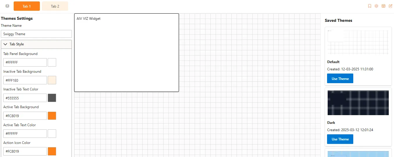
Expand the Tab Style section
In the Theme Settings panel, click the dropdown to expand the Tab Style section.
-
Customize Tab Appearance
Use the available fields and color pickers to set your preferred styles:
-
Tab Panel Background – Color of the entire tab container.
-
Inactive Tab Background – Background color for unselected tabs.
-
Inactive Tab Text Color – Text color for unselected tab labels.
-
Active Tab Background – Highlight color for the selected tab.
-
Active Tab Text Color – Text color for the active tab.
-
Action Icon Color – Color of icons like edit or close within the tab header.
-
Customize Canvas Style
After opening the Theme Settings Panel, you can personalize the appearance of your dashboard canvas. Follow these steps to customize the Canvas Style:
-
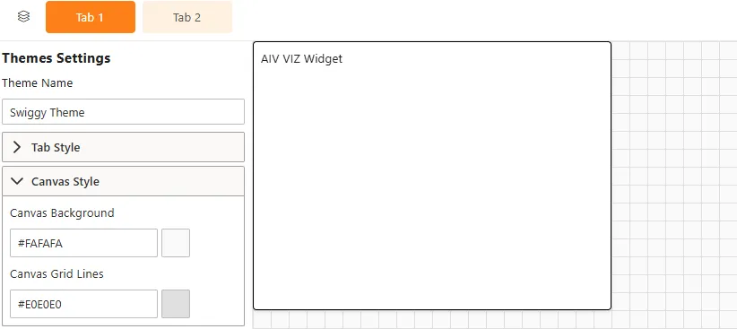
Expand the Canvas Style Section
In the Theme Settings panel, click the dropdown to expand the Canvas Style section.
-
Customize Canvas Appearance
Use the available options to style your dashboard canvas:
-
Canvas Background – Choose a solid color to serve as the background of your canvas area.
-
Canvas Grid Lines – Set the color of the grid lines that appear on the canvas to assist with alignment and layout.
-
Customize Widget Style
To apply visual consistency across all widgets, follow these steps in the Theme Settings Panel:
-
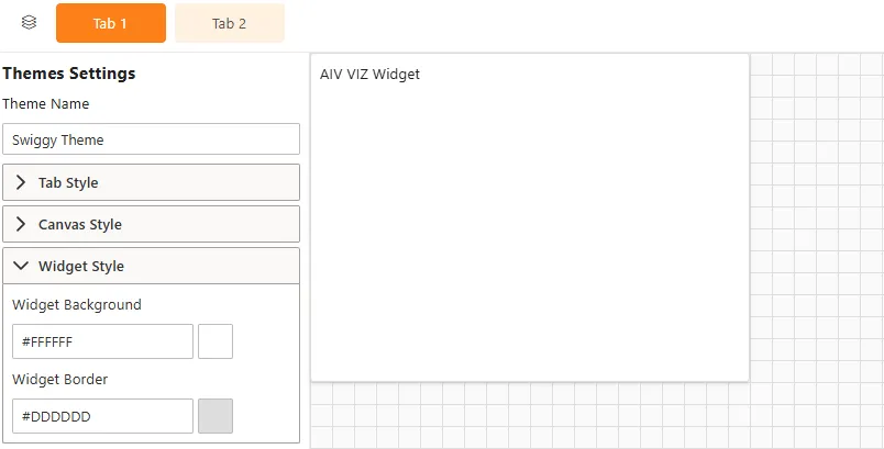
Expand the Widget Style Section
In the Theme Settings panel, click the dropdown to expand the Widget Style section.
-
Customize Widget Appearance
Use the available options to define the look and feel of your widgets:
-
Widget Background – Set the background color for all widgets.
-
Widget Border – Choose the color and style for widget borders.
-