Formatting series Column/Bar Chart
The series Properties are as follows:
Select Series dropdown
The series dropdown allows users to switch between different series, updating all controls to reflect the changes made to the selected series.
Series - General Properties
Overview: The Series - General Properties section encompasses various properties that users can customize to refine the appearance and behavior of the chart series. These properties include Series Type, Series Name, Column Width, Opacity, Border Width, Border Color, Hide Series, and Series Stacked.
Description: This section covers key properties for customizing chart series.
- Series Type: Choose the type of series (e.g., line, bar, area).
- Series Name: Assign a name to the series for identification.
- Column Width: Adjust the width of series columns.
- Opacity: Control the transparency of the series.
- Border Width: Specify the width of series borders.
- Border Color: Choose the color of series borders.
- Hide Series: Toggle visibility for specific series.
- Series Stacked: Decide if series should be stacked or side by side.
Output: 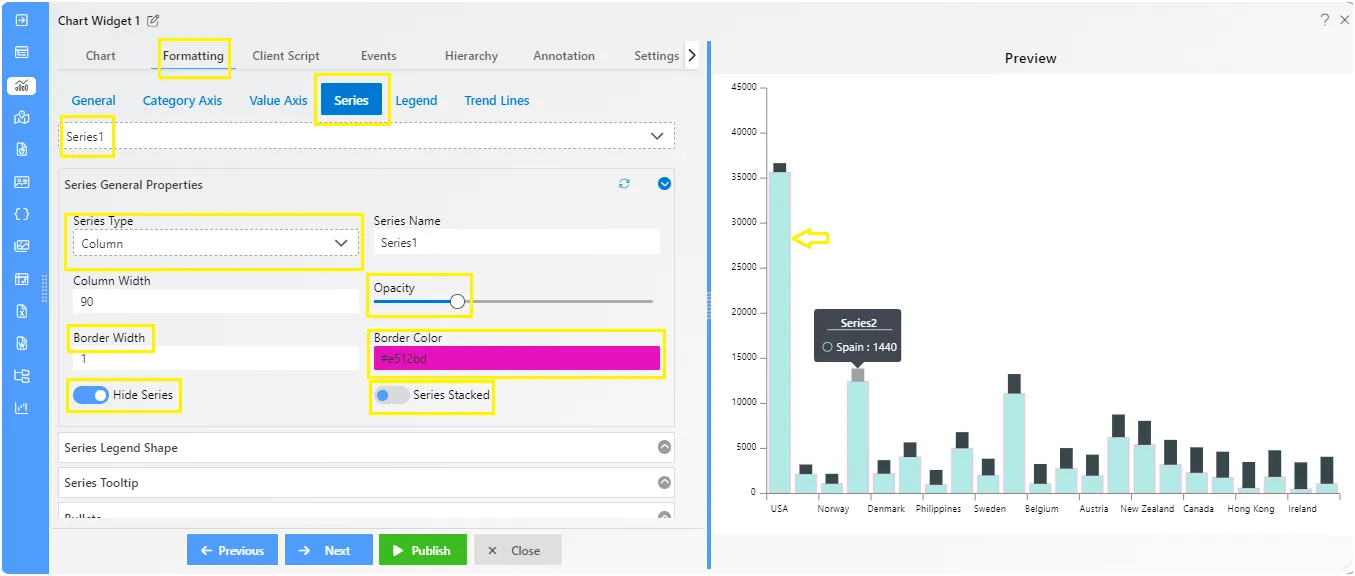
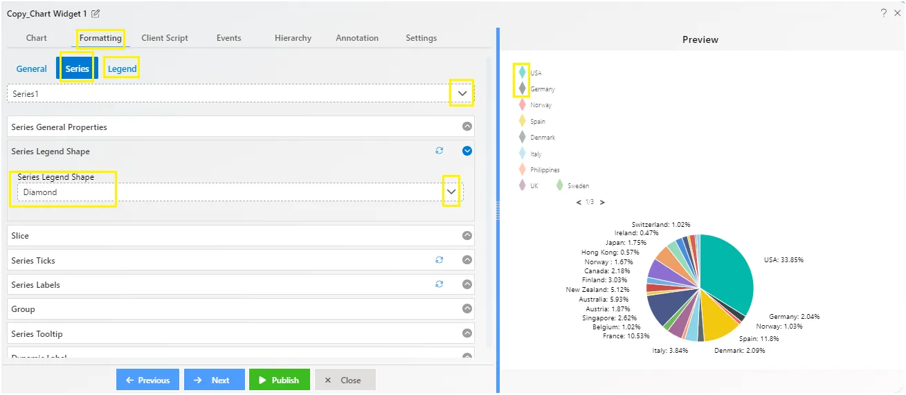
Series - Legend Shape
aiv_dashboard_formatting_series_legendshape Overview: The Series Legend Properties section provides options for customizing the appearance of legends associated with chart series.
Description: You can pick different shapes like circles, squares, triangles, and more for your legends. to make them visible on chart, you need to enable the legend proeprties first. Go to the Legend tab from the Formatting, then click on the Legend Properties controlbox, and click on the toggle button.
Choosing the right shape for each legend helps you share information about your data in a way that’s easy to see and understand.
Output: 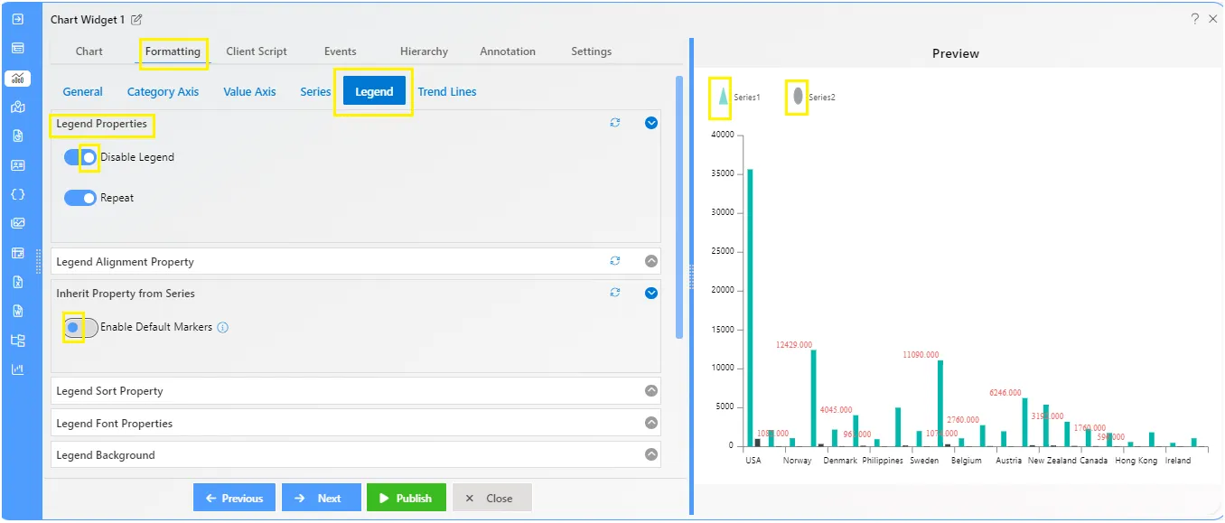
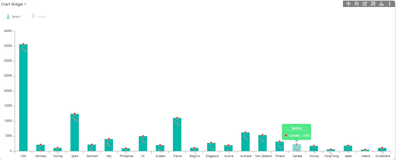
Series - Tooltip
Overview: The series tooltip feature lets you customize tooltips in your chart. You can change the tooltip’s color, text color, and background color to suit your preferences.
Description: To customize tooltips, users need to follow these steps:
- Click on the toggle button to enable the series tooltip feature.
- Choose the background color and text color for the tooltip.
- Once customized, the tooltip will be visible on the chart when users hover their mouse over the chart plot.
Output: 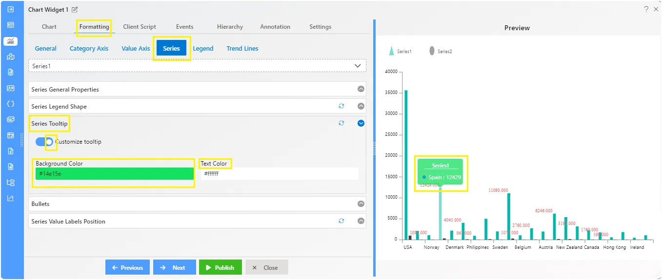
Series - Bullets
Overview: The Series - Bullets feature enhances chart visuals by adding customizable bullets to data points, aiding in data representation.
Description: To enable the bullets on the chart, click on the toggle button then the controls will appear below. From the properties, users can select the Type of the Bullets like Square, circle, triangle, diamond. Additionally, users can add the required width, height, color, border color, and border width. The feature also includes advanced options like Hide/Show bullets and adding values.
Output: 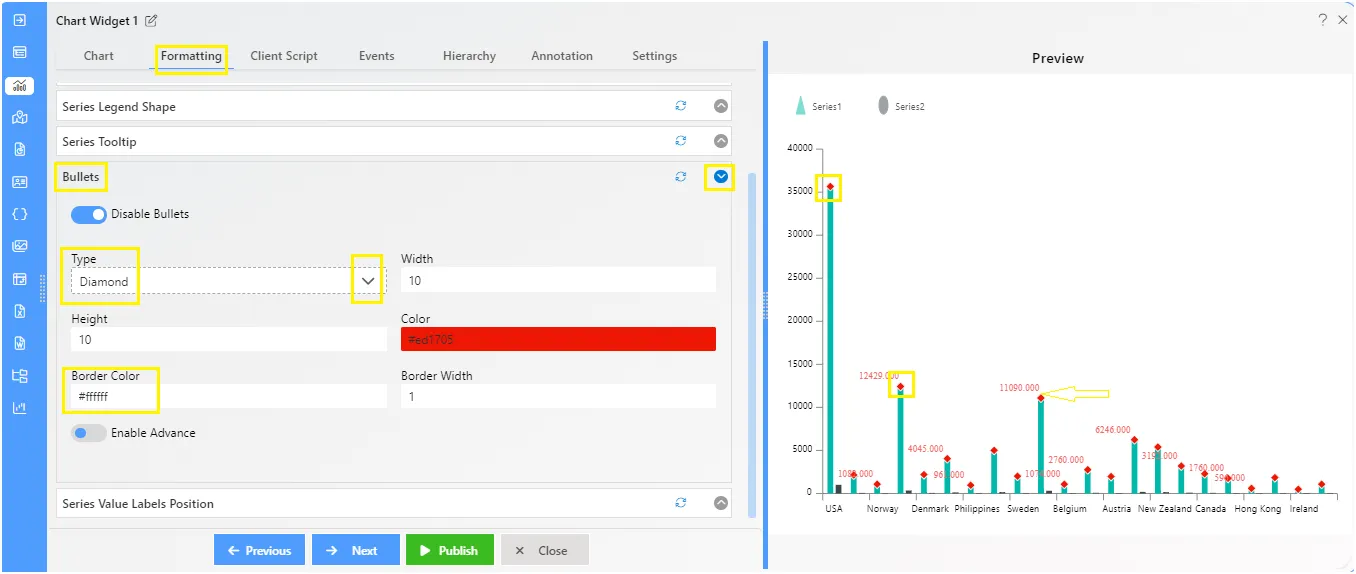
Series - Value Labels Position
Overview: The Series - Value Labels Position feature enhances chart readability by allowing users to customize the position and appearance of value labels on the chart plot.
Description: The Value Labels feature ensures clear data presentation on the chart plot. Users can easily customize label position, text display, rotation, and aesthetics. Options include adjusting font properties, background color, opacity, decimal places, padding, and text alignments for enhanced clarity and visual appeal.
Output: 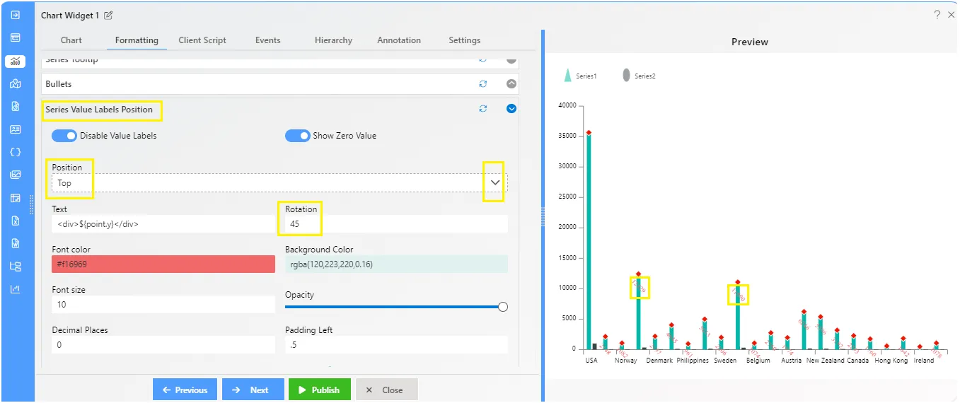
To know more about other formatting properties click on below links:-
General Properties
Category Axis Properties
Value Axis Properties
Series Properties
Legend Properties
Trend Line