Custom Visualization With AI
Introduction
Custom visualization With AI allow you to embed custom code into your application, enabling the creation of specific visualizations such as charts, maps, tables, dashboards, filters, and more. By leveraging web technologies such as HTML, CSS, and JavaScript, along with powerful libraries like Chart.js, developers can build tailored, dynamic visualizations that clearly communicate complex datasets.
Steps to Create Custom Visualization With AI
-
If you haven’t already created a dashboard, start by creating one using the Create Viz.
-
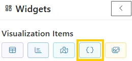
In dashboard canvas, go to the Widgets section and select Custom Visualization With AI.
-
After selecting Custom Visualization With AI, the custom visualization editor will appear, where you can start building your visualization using different code sections.
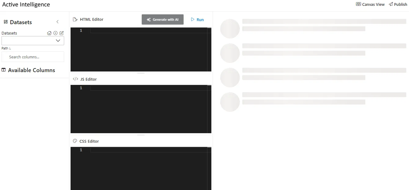
Custom Visualization Editor
The custom visualization editor consists of the following sections:
-
Datasets:
Dynamically select data by choosing a dataset. Upon selection, the relevant columns associated with that dataset will be available for display. -
Available Columns:
Displays all the columns tied to the selected dataset so you can map specific fields to your visualization. -
HTML:
Defines the structure of your visualization. You can add elements like headings, paragraphs, images, links, or<canvas>elements for charts. -
JavaScript:
Adds interactivity and functionality. Use it to bind data, implement dynamic behaviors, or create charts using libraries such as Chart.js. -
CSS:
Styles your visualization by adjusting colors, fonts, spacing, and layouts, ensuring the design aligns with your branding and enhances readability.
Dataset Binding in Custom Visualization With AI
There are two primary methods for connecting datasets to custom visualization: Dynamic Dataset Binding and Static Dataset Binding.
1. Dynamic Dataset Binding
This widget uses the swiggy dataset (injected via {{dataset::swiggy}}) to dynamically calculate the total number of restaurants. The dataset is bound in the dashboard editor through a visual dropdown, and the purpose of this setup is to generate a KPI card that displays the Total Restaurants count in real time.
HTML
<div class="kpi-card" id="swiggy-kpi">
  <h3>Total Restaurants</h3>
  <p id="swiggy-kpi-value">0</p>
</div>
JS
const swiggyData = {{dataset::swiggy}};

function getTotalRestaurants() {
  return Array.isArray(swiggyData) ? swiggyData.length : 0;
}

document.addEventListener('DOMContentLoaded', () => {
  const count = getTotalRestaurants();
  const el = document.getElementById('swiggy-kpi-value');
  if (el) el.textContent = count;
});
CSS
.kpi-card {
  background: #fff;
  border-left: 5px solid #fc8019;
  padding: 20px;
  border-radius: 8px;
  font-family: Arial, sans-serif;
  width: 220px;
  box-shadow: 0 4px 8px rgba(0,0,0,0.05);
}

.kpi-card h3 {
  margin: 0 0 10px;
  color: #fc8019;
}

.kpi-card p {
  font-size: 24px;
  font-weight: bold;
  margin: 0;
  color: #fc8019;
}
Output

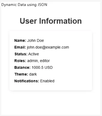
2. Static Dataset Binding
In static binding, the data is embedded directly in the code (usually as JSON). This approach is useful when the dataset does not change or does not require real-time updates. In the following example, a static JSON object (userData) is used to generate a User Information widget, and the output renders a styled component displaying key profile details such as Name, Email, Status, Roles, Balance, Theme, and Notifications.
HTML
<h1>User Information</h1>
<div id="user-info" class="user-info"></div>
JS
const userData = {
  "user": {
    "id": 1,
    "name": "John Doe",
    "email": "john.doe@example.com",
    "isActive": true,
    "roles": ["admin", "editor"]
  },
  "account": {
    "balance": 1000.50,
    "currency": "USD"
  },
  "preferences": {
    "theme": "dark",
    "notifications": true
  }
};

function displayUserInfo(data) {
  const userInfoDiv = document.getElementById('user-info');
  userInfoDiv.innerHTML = `
    <p><span>Name:</span> ${data.user.name}</p>
    <p><span>Email:</span> ${data.user.email}</p>
    <p><span>Status:</span> ${data.user.isActive ? 'Active' : 'Inactive'}</p>
    <p><span>Roles:</span> ${data.user.roles.join(', ')}</p>
    <p><span>Balance:</span> ${data.account.balance} ${data.account.currency}</p>
    <p><span>Theme:</span> ${data.preferences.theme}</p>
    <p><span>Notifications:</span> ${data.preferences.notifications ? 'Enabled' : 'Disabled'}</p>
  `;
}

displayUserInfo(userData);
CSS
.user-info {
  background-color: white;
  padding: 20px;
  border-radius: 8px;
  box-shadow: 0 2px 10px rgba(0, 0, 0, 0.1);
  width: 300px;
  margin: 0 auto;
}

.user-info p {
  font-size: 16px;
  margin: 10px 0;
}

.user-info span {
  font-weight: bold;
}
Output
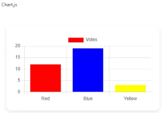
Using Chart.js for Custom Visualizations
Chart.js is a versatile and lightweight JavaScript library for creating responsive and interactive charts. It supports a wide range of chart types—Pie, Line, Bar, Radar—and provides:
- Customizable color schemes
- Tooltips
- Animations
- Responsive layouts
- Interactive legends
HTML
<!DOCTYPE html>
<html lang="en">
<head>
  <meta charset="UTF-8">
  <meta name="viewport" content="width=device-width, initial-scale=1.0">
  <title>Chart.js Example</title>
  <script src="https://cdn.jsdelivr.net/npm/chart.js"></script>

</head>
<body>
  <div class="chart-container">
    <canvas id="myChart"></canvas>
  </div>

</body>
</html>
JS
 const ctx = document.getElementById('myChart');

    new Chart(ctx, {
      type: 'bar',
      data: {
        labels: ['Red', 'Blue', 'Yellow'],
        datasets: [{
          label: 'Votes',
          data: [12, 19, 3],
          backgroundColor: ['red', 'blue', 'yellow']
        }]
      },
      options: {
        responsive: true,
        plugins: {
          legend: { position: 'top' },
          tooltip: { enabled: true }
        }
      }
    });
CSS
      body {
      font-family: Arial, sans-serif;
      display: flex;
      justify-content: center;
      align-items: center;
      height: 100vh;
      background: #ffffff;
      overflow: hidden;
    }
    .chart-container {
      width: 500px;
      background: #fff;
      padding: 20px;
      border-radius: 12px;
      box-shadow: 0 4px 10px rgba(0,0,0,0.1);
    }
Output
Key Benefits
-
Dynamic Data Rendering: Visualizations stay updated with the latest dataset values.
-
Interactivity: Features like hover states, tooltips, and legends enhance usability.
-
Customization: Colors, layouts, labels, and behaviors can be tailored.
-
Responsive Design: Charts adapt seamlessly across devices.
By combining dynamic dataset binding, static dataset binding, and libraries like Chart.js, you can create rich, interactive, and responsive custom visualizations. These are ideal for dashboards, reporting systems, and analytics platforms, offering real-time insights in an engaging format.
Listening to Clear Filter Events
Custom visualizations can listen to filter clear events from the AIV dashboard. This allows your custom visualization to respond when filters are cleared by the user.
JavaScript
window.addEventListener('message', function (event) {
  // Optional security check:
  // if (event.origin !== 'https://your-angular-domain.com') return;

  const msg = event.data;
  if (!msg || msg.type !== 'AIV_CUSTOM_VIZ_COMMAND') return;

  if (msg.action === 'CLEAR_FILTER') {
    alert('Cleared');
    // Add your custom logic here to handle filter clearing
    // For example: reset your visualization, reload data, etc.
  }
});
How it works:
- The code listens for
messageevents from the parent window (AIV dashboard). - It checks if the message type is
AIV_CUSTOM_VIZ_COMMAND. - When the action is
CLEAR_FILTER, it triggers your custom logic. - You can replace the
alert('Cleared')with your own code to reset visualizations, reload data, or perform any other action needed when filters are cleared.
Security Note:
Uncomment and configure the origin check (event.origin) to ensure messages are only accepted from trusted domains.
Summary
The AIV Custom Visualization Buddy adds complete flexibility to dashboards by enabling custom-built visualizations.
With HTML, CSS, and JavaScript support, it helps teams deliver tailored, interactive, and branded visual experiences beyond standard widgets.