Optional Y Series Grouping
Overview
This document explains how to use Optional Y Series Grouping in X-Y charts. This setting can be applied to Column, Bar, Line, and Area charts.
Use Case: This feature is useful for visualizing chart data grouped by specific values, such as year, month, or other categories.
Optional Y Series Grouping: This video explains how to use Optional Y Series Grouping in the AIV application.
Steps to learn how to use Optional Y Series Grouping:
-
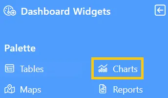
Click the Charts icon from the left vertical menu, as shown below:
-
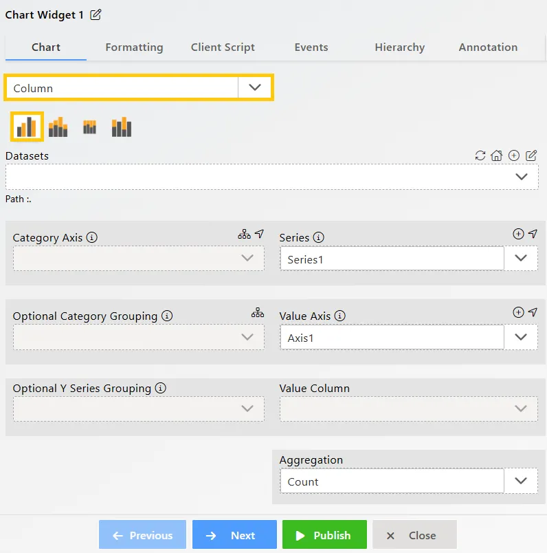
The Chart Edit menu box will appear, and by default, the Clustered Column chart will be selected, as shown below:
-
Enter the following details for the Column or Bar Chart Widget:
-
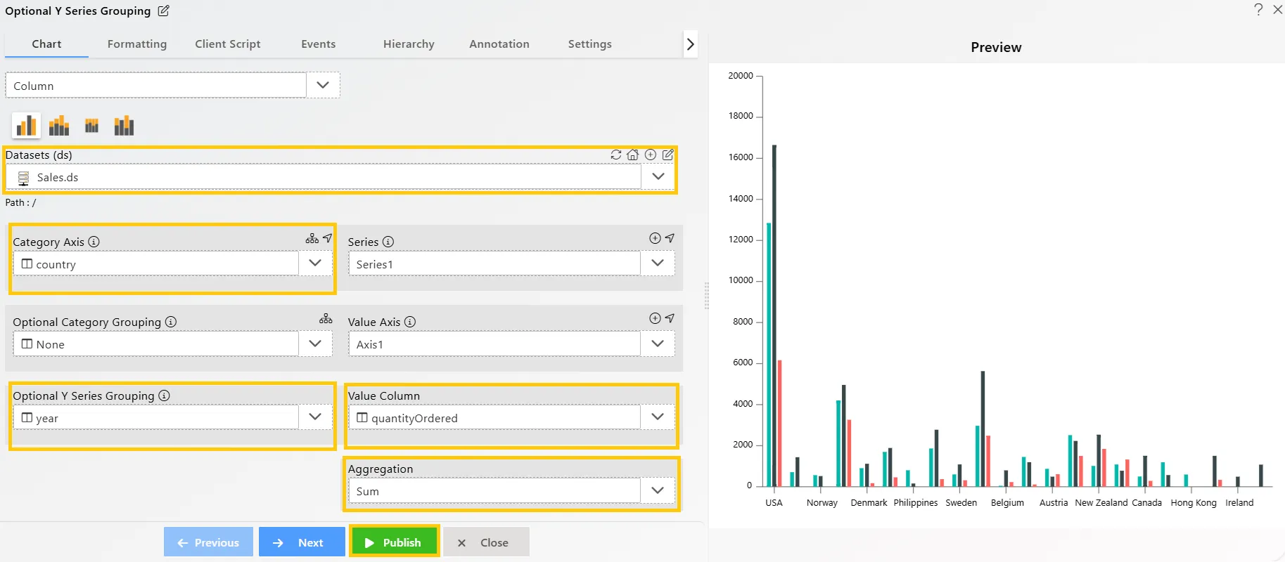
Datasets (ds): Sales.ds
-
Category Axis: country
-
Optional Y Series Grouping: year
-
Value Column: quantityOrdered
-
Aggregation: Sum
-
-
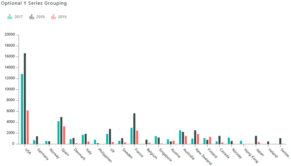
Click on the Publish button, then the Preview icon, and finally click on the SAVE AND EXIT button to view the Column Chart as shown below:
-
Now, you can see that the entire chart is grouped by year, with three columns for each country, indicating that the dataset contains values for three years.
-
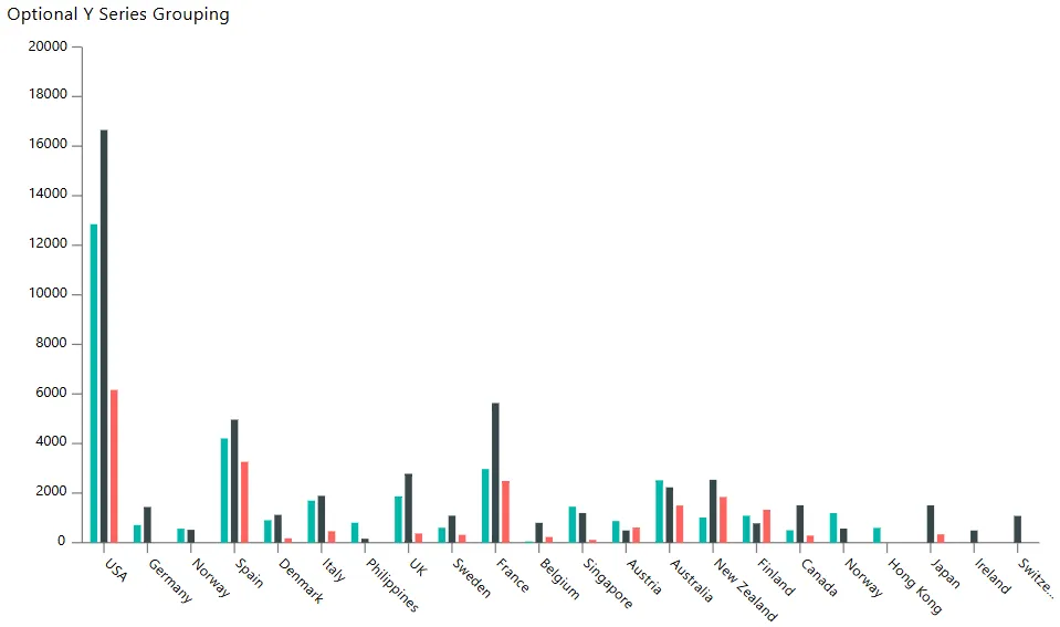
To view which bar represents which year, edit the chart by clicking the
 icon in the top-right corner. In the Edit Menu, go to Formatting Tab → Legend Option → Legend Properties, and enable the legend, as shown below:
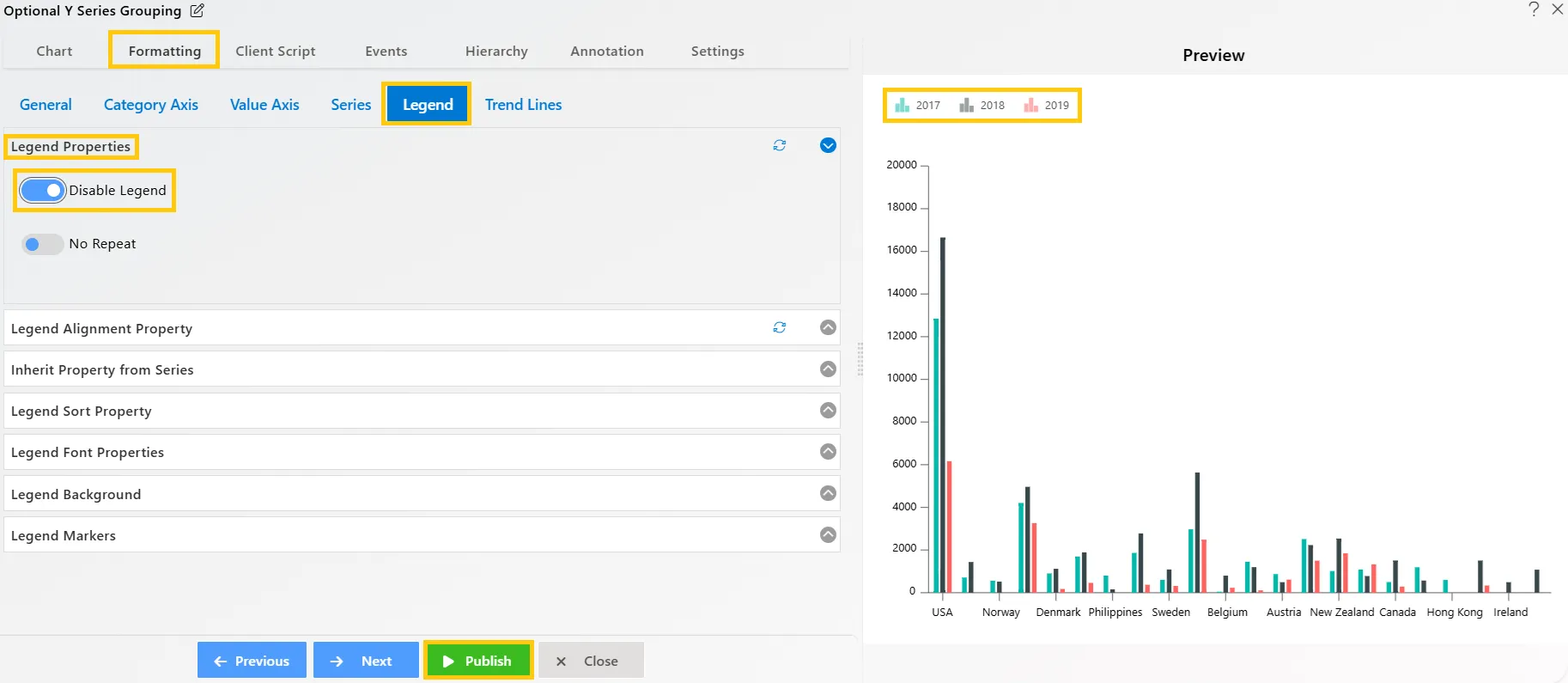
-
Once you enable the legend in the chart, you will see it added to the top-left side of the chart widget. Now, you can identify the year columns by the colors in the legend.
In this way, you can create charts with Optional Y Series Grouping in the AIV application.