Pie Chart Series Fomatting
Series - General Properties
Overview: The Series - General Properties section encompasses various properties that users can customize to refine the appearance and behavior of the chart series. These properties include Series Type, Series Name, Column Width, Opacity, Border Width, Border Color, Hide Series.
For more information on General Properties click here
Series - Legend Shape
Overview: The Series Legend Properties section provides options for customizing the appearance of legends associated with chart series.
For more information on Legend Shape click here
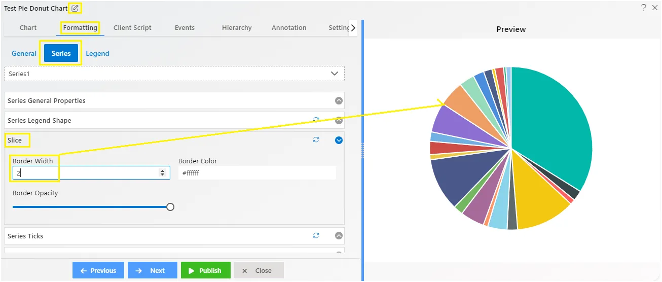
Series - Slice
Overview: Slice controls used to control the slices appearance of pie chart in AIV.
Description:
-
Border Width: It used to give border size to every slice individually in pie chart. as user increase it the border size increase, as user decrease it border size get reduced.
-
Border Color: it used to give color in the border of pie slices.
-
Border Opacity: it used to control the visibility level of border, by using the draggable slider user can increase or decrease border opacity in pie chart.
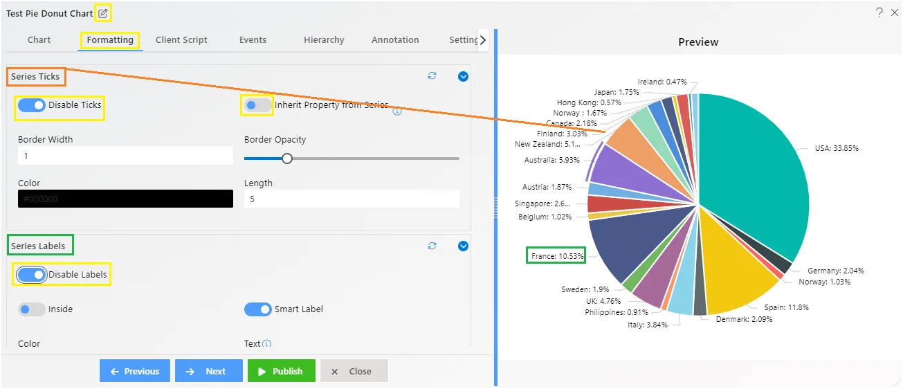
Series - Series Ticks
Overview: Series ticks represent the intervals or divisions along the Series axis of a chart. These ticks help in visually organizing and presenting data points. Adjustments such as width along with length, color, and opacity of Series ticks can enhance the clarity and readability of the chart.
For more information on Dynamic Dataset Color click here
Series - Series Labels
Overview: Series labels can be added to a chart series by enabling the visible option in the SeriesLabel. By default, the labels will arrange themselves smartly to avoid overlapping.
The Label properties govern all display types of the labels on the Series axis. Users can truncate text, change label positions, choose from various alignments, adjust rotation, set a maximum label text length, and control label placement.
For more information on Dynamic Dataset Color click here
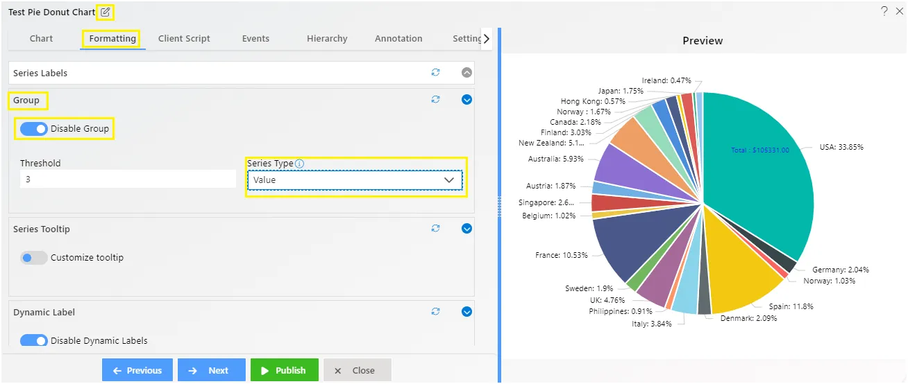
Series - Group
Overview:* Group used in pie chart to make group of values available in pie chart, user can control the number of groups to visualize in widget.
Description:
-
As User enable the group using the toggle button, its menu gets appear.
-
The Threshold is used to control the number of pie slices in chart widget.
-
Series Type: It has two series type like points and values
-
Point Series Type: The point use for how much points of threshold should be visible on chart. If user add 3 then it takes 3 slices for visualization and take other to the group. as shown in figure below:
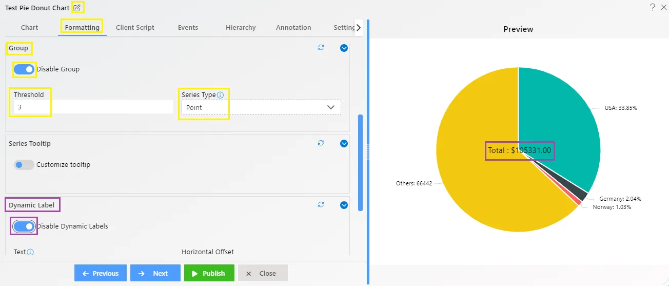
- Values Series Type: The value use for how much values of slices should be visible in chart.
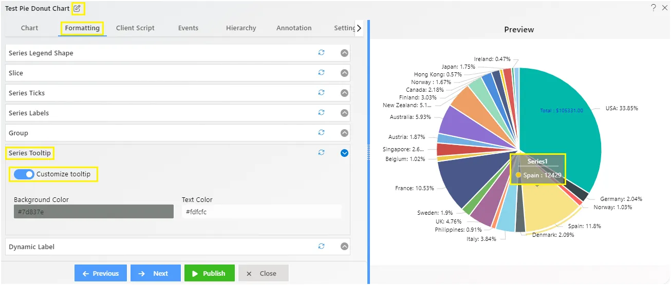
Series - Cursor Tooltip
Overview: The Cursor Tooltip feature enables the display of tooltips on the Series axis cursor by toggling the button. When activated, the chart provides details about data points when the mouse hovers over them. By default, the tooltip is disabled. You can enable it by setting the enable property to true.
For more information on Cursor Tooltip properties click here
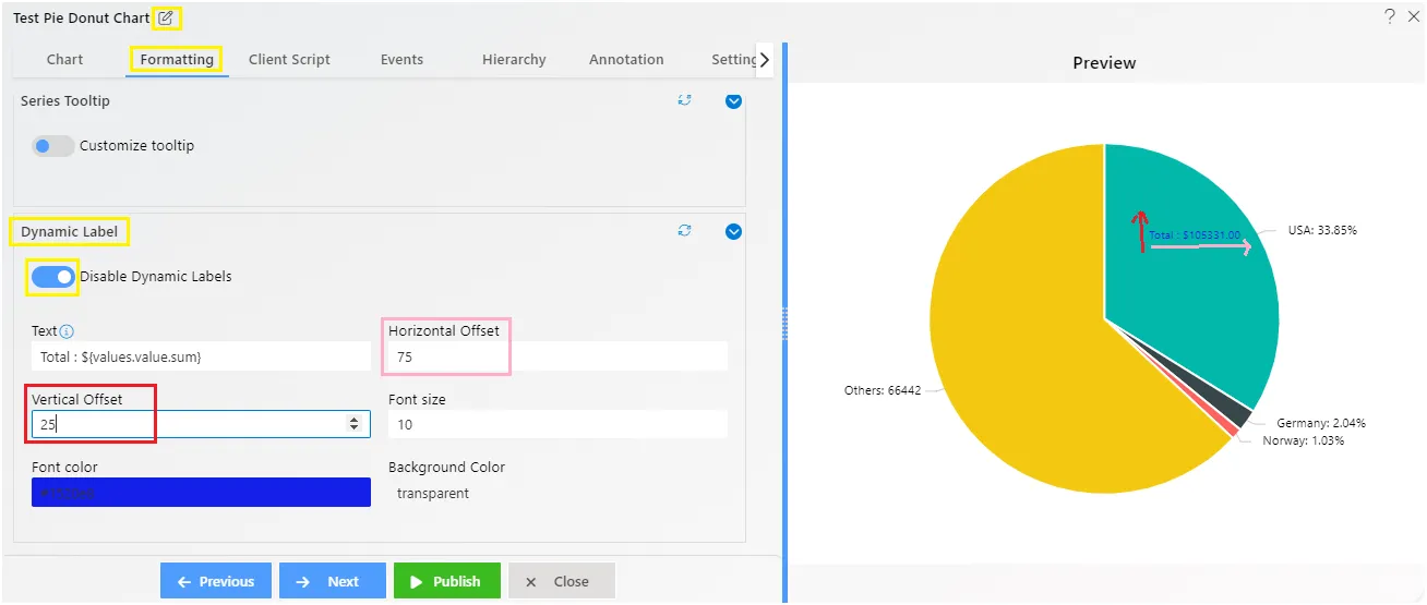
Series - Dynamic Label
-
Dynamic label adds a label in pie chart to show the dynamic value label which contains total value of pie chart, and its transforms automatically as user select pie slices in widget.
-
To apply dynamic label in pie chart, user needs to enable toggle button then it’s controls will get appear as shown in above figure.
- Text box: Used to show the value format of Dynamic label.
- Horizontal Offset: Used to control the position of label horizontally in pie chart.
- Vertical Offset: Used to control the position of label vertically in pie chart.
- Font Size: By using the font size control user can change the font size of the Dynamic Label.