Scatter Chart
Introduction
The Scatter Chart widget displays individual data points on a two-dimensional plane, where each point represents the values of two variables.
It is primarily used to observe relationships between variables, detect correlations, and identify outliers or clusters.
Purpose
Scatter Charts are particularly effective when you want to:
- Show the relationship between two numerical variables.
- Identify correlations, clusters, or trends (positive, negative, or no correlation).
- Spot outliers in datasets.
- Visualize the distribution and spread of data.
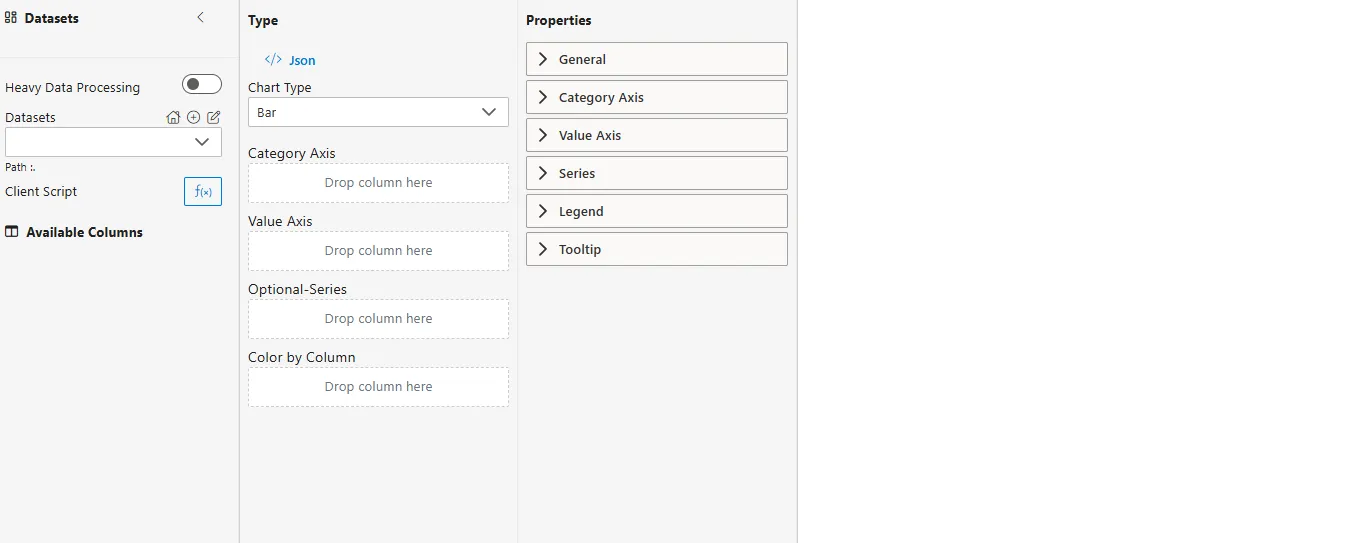
Steps to Create a Scatter Chart
-
From the left vertical menu, select the Charts icon.
-
A widget will be automatically added to the Viz canvas.
-
Select Dataset
- From the Datasets dropdown, choose your dataset (e.g.,
TrainingImpact.ds). - Available columns will be displayed in the Available Columns panel.
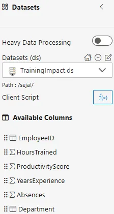
- From the Datasets dropdown, choose your dataset (e.g.,
Sample Dataset (TrainingImpact.ds)
| EmployeeID | HoursTrained | ProductivityScore | YearsExperience | Absences | Department |
|---|---|---|---|---|---|
| E101 | 15 | 82 | 3 | 1 | Sales |
| E102 | 20 | 90 | 5 | 0 | HR |
| E103 | 8 | 65 | 2 | 3 | IT |
| E104 | 12 | 75 | 4 | 2 | Finance |
| E105 | 5 | 55 | 1 | 4 | Sales |
Configuration Steps (Exact Titles)
-
Select Chart Type
- From the Type dropdown in the Properties Panel, choose Scatter.
-
Assign Category Axis (X-Axis)
- Drag a categorical column to the Category Axis field.
- Defines the categories along the vertical axis.
- Example:
Department.
-
Assign Value Axis
- Drag another numerical column into the Value Axis field.
- This typically represents the dependent variable.
- Example:
ProductivityScore.
-
Configure Aggregator
- For both Category Axis and Value Axis, click on the
 icon.
icon. - Choose an Aggregator:
- None (default, for individual data points)
- Sum, Average, Min, Max, Count, Distinct Count
- For both Category Axis and Value Axis, click on the
-
Optional – Series
- Drag a categorical column into the Optional-Series field.
- Creates separate colored groups of points.
- Example:
Department→ compare productivity across departments.
-
Optional – Color by Column
- Drag a categorical or numerical column here.
- If categorical, distinct colors are assigned.
- If numerical, a color gradient is applied.
- Example:
Absences→ highlight if higher absences impact productivity.
Common Functionalities (Properties Panel – Exact Titles)
- General
- Category Axis: Configure X-axis scale, labels, ticks.
- Value Axis: Configure Y-axis scale, labels, ticks.
- Series: Customize series visibility, styles, grouping.
- Tooltip
Use Case: Marketing Campaign Analysis
Introduction
Scatter Charts can provide crucial insights into the effectiveness of marketing strategies by comparing advertising spend with sales performance.
Sample Dataset (MarketingCampaigns.ds)
| CampaignID | AdSpend | Sales | Channel |
|---|---|---|---|
| C001 | 5000 | 20000 | Online |
| C002 | 7000 | 25000 | TV |
| C003 | 3000 | 10000 | Radio |
| C004 | 9000 | 27000 | Online |
| C005 | 6000 | 15000 |
How to Configure
- Category Axis (X-Axis) →
AdSpend - Value Axis (Y-Axis) →
Sales - Series (Optional) →
Channel(different colors for Online, TV, Radio, Print)
Business Questions Answered
- What is the relationship between advertising spend and sales?
- Which campaigns had high spend but low sales (outliers)?
- Does increased ad spend generally lead to higher sales?
Summary
- Scatter Chart → Quickly identifies correlations between spend and sales.
- Outlier Detection → Pinpoints underperforming or overperforming campaigns.
- Strategic Insights → Helps optimize budget allocation across channels.