Analysis Widget
Introduction
The Analysis Widget enables users to view and interact with Adhoc Analysis reports directly on the dashboard. Users can explore data in a flexible pivot-table format or instantly visualize it as charts.
If a new report is created within the widget, it is automatically saved in the Adhoc Analysis section for future use.
Purpose
The Analysis Widget provides a user-driven analytical experience where data can be grouped, aggregated, filtered, and visualized across multiple dimensions.
It is ideal for answering complex business questions that require multi-level analysis without pre-defining every view.
Steps to Create an Analysis Widget
-
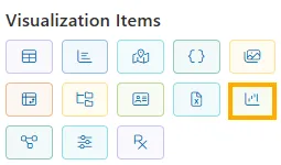
From the left vertical menu, click the Analysis Widget icon.
-
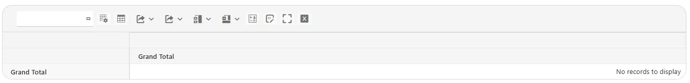
An empty container appears on the canvas.
-
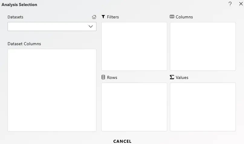
Click the Show Field List icon to open the Analysis Selection modal.
-
Configure your pivot structure:
Area Description Example Datasets & Available Columns Select the dataset. Columns appear below. dssuperstore.dsFilters Restrict data before analysis. ShipMode = First ClassRows Defines pivot rows. Country,CityColumns Defines pivot columns. Category,Sub-CategoryValues Numerical fields with aggregation (Sum, Avg, Count). Sales,Profit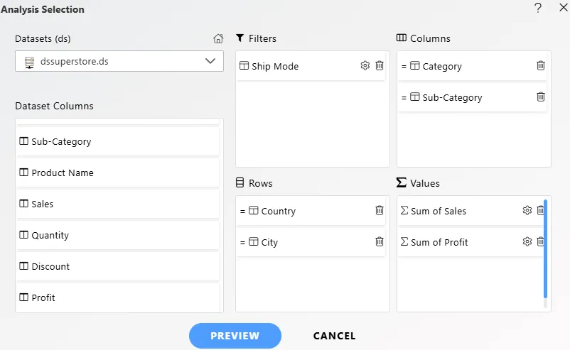
-
Click Preview to validate results.
-
Save your configuration using Save As.
Advanced Options
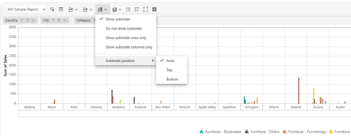
Subtotals & Grand Totals
Flexible options for showing or hiding totals in pivot tables.
-
Show – Display totals for rows and/or columns.
-
Do not show – Hide all totals.
-
Show rows only – Show totals only for rows.
-
Show columns only – Show totals only for columns.
-
Positioning: Place totals at the Top or Bottom (default).
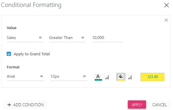
Conditional Formatting
Apply styles to values based on predefined rules. Helps highlight trends, outliers, and key insights.
- Value – Select a field or All Values. Use operators: Less Than, Greater Than, Equal To, Not Equal To, Between, Not Between.
- Apply to Grand Total – Extend rules to totals.
- Format – Customize font family, size, color, background color, and number preview.
- + Add Condition – Add multiple rules.
Actions:
- Apply – Save rules.
- Cancel – Discard.
Example: Highlight Sales values Greater Than 10,000 with a teal font and yellow background.
Number Formatting
Control how numeric values appear for better readability and reporting consistency.
- Values – Apply to selected fields or All Values.
- Format Type – Number, Currency, Percentage, or Custom.
- Grouping – Enable/disable thousand separators.
- Decimal Places – Set decimals.
- Custom Format – Define custom strings (e.g.,
FY##: 0.00M).
Actions:
-
Apply – Save changes.
-
Cancel – Discard.
Chart Options
Switch pivot data into different charts for faster insights.
Available Chart Types:
Select from Column, Bar, Line, Area, Scatter, Polar, Stacked Column, or More as per your analysis needs.
Additional Options:
- Multiple Axis – Plot values on dual Y-axes.
- Show Legend – Toggle legend visibility.
How to Use:
- Click the Chart Type icon.
- Select a chart.
- Use Multiple Axis/Legend options.
- Switch back anytime with Show Table.
Example: Compare Sales vs. Profit with a Column chart + Multiple Axis, or show segment contribution with a Stacked Column chart.
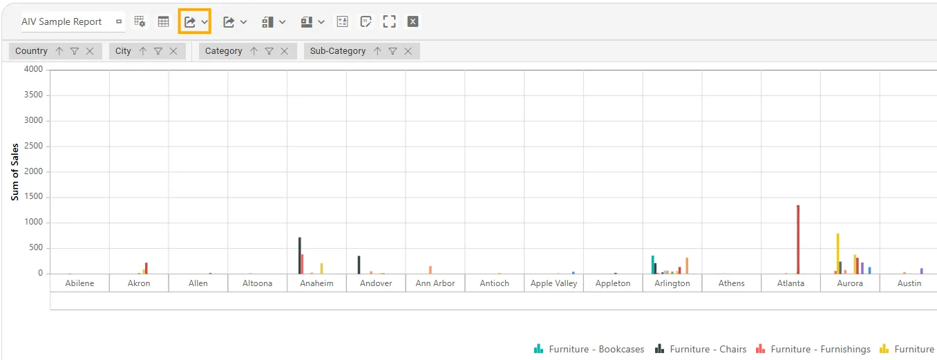
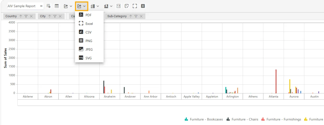
Export / Download
Export results for offline use: PDF, Excel, CSV, PNG, JPEG, SVG.
-
How to Use: Click the Download icon → choose format.
-
Benefit: Share insights or perform further analysis outside AIV.
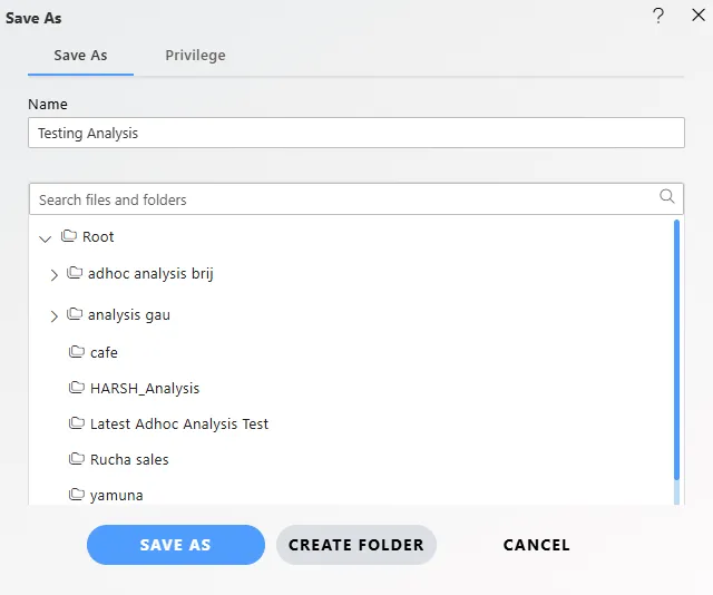
Saving Your Work
-
Save As – Create a new copy.
-
Always save before previewing to avoid losing changes.
Use Cases
| Use Case | Example | Features Used |
|---|---|---|
| Sales Performance | Analyze revenue by Region (Columns) and Category (Rows). | Rows, Columns, Values, Totals |
| Financial Budgeting | Compare Actual vs. Budget across Departments. | Custom Calculations, Values |
| HR Headcount | Distribution by Location (Columns) and Job Level (Rows). | Rows, Columns, Count |
| Web Traffic | Sessions by Traffic Source and Landing Page. | Rows, Columns, Chart View |
| Survey Data | Avg. Satisfaction by Age Group & Gender. | Rows, Columns, Average, Subtotals |
Example Scenario: Product Sales by Region
Objective: Identify which product categories perform best by region.
Dataset (SalesData):
| Region | Category | UnitsSold |
|---|---|---|
| North | Electronics | 500 |
| North | Apparel | 300 |
| West | Electronics | 750 |
| West | Apparel | 450 |
Steps:
- Add an Analysis Widget.
- Open Field List.
- Drag
Category → Rows,Region → Columns,UnitsSold → Values (Sum). - Preview the pivot table.
- Switch to Stacked Column Chart for visual comparison.
- Export results to Excel.
Outcome: Start with a pivot table, switch to chart view for insights, and export results—all in a few clicks.