Card Widget
Introduction
The Card Widget is a versatile display component designed to highlight a single, important metric or key performance indicator (KPI). It provides a clear, concise visual representation of a specific data point, often accompanied by a title, conditional formatting, and even an optional image.
Purpose
This widget is ideal for drawing immediate attention to critical numbers, such as total sales, average ratings, or conversion rates. It allows for extensive customization of its value, title, and appearance, making it a powerful tool for summarizing essential information at a glance.
Steps to Add and Configure the Card Widget
-
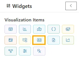
Add Widget: From the left-side widget panel, click the Card Widget icon.
-
Widget Block Appears: A new widget block will be added to your canvas.
-
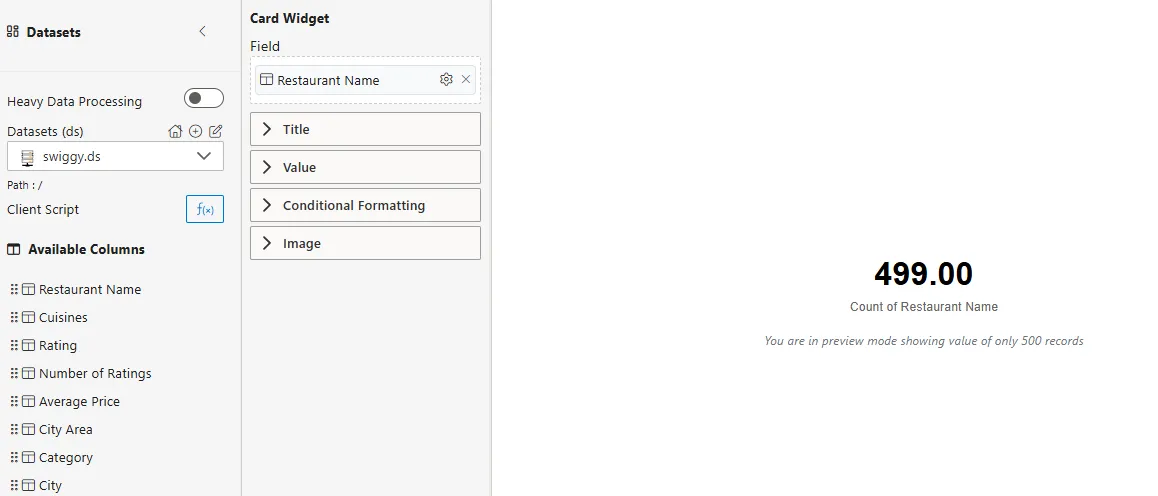
Select a Dataset: From the Datasets (ds) dropdown, choose the dataset you want to use (e.g.,
swiggy.ds).-
Drag a column (e.g., Restaurant Name) from Available Columns into the Field section.
-
Use the ⚙️ icon to apply aggregation functions such as Sum, Count, Average, Min, Max.
-
-
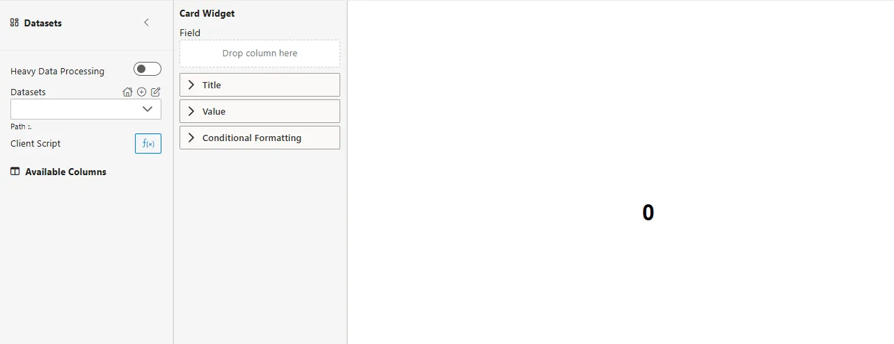
Configure the Card: Expand the Title, Value, Conditional Formatting, and Image sections to customize the widget.
-
Preview the Widget: The right-hand panel will update to show the configured card with your selected field and formatting.
-
Publish: Once satisfied, click Publish (top-right corner) to finalize the widget for your report/dashboard.
Field Configuration
The Field section defines which data column the card widget will display.
| Option | Description |
|---|---|
| Datasets (ds) | Select the dataset you wish to use from the dropdown (e.g., swiggy.ds). |
| Drop column here | Drag and drop a column from Available Columns into this area. |
| ⚙️ Icon (Settings) | Apply aggregation functions such as Sum, Count, Average, Min, Max. |
| Path | Indicates the path to your selected dataset. |
| Client Script (f(x)) | Open a script editor for advanced data manipulation or custom calculations. |
Title Configuration
The Title section allows you to define and style the text that accompanies your metric.
| Option | Description |
|---|---|
| Text | Enter the desired title for your card (e.g., “Total Sales,” “Average Rating”). |
| Title Position | Choose where the title appears relative to the value (e.g., Top, Bottom). |
| Title Align | Set the horizontal alignment of the title (e.g., Left, Center, Right). |
| Font Family | Select the font for the title text (e.g., DIN, Arial, Tahoma). |
| Font Size | Adjust the size of the title text (e.g., 12, 16). |
| Font Weight | Set the boldness of the title text (e.g., Normal, 700/Bold). |
| Color | Choose the font color for the title. |
| Background Color | Set a background color for the title area (e.g., transparent, #FFFFFF). |
| Padding (px) | Adjust the internal spacing around the title text. |
| Margin Bottom (px) | Control the space below the title. |
| Hyperlink | Add a clickable URL to the title. |
Value Configuration
The Value section focuses on styling and formatting the main numerical display of your card.
| Option | Description |
|---|---|
| Font Family | Select the font for the displayed value. |
| Font Size | Adjust the size of the value text (e.g., 32). |
| Font Weight | Set the boldness of the value text (e.g., 700/Bold). |
| Color | Choose the font color for the value (e.g., #000000/Black). |
| Background Color | Set a background color for the value area (e.g., transparent). |
| Decimal Places | Define how many decimal places to show for the value (e.g., 2). |
| Thousand Separator | Toggle to enable/disable thousand separators for large numbers. |
| Display Unit | Automatically or manually set units for large numbers (e.g., Auto, K, M, B). |
| Percentage | Toggle to display the value as a percentage. |
| Prefix | Add text before the value (e.g., currency symbol like ’$’). |
| Suffix | Add text after the value (e.g., unit like ‘units’). |
| Padding (px) | Adjust the internal spacing around the value. |
| Margin Bottom (px) | Control the space below the value. |
| Align | Set the horizontal alignment of the value (e.g., Center). |
Conditional Formatting
Conditional Formatting allows you to dynamically change the appearance of the card’s title or value based on specific rules.
| Option | Description |
|---|---|
| Formatting On | Choose whether the conditional formatting applies to the Title, Value, or Background. |
| f(x) | Click this to open the conditional formatting rule builder. |
| Column Name | Select the column used to evaluate the rules (e.g., Category). |
| Add | Click to add a new formatting rule. |
| If Value | Define the condition (e.g., Equal, Greater than, Less than). |
| Value | Enter the value to compare against. |
| Units | Select the display unit for numbers (e.g., None, K (Thousands), M (Millions), B (Billions), T (Trillions)). |
| Rule Type | Choose what property to change (e.g., Color). |
| Color / Font Family / Font Weight / Font Size | Specify the styling to apply when the condition is met. |
| Save | Click to save your conditional formatting rules. |
Image Configuration
The Image section allows you to embed an image within your card widget.
| Option | Description |
|---|---|
| Use Image | Toggle this switch On to enable image functionality. |
| Image Path | Select the image file you want to display. |
| Image Width | Set the width of the image in pixels. |
| Image Height | Set the height of the image in pixels. |
| Image Position | Choose the image’s placement relative to the text (e.g., Left, Right, Top, Bottom). |
| Margin Top (px) | Control the space above the image. |
| Margin Right (px) | Control the space to the right of the image. |
| Margin Bottom (px) | Control the space below the image. |
| Margin Left (px) | Control the space to the left of the image. |
| Text | Add a descriptive text for the image (optional). |
| Splitter | Toggle this to add a visual separator between the image and text. |
Example: Conditional Formatting
You can apply Conditional Formatting on the Rating field to highlight restaurant performance dynamically.
Steps
-
Expand the Conditional Formatting section.
-
Choose to format: Value.
-
Click fx to open the rule editor.
-
Define rules such as:
Field Example Column Name RatingIf Value Greater Than or Equal To Value 4.0 Rule Type Color Color Green Font Size 32 -
Add another rule for ratings below 4.0:
Field Example Column Name RatingIf Value Less Than Value 4.0 Rule Type Color Color Red Font Size 32 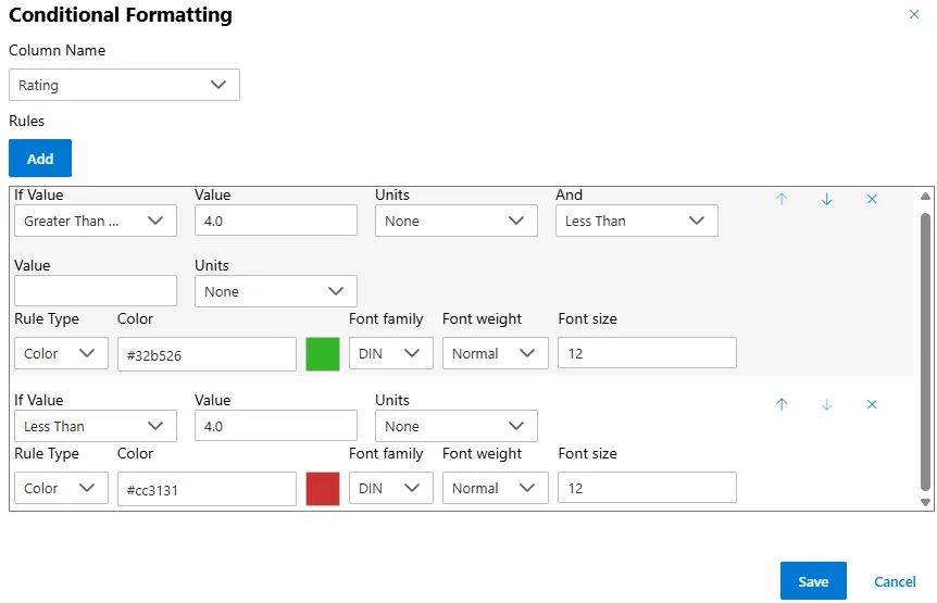
-
Click Save.
Result
- If the Top Rating ≥ 4.0, the card value (e.g.,
4.3) will appear in Green. - If the Top Rating < 4.0, the card value will appear in Red.
This ensures your Card Widget always provides instant visual feedback on restaurant performance, even when only one record (top-rated restaurant) is returned from the dataset.