Column / Bar Chart
Introduction
The Column Chart and Bar Chart widgets allow you to compare values across categories using rectangular bars.
- Column Chart - Vertical bars (categories on the X-axis, values on the Y-axis).
- Bar Chart - Horizontal bars (categories on the Y-axis, values on the X-axis).
These charts are among the most common visualization types, making it easy to compare values and identify patterns.
Purpose
To compare values across categories.
They are particularly effective when you want to:
- Compare different categories (e.g., sales of product categories).
- Show relative contribution (proportions) of sub-categories using a stacked Column/Bar Chart.
- Use Bar Chart when category names are long or when you have many categories.
- Use Stacked/Grouped mode to see both totals and category breakdowns.
Steps to Create a Column / Bar Chart
-
From the left vertical menu, select the Charts icon.
-
A widget will be automatically added to the edit screen.
-
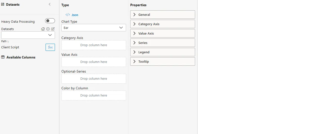
Select Dataset
-
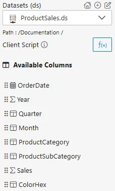
From the Datasets dropdown, choose your dataset (e.g.,
ProductSales.ds). -
Available columns will be displayed in the Available Columns panel.
-
Sample Dataset (ProductSales.ds)
| OrderDate | Year | Quarter | Month | ProductCategory | ProductSubCategory | Sales | ColorHex |
|---|---|---|---|---|---|---|---|
| 2023-01-15 | 2023 | Q1 | Jan | Electronics | Laptops | 12000 | #1f77b4 |
| 2023-02-20 | 2023 | Q1 | Feb | Electronics | Smartphones | 8500 | #2ca02c |
| 2023-04-10 | 2023 | Q2 | Apr | Appliances | Kitchen | 7000 | #ff7f0e |
| 2023-05-25 | 2023 | Q2 | May | Electronics | Laptops | 15000 | #1f77b4 |
| 2023-08-05 | 2023 | Q3 | Aug | Appliances | Laundry | 6500 | #9467bd |
-
Select Chart Type
- From the Chart Type dropdown in the Type panel, choose Column or Bar.
-
Assign Category Axis
- Drag a categorical column to the Category Axis field.
- Defines the categories along the horizontal axis (Column Chart) or vertical axis (Bar Chart).
- Example:
ProductCategory,ProductSubCategory
-
Assign Value Axis
- Drag a numerical column into the Value Axis field.
- Determines the bar length/height.
- Example:
Sales
-
Configure Aggregator
- Click on the
 icon next to the Value Axis field.
 - Choose an Aggregator to define how values are calculated:
- Count – Number of records.
- Distinct Count – Unique count of records.
- Sum – Total of all values.
- Average – Mean value.
- Min – Minimum value.
- Max – Maximum value.
- Click on the
-
Optional – Series
- Drag another categorical column into the Series field.
- Example: Compare
ProductSubCategorywithin eachProductCategory. - By default, it creates a grouped bar chart, but you can switch to a stacked bar chart by enabling the Stack option under General.
-
Optional – Color by Column
-
Assign colors by dragging a categorical column here.
-
Example: Color by
ProductCategory.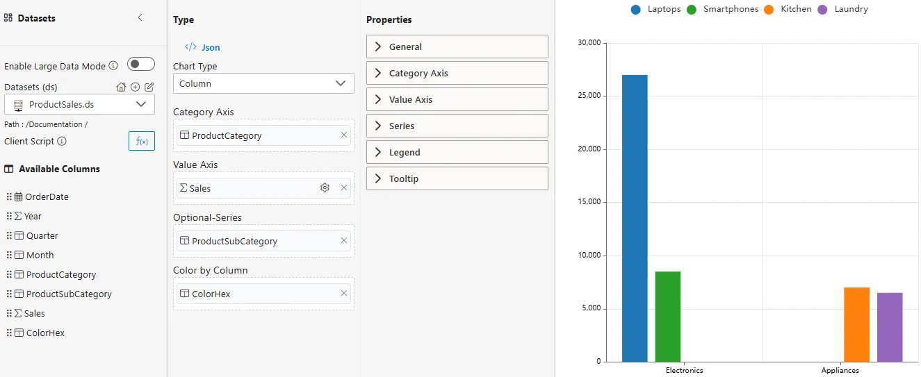
-
Common Functionalities (Properties Panel)
- General
- Category Axis: Labels, ticks, display range.
- Value Axis: Scale, labels, display range.
- Series
- Legend
- Tooltip
Use Case: Employee Performance
Introduction
The Employee Performance use case demonstrates how Column and Bar Charts can be applied to HR or organizational datasets. By visualizing employee scores across departments, managers can easily compare overall department performance and identify top contributors.
Sample Dataset (StudentMarks.ds)
| Year | Student | Subject | Marks |
|---|---|---|---|
| 2023 | Alice | Math | 85 |
| 2023 | Alice | Science | 90 |
| 2023 | Bob | Math | 78 |
| 2023 | Bob | Science | 82 |
| 2023 | Charlie | Math | 92 |
| 2023 | Charlie | Science | 88 |
| 2024 | Alice | Math | 88 |
| 2024 | Alice | Science | 93 |
| 2024 | Bob | Math | 81 |
| 2024 | Bob | Science | 85 |
| 2024 | Charlie | Math | 95 |
| 2024 | Charlie | Science | 90 |
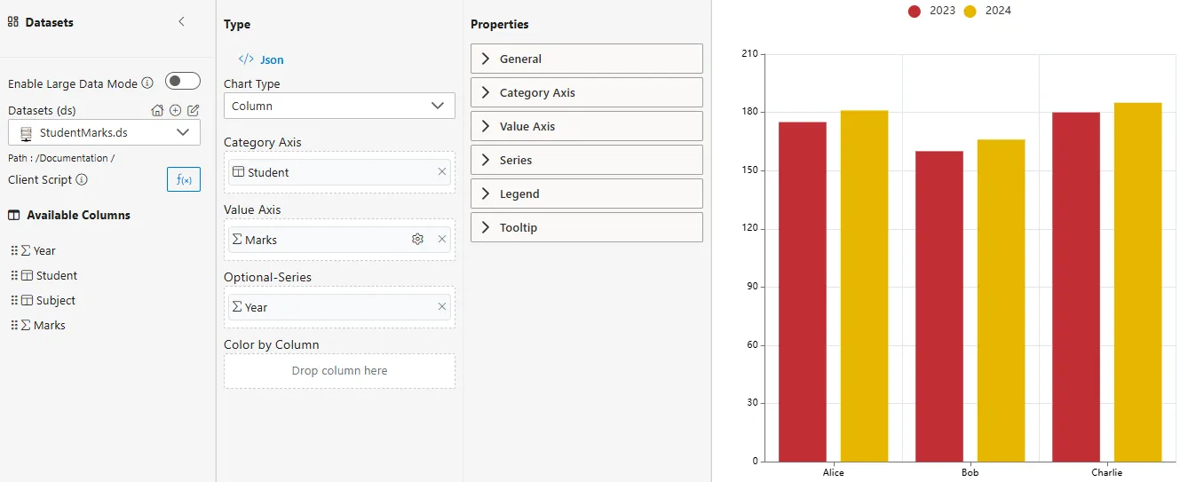
How to Configure
-
Enter the following details for the Column or Bar Chart Widget:
-
Datasets (ds) -> StudentMarks.ds
-
Chart Type -> Column Chart
-
Category Axis -> Student
-
Value Axis -> Marks
-
Aggregator -> Sum
-
Optional Series -> Year (to see stacked bar chart or grouped bar chart contributions)
-
Summary
The Student Marks use case illustrates how Column and Bar Charts can provide insights into academic performance.
- Column Chart -> Quick comparison of students’ marks across years.
- Bar Chart -> Useful when student names or subject labels are long.
- Stacked/Grouped Charts -> Help visualize both total marks and individual year-wise contributions for each student.