Legend
Introduction
The Legend Properties allow you to configure the chart legend, which provides a key to understanding the different series or categories represented in your chart.
Purpose
To customize the visibility, layout, and appearance of the chart legend, making it easier for users to interpret the visualization.
Legend Properties
Click to view Legend Properties
-
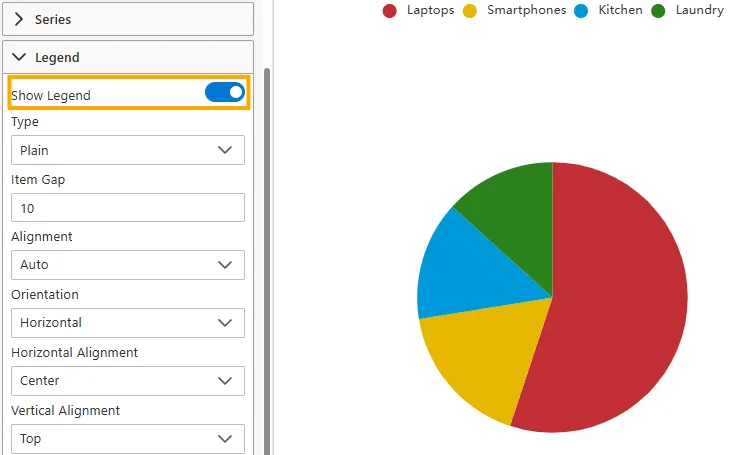
Show Legend
Toggle this switch ON to display the legend, or OFF to hide it.
-
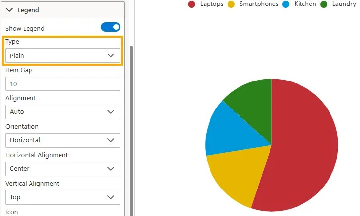
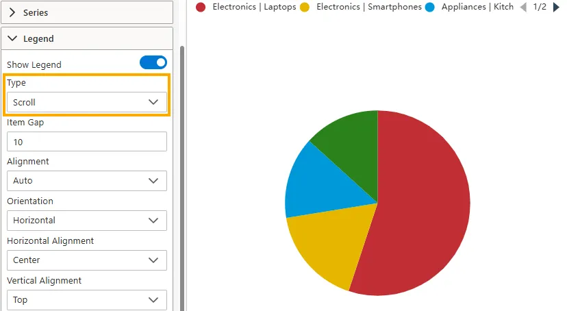
Type
Defines the layout style of legend items.
-
Plain: Displays all legend items in a list format without scrolling or pagination.
-
Scroll: Displays legend items in a scrollable or paginated format, useful when the chart has many items.
-
-
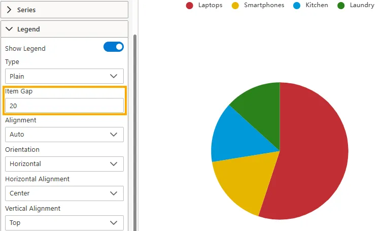
Item Gap
Sets the horizontal spacing (in pixels) between legend items.
-
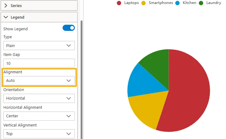
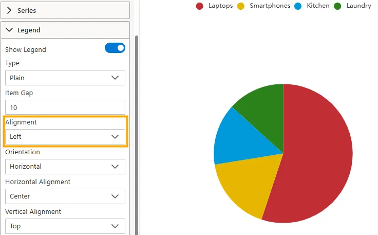
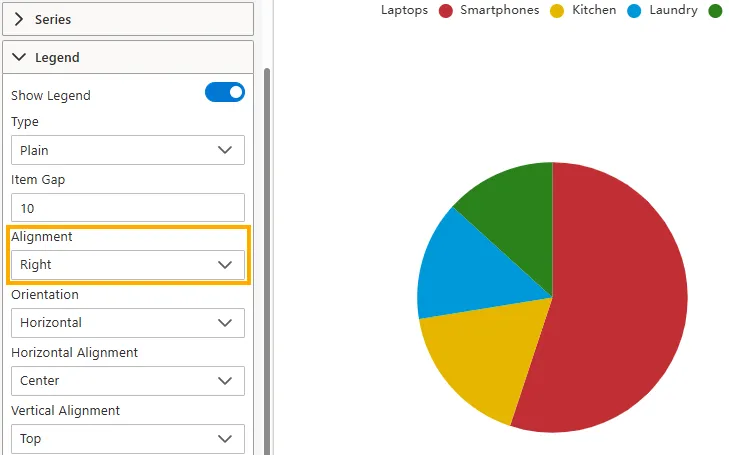
Alignment
Controls how legend items are aligned within the legend container.
-
Auto: Adjusts alignment automatically based on available space.
-
Left: Aligns items to the left.
-
Right: Aligns items to the right.
-
-
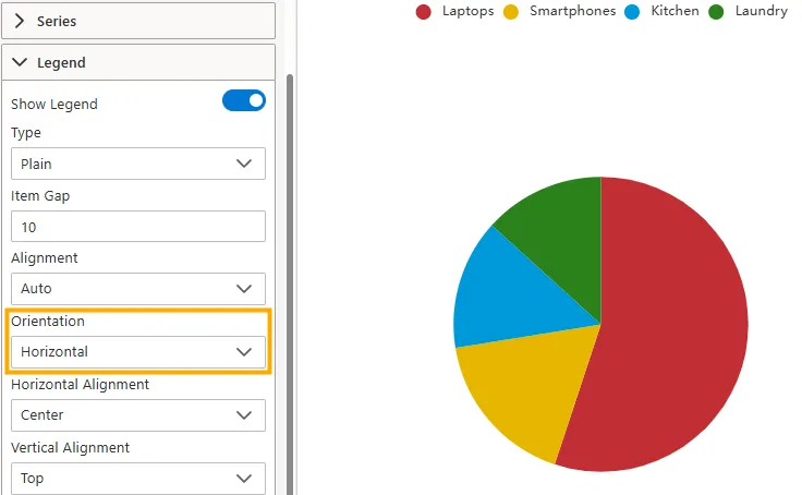
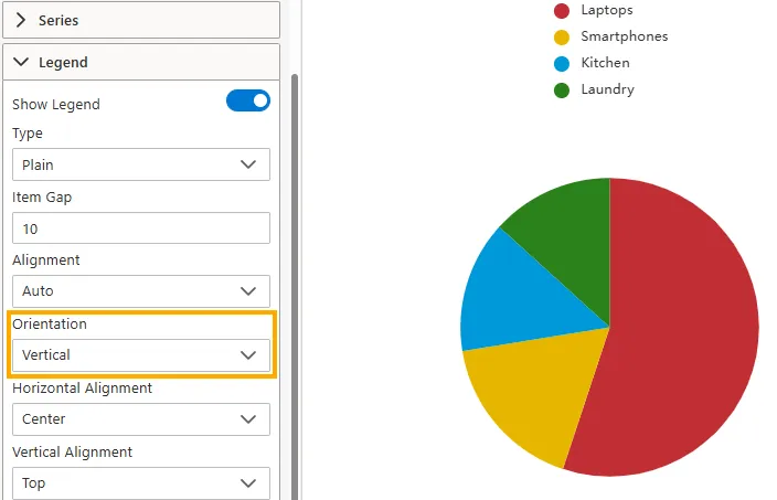
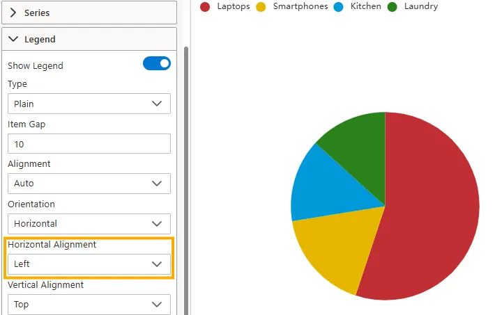
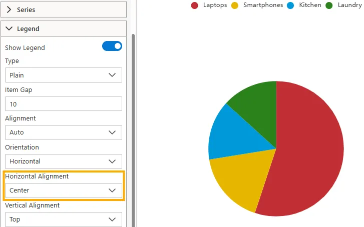
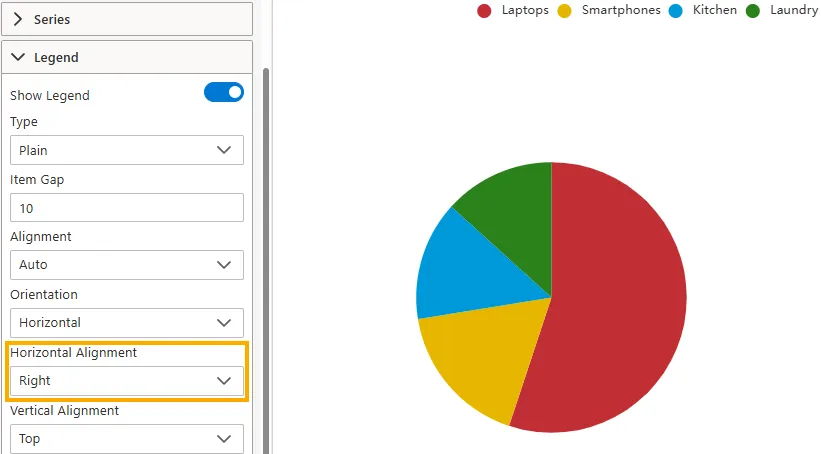
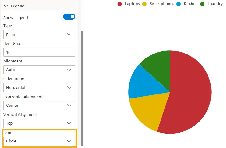
Orientation
Defines how legend items are arranged.
-
Horizontal: Items are displayed side by side.
-
Vertical: Items are stacked vertically.
-
-
Horizontal Alignment
Aligns the legend horizontally within the chart area.
-
Left: Positions the legend on the left.
-
Center: Positions the legend in the middle.
-
Right: Positions the legend on the right.
-
-
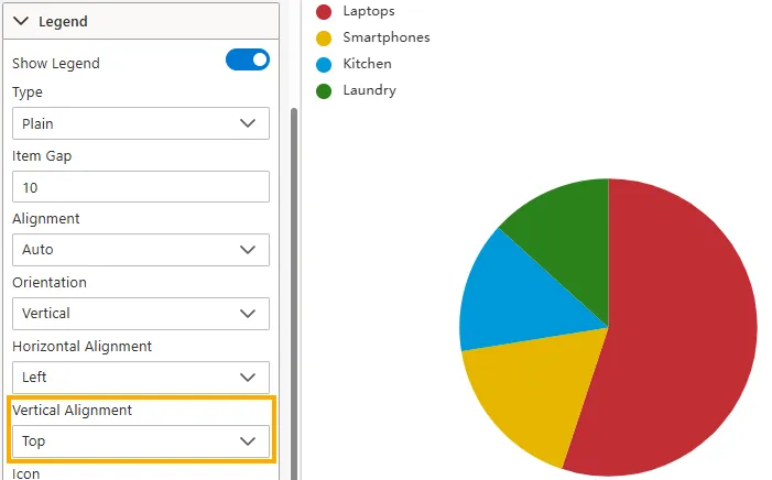
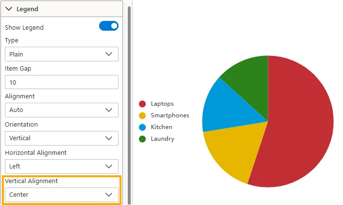
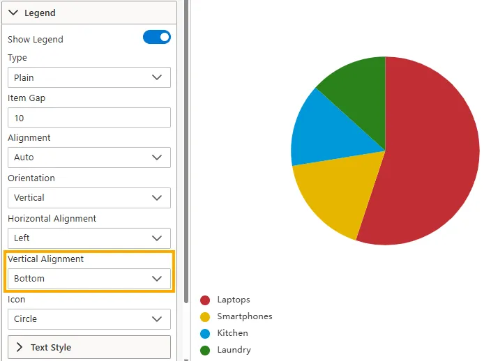
Vertical Alignment
Aligns the legend vertically within the chart area.
-
Top: Places the legend at the top.
-
Center: Places the legend in the center.
-
Bottom: Places the legend at the bottom.
-
-
Icon
Sets the shape of the icon displayed next to each legend item.
Options: Circle, Rect, RoundRect, Triangle, Diamond, Pin, Arrow.
-
Text Style (Expand to view options)
Customize the appearance of legend text:
-
Color -> Set the legend text color (e.g.,
#000000). -
Font Style -> Choose Normal, Italic, or Oblique.
-
Font Weight -> Choose Normal, Bold, Bolder, Lighter, or numeric values like 100, 200, 300, 400.
-
Font Size -> Set the size of the legend text in pixels (e.g.,
14). -
Width -> Define a fixed width (in pixels) for legend text (e.g.,
100). If not set, it adjusts automatically.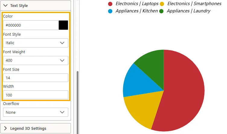
-
-
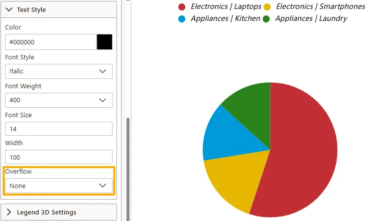
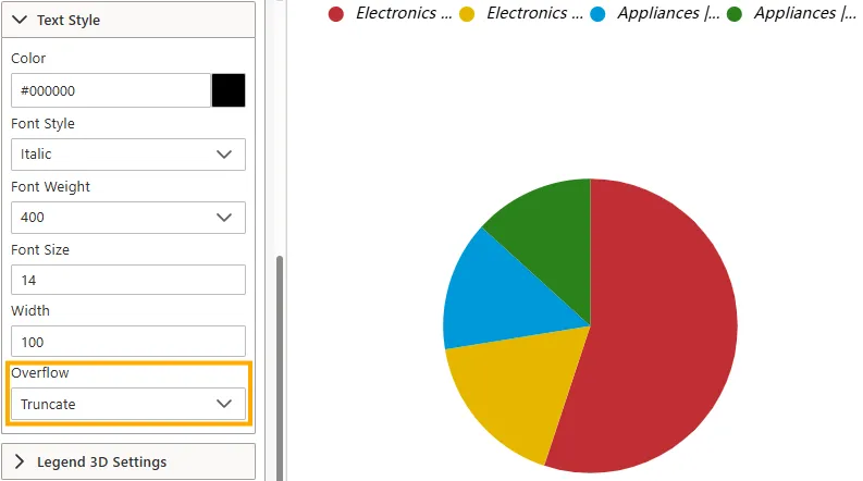
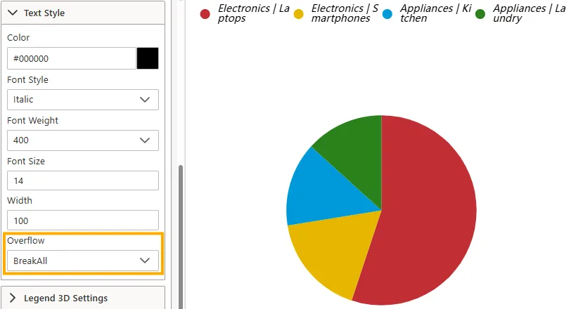
Overflow -> Determines how text behaves when it exceeds the defined width. Options:
-
None -> Text may overflow beyond the container.
-
Truncate -> Cuts off overflowing text with ellipsis.
-
Break -> Moves text to a new line when it reaches the width limit.

-
BreakAll -> Breaks text at any character to fit within width.
-
-
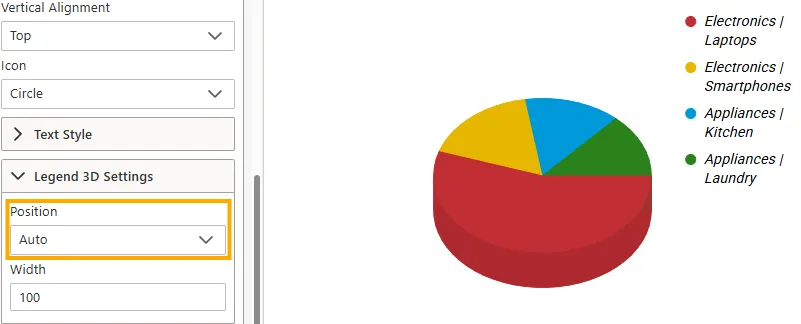
Legend 3D Settings (Expand to view options)
Customize how the legend appears when working with 3D charts.
-
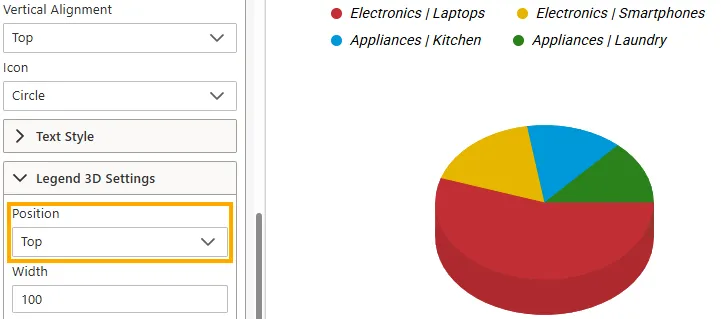
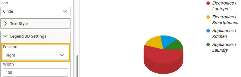
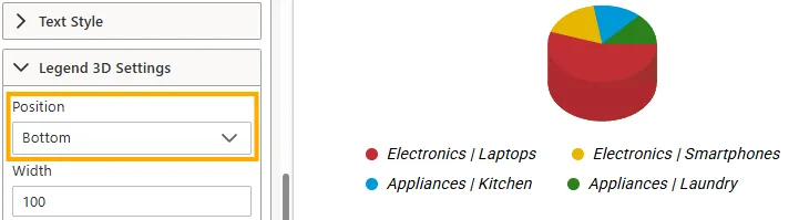
Position -> Defines where the legend is placed relative to the 3D chart.
-
Auto -> Automatically positions the legend based on available space.
-
Top -> Places the legend above the chart.
-
Right -> Places the legend on the right side.
-
Bottom -> Places the legend below the chart.
-
Left -> Places the legend on the left side.
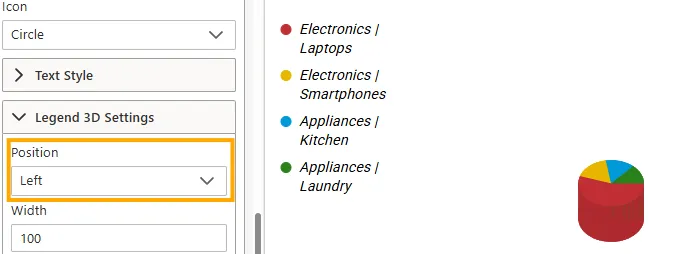
-
-
Width → Sets a fixed width (in pixels) for the legend container (e.g.,
100).
If not specified, it adjusts automatically based on the chart layout.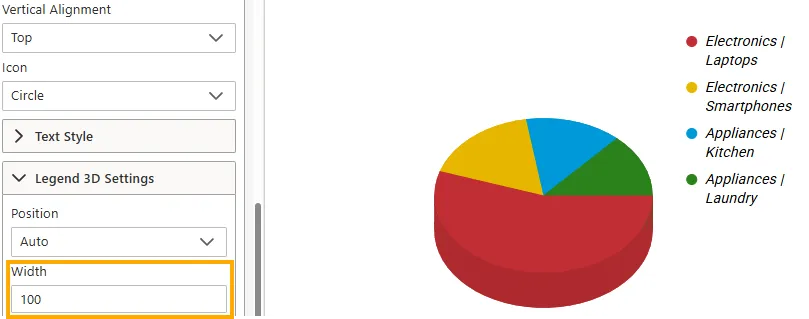
-
Use Cases
Legends provide quick visual identification of chart categories and series. Examples include:
| Use Case | Example | Why It Helps |
|---|---|---|
| Sales Breakdown | Legend lists product categories with unique colors | Users can quickly associate data series with their meaning. |
| Time Series Data | Legend shows multiple years or metrics | Helps distinguish between overlapping trends in the chart. |
| Comparative Analysis | Legend identifies business units or regions | Enables easy comparison without confusion. |
Summary
The Legend Properties give you full control over how chart series are represented. By adjusting visibility, alignment, orientation, icons, and text style, you can make legends both clear and space-efficient, ensuring users interpret your visualization correctly.