Tooltip
Introduction
The Tooltip Properties allows you to configure the interactive pop-up that appears when a user hovers over elements in your chart, providing detailed information about the data point.
Purpose
To customize the appearance, behavior, and content of tooltips in order to enhance user understanding and interaction with the visualization.
Tooltip Properties
Click to view Tooltip Properties
-
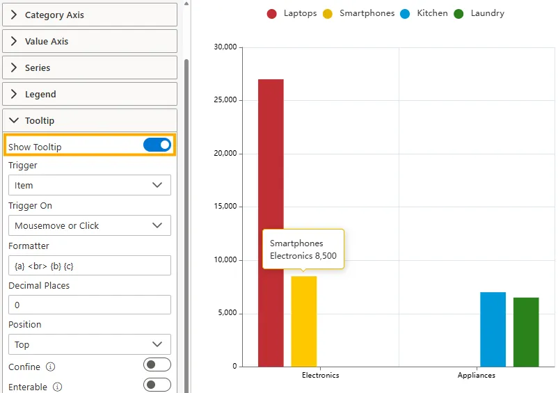
Show Tooltip
Toggle this switch ON to enable tooltips, or OFF to disable them.
-
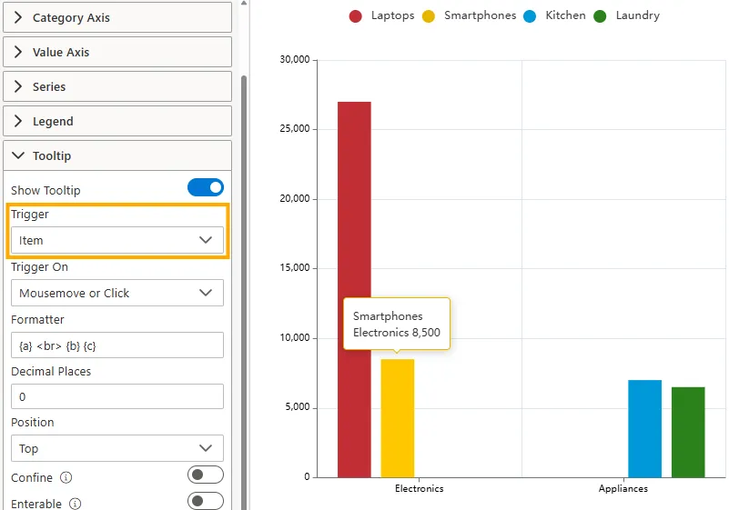
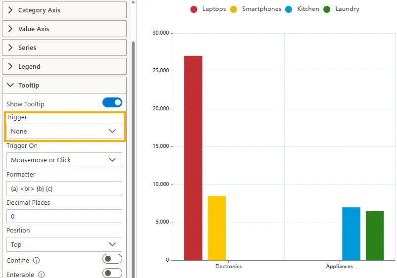
Trigger
Defines what type of element activates the tooltip.
-
Item: Triggered by an individual data item. Commonly used for charts without a category axis (e.g., scatter charts, pie charts). The tooltip appears when hovering over a single element, such as a bar, slice, or point.
-
Axis: Triggered by the chart’s axis. Mainly used for charts with a category axis (e.g., bar charts, line charts). The tooltip shows information for all data items aligned with the hovered axis position.
-
None: Disables tooltip triggering. No tooltip will appear when interacting with the chart.
-
-
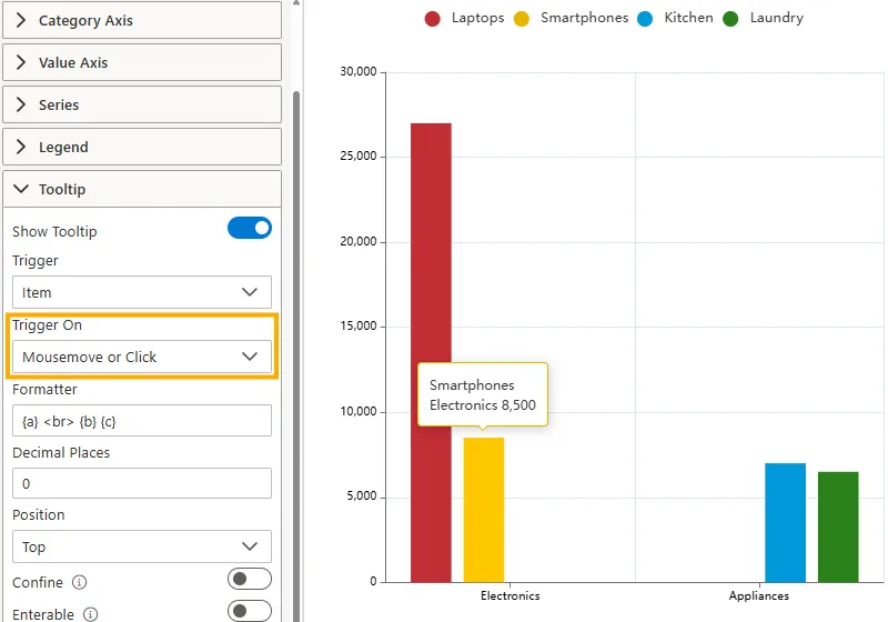
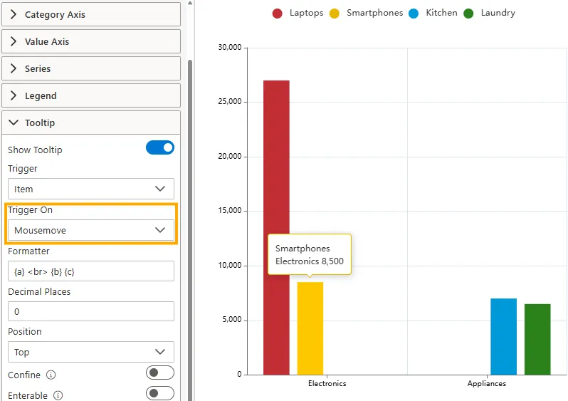
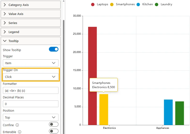
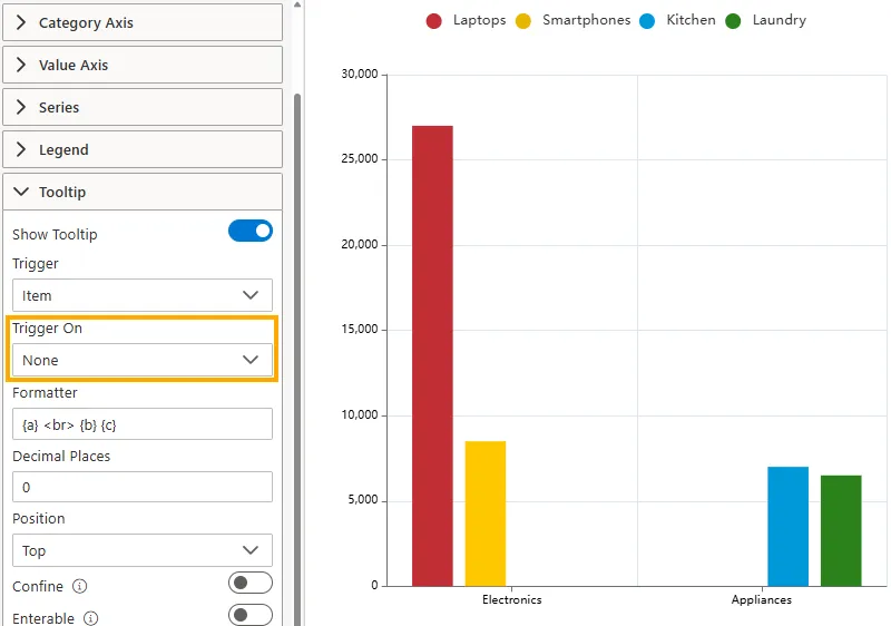
Trigger On
Specifies the user action that activates the tooltip.
-
Mousemove or Click: The tooltip appears when the user either hovers over a chart element or clicks on it.
-
Mousemove: The tooltip appears only when hovering the mouse over a chart element.
-
Click: The tooltip appears only when the user clicks on a chart element.
-
None: Disables tooltip activation. No tooltip will appear on interaction.
-
-
Formatter
Use a custom format string to define the content and layout of the tooltip.
-
Placeholders:
-
{a}= series name -
{b}= category name -
{c}= value or percentage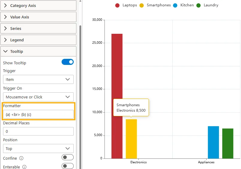
-
-
Template Variables:
The tooltip supports placeholders
{a},{b},{c}, and{d}.Placeholder Common Meaning Notes by Chart Type {a} Series name Always represents the series name across all chart types. {b} Data/category name For line/bar charts it’s the category, for pie/funnel it’s the data item name, and for maps it’s the area name. {c} Data value Numeric value (e.g., sales, revenue, count). For maps it represents the merged data value. {d} Extra info Often unused. For pie/funnel/gauge charts, it represents the percentage. 
-
-
Decimal Places
Set the number of decimal places for numerical values displayed within the tooltip (e.g.,
0for whole numbers).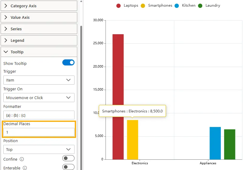
-
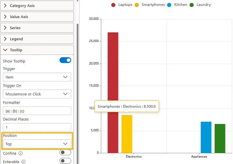
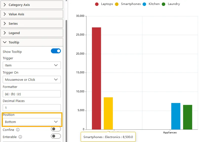
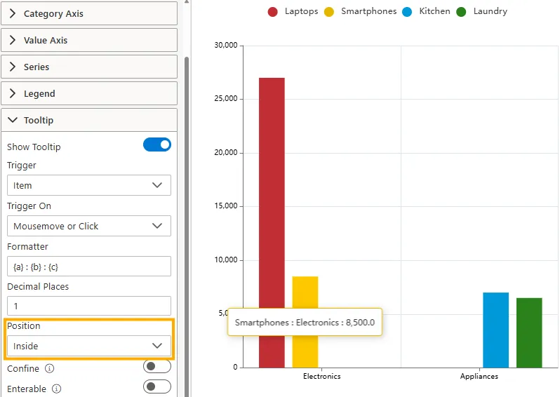
Position
Sets the tooltip box position relative to the mouse pointer or the triggered element.
-
Top: Displays the tooltip above the cursor or element.
-
Bottom: Displays the tooltip below the cursor or element.
-
Left: Displays the tooltip to the left of the cursor or element.

-
Right: Displays the tooltip to the right of the cursor or element.

-
Inside: Displays the tooltip inside the chart element itself (e.g., inside a bar, slice, or point).
-
-
Confine
When ON, the tooltip box is restricted within the chart area, preventing it from going off the edge of the screen and ensuring it always remains visible.

-
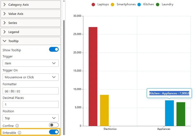
Enterable
When ON, the tooltip remains visible even when the mouse cursor moves inside it. This is useful when you need to copy text or interact with the content inside the tooltip without it disappearing.
-
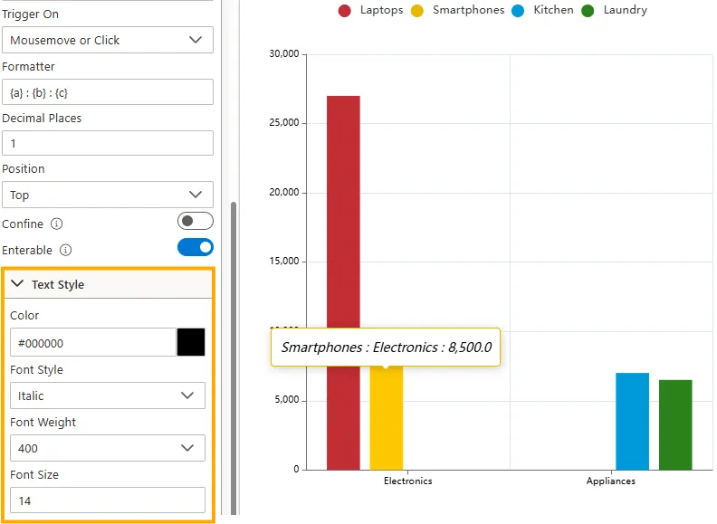
Text Style (Expand to view options)
Customize the appearance of the text within the tooltip:
-
Color -> Set the tooltip text color (e.g.,
#000000). -
Font Style -> Choose Normal, Italic, or Oblique.
-
Font Weight -> Choose Normal, Bold, Bolder, Lighter, or numeric values like 100, 200, 300, 400.
-
Font Size -> Set the size of the tooltip text in pixels (e.g.,
14).
-
Use Cases
Tooltips provide quick, contextual insights without cluttering the chart. Examples include:
| Use Case | Example | Why It Helps |
|---|---|---|
| Sales Analysis | Hovering over a bar shows Product Name and Revenue | Users can instantly see values without opening a detailed table. |
| Financial Reporting | Hovering on a line point shows Date and Closing Price | Makes trends clearer with precise values. |
| Customer Insights | Tooltip shows Customer Name, Region, Purchase History | Quick access to context without additional clicks. |
Summary
The Tooltip Properties provides flexible options to control how information is displayed when users interact with your chart. By adjusting triggers, format, style, and behavior, you can deliver tooltips that are both informative and user-friendly.