Line / Area Chart
Introduction
The Line Chart and Area Chart widgets allow you to visualize trends over time or continuous data.
- Line Chart - Displays data points connected by straight lines. Ideal for trend analysis.
- Area Chart - Similar to Line Chart but with the area below the line filled. Useful for showing cumulative values.
These charts are widely used for time series analysis or continuous variable comparisons.
Purpose
To analyze trends and changes over time.
They are particularly effective when you want to:
- Visualize time-based trends (e.g., monthly sales, website traffic).
- Compare multiple series using stacked or overlapping areas.
- Highlight cumulative totals (Area Chart) or exact trends (Line Chart).
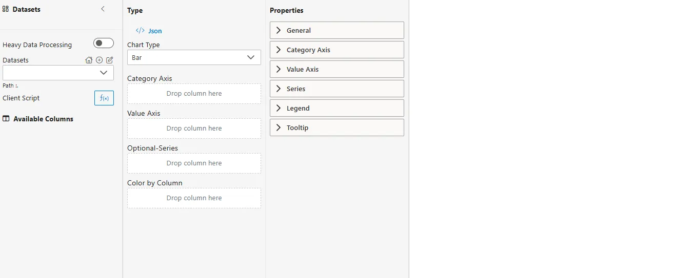
Steps to Create a Line / Area Chart
-
From the left vertical menu, select the Charts icon.
-
A widget will be automatically added to the Viz canvas.
-
Select Dataset
-
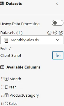
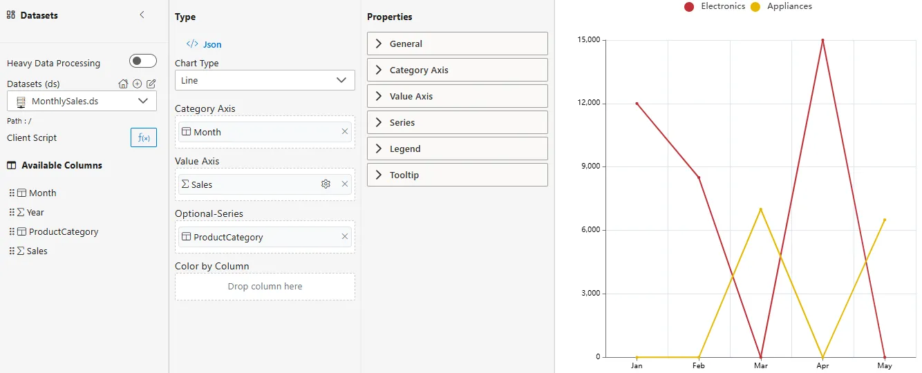
From the Datasets dropdown, choose your dataset (e.g.,
MonthlySales.ds). -
Available columns will be displayed in the Available Columns panel.
-
Sample Dataset (MonthlySales.ds)
| Month | Year | ProductCategory | Sales |
|---|---|---|---|
| Jan | 2023 | Electronics | 12000 |
| Feb | 2023 | Electronics | 8500 |
| Mar | 2023 | Appliances | 7000 |
| Apr | 2023 | Electronics | 15000 |
| May | 2023 | Appliances | 6500 |
Configuration Steps
-
Select Chart Type
- From the Chart Type dropdown in the Properties Panel, choose Line or Area.
-
Assign Category Axis
- Drag a categorical or time column into the Category Axis field.
- Defines the categories or time periods along the horizontal axis.
- Example:
Month.
-
Assign Value Axis
- Drag a numerical column into the Y-Axis field.
- Determines the values plotted along the vertical axis.
- Example:
Sales.
-
Configure Aggregator
- Click on the
 icon next to the Y-Axis field.
 - Choose an Aggregator to define how values are calculated:
- Sum – Total of all values.
- Average – Mean value.
- Min – Minimum value.
- Max – Maximum value.
- Count – Number of records.
- Distinct Count – Unique count of records.
- Click on the
-
Optional – Series
- Drag another categorical column into the Series field.
- This creates multiple lines/areas, one for each unique value in the series column.
- Example: Compare
ProductCategorytrends over months.
-
Optional – Color by Column
-
Assign colors by dragging a categorical column here.
-
Alternative way to color lines/areas if Series is not used.
-
Common Functionalities (Properties Panel)
- General
- X-Axis: Labels, ticks, display range.
- Y-Axis: Scale, labels, display range.
- Series: Line width, color, markers.
- Legend
- Tooltip
Use Case: Website Traffic Trend
Introduction
The Website Traffic Trend use case demonstrates how Line and Area Charts can track daily visitor counts, compare different traffic sources, and highlight peak periods of user engagement.
Sample Dataset (WebsiteTraffic.ds)
| Date | Source | Visitors |
|---|---|---|
| 2023-01-01 | Organic | 1200 |
| 2023-01-01 | Paid Ads | 800 |
| 2023-01-02 | Organic | 1500 |
| 2023-01-02 | Social Media | 600 |
| 2023-01-03 | Paid Ads | 950 |
How to Configure
-
Category Axis ->
Date -
Value Axis ->
Visitors(Aggregator = Sum) -
Optional Series ->
Source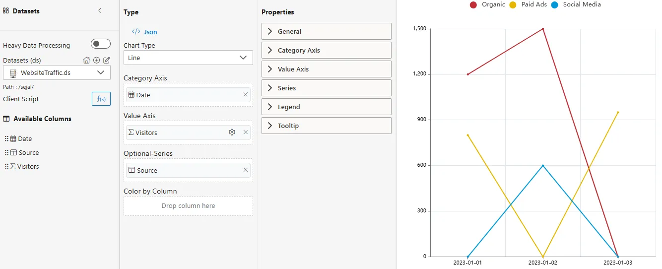
Business Questions Answered
- How does daily traffic vary across different sources?
- Which source contributes the most visitors over time?
- Are there specific dates where traffic peaks or drops?
Summary
- Line Chart -> Best for precise analysis of visitor trends.
- Area Chart -> Useful for showing cumulative contribution of traffic sources.
- Series Comparison -> Compare Organic, Paid, and Social Media traffic in one view.