Pie / Donut Chart
Introduction
The Pie Chart and Donut Chart widgets allow you to visualize proportions of a whole.
Each slice represents a category’s contribution relative to the total.
- Pie Chart – Circular chart divided into slices.
- Donut Chart – Similar to a pie chart but with a hole in the middle for a modern look or to display totals.
These charts are best for showing percentage or proportional data at a glance.
Purpose
To show proportions of categories within a whole.
They are particularly effective when you want to:
- Highlight relative contribution of each category.
- Show percentage breakdowns rather than absolute values.
- Use Donut Chart for better readability when you also want to show the total in the center.
- Avoid when there are too many categories, as slices become difficult to compare.
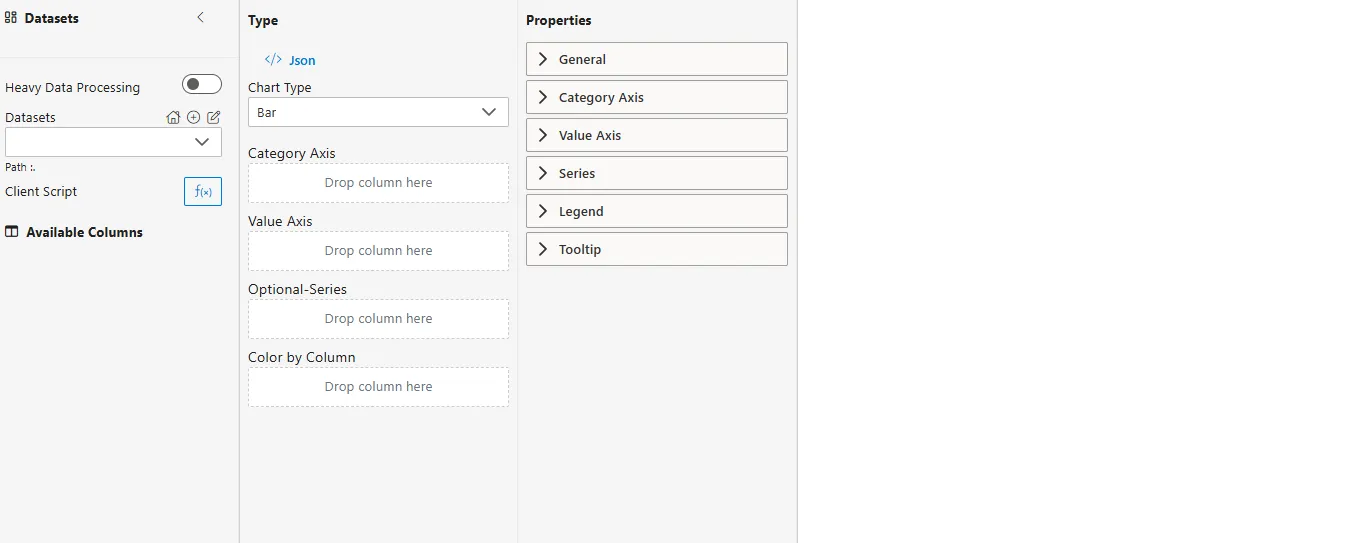
Steps to Create a Pie / Donut Chart
-
From the left vertical menu, select the Charts icon.
-
A widget will be automatically added to the Viz canvas.
-
Select Dataset
-
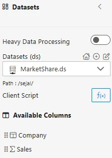
From the Datasets dropdown, choose your dataset (e.g.,
MarketShare.ds). -
Available columns will be displayed in the Available Columns panel.
-
Sample Dataset (MarketShare.ds)
| Company | Sales |
|---|---|
| Alpha Corp | 45000 |
| Beta Ltd | 30000 |
| Gamma Inc | 20000 |
| Delta Co | 15000 |
| Epsilon Group | 10000 |
Configuration Steps
-
Select Chart Type
- From the Type dropdown in the Properties Panel, choose Pie or Donut.
-
Assign Category Field
- Drag a categorical column to the Category field.
- Defines the slices of the chart.
- Example:
Company
-
Assign Value Field
- Drag a numerical column into the Values field.
- Determines the size of each slice.
- Example:
Sales
-
Configure Aggregator
- Click on the
 icon next to the Values field.
 - Choose an Aggregator to define how values are calculated:
- Count – Number of records.
- Distinct Count – Unique count of records.
- Sum – Total of all values.
- Average – Mean value.
- Min – Minimum value.
- Max – Maximum value.
- Click on the
-
Optional – Color by Column
-
Assign colors by dragging a categorical column here.
-
Example: Color by
Company.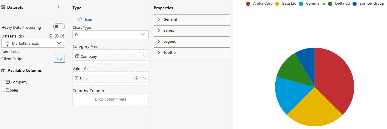
-
Common Functionalities (Properties Panel)
- General
- Labels: Show/hide category names, values, or percentages.
- Colors: Configure custom palette for slices.
- Legend
- Tooltip
Use Case: Employee Performance
Introduction
The Employee Performance use case demonstrates how Pie and Donut Charts can show proportional contributions. By visualizing department-level shares, managers can easily identify which areas contribute most to overall performance.
Sample Dataset (EmployeePerformance.ds)
| Department | Employee | Score |
|---|---|---|
| Sales | John | 85 |
| Sales | Mary | 90 |
| HR | Anita | 75 |
| HR | Rahul | 82 |
| IT | Sanjay | 95 |
| IT | Priya | 88 |
How to Configure
-
Category ->
Department -
Value ->
Score(Aggregator = Sum)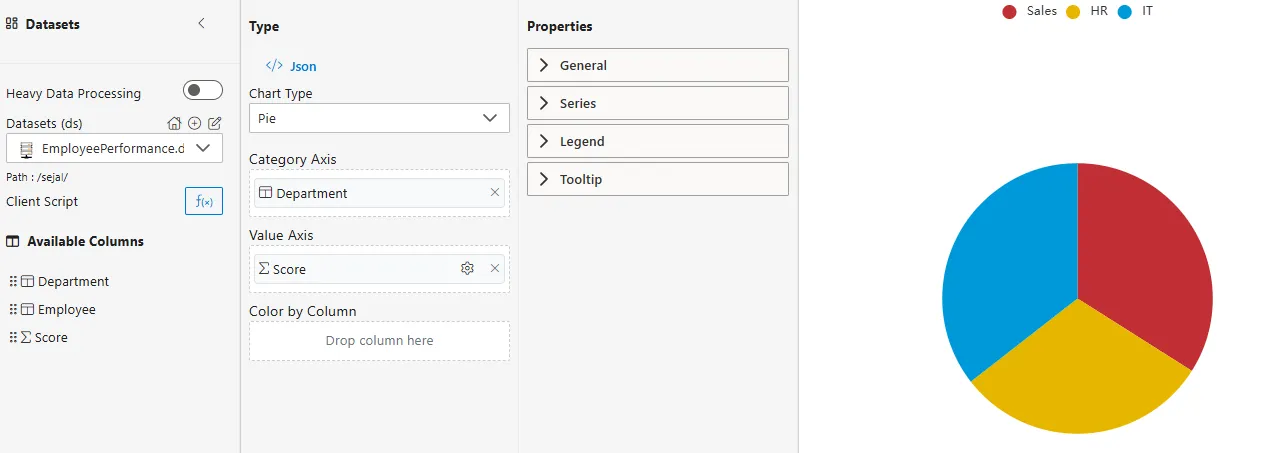
Business Questions Answered
- Pie Chart -> What percentage of the total performance score does each department contribute?
- Donut Chart -> Which department contributes most, and how does the total look in the center?
- Employee-level Pie Chart -> How do individual employees contribute to the total departmental performance?
Summary
The Employee Performance use case illustrates how Pie and Donut Charts can provide insights into proportions.
- Pie Chart -> Best for simple breakdowns of a few categories.
- Donut Chart -> More modern look and supports showing totals in the center.
- Employee/Department slices -> Help identify major contributors at both levels.