Image and Text Widget
Introduction
Easily add branding elements, instructions, annotations, or any visual content. This widget allows you to:
- Upload and display images
- Insert styled text or headings
- Combine visuals with informative content
Purpose
The widget is designed for storytelling and annotation by letting you write formatted text and embed images like PNG, JPG, or SVG into your visualizations.
Steps to add Image and Text Widget
-
From the left-side widget panel, click the Image & Text Widget icon.
-
A new widget block labeled Image and Text will appear on your canvas.
-
Enter and Format Text
You’ll see a rich-text editor (like Word or Google Docs). You can:
Feature Description Example Use Bold Makes text bold. Important Italic Italicizes text. Note Underline Underlines text. Summary Strikethrough Adds a line through text. Old ValueBackground Color Highlights text with a background color. Revenue ↑ Font Color Change text color. Warning Bullet List Adds bullet points. - Item 1
- Item 2Number List Adds numbered list. 1. Step One
2. Step TwoSubscript Makes text appear smaller and below baseline. H₂O Superscript Makes text appear smaller and above baseline. X² , 10⁵ Move Text Left/Right Shifts the selected text one step to the left or right when the corresponding option is clicked. Selected text moves left ⬅️ or right ➡️ by one step Font Size Options Provides preset font sizes: Small, Normal, Large, Huge. Small
Normal
Large
HugeHeading Levels Formats text as headings from H1–H6, or Normal text. # Heading 1
## Heading 2
### Heading 3 …
###### Heading 6Font Family Choose a font style. Courier Text Paragraph Alignment Aligns text to Left, Center, Right, or Justify for block text. Left
Center
Right
JustifyRemove Formatting Clears all formatting from selected text (bold, italic, underline, colors, sizes, headings, etc.), reverting to plain text. Normal Text Insert Link Turns selected text into a clickable hyperlink that opens a URL. AIVHUB Insert Image Upload and embed an image directly from your computer into the editor. Type your message directly in the
Enter Textbox, and use the above tools to format it. -
Upload and Insert Images
Below the text box, there’s a section titled Image Upload Panel.
How Upload Works:
- Click the
 button.
 - A file selector opens — choose one or more
.jpg,.png, or.svgfiles from your system. - Once uploaded, images will:
- Appear in a list view above the Upload button.
- Automatically be stored for use in the widget.
To Use an Uploaded Image:
- Place your cursor where you want the image in the text box.
- Select the desired image from the upload list (e.g.,
logo.png,swiggylogo.jpg). - The image will be embedded into the text content inline.
- Click the
-
Publish the Widget
Once you’re done designing:
-
Click Publish button at the top right.
-
The widget is now live and visible in your Viz.
If needed, click Canvas View to go back to layout mode.
-
Use Cases
The Image and Text Widget is a versatile tool for adding context, branding, and narrative to your dashboards. It excels where raw data and charts alone are not enough.
| Use Case | Description | Key Features Used | Benefit |
|---|---|---|---|
| Dashboard Title and Branding | Create a professional header for your dashboard with your company logo, a title, and a brief description or date range. | Image Upload, Font Sizing, Bold Text, Center Alignment | Establishes a clear, branded, and professional entry point for any visualization, immediately setting the context for the user. |
| Annotating a Chart or KPI | Place the widget next to a complex chart or a key performance indicator (KPI) to explain trends, anomalies, or important context. | Bullet Points, Font Color, Italic Text | Prevents misinterpretation of data by providing crucial narrative. Answers the “why” behind the numbers (e.g., “Spike in sales due to holiday promotion”). |
| Creating a “Key Takeaway” Box | Summarize the most critical insight from the entire dashboard in a visually distinct box with an icon and bold text. | Font Sizing, Font Color, Image Upload (for icons), Bold Text | Directs the attention of busy executives or stakeholders to the single most important message, saving them time and ensuring the main point is not missed. |
| User Guide or Instructions | Provide instructions on how to use the dashboard, explaining filters, drill-downs, or data sources. | Numbered Lists, Hyperlinks, Bold Text | Improves user adoption and reduces support questions by embedding help directly within the dashboard interface. |
| Displaying Static Information | Show important static content like contact information for the BI team, data refresh disclaimers, or links to external documentation. | Hyperlinks, Font Styles | Provides essential metadata and support channels, making the dashboard a more complete and trusted resource. |
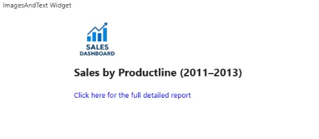
Example Scenario: Sales by Productline Dashboard
Objective
Create an engaging and informative header for a “Sales by Productline” dashboard.
The header should include a company logo, a clear title, a summary of the key achievement, and a link to the detailed report.
Assets Needed
Before you start, make sure you have this file on your computer:
company-logo.png(Your company’s official logo)
Steps
-
Add the Widget
- On your Sales dashboard, add a new Image and Text Widget at the top.
-
Upload Your Asset
- Upload
company-logo.png.
- Upload
-
Compose the Header Content
-
Step 3.1: Insert the Logo
Insert the company logo at the top of the Textarea. -
Step 3.2: Add the Title
Type:Sales by Productline (2011–2013)Make it Bold and use a Large font size.
-
Step 3.3: Add a Hyperlink
Add a link to your report. Use HTML so it opens in a new tab:
<a href="https://aiv.test.oneaiv.com:8086/aiv/embed/external/594c5971436f6741626554617844427452466a6770713253364e4c7852444952435963516c4e41554c3755253344/a_u__Admin&a_p__&a_t__eyJhbGciOiJIUzI1NiJ9.eyJzdWIiOiJBZG1pbjo6RGVmYXVsdCIsImlhdCI6MTc1NjQ1NTkyN30.SPIBRuHv_G606wVMFkYqxZVIiJslB3rNoeTJQh_fZQg&a_d__Default&a_ex__&a_af__false/noparam" target="_blank">
Click here for the full detailed report
</a>
-
-
Final Styling
- Center-align all content for a clean, banner-like appearance.
Visual Outcome