Spreadsheet Widget
Introduction
The Spreadsheet Widget in AIV allows users to interact with tabular data in a familiar Excel-style interface. This widget supports rich cell formatting, editing, sorting, protection, and client-side scripting—making it ideal for both data exploration and presentation.
Adding the Spreadsheet Widget
-
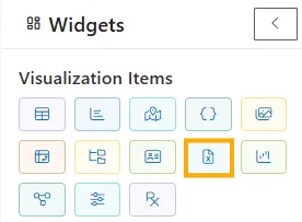
On the blank Viz, select the Spreadsheet Widget from the vertical left toolbar.
-
The widget is automatically added to the canvas with editable configuration options on the left panel.
Configuration Panel Options
The left sidebar of the Spreadsheet Widget offers a range of options grouped into interactive checkboxes and input areas:
General Settings
| Option | Description |
|---|---|
| Allow Editing | Enables cell-level editing |
| Allow CellFormatting | Lets you format font, size, color, background, etc. |
| Sorting | Allows column-wise data sorting |
| Allow Hyperlink | Supports insertion of hyperlinks |
| Enable Clipboard | Enables copy/paste functionality |
| Allow Image | Lets you insert images in cells |
| Allow UndoRedo | Enables undo/redo history |
| Resizing | Enables resizing of rows and columns |
| Show Ribbon | Displays the top Ribbon UI (Home, Insert, Formulas, etc.) |
| Show FormulaBar | Displays formula bar above the sheet |
| Filtering | Enables filter icons on columns |
| Allow Protection | Allows protection of certain cells or sheets |
| Allow Scrolling | Enables vertical and horizontal scrolling |
| Allow FindAndReplace | Adds find and replace support |
| Allow Chart | Enables in-sheet chart visualizations |
-
Heavy Data Processing Toggle: Enable for large datasets or advanced processing use cases.
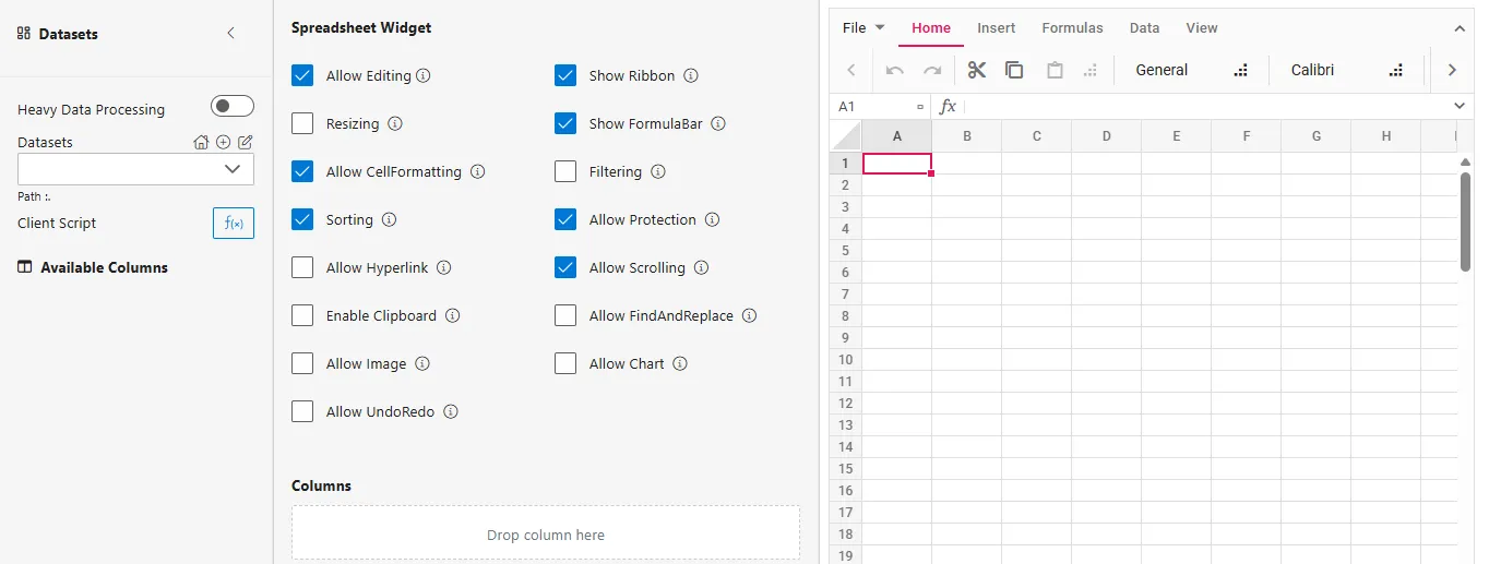
Dataset Configuration
On the left, below the widget settings:
- Datasets Dropdown: Select a dataset to bind to the spreadsheet.
- Available Columns: Drag and drop columns from the selected dataset into the columns.
Client Script (Optional Data Filtering)
You can filter or preprocess your dataset dynamically using the Client Script before it’s used in the card. This is useful for narrowing down data or performing aggregations.
Steps: Apply Client Script Filter
-
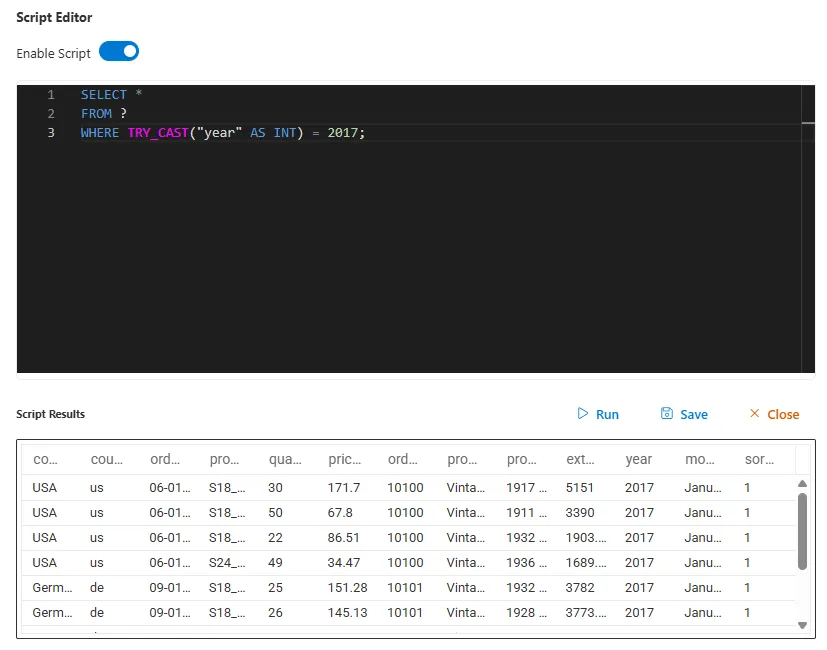
Click on the fx() Client Script button located in the Datasets section, below the dataset dropdown.
-
Enable the script toggle (switch it ON) at the top right of the script editor.
-
Enter a SQL-like query to filter or transform your data.
Example:SQL
SELECT * FROM ? WHERE "month" = 'February';-
The
?automatically refers to the selected dataset. -
You can use standard SQL syntax for filtering, ordering, and selecting columns.
-
-
Click Run to preview the result of your script.
-
Click Save to apply the filter to the widget.
-
Confirm that your card widget updates with the filtered data.
Spreadsheet Features
✅ Cell Formatting
Apply rich formatting including:
- Font: Change typeface (e.g., Calibri → Arial)
- Font Size: Choose from sizes like 11, 14, etc.
- Bold, Italic, Underline
- Text Color: e.g.,
#d9e2f3 - Background Fill: e.g.,
#ffe599 - Cell Format: Switch between formats like General, Number, Date, etc.
✅ Toolbar Access
- The Ribbon menu offers tabs like:
- Home: Font, alignment, style tools
- Insert, Formulas, Data, View (if enabled)
Example Use Case
- Select the “car” dataset from the dropdown.
- Drag column headers into the sheet.
- Format the header row:
- Make it bold
- Set font size to 14
- Change text color and background color
- Protect important cells if needed.
- Click Publish to save and deploy the visualization.
Final Output
The widget will display an Excel-like editable interface, respecting all user-selected features. Formatting is instantly applied, and users can interact with data just like in a spreadsheet.
Summary
The Spreadsheet Widget is a dynamic, configurable interface that supports editable tabular views, Excel-like formatting, dataset integration, and client-side enhancements. It’s perfect for reporting, data manipulation, and Vizs requiring in-cell interaction.
💡 Use Cases
The Spreadsheet Widget is more than just a data viewer; it’s an interactive workspace. It’s the perfect choice when users need to not only see data but also manipulate, model, or annotate it.
| Use Case | Who It’s For | Key Features Used | Benefit |
|---|---|---|---|
| Interactive “What-If” Analysis | Financial Analysts, Sales Managers | Allow Editing, Formulas, Cell Formatting | Users can change input values (e.g., growth rate, price) in certain cells and see the calculated impact on other cells (e.g., forecasted revenue) in real-time, all within the dashboard. |
| Collaborative Data Review & Annotation | Business Teams, Project Managers | Allow Editing, Cell Formatting (background colors), Comments (if supported) | A team can review a list of items (e.g., monthly expenses, project tasks) and mark them up directly in the sheet—coloring rows green for “Approved,” yellow for “Review,” or red for “Rejected.” |
| Ad-Hoc Data Cleansing & Preparation | Data Analysts | Allow Editing, FindAndReplace, Sorting, Filtering | Before using data in other charts, an analyst can quickly fix typos, standardize category names, or remove outliers directly in the spreadsheet interface without needing to go back to the source. |
| Simple Budgeting & Forecasting | Department Heads, Small Business Owners | Allow Editing, Formulas, Protection | Create a simple budget template where users can input their planned expenses into editable cells, while cells containing formulas (like totals and variances) are protected from accidental changes. |
| Creating Highly Formatted, Printable Reports | All Users | Cell Formatting, Resizing, Allow Image | Design pixel-perfect tables that look exactly like a traditional spreadsheet report, complete with merged cells, specific borders, company logos, and custom layouts suitable for printing or exporting to PDF. |
🧪 Example Scenario: Creating an Interactive Sales Forecast
🎯 Objective
A sales manager needs to review the actual sales figures from the previous quarter and create a forecast for the next quarter. They want to be able to manually input their forecast numbers and see the variance calculated automatically.
📁 Sample Dataset (QuarterlySales)
The widget is initially connected to a dataset containing actual sales data.
| Product | Region | ActualSales |
|---|---|---|
| Alpha-1 | North | 150,000 |
| Alpha-1 | West | 120,000 |
| Beta-2 | North | 95,000 |
| Beta-2 | West | 110,000 |
🧭 Steps to Configure and Use the Widget
-
Add Widget and Connect Data
- Add a Spreadsheet Widget to the canvas.
- Connect it to the
QuarterlySalesdataset. The data forProduct,Region, andActualSalespopulates the first three columns (A, B, C).
-
Enable Key Features
- In the configuration panel, ensure the following are checked:
- ✅ Allow Editing
- ✅ Allow CellFormatting
- ✅ Show Ribbon
- ✅ Show FormulaBar
- ✅ Allow Protection
- In the configuration panel, ensure the following are checked:
-
Prepare the Forecast Sheet
- Add New Columns: The sales manager adds two new headers in the sheet:
ForecastedSalesin cell D1 andVariancein cell E1. - Format Headers: They select the header row (Row 1), make the text Bold, and apply a light blue background fill to distinguish it.
- Add New Columns: The sales manager adds two new headers in the sheet:
-
Enter Forecast Data (Interactive Editing)
- The manager now manually enters their forecast numbers into the
ForecastedSalescolumn (Column D). For example, for “Alpha-1” in the North region, they might forecast160,000.
- The manager now manually enters their forecast numbers into the
-
Use a Formula for Automatic Calculation
- In the
Variancecolumn (cell E2), the manager clicks on the cell and types a formula into the Formula Bar:=D2-C2. - They then drag the fill handle (the small square at the bottom-right of cell E2) down to apply this formula to all the rows. The variance is now calculated automatically for each product/region.
- In the
-
Apply Protection
- To prevent accidental changes to the original data, the manager selects the
ActualSalescolumn (Column C), right-clicks, and chooses “Protect Cells.”
- To prevent accidental changes to the original data, the manager selects the
-
Publish the Dashboard
- The manager clicks Publish.
🖼️ The Final User Experience
The sales manager now has a powerful, interactive forecasting tool on their dashboard:
- A Living Document: The widget displays both historical data (
ActualSales) and the user-generated forecast (ForecastedSales) side-by-side. - Instant Feedback: As they adjust numbers in the
ForecastedSalescolumn, theVariancecolumn updates instantly, showing the difference between actuals and their forecast. - Data Integrity: The original
ActualSalesdata is locked and cannot be accidentally overwritten. - Professional Look: The formatted headers make the sheet easy to read and understand.
This scenario perfectly illustrates how the Spreadsheet Widget transforms a static data view into a dynamic workspace for planning, analysis, and decision-making.