Table Widget
The Table Widget is a core component designed to present structured data in a clear, interactive, and customizable format. It transforms raw datasets into organized tables that can be sorted, filtered, styled, and extended with scripts—making it easier to explore data, compare records, and perform quick analysis.
Purpose
To visualize structured data in a flexible tabular layout with column-level formatting, conditional logic, and advanced features like filtering, pagination, and scripting.
Key Features
-
Data Display: Structured layout with a responsive design that efficiently handles thousands of records.
-
Sorting: Single or multi-column with ascending and descending order.
-
Filtering: Column-level filters with support for multiple conditions.
-
Custom Columns: Create calculated fields add HTML/JS for dynamic content such as badges, icons, and buttons.
-
Conditional Formatting: Apply row or cell styles (colors, icons, font rules) based on defined logic.
-
Pagination: Page navigation with configurable rows per page and jump-to-page support.
-
Column & Header Styling: Control alignment, width, fonts, colors, and borders.
-
Performance Options: Virtualization and optimized data processing for large datasets.
Steps to Create a Table Widget
-
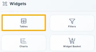
From the left vertical menu, click the Tables icon.
-
A new screen appears to configure the widget.
-
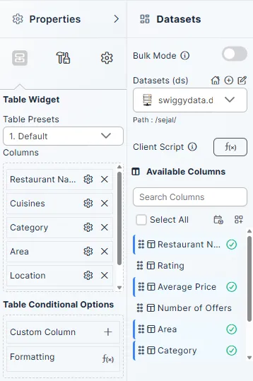
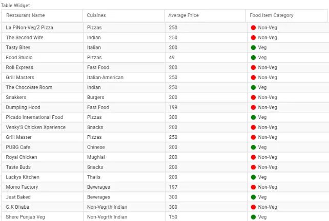
From the Dataset dropdown, select a dataset (for example, swiggydata.ds).
-
Columns from the selected dataset appear in Available Columns.
-
Drag and drop the required columns (for example, Restaurant Name, Cuisines, Average Price, Category, Area, Location) into the Columns section of the widget.
Configuring the Widget
Client Script
-
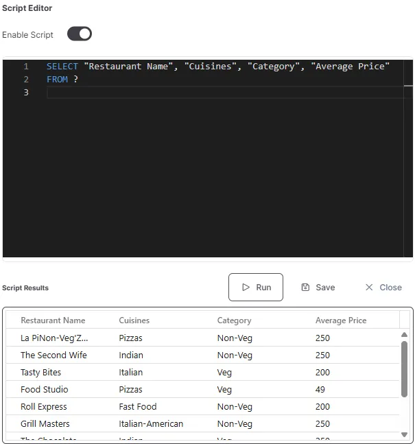
Select Dataset: Choose a dataset (e.g., swiggy.ds).
-
Click on
 to open Script Editor screen.
 -
Optional Filter Logic (Client Script): Apply SQL-like filters before rendering.
Example:
SELECT * FROM ? WHERE “Category” = ‘Non-Veg’
This filters the dataset before it reaches the table.
--- link to client script
Add Columns
-
Drag columns (e.g., Restaurant Name, Cuisines, Average Price, Category) into the widget.
-
You can add calculated or styled columns to enrich your dataset table.
Steps to Create a Custom Column
-
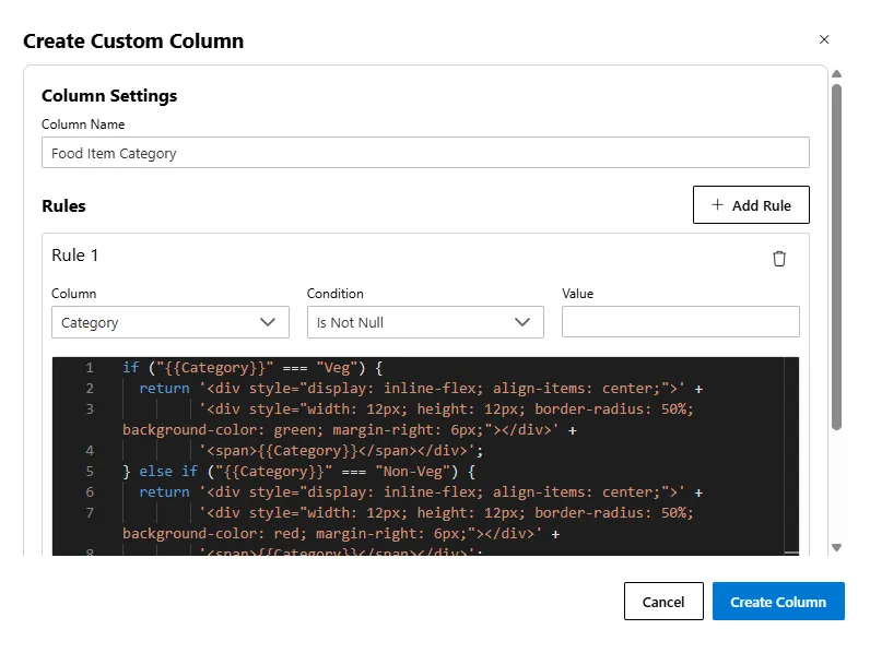
Click the ➕ icon next to Columns.
-
Enter a Column Name -> This is the label that will appear in your table (e.g., Food Item Category).
-
Set a Rule
-
Column -> The dataset field you want to check (e.g., Category).
-
Condition -> Logic applied to that column (e.g., Is Not Null, Equals, Greater Than, etc.).
-
Value -> The value to compare against (leave empty if not needed, e.g., for Is Not Null).
-
-
Add Rendering Code (JavaScript) to style the output dynamically.
-
Click Create Column -> The formatted column appears in your table.
Example: Veg/Non-Veg Indicator
-
Column Name -> Food Item Category
-
Column -> Category
-
Condition -> Is Not Null
-
Value -> (leave blank)
if ("{{Category}}" === "Veg") {
  return '<div style="display: inline-flex; align-items: center;">' +
         '<div style="width: 12px; height: 12px; border-radius: 50%; background-color: green; margin-right: 6px;"></div>' +
         '<span>{{Category}}</span></div>';
} else if ("{{Category}}" === "Non-Veg") {
  return '<div style="display: inline-flex; align-items: center;">' +
         '<div style="width: 12px; height: 12px; border-radius: 50%; background-color: red; margin-right: 6px;"></div>' +
         '<span>{{Category}}</span></div>';
} else {
  return '<div>{{Category}}</div>';
}
Output
Column Settings
Click the  icon next to any column to open its settings:
| Setting | Description |
|---|---|
| Column Name | Rename display name |
| Content Align | Align column data: Left, Center, Right |
| Width | Adjust column width in pixels |
Header Settings
You can customize headers for each column individually by clicking the icon next to the column name inside the Table Widget -> Columns section.
| Setting | Description |
|---|---|
| Header Align | Align the text in the header (Left, Center, or Right). |
| Text Color | Set the header font color using HEX code or color picker. |
| Background Color | Set the background color of the column header. |
| Font Size | Adjust the font size of the header text (e.g., 12px, 16px). |
| Font Weight | Choose from Normal, Bold, or other weight levels. |
| Font Style | Pick between Normal, Italic, etc., for header text style. |
These settings allow for per-column header formatting — useful for highlighting key fields (e.g., metric columns in bold or different background colors).
Format Value
Format the display of data within the cells of this column. This is especially useful for numeric values.
| Setting | Description | Example |
|---|---|---|
| Decimal Places | Specify the number of decimal points to display. | 2 formats 150 as 150.00. |
| Before Symbol | Add a prefix symbol or text before the value. | $ formats 150 as $150. |
| After Symbol | Add a suffix symbol or text after the value. | kg formats 150 as 150 kg. |
| Thousands Separator | Enable to display a comma as a thousands separator. | Formats 1000000 as 1,000,000. |
| Percent | Format the value as a percentage (multiplies by 100 and adds %). | Formats 0.95 as 95%. |
How to Use
- Click on the icon next to the desired column in the Table Widget -> Columns section.
- In the pop-up panel, expand the Header Settings section.
- Apply your header text formatting, including alignment, color, background color, size, weight, and style.
- Click outside the panel or press Enter to apply changes.
Example: To make the header of the Restaurant Name column appear distinct, set Font Weight: Bold, Text Color: #000000, and Background Color: #e0e0e0.
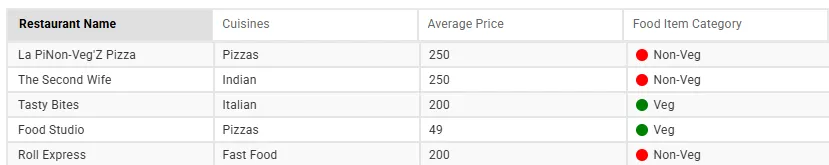
Table Settings
Expand the Table Settings panel to configure table-wide features:
| Option | Description |
|---|---|
| Sorting | Enable/disable column sorting |
| Multisorting | Allow sorting by multiple columns |
| Filtering | Enable column filter dropdowns |
| Show Column Menu | Show additional column-level options |
| Hide Scrollbar | Hides the vertical scrollbar, useful with pagination. |
| Virtualization | Improve performance for large datasets |
| Pagination | Paginate rows for cleaner display |
| Records per Page | Set number of rows per page (e.g., 10, 25, 50). This option is applicable only when Pagination is enabled. |
| Text Wrap | Wrap cell content for long text |
| Wrap Mode | Options: Both, Header, Value |
| Grid Lines | Control gridline visibility: • None -> No gridlines • Default -> System default style • Horizontal -> Show only row separators • Vertical -> Show only column separators • Both -> Show both row & column separators |
| Conditional Formatting (Row) | Click the f(x) icon to define styling rules |
| Row Height | Set height (in px) of each row (default: 25) |
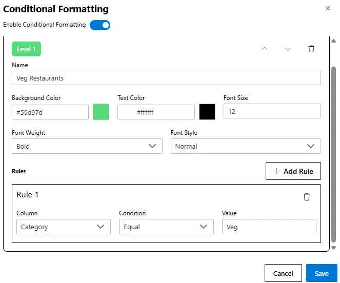
Steps to Apply Conditional Formatting
-
Enable Conditional Formatting
-
Go to Table Settings -> click f(x) Conditional Formatting (Row).
-
Toggle Enable Conditional Formatting -> ON.
-
-
Add a Formatting Level
- Click Add Level to create a new formatting rule.
-
Configure Formatting Options
-
Set Name, Background Color, Text Color, Font Size, Font Weight, and Font Style.
-
Each level can include multiple rules.
-
Example : Highlight Veg Restaurants
| Field | Value |
|---|---|
| Name | Veg Restaurants |
| Background Color | #59d97d (green) |
| Text Color | #ffffff |
| Font Weight | Bold |
| Rule | Column: Veg/Non-Veg -> Condition: Equals -> Value: Veg |
-
Each level can include multiple rules.
-
Click Save to apply changes.
Publishing
After customizing the widget:
- Click the Publish button (top-right).
- The table widget will appear on your dashboard canvas.
Header Settings
| Field | Description |
|---|---|
| Hide Header | Completely hides the header row of the table. |
| Name | Optional label for the level (e.g., High Performance) |
| Background Color | Set cell background (e.g., #59d97d) |
| Text Color | Text color (e.g., #ffffff) |
| Font Size | Enter font size (e.g., 12) |
| Font Weight | Choose from Normal, Bold, etc. |
| Font Style | Choose from Normal, Italic, etc. |
| Header Column Border Color | Set the color of the border around the header cell. |
Body Settings
These settings control the appearance of the table’s body, including row styling and pagination controls.
| Setting | Description |
|---|---|
| Body Background Color | Sets the overall background color for the table body (e.g., #ffffff). |
| Body Font Size | Defines the font size for the data within the table cells (e.g., 12 px). |
| Row Border Color | Sets the color of horizontal lines between rows (e.g., #e5e5e5). |
| Column Border Color | Sets the color of vertical lines between columns (e.g., #e5e5e5). |
| Even Row Background Color | Background color for even-numbered rows for zebra striping (e.g., #f9f9f9). |
| Even Row Font Color | Text color for even-numbered rows (e.g., #333333). |
| Odd Row Background Color | Background color for odd-numbered rows (e.g., #ffffff). |
| Odd Row Font Color | Text color for odd-numbered rows (e.g., #333333). |
| Pagination Active Background Color | Background color for the currently active page number (e.g., #000000). |
| Pagination Active Font Color | Text color for the active page number (e.g., #ffffff). |
| Pagination Background Color | Background color for the pagination control area (e.g., transparent). |
| Pagination Font Color | Text color for inactive page numbers (e.g., #333333). |
Use Cases
| Use Case | Audience | Features Used | Benefit |
|---|---|---|---|
| Data Exploration | Analysts, Power Users | Sorting, Filtering, Pagination | Explore and analyze large datasets. |
| Operational Monitoring | Support, Operations | Conditional Formatting, Custom Columns | Quickly spot trends and issues. |
| Financial Reporting | Finance, Accounts | Column Formatting, Header Styling | Clean, professional tables. |
| CRM and Sales Management | Sales Teams | Filtering, Sorting, Action Buttons | Lightweight CRM in a table. |
| Product Catalog & Inventory | E-commerce, Logistics | Filtering, Text Wrap, Pagination | Manage stock or product listings easily. |
Example: Real-time Order Monitoring
Goal
Let an operations manager track real-time orders and highlight:
- Pending orders (yellow background)
- High-value orders (green and bold)
Sample Data
| OrderID | Customer | Status | Value |
|---|---|---|---|
| 1001 | John Smith | Shipped | 150.00 |
| 1002 | Jane Doe | Pending | 2500.00 |
| 1003 | Acme Corp | Shipped | 75.50 |
| 1004 | Peter Jones | Pending | 800.00 |
| 1005 | Global Inc | Delivered | 5000.00 |
Steps
-
Add Table Widget and connect to
Ordersdataset. -
Drag columns into the widget.
-
Enable Sorting, Filtering, and Pagination.
-
Apply Conditional Formatting:
-
Level 1:
Status = Pending→ Light Yellow (#FFF3CD) -
Level 2:
OrderValue > 1000→ Light Green (#D4EDDA), Bold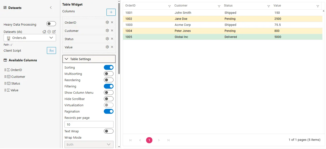
-
-
Customize header styles and publish.
The result is a real-time dashboard view with visual cues for priority processing.
Advanced Table Widget Configuration
This section explains advanced configuration options that control table behavior, layout, and interaction.
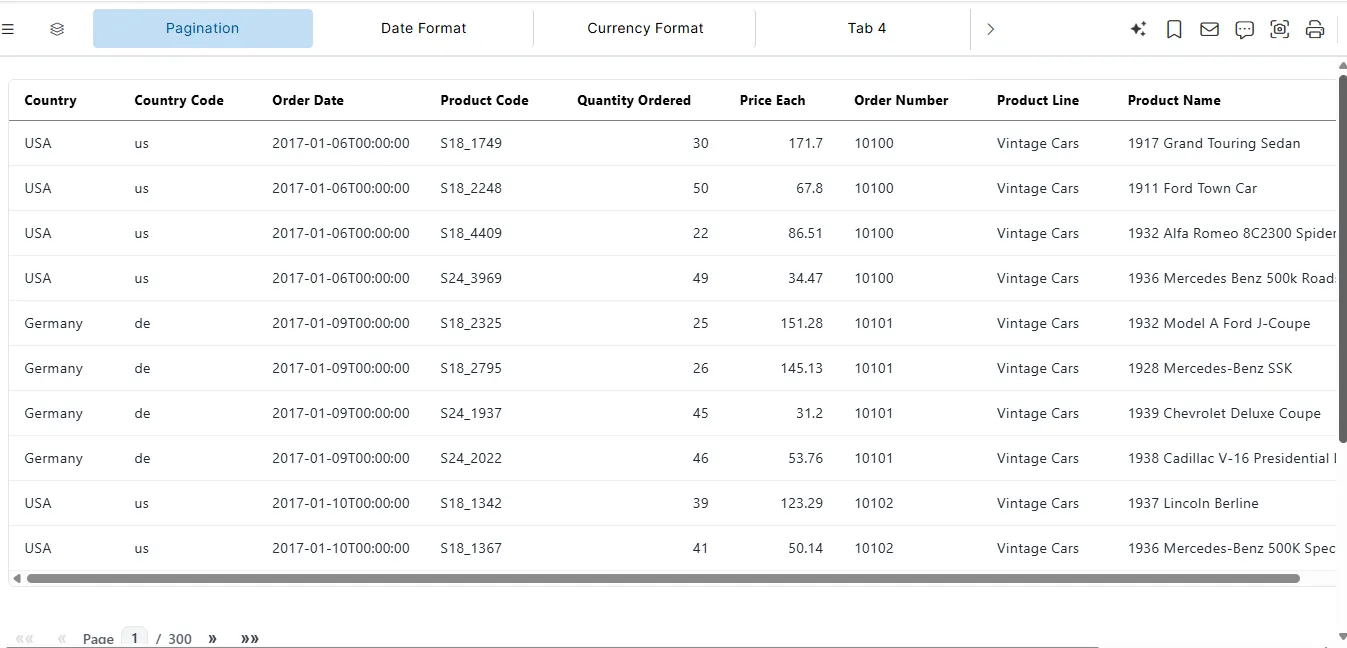
Pagination Configuration
Pagination controls how records are divided and displayed across multiple pages in the table.
It improves performance and usability when working with large datasets by limiting the number of visible rows at a time.
Pagination Properties
| Property | Type | Description |
|---|---|---|
paginated | Boolean | Enables pagination for the table |
pageSize | Number | Number of rows displayed per page |
Pagination Example
{
  "paginated": true,
  "pageSize": 10
}
<<<<<<< sejal-images-update

master
Pagination Behavior
-
Displays a fixed number of rows per page
-
Navigation controls are rendered automatically
-
Works seamlessly with sorting and filtering
-
Page state updates dynamically based on user interaction
Layout Configuration
Layout configuration controls the visual density and spacing of table rows.
It is useful for optimizing table appearance based on data volume and screen size.
Layout Properties
| Property | Type | Description |
|---|---|---|
compact | Boolean | Displays the table in compact (reduced padding) mode |
Layout Example
{
  "compact": true
}
Layout Behavior
-
Reduces row height and cell padding
-
Allows more rows to fit within the visible area
-
Does not affect data values or interactions
Columns Configuration
Each object inside the columns array represents a table column and controls how the data is displayed in the table.
This section covers basic column display properties such as label, key, and alignment.
Column Properties
| Property | Type | Description |
|---|---|---|
label | String | Header text displayed in the table |
key | String | Data field name from the dataset |
align | String | Text alignment (left, right, center) |
Columns Example
"columns": [
  { "label": "Country", "align": "left", "key": "country" },
  { "label": "Product Line", "align": "left", "key": "productLine" },
  { "label": "Quantity Ordered", "align": "right", "key": "quantityOrdered" },
  { "label": "Extended Price", "align": "right", "key": "extendedPrice" }
]
Columns Behavior
- The
labeldefines the column header displayed in the table. - The
keymaps the column to the dataset field. - The
alignproperty adjusts text alignment within the column cells. - Columns in this example are basic display columns; numeric/currency formatting or date formatting can be added later.
Columns Usage Notes
-
labelandkeyare required for all columns. -
alignis optional. -
Columns can be combined with advanced features like
format,colorScale,totalRow,delta, orbar. -
Proper usage ensures display correctness and compatibility with table-level features like pagination, sorting, and totals.
Sorting Configuration
Sorting enables users to reorder table data by clicking on column headers.
It provides interactive data exploration without altering the source data.
Sorting Properties
| Property | Type | Description |
|---|---|---|
sortable | Boolean | Enables sorting on all columns |
Sorting Example
{
  "sortable": true
}
Sorting Behavior
-
Supports ascending and descending order
-
Sorting is applied using the column key
-
Visual indicators show the active sort direction
-
Sorting works alongside pagination
Usage Notes
- Sorting is enabled globally using the
sortableproperty. - Sorting applies to all columns and cannot be configured per column.
- Sorting does not modify the underlying dataset; it affects display only.
- Works seamlessly with pagination and search.
- If
sortableis set tofalseor not provided, column headers are not interactive.
Format Configuration
The format property is a versatile column-level configuration that controls how data values are displayed in table columns.
It supports multiple data types, including dates and currency, with specific sub-properties depending on the type.
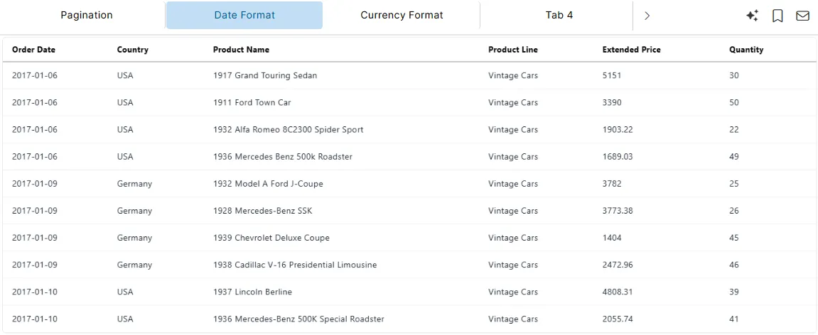
Date Format
Used to control how date-type columns are displayed.
Date Format Properties
| Property | Type | Description |
|---|---|---|
format | Object | Enables formatting for a column |
type | String | Specifies the data type (date) |
dateFormat | String | Defines the display format for date values |
Date Format Example
{
  "format": {
    "type": "date",
    "dateFormat": "YYYY-MM-DD"
  },
  "label": "Order Date",
  "key": "orderDate"
}
<<<<<<< sejal-images-update

master
Date Format Behavior
- Converts raw date values into a readable format
- Ensures consistent date display across the table
- Formatting is applied only to the specified column
- Sorting uses the underlying date value, not the formatted text
Common Date Format Patterns
| Format | Output Example |
|---|---|
YYYY-MM-DD | 2024-06-15 |
DD-MM-YYYY | 15-06-2024 |
MM/DD/YYYY | 06/15/2024 |
MMM YYYY | Jun 2024 |
Usage Notes
- The
formatobject is optional - Only applicable when
typeis set todate - If
formatis not provided, the raw date value is displayed
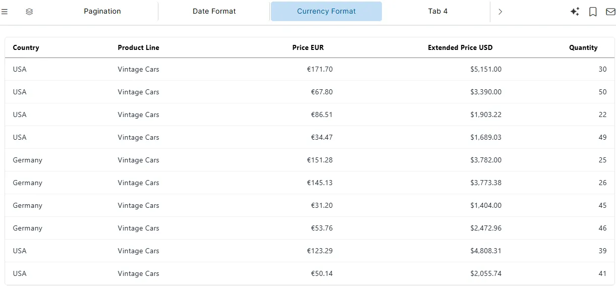
Currency Format
Used to display currency values in table columns.
Currency Format Properties
| Property | Type | Description |
|---|---|---|
format | Object | Enables formatting for a column |
type | String | Specifies the data type (currency) |
currency | String | ISO currency code (e.g., USD, EUR, INR) |
locale | String | Locale used for number formatting (optional) |
decimals | Number | Number of decimal places to display (optional) |
Currency Format Example
{
  "format": {
    "type": "currency",
    "currency": "EUR",
    "locale": "en-GB"
  },
  "label": "Price EUR",
  "align": "right",
  "key": "priceEach"
}
<<<<<<< sejal-images-update

master
Currency Format Behavior
- Displays values with appropriate currency symbols
- Applies locale-specific number separators
- Decimal precision can be controlled using
decimals - Formatting affects display only
- Sorting uses the underlying numeric value, not the formatted text
Supported Currency Examples
| Currency Code | Display Example |
|---|---|
| USD | $1,234.00 |
| EUR | €1,234.00 |
| INR | ₹1,234.00 |
| GBP | £1,234.00 |
Usage Notes
- The
formatobject is optional - Only applicable when
typeis set tocurrency - If
formatis not provided, the raw numeric value is displayed - Currency symbol and separators depend on the specified
currencyandlocale - Sorting is performed using the underlying numeric value, not the formatted text
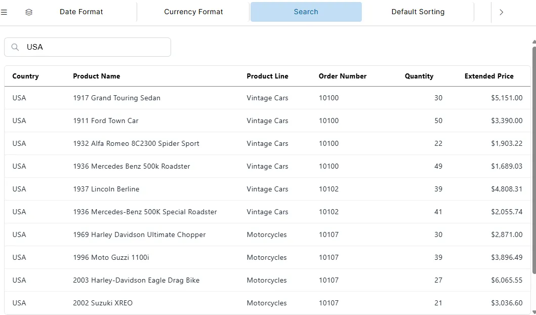
Search Configuration
The searchable property enables a global search input for the table.
When enabled, users can search across all visible columns to quickly filter records.
Search Property
| Property | Type | Description |
|---|---|---|
searchable | Boolean | Enables search functionality for the table |
Search Configuration Example
"searchable": true<<<<<<< sejal-images-update

master
Search Behavior
- Displays a search input above the table
- Filters rows based on matching text in any column
- Search is case-insensitive
- Filtering happens in real time as the user types
Usage Notes
- Search applies only to the data currently loaded in the table
- Works alongside pagination and sorting
- If
searchableis not provided or set tofalse, the search input is hidden
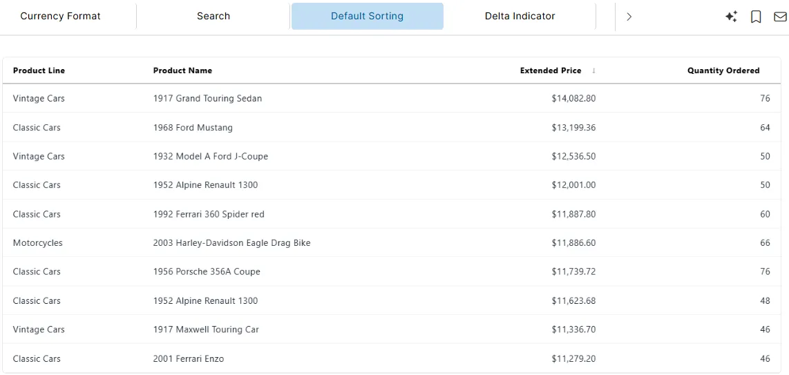
Default Sort Configuration
The defaultSort property allows you to set the initial sorting order of the table when it loads.
When enabled, the table automatically sorts by the specified column(s) and direction.
Default Sort Property
| Property | Type | Description |
|---|---|---|
defaultSort | Array | Array of objects defining the default column(s) to sort and their direction (asc or desc). |
Each object in the array contains:
| Property | Type | Description |
|---|---|---|
column | String | The key of the column to sort by. |
direction | String | Sort direction: asc for ascending or desc for descending. |
Default Sort Configuration Example
"defaultSort": [
  {
    "column": "extendedPrice",
    "direction": "desc"
  }
]
<<<<<<< sejal-images-update

master
Default Sort Behavior
- The table initially sorts according to the specified column(s) and direction.
- Supports multiple columns by specifying multiple objects in the array.
- Works alongside
sortable: trueto allow users to change sorting interactively.
Usage Notes
- Optional property; if not provided, the table displays rows in the order they are loaded.
- Only applies to columns that are sortable.
directionmust be eitherascordesc.- Can be combined with pagination and search features.
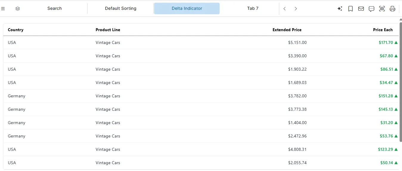
Delta Configuration
The showDelta property enables a delta indicator for numeric or currency columns in the table. When enabled, users can quickly see the change compared to previous values.
Delta Property
| Property | Type | Description |
|---|---|---|
| showDelta | Boolean | Displays the difference between the current and previous value for a column |
Delta Configuration Example
{
"format": {
"showDelta": true,
"decimals": 2,
"currency": "USD",
"type": "currency"
},
"label": "Price Each",
"align": "right",
"key": "priceEach"
}
<<<<<<< sejal-images-update

master
Delta Behavior
- Displays a delta indicator alongside the numeric or currency value
- Useful for tracking changes over time.
- Works for number and currency column types.
- Formatting options (decimals, currency symbol) apply to both value and delta.
- Sorting uses the underlying numeric value, not the delta display.
Usage Notes
showDeltais optional.- Applicable only to columns with
typeset tonumberorcurrency. - Does not affect raw data, it affects display only.
- Can be combined with pagination, sorting, and search.
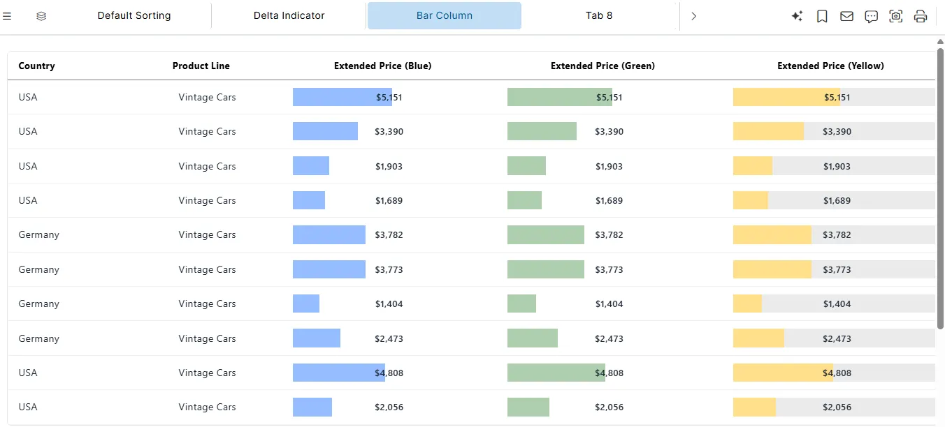
Bar Column Configuration
The table widget supports bar-type columns, allowing numeric or currency values to be displayed as horizontal bars with optional numeric values. This provides an at-a-glance visual representation of values while retaining numeric information.
Bar Column Properties
All bar properties are defined inside the column format object.
| Property | Type | Description |
|---|---|---|
barShowValue | Boolean | If true, displays the numeric value on top of the bar. |
barMax | Number | Maximum value used to scale the bar length. |
type | String | Must be set to bar to enable bar-style rendering |
barColor | String | Color of the bar (hex code or named color). |
barBackgroundColor | String | Optional background color for the bar area. |
Bar Column Configuration Example
{
  "format": {
    "barShowValue": true,
    "decimals": 0,
    "barMax": 10000,
    "currency": "USD",
    "type": "bar",
    "barColor": "#95beffff"
  },
  "label": "Extended Price (Blue)",
  "align": "center",
  "key": "extendedPrice"
}
<<<<<<< sejal-images-update

master
Bar Column Behavior
- Renders horizontal bars proportional to the numeric value.
- Displays numeric values on bars if
barShowValueistrue. - Bars can have custom colors (
barColor) and optional background color (barBackgroundColor). barMaxdefines the scale for consistent bar lengths across columns.- Compatible with pagination, sorting, and compact table mode.
- Bar columns support numeric and currency formatting.
- When
currencyis provided, values displayed on the bar use currency formatting.
Usage Notes
- Bar columns require
typeto be set tobar. barMaxshould be consistent across bar columns for meaningful comparison.- Multiple bar columns can coexist with different colors and styles.
- Can be combined with numeric or currency formatting for clear value representation.
Total Row Configuration
The table widget supports a Total Row feature that displays summary values (such as sums or averages) at the bottom of the table.
This is useful for presenting aggregates alongside detailed tabular data.
Total Row Property (Top-Level)
| Property | Type | Description |
|---|---|---|
totalRow | Boolean | Enables a summary row at the bottom of the table |
Total Row Example (Top-Level)
"totalRow": true- When enabled, a footer row is rendered
- Aggregate values are calculated per column using totalCalc
Column-Level Total Calculation
Each column can define how its total value is calculated using the totalCalc property.
This provides fine-grained control over which columns participate in the Total Row and how their values are aggregated.
totalCalc Property
| Property | Type | Description |
|---|---|---|
totalCalc | String | Defines the aggregation method applied to the column in the total row |
Supported totalCalc Values
| Value | Description |
|---|---|
sum | Calculates the total sum of all numeric values in the column |
mean | Calculates the average (mean) of the column values |
- | No calculation; the column is ignored in the total row |
Total Calculation Example
{
  "totalCalc": "sum",
  "format": {
    "decimals": 2,
    "currency": "USD",
    "type": "currency"
  },
  "label": "Extended Price",
  "align": "right",
  "key": "extendedPrice"
}
<<<<<<< sejal-images-update

master
Total Row Behavior
- The total row appears below the last table row
- Calculations are performed using the raw numeric data
- Formatting (
currency,decimals,number) is applied after calculation - Columns with
totalCalc: "-"display no value in the total row - Works seamlessly with pagination, sorting, search, and compact mode
Usage Notes
totalRowis optional and disabled by defaulttotalCalcshould only be used with numeric or currency columns- Non-numeric columns should use
totalCalc: "-"to avoid invalid calculations - Aggregation does not modify the dataset, only the table display
- Calculations reflect the currently loaded data, not external or backend totals
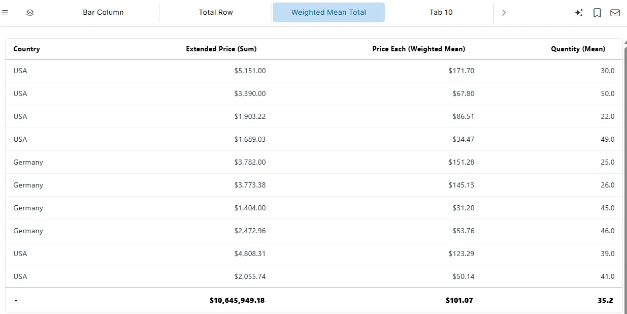
Weighted Mean Total Calculation
In addition to sum and mean, the table widget now supports a weighted mean calculation for numeric/currency columns.
This allows you to calculate an average that takes into account the relative importance (weight) of each row.
weightedMean Property
| Property | Type | Description |
|---|---|---|
totalCalc | String | Set to "weightedMean" to calculate a weighted average for the column |
weightCol | String | Specifies the key of the column used as the weight for the calculation |
Weighted Mean Example
{
  "totalCalc": "weightedMean",
  "format": {
    "decimals": 2,
    "currency": "USD",
    "type": "currency"
  },
  "label": "Price Each (Weighted Mean)",
  "align": "right",
  "key": "priceEach",
  "weightCol": "quantityOrdered"
}
<<<<<<< sejal-images-update

master
Weighted Mean Behavior
-
Calculates a weighted average using the formula:
Weighted Mean = Σ(value × weight) ÷ Σ(weight)
-
weightColmust reference a numeric column in the table -
Works with numeric and currency columns
-
Formatting (
currency,decimals,number) is applied after calculation -
Compatible with
totalRow, pagination, sorting, search, and compact mode
Usage Notes
weightedMeanis optionalweightColis required when usingweightedMean- Only use with numeric or currency columns
- Aggregation does not modify the dataset, only the table display
- Calculation reflects currently loaded data, not external totals
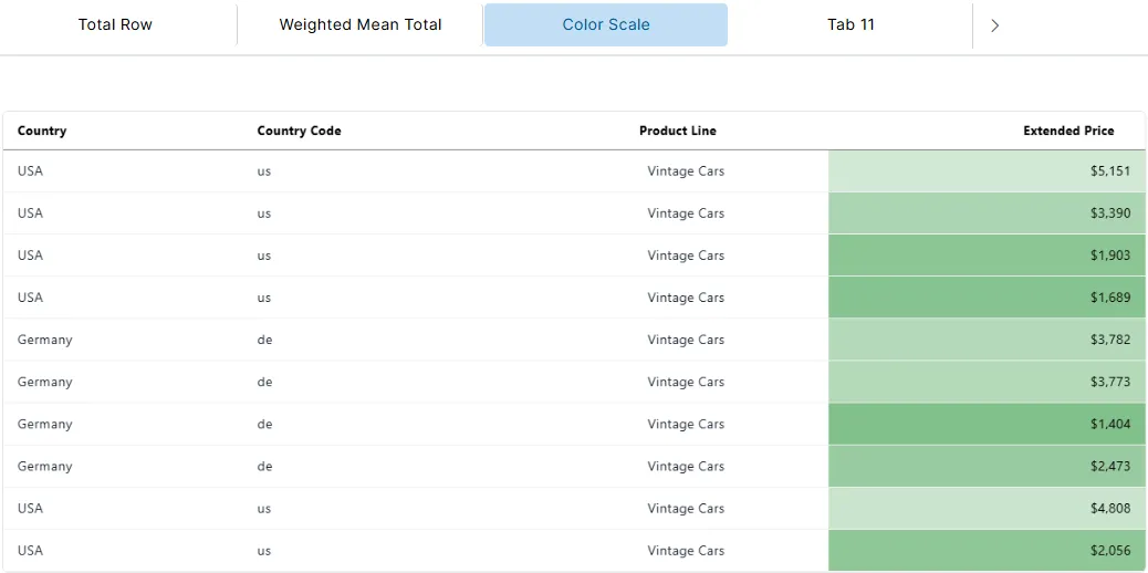
Color Scale Configuration
The colorScale property allows numeric or currency columns to be visually enhanced using a gradient of colors based on their values.
Color Scale Property
| Property | Type | Description |
|---|---|---|
colorScale | Array | Array of three colors [lowValueColor, neutralColor, highValueColor] applied to the column’s values |
Example
{
"format": {
"decimals": 0,
"currency": "USD",
"type": "currency"
},
"colorScale": [
"#6db678",
"white",
"#ce5050"
],
"label": "Extended Price",
"align": "right",
"key": "extendedPrice"
}
<<<<<<< sejal-images-update

master
Behavior
- Values below average are shaded with the first color (e.g., green
#6db678) - Values around the midpoint are shaded with the middle color (e.g., white)
- Values above average are shaded with the last color (e.g., red
#ce5050) - Compatible with sorting, pagination, total row, weighted mean, delta, and bar columns
- Does not modify underlying numeric values, only visual display
Color Scale Usage Notes
colorScaleis optional.- Requires exactly three colors in the array:
[lowValueColor, neutralColor, highValueColor]. - Only affects the visual representation of values; underlying data remains unchanged.
- Can be combined with formatting options such as
decimalsandcurrency. - Works seamlessly with sorting, pagination, total row, weighted mean, delta, and bar columns.
- Multiple columns can each have their own independent
colorScale. - Avoid using
colorScaleon text/date columns as it has no effect.
Table Grouping Configuration
The table widget supports grouping rows by a specific column, including optional group counts and expanded/collapsed states.
Group Configuration Properties
| Property | Type | Description |
|---|---|---|
groupConfig | Object | Configuration object for row grouping |
groupBy | String | Column key used for grouping rows |
showGroupCount | Boolean | Displays the number of rows in each group |
expandAll | Boolean | Expands all groups by default; if false, groups are collapsed |
Example
"groupConfig": {
  "showGroupCount": true,
  "groupBy": "country",
  "expandAll": true
}
<<<<<<< sejal-images-update
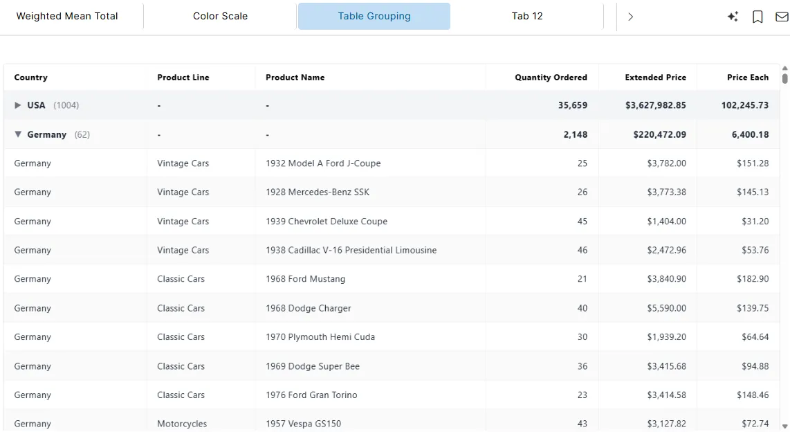

master
Behavior
- Rows are grouped by the
countrycolumn - Each group shows the number of rows in that group (
showGroupCount: true) - All groups are expanded by default (
expandAll: true) - Sorting and pagination work within each group
Usage Notes
groupConfigis optional; if not provided, rows are displayed normally- Works with pagination, search, sorting, delta, total rows, and bar/colored columns
groupBymust reference a valid column key in the tableshowGroupCountis optional; iffalse, the group row shows only the group labelexpandAllcontrols the default collapsed/expanded state; users can still expand/collapse groups interactively
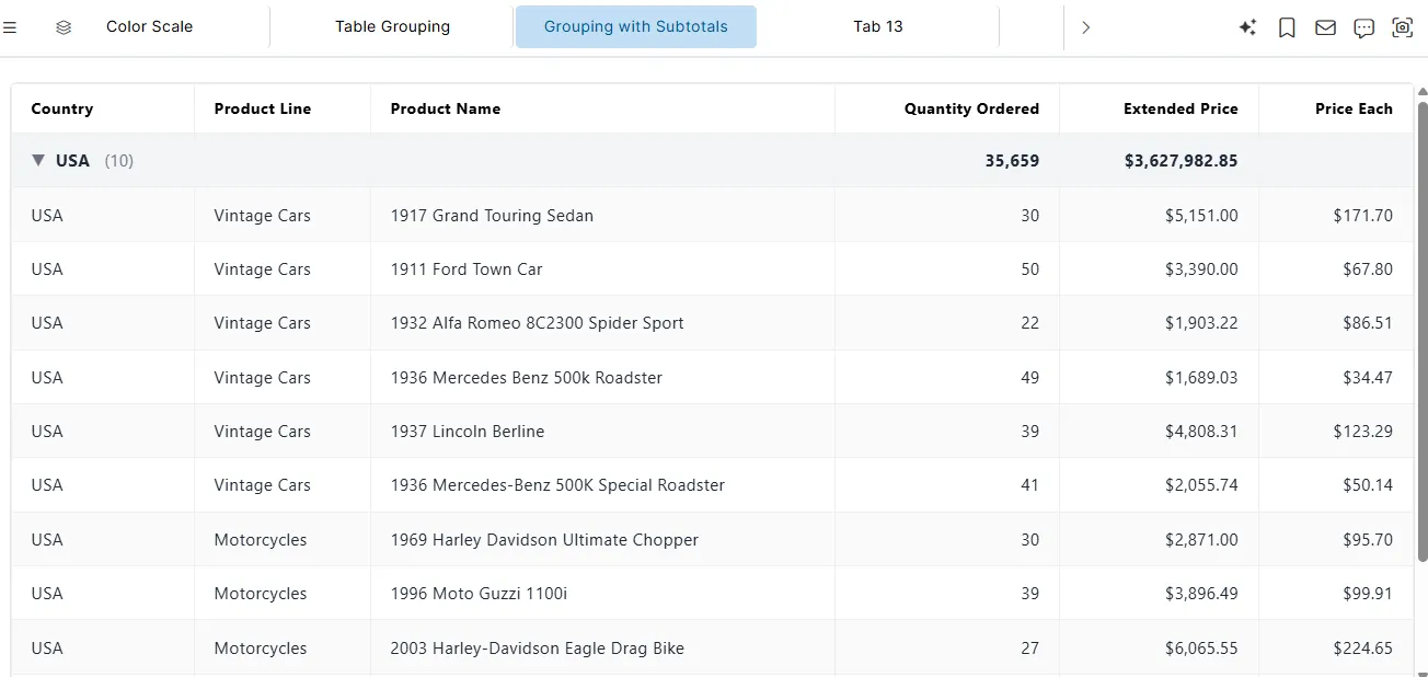
Table Grouping with Subtotals Configuration
This configuration allows rows to be grouped by a column, and numeric/currency columns to display subtotals within each group. It also supports common table styles like striped rows, hover highlights, and bordered layout.
Table Style Properties
| Property | Type | Description |
|---|---|---|
striped | Boolean | Displays alternating row colors for readability |
hover | Boolean | Highlights a row when hovered over |
bordered | Boolean | Adds borders around table cells |
Column-Level Subtotals
| Property | Type | Description |
|---|---|---|
subtotal | String | Aggregation method for the column in group subtotals. Supported: sum, mean, weightedMean, - (no subtotal) |
Example
{
  "subtotal": "sum",
  "format": "number",
  "label": "Quantity Ordered",
  "align": "right",
  "key": "quantityOrdered"
}
Behavior:
- Aggregates the column values within each group
- Supports
sum,mean, andweightedMean(requiresweightCol) - Works with numeric and currency columns
- Formatting (
number,currency,decimals) is applied after calculation - Sorting and pagination operate on underlying data
Group-Level Subtotals
| Property | Type | Description |
|---|---|---|
subtotals | Array | Column keys to display group-level subtotals |
Example
"groupConfig": {
  "subtotals": [
    "quantityOrdered",
    "extendedPrice"
  ],
  "showGroupCount": true,
  "groupBy": "country",
  "expandAll": false
}
<<<<<<< sejal-images-update

master
Behavior:
- Displays subtotals for the specified columns under each group
- Works alongside
groupBy,showGroupCount, andexpandAll - Subtotals use the column’s formatting (number, currency, decimals)
- Does not modify underlying data, only affects display
Usage Notes
- Subtotals are optional and must be defined per column with
subtotal - The
subtotalsarray ingroupConfigdetermines which columns show group-level subtotals - Works only with numeric or currency columns
- Compatible with pagination, search, colorScale, delta, bar columns, and total row
weightedMeansubtotal requires a validweightCol
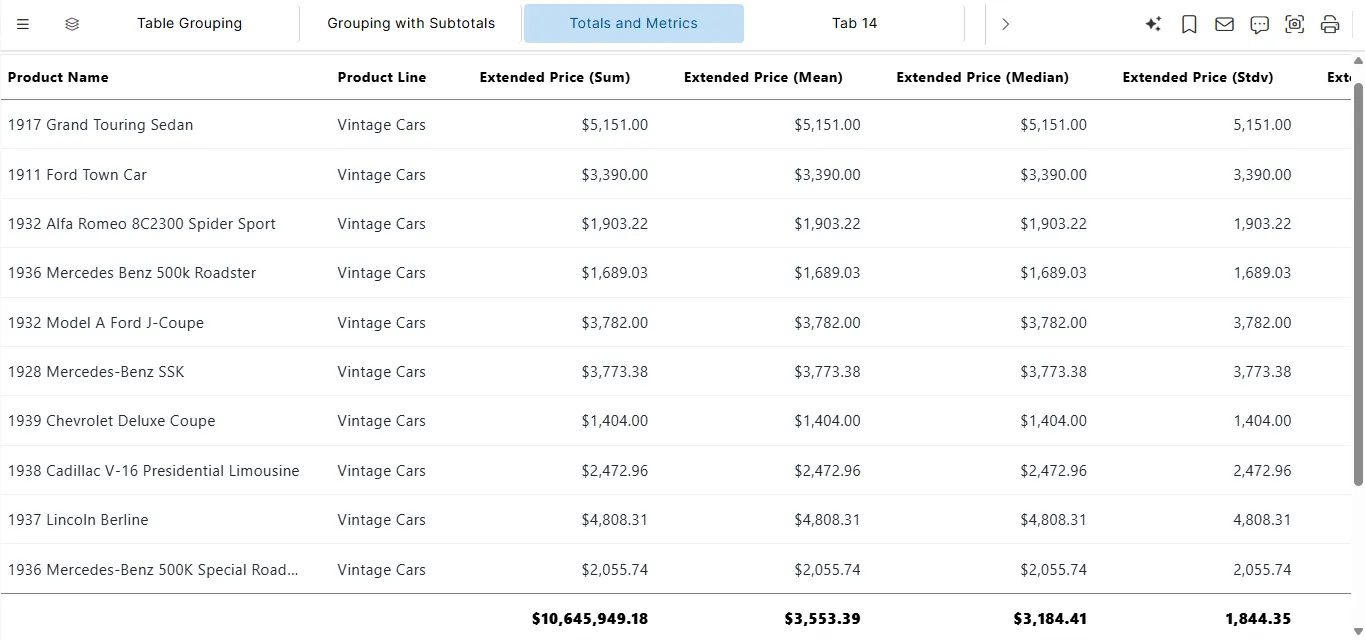
Total Row & Derived Column Calculations
The table widget supports advanced aggregate calculations in the total row and derived metrics per column, including sum, mean, median, standard deviation, min, max, count, mode, running sum, running average, and rank.
Column-Level Total Calculations (totalCalc)
The totalCalc property defines how values in numeric or currency columns are aggregated in the total row.
| Property | Type | Description |
|---|---|---|
totalCalc | String | Defines the aggregation method applied to the column in the total row. Supported values: sum, mean, median, stdv, min, max, count, mode |
Example
{
  "totalCalc": "sum",
  "format": "currency",
  "label": "Extended Price (Sum)",
  "align": "right",
  "key": "extendedPrice"
}
Behavior:
- Performs the specified aggregation for the column in the total row
- Works with numeric or currency columns
- Other formatting (
currency,decimals) is applied after calculation - Columns without
totalCalcare ignored in the total row modecan also be applied to text columns, returning the most frequent value
Derived Column Formats
Derived formats calculate row-level cumulative or rank-based metrics.
| Format | Description |
|---|---|
runningSum | Displays the cumulative sum of the column values from the first row to the current row |
runningAverage | Displays the cumulative average of the column values up to the current row |
rank | Displays the rank of the column value compared to all other rows (1 = highest by default) |
Example
{
  "format": "runningSum",
  "label": "Extended Price (Running Sum)",
  "align": "right",
  "key": "extendedPrice"
}
<<<<<<< sejal-images-update

master
Behavior:
- Calculates row-level metrics based on the sequence of rows
- Works with numeric and currency columns
- Supports alignment (
left,right,center) independently of calculation - Sorting the table affects running sum, average, and rank results dynamically
Usage Notes
totalCalcand derived formats are optionaltotalCalconly affects the total row, not the underlying dataset- Derived formats (
runningSum,runningAverage,rank) calculate row-level metrics dynamically - Can be combined with pagination, sorting, search, grouping, colorScale, delta, bar columns, and totalRow
modecalculates the most frequent value in the column; works with text, numeric, or currency columnsstdvcalculates standard deviation for numeric columns- Ensure the column type matches the calculation (numeric/currency for sum, mean, runningSum, etc.)
rankhandles ties either by assigning the same rank or by row order, depending on table behavior
Text Column Totals in Total Row
The table widget supports total row calculations for text (categorical) columns using the totalCalc property, enabling meaningful summaries for non-numeric data.
Supported Text totalCalc Values
| Value | Description |
|---|---|
Total | Displays all unique values from the column |
mode | Displays the most frequently occurring value |
Example: Text Totals
{
  "totalCalc": "Total",
  "label": "Country",
  "key": "country"
}
Text Column Total (Mode)
{
  "totalCalc": "mode",
  "label": "Product Line",
  "key": "productLine"
}
Behavior
Totalaggregates and displays unique categorical valuesmodereturns the dominant (most frequent) value- Results are rendered only in the total row
- Independent of row order or sorting
- Compatible with pagination, grouping, and search
Usage Notes
- Applicable only to text or categorical columns
- Numeric aggregations (
sum,mean, etc.) are not supported on text columns - Purely a display feature — underlying data remains unchanged
- Useful for high-level category summaries and data coverage indicators
Summary
The Table Widget is essential for displaying structured data with full control over styling, formatting, filtering, and behavior. Whether for analytics, operations, finance, or CRM, it’s your go-to tool for data visibility inside VIZ.