Tab Settings
Introduction
The Tab Settings panel allows users to customize the appearance, layout, and style of tabs within tabbed navigation or content areas.
It provides control over text styling, tab dimensions, and colors for both inactive and active states, ensuring the tabs are visually clear and aligned with the dashboard design.
Purpose
To provide flexible control over how tabs are displayed and styled, making navigation intuitive, accessible, and consistent with user preferences or branding standards.
Steps to Access Tab Settings
-
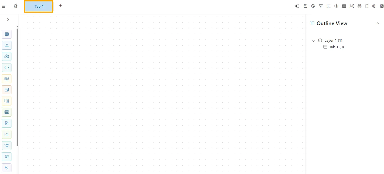
After creating a new dashboard, the canvas opens with a Tab component displayed at the top.
-
Hover over the Tab component. A settings
 icon will appear. Click on the icon to open the Tab Settings panel.
 -
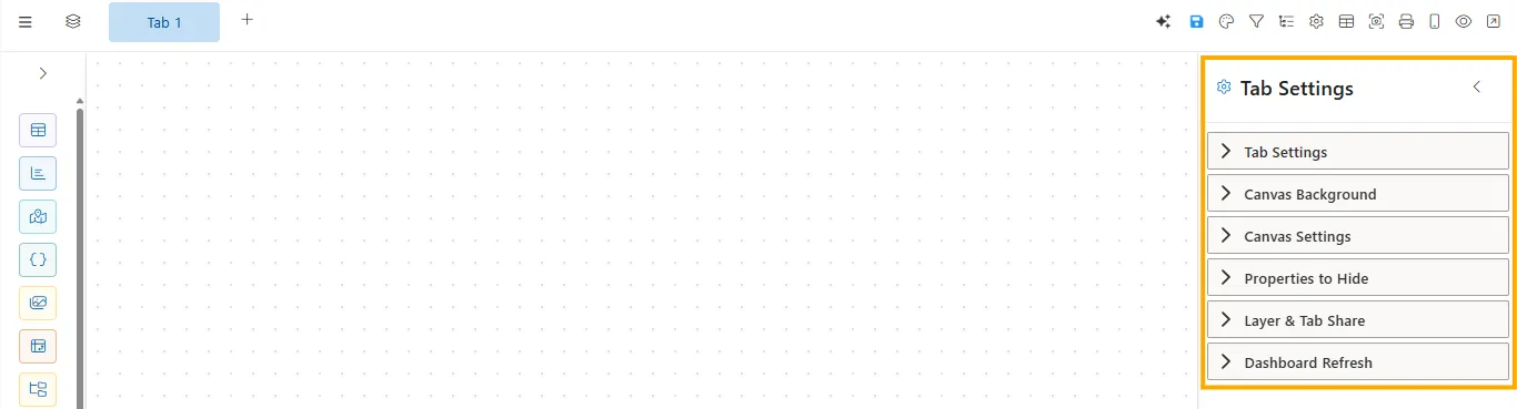
The Tab Settings panel will open, displaying all available customization options.
Tab Settings
Click to view Tab Settings
Below are the properties available for customizing the tab appearance and behavior:
Tab Settings
The Tab Settings panel allows you to customize the look and behavior of tabs within a dashboard or content area. It helps users quickly identify, switch between, and interact with different sections in a clear and visually consistent way.
Font Size
Defines the size of the text displayed within each tab.
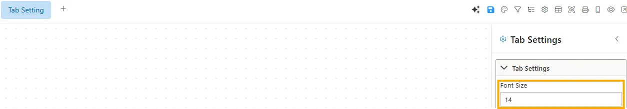
- Input Type: Number input (px).
- Impact: Larger sizes improve readability; smaller sizes save space.
- Example: Font size set to 14px for clear visibility.
Width
Sets the width of individual tabs.
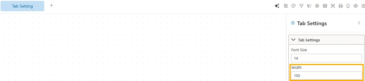
- Input Type: Number input (px).
- Impact: Fixed width ensures consistency; percentage allows responsive layouts.
- Example: Width set to 150px makes each tab uniform.
Font Weight
Adjusts the thickness/boldness of the tab text.
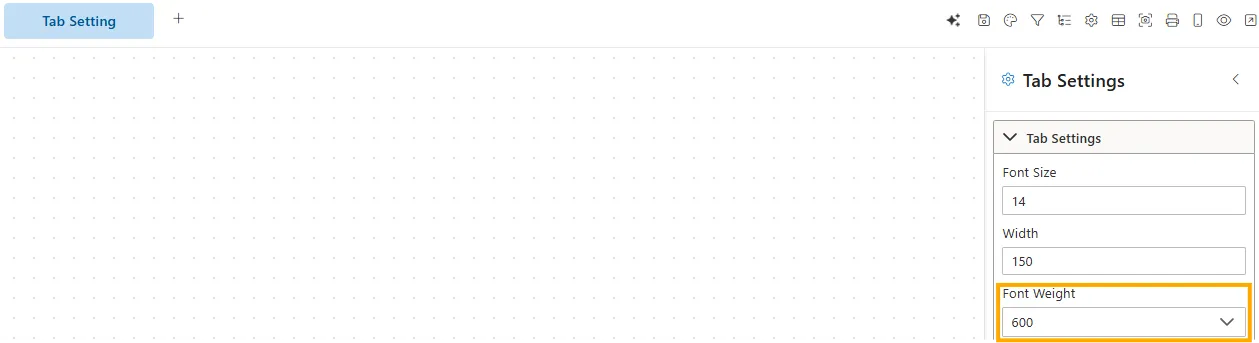
- Input Type: Dropdown (Normal, Bold, Bolder, Lighter, 100–900)
- Impact: Emphasizes or softens the tab text depending on importance or design style.
- Example: Tab text set to 600 (Semi-Bold) for better visibility.
Font Style
Adjusts the style of the tab text.
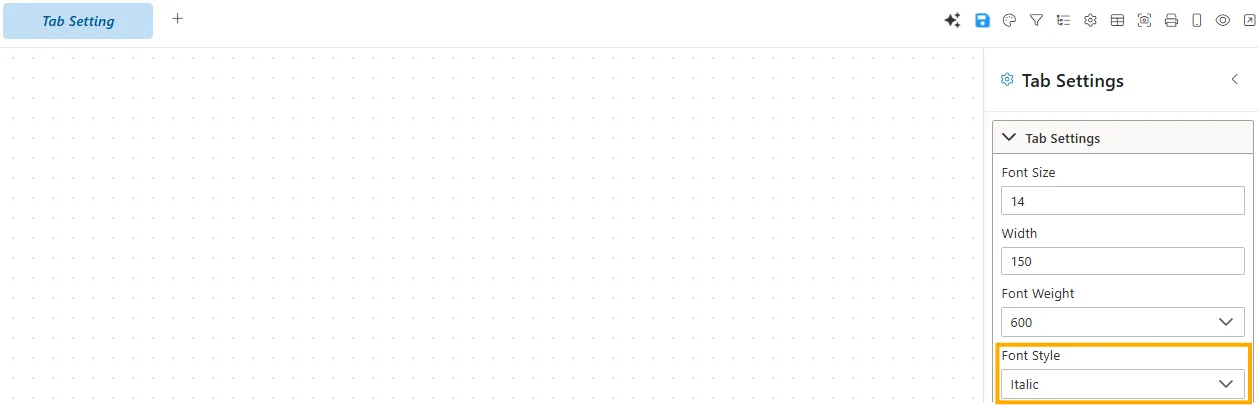
- Input Type: Dropdown (Normal, Italic, Oblique).
- Impact: Allows differentiation or emphasis in tab text.
- Example: Italic style applied for emphasis.
Font Color
Defines the text color of inactive tabs.
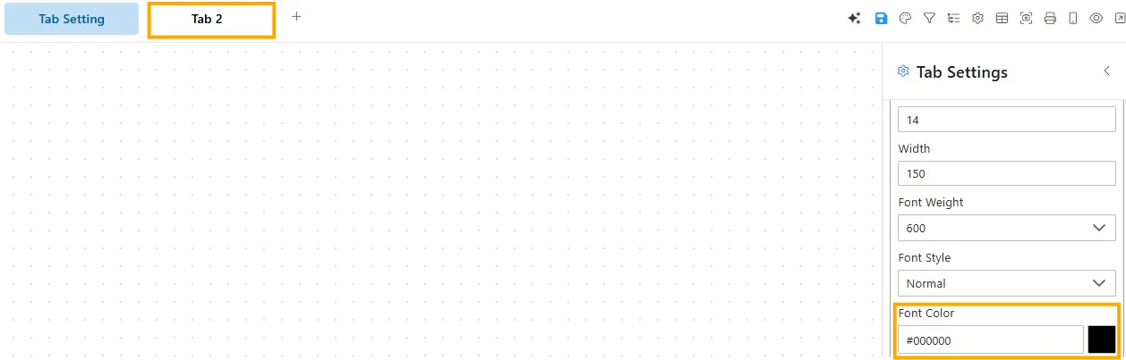
- Input Type: Color picker / HEX code.
- Impact: Helps distinguish inactive tabs from active ones.
- Example: Inactive font color set to #000000 (black).
Tab Background
Sets the background color of inactive tabs.
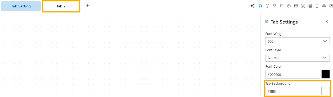
- Input Type: Color picker / HEX code.
- Impact: Provides visual separation between active and inactive states.
- Example: Background set to #ffffff (white).
Active Tab Color
Defines the text color of the currently active tab.
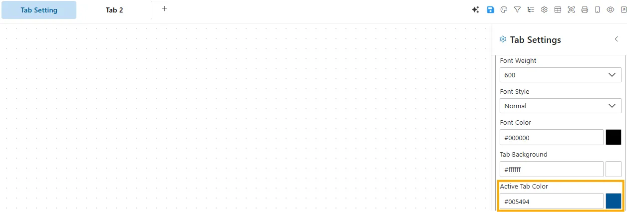
- Input Type: Color picker / HEX code.
- Impact: Highlights the selected tab.
- Example: Active tab color set to #005494 (blue).
Active Tab Background Color
Sets the background color of the active tab.
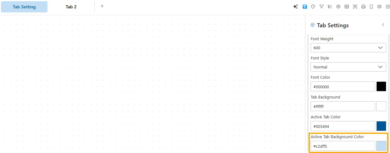
- Input Type: Color picker / HEX code.
- Impact: Clearly differentiates active tab from inactive ones.
- Example: Active background color set to #c2dff5 (light blue).
Canvas Background
The Canvas Background panel controls the visual properties of the background for your canvas or working area.
Background Color
Sets a solid color for the canvas background.
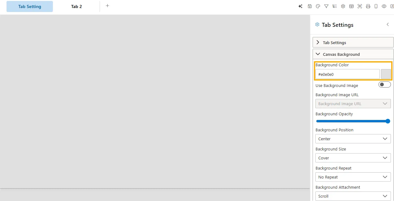
- Input Type: HEX code / Color picker.
- Impact: Defines the default background tone.
- Default:
#e0e0e0(light gray) or transparent.
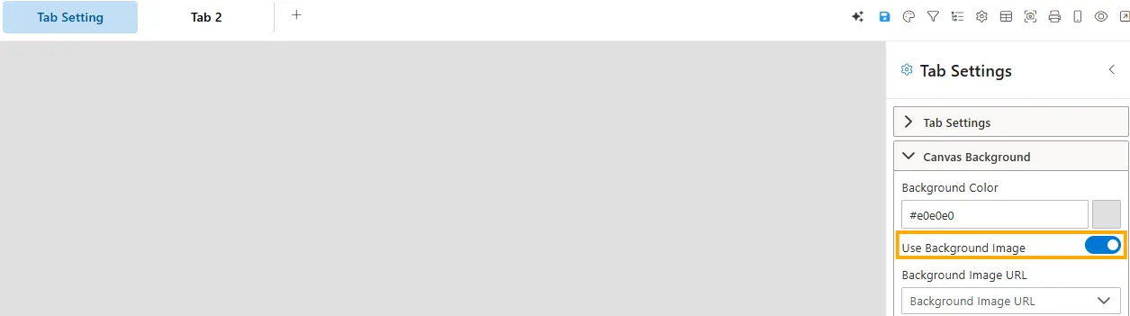
Use Background Image
Controls whether a background image is applied to the canvas.
-
Disabled -> The canvas shows only the selected background color.
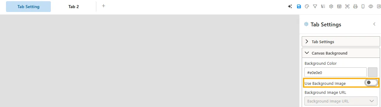
-
Enabled -> A background image is applied, overriding the solid color.
-
Visibility: Toggle switch (On/Off).
-
Impact: Allows customization of the canvas appearance using images.
-
Example: A light gray background may be replaced with a company logo or texture when enabled.
Background Image URL
Specifies the image source for the background.
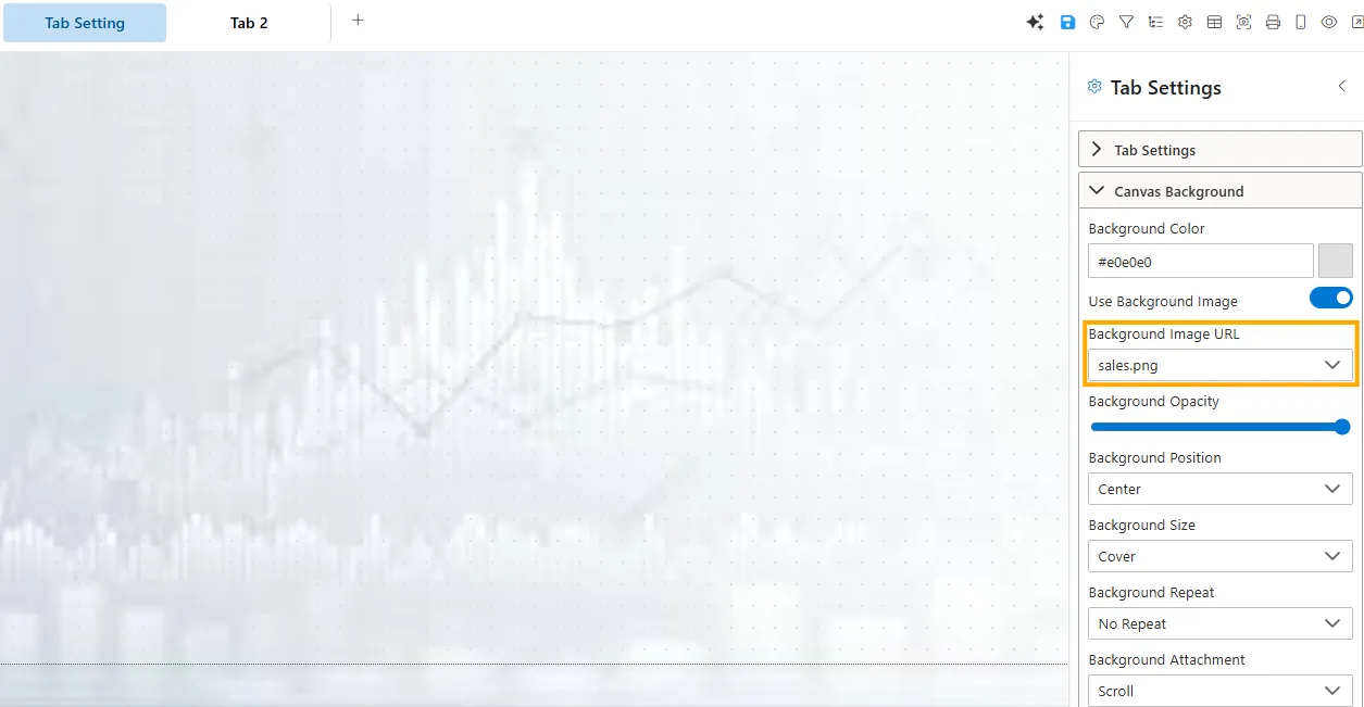
- Input Type: Text field (URL) or dropdown (media library).
- Impact: Applies the chosen image as the canvas background.
Background Opacity
Adjusts the transparency of the background color/image.
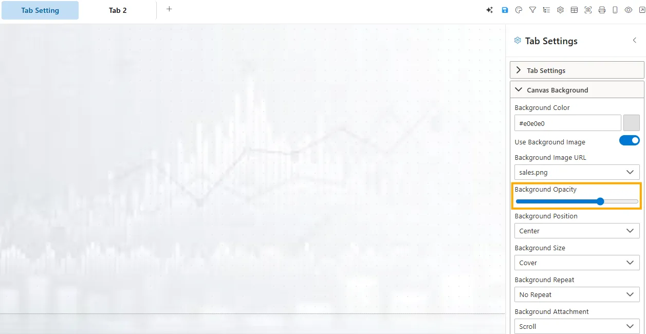
- Input Type: Slider (0%–100%).
- Impact: Lower values make the background more transparent.
Background Position
Defines how the background image is positioned within the canvas.
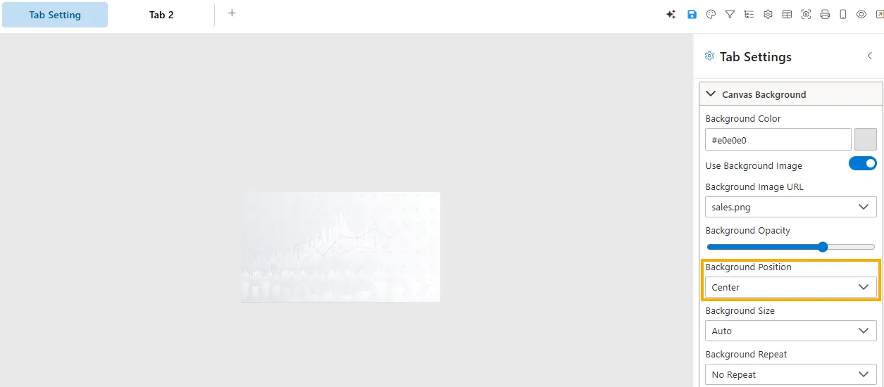
- Input Type: Dropdown.
- Options: Center, Top Left, Top Right, Bottom Left, Bottom Right, Top Center, Bottom Center, Left Center, Right Center.
- Default: Center.
Background Size
Controls how the image scales within the canvas.
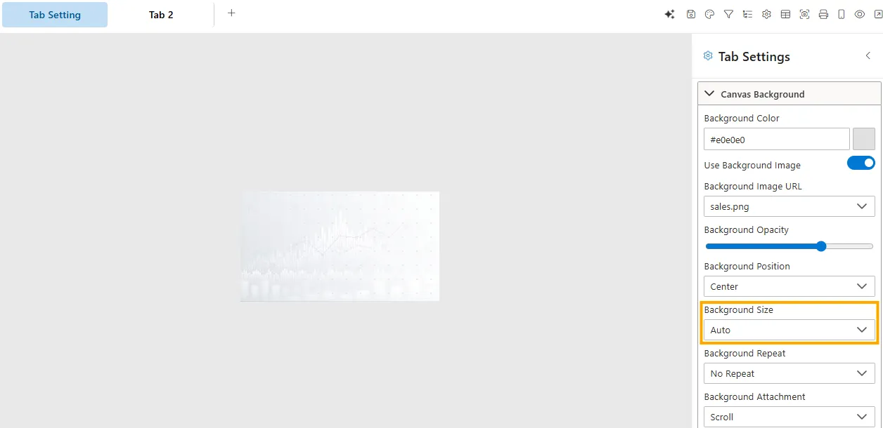
- Input Type: Dropdown / Custom values.
- Options: Cover, Contain, Auto, or specific (e.g.,
100% 100%). - Default: Cover or Auto.
Background Repeat
Specifies if/how the background image repeats.
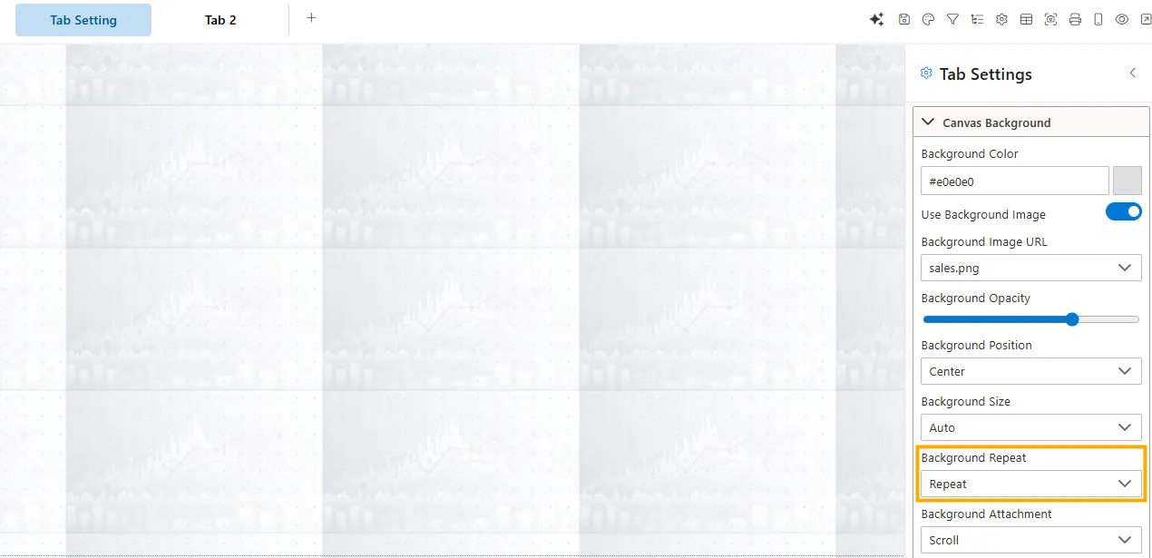
- Input Type: Dropdown.
- Options: No Repeat, Repeat, Repeat-X, Repeat-Y.
- Default: No Repeat.