Widget Settings
Introduction
The Widget Settings panel allows users to extensively customize the appearance, layout, and functionality of widgets.
It provides control over elements such as titles, subtitles, borders, backgrounds, shadows, labels, refresh behavior, and general visibility, ensuring each widget is tailored to meet specific requirements.
Purpose
To provide granular control over how widgets are displayed, styled, and refreshed, ensuring they align with business needs, branding standards, and user preferences.
Steps to Access Widget Settings
-
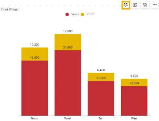
Hover over the desired widget on your dashboard.
-
Click on the
 icon in the top-right corner of the widget.
 -
The Widget Settings panel will open, displaying customization options.
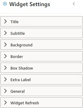
Widget Settings Properties
Click to view Widget Settings
Below are the properties available for customizing the widget appearance and behavior:
-
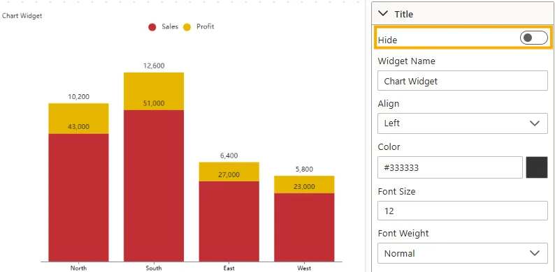
Title
The Title is the main heading displayed at the top of the widget. It helps users quickly identify the chart or visualization.
Below are the properties available for customizing the widget title:
-
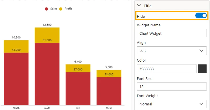
Hide
Controls whether the widget title is displayed at the top of the chart.
-
Disabled -> The title “Chart Widget” is visible above the chart.
-
Enabled -> The title is hidden, and the chart appears without a heading.
-
Visibility: Toggle switch (On/Off).
-
Impact: Useful when the chart context already explains the data.
-
Example: In a Column Chart, disabling “Hide” shows “Chart Widget”; enabling it removes the title.
-
-
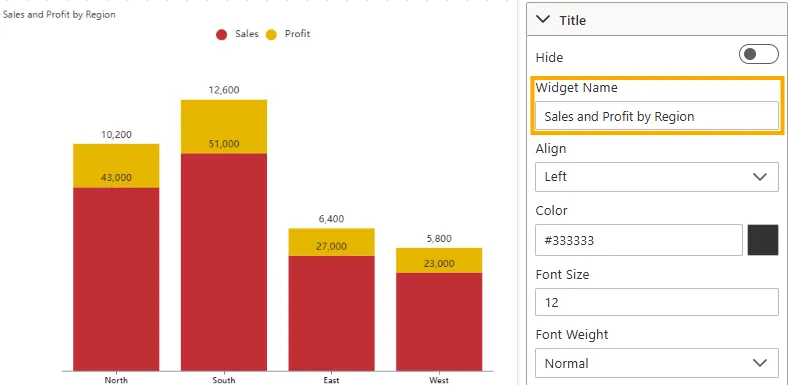
Widget Name
Defines the title text that appears at the top of the widget.
-
Input Type: Text field.
-
Impact: Allows customization of the chart heading.
-
Example: The widget name is set to “Sales and Profit by Region”, displayed above the chart.
-
-
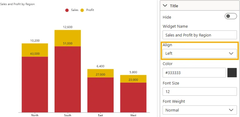
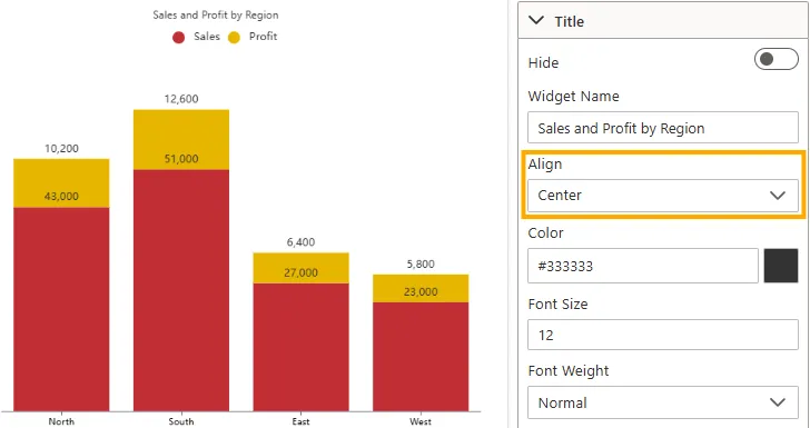
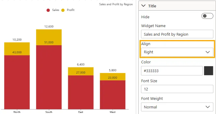
Align
Sets the horizontal alignment of the widget title.
-
Left -> Aligns title to the left (default).
-
Center -> Aligns title in the middle.
-
Right -> Aligns title to the right.
-
Input Type: Dropdown
-
Impact: Ensures consistency with dashboard layout.
-
Example: Title “Sales and Profit by Region” is right-aligned above the chart.
-
-
Color
Defines the font color of the widget title.
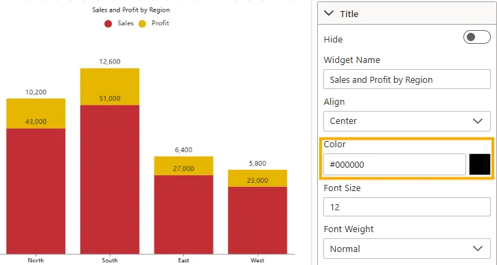
-
Input Type: Color picker or HEX code (e.g., #000000).
-
Impact: Adjusts visibility and theme consistency.
-
Example: Title displayed in black (#000000) for contrast against a white background.
-
-
Font Size
Controls the size of the title text.
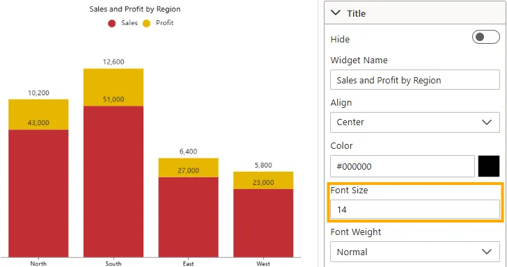
-
Input Type: Numeric field (e.g., 12px, 16px).
-
Impact: Larger values emphasize the title; smaller values conserve space.
-
Example: Title set to 16px, providing balanced readability.
-
-
Font Weight
Adjusts the thickness/boldness of the title text.
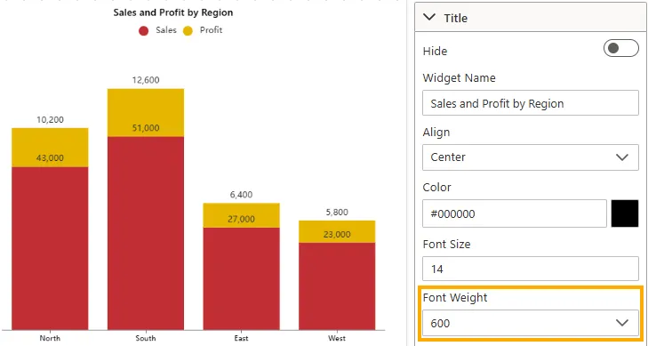
-
Input Type: Dropdown (Normal, Bold, Bolder, Lighter, 400, 500, 600).
-
Impact: Makes important titles stand out.
-
Example: Title set to 600 (Semi-Bold) for prominence.
-
-
Background Color
Applies a background color behind the title bar.
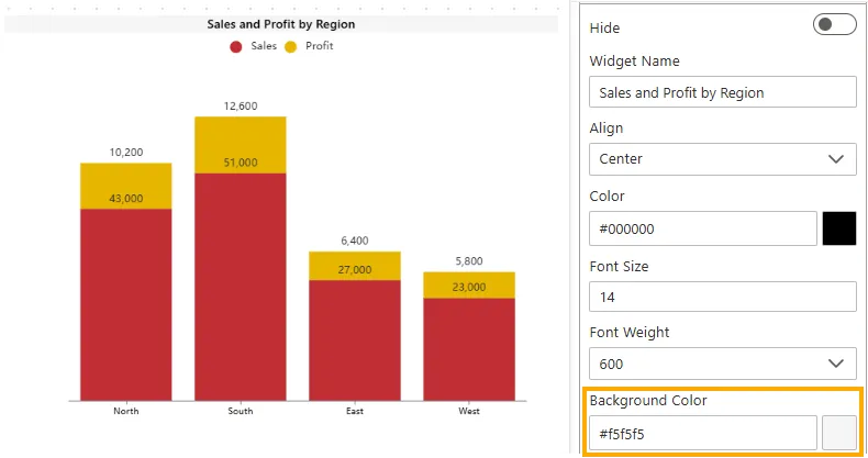
-
Input Type: Color picker or HEX code (e.g., #f5f5f5).
-
Impact: Enhances visual distinction of the title area.
-
Example: Background color set to white (#ffffff), blending with widget background.
-
-
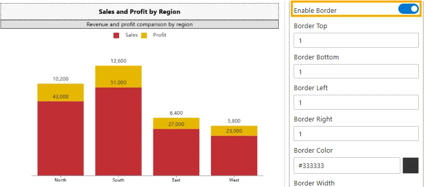
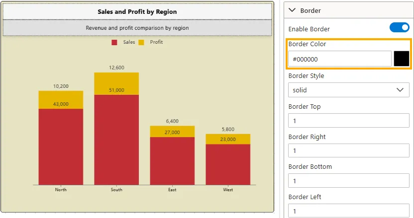
Enable Border
Toggles the visibility of the widget border around the chart.
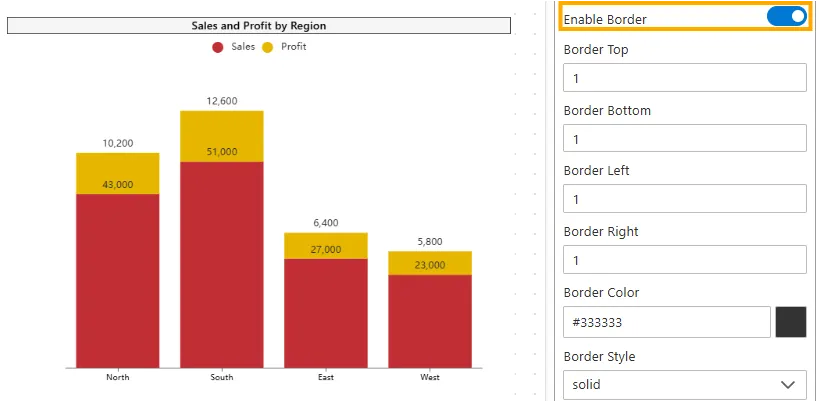
-
Input Type: Toggle switch (On/Off).
-
Impact: Displays or hides the border, defining separation from the background.
-
Example: Chart has border enabled for clear separation.
-
-
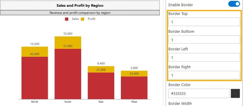
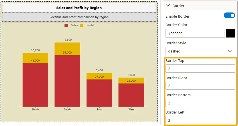
Border Top / Bottom / Left / Right
Sets the thickness of each side of the widget border in pixels.
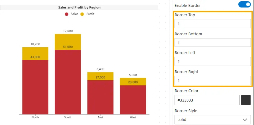
-
Input Type: Numeric field (e.g., 1, 2, 3).
-
Impact: Thicker borders make the chart edges more visible; thinner borders make them less noticeable.
-
Example: All sides set to 1px for a uniform frame.
-
-
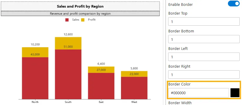
Border Color
Defines the color of the widget border.
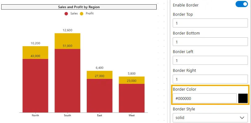
-
Input Type: Color picker or HEX code (e.g., #000000).
-
Impact: Helps the border match the dashboard theme or stand out.
-
Example: Border color set to #000000 (black) for clear separation.
-
-
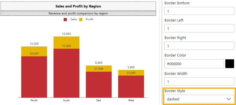
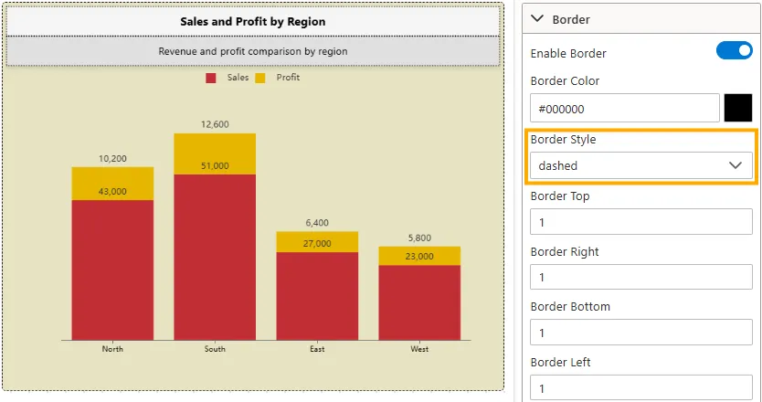
Border Style
Adjusts the visual style of the border line.
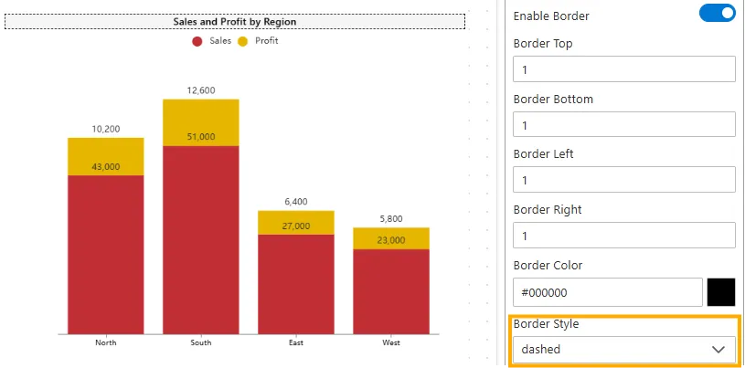
-
Input Type: Dropdown (Solid, Dashed, Dotted, Double, Groove, Ridge, Inset, Outset).
-
Impact: Enhances visual distinction; different styles create subtle emphasis.
-
Example: Dashed border provides light separation.
-
-
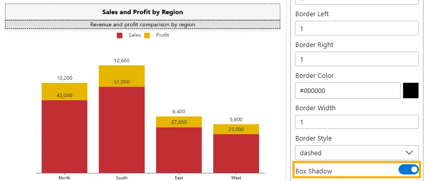
Box Shadow
Toggles the shadow effect around the widget.
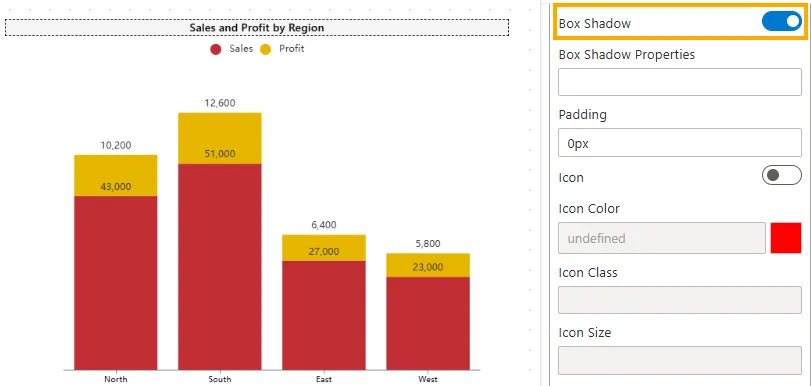
-
Input Type: Toggle switch (On/Off).
-
Impact: Adds depth to the widget by creating a floating appearance.
-
Example: Enabled to make the chart look raised from the background.
-
-
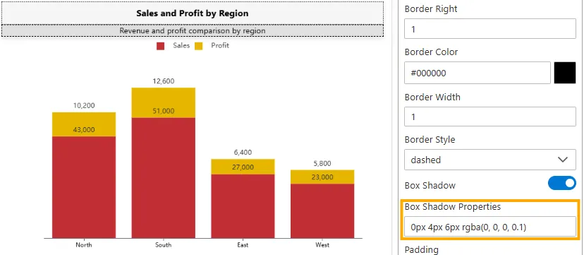
Box Shadow Properties
Defines the appearance of the shadow when Box Shadow is enabled.
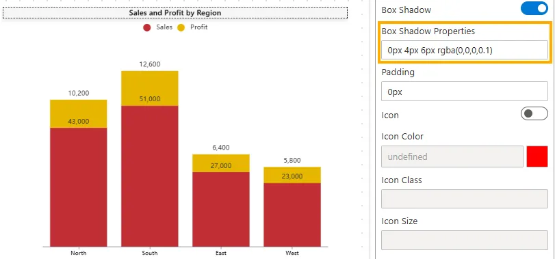
-
Input Type: Text field (CSS-like values, e.g.,
0px 4px 6px rgba(0,0,0,0.1)). -
Impact: Adjusts the size, blur, and color of the shadow, controlling how pronounced or subtle it looks.
-
Example:
0px 4px 6px rgba(0,0,0,0.1)creates a subtle shadow below the widget.
-
-
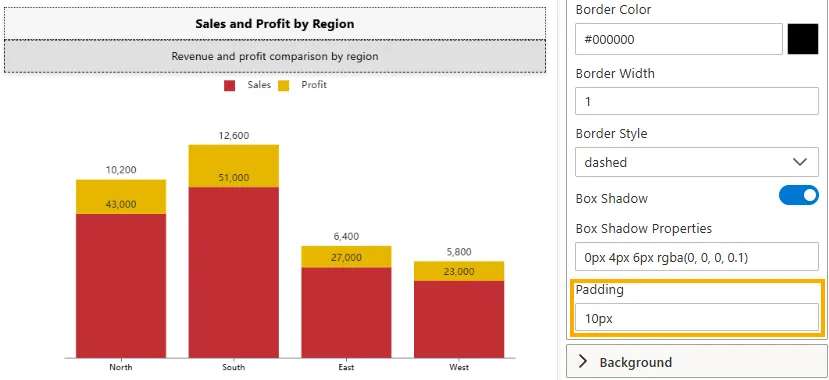
Padding
Controls the inner spacing between the content (text or icon) and the element’s border.
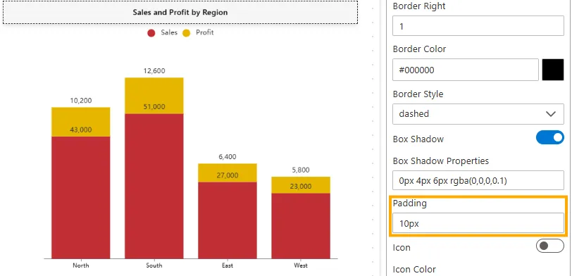
-
Input Type: String (Pixel values only, e.g.,
px). -
Default Value:
0px. -
Impact: Improves readability by adding space inside the element, keeping content away from edges.
-
Example:
10px-> Applies 10px padding to all four sides (1-value).10px 20px-> 10px top/bottom, 20px left/right (2-values).5px 10px 15px-> 5px top, 10px left/right, 15px bottom (3-values).5px 10px 20px 15px-> 5px top, 10px right, 20px bottom, 15px left (4-values).
-
-
Subtitle
The Subtitle is an optional descriptive text displayed below the Title. It is useful for adding context, such as timeframe, filters, or supporting details about the chart.
Below are the properties available for customizing the widget subtitle:
-
Hide
Controls whether the widget subtitle is displayed below the title.
-
Disabled -> The subtitle is blank by default so nothing is visible below the title when you ente rthe title than it be visible.
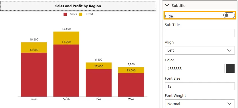
-
Enabled -> The subtitle is hidden, and only the title remains visible.
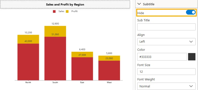
-
Visibility: Toggle switch (On/Off).
-
Impact: Useful for adding extra context such as timeframe, filters, or explanatory notes. Hiding the subtitle helps keep the widget clean when this additional detail is not needed.
-
Example: In a Column Chart, disabling “Hide Subtitle” shows nothing below the title if no text is entered. Once you add text, it will appear as the subtitle. Enabling it hides the subtitle completely, regardless of whether text is entered or not.
-
-
Subtitle
Defines the subtitle text that appears below the widget title.
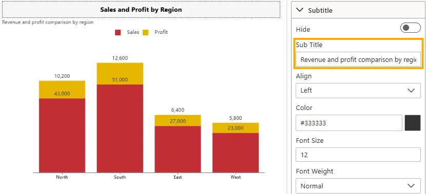
- Input Type: Text field.
- Impact: Provides additional context or description under the main title.
- Example: The subtitle is set to “Revenue and profit comparison by region”, displayed below the widget title.
-
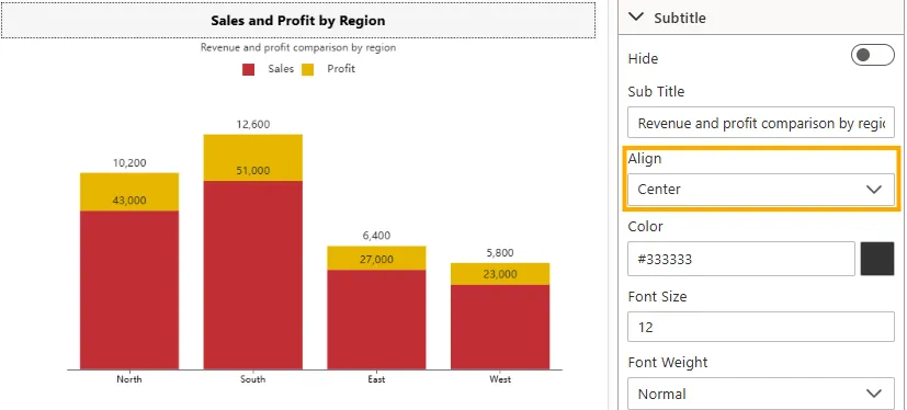
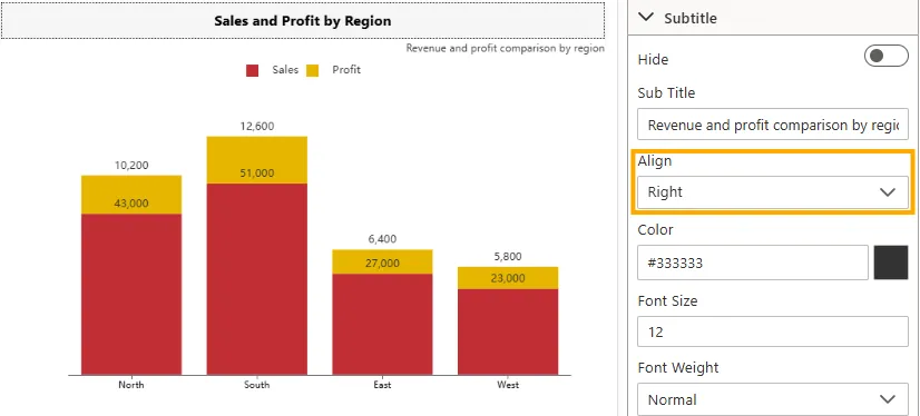
Align
Sets the horizontal alignment of the subtitle text.
-
Left -> Aligns subtitle to the left (default).
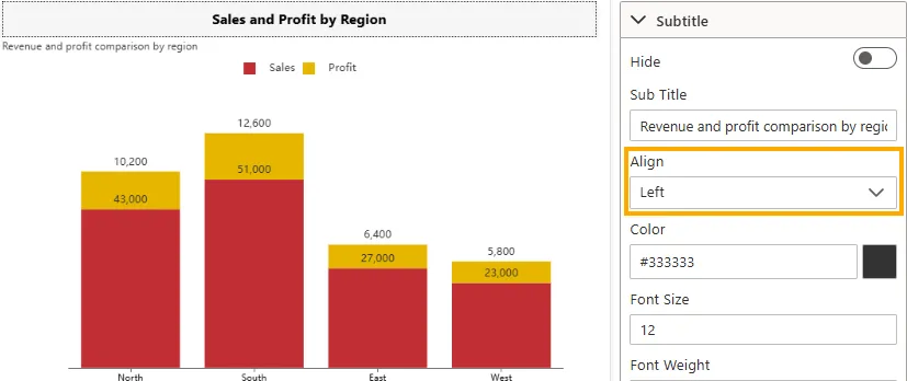
-
Center -> Aligns subtitle in the center.
-
Right -> Aligns subtitle to the right.
-
Input Type: Dropdown.
-
Impact: Ensures consistency with title alignment and overall widget layout.
-
Example: Subtitle “Revenue and profit comparison by region” is centered below the widget title.
-
-
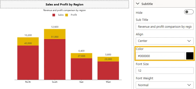
Color
Defines the font color of the subtitle text.
-
Input Type: Color picker or HEX code (e.g., #000000).
-
Impact: Adjusts subtitle visibility and theme consistency.
-
Example: Subtitle displayed in black (#000000) for readability.
-
-
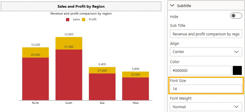
Font Size
Controls the size of the subtitle text.
-
Input Type: Numeric field (e.g., 12px, 14px, 16px).
-
Impact: Larger values make the subtitle more prominent; smaller values keep it subtle.
-
Example: Subtitle set to 14px for secondary emphasis below the title.
-
-
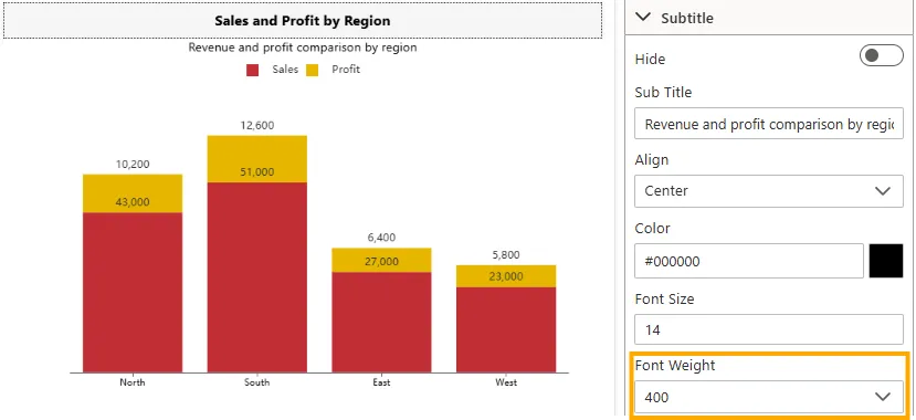
Font Weight
Adjusts the thickness/boldness of the subtitle text.
-
Input Type: Dropdown (Normal, Bold, Bolder, Lighter, 400, 500, 600).
-
Impact: Allows subtitle to stand out or remain subtle.
-
Example: Subtitle set to Normal (400) for balanced readability.
-
-
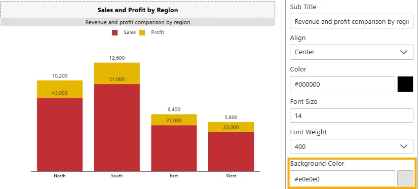
Background Color
Applies a background color behind the subtitle bar.
-
Input Type: Color picker or HEX code (e.g., #e0e0e0).
-
Impact: Highlights the subtitle area separately from the chart.
-
Example: Background color set to #e0e0e0 (Slightly Dark Gray) to match the widget.
-
-
Enable Border
Toggles the visibility of the border around the subtitle area.
-
Input Type: Toggle switch (On/Off).
-
Impact: Defines separation between subtitle and widget body.
-
Example: Subtitle border enabled with a 1px line for clarity.
-
-
Border Top / Bottom / Left / Right
Sets the thickness of each side of the subtitle border in pixels.
-
Input Type: Numeric field (e.g., 1, 2, 3).
-
Impact: Adjusts the visibility of individual border sides.
-
Example: Top and bottom borders set to 1px for subtle framing.
-
-
Border Color
Defines the color of the subtitle border.
-
Input Type: Color picker or HEX code (e.g., #000000).
-
Impact: Matches subtitle border with the dashboard theme.
-
Example: Border color set to #000000 (black).
-
-
Border Width
Defines the thickness of the widget border in pixels.
-
Input Type: Numeric field (e.g., 0, 1, 2, 3…).
-
Impact: A thicker border makes the widget more distinct, while a thinner or zero border gives a cleaner look.
-
Example: In a Column Chart, setting border width to 2px creates a clear frame around the widget, while 0px removes the border entirely.
-
-
Border Style
Adjusts the visual style of the subtitle border line.
-
Input Type: Dropdown (Solid, Dashed, Dotted, Double, Groove, Ridge, Inset, Outset).
-
Impact: Enhances subtitle emphasis with different line styles.
-
Example: A dashed border adds light separation.
-
-
Box Shadow
Toggles the shadow effect around the subtitle.
-
Input Type: Toggle switch (On/Off).
-
Impact: Adds depth to the subtitle, creating a floating effect.
-
Example: Shadow enabled for a raised look.
-
-
Box Shadow Properties
Defines the appearance of the shadow when Subtitle Box Shadow is enabled.
-
Input Type: Text field (CSS-like values, e.g.,
0px 4px 6px rgba(0,0,0,0.1)). -
Impact: Controls offset, blur, and opacity of the shadow.
-
Example:
5px 5px 10px rgba(0,0,0,0.3)adds a soft shadow below the subtitle.
-
-
Padding
Controls the inner spacing between the subtitle text and its border/container edges.
- Input Type: String (Pixel values only, e.g.,
px) - Default Value:
0px - Impact: Improves readability by keeping text away from edges.
- Example:
10px→ Applies 10px padding to all four sides (1-value).10px 20px→ 10px top/bottom, 20px left/right (2-values).5px 10px 15px→ 5px top, 10px left/right, 15px bottom (3-values).5px 10px 20px 15px→ 5px top, 10px right, 20px bottom, 15px left (4-values).
- Input Type: String (Pixel values only, e.g.,
-
Background
The Background settings control the appearance of the area behind the widget. You can customize it using a solid color, an image, or a combination with adjustable opacity, size, and position.
Below are the properties available for customizing the widget background:
-
Background Color
Defines the background fill using a hexadecimal color code.
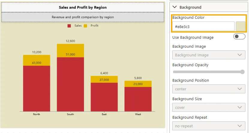
- Input Type: Hex code or Color Picker (e.g.,
#ffffff= White). - Impact: Provides a solid background color that can match branding or improve contrast.
- Example: Setting background to
#f5f5f5gives the widget a light gray background for subtle separation.
- Input Type: Hex code or Color Picker (e.g.,
-
Use Background Image
Controls whether a background image is applied.
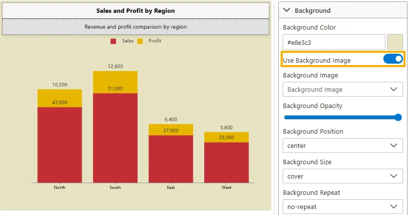
- Toggle Switch: On/Off.
- Impact: When enabled, related image settings become active.
-
Background Image
Allows selecting or assigning the background image.
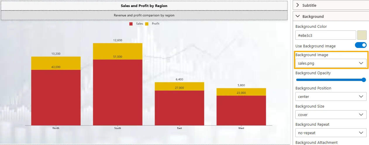
- Input Type: Dropdown / File selector.
- Impact: Custom images can enhance visual style or branding of the widget.
-
Background Opacity
Adjusts the transparency of the background.
- Input Type: Slider (0% = fully transparent, 100% = fully opaque).
- Impact: Useful for blending the background with chart visuals.
- Example: Setting opacity to 70% lets the chart remain visible over a strong background image.
-
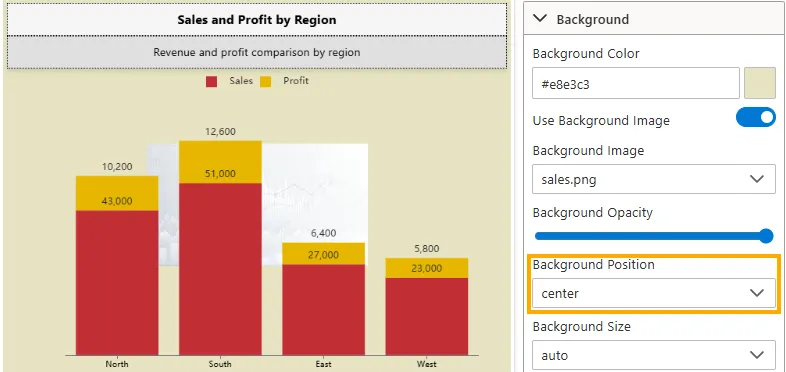
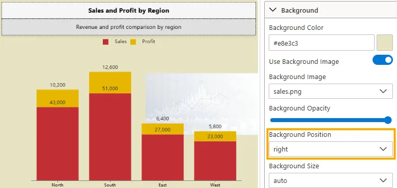
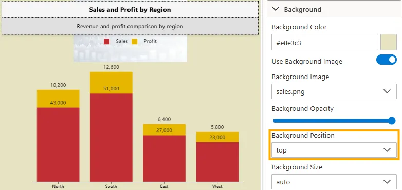
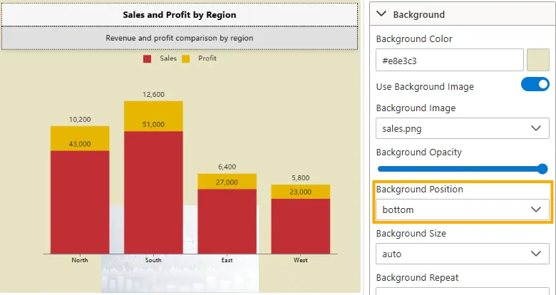
Background Position
Defines how the background image is aligned within the widget.
-
Left -> Aligns the background image to the left edge.
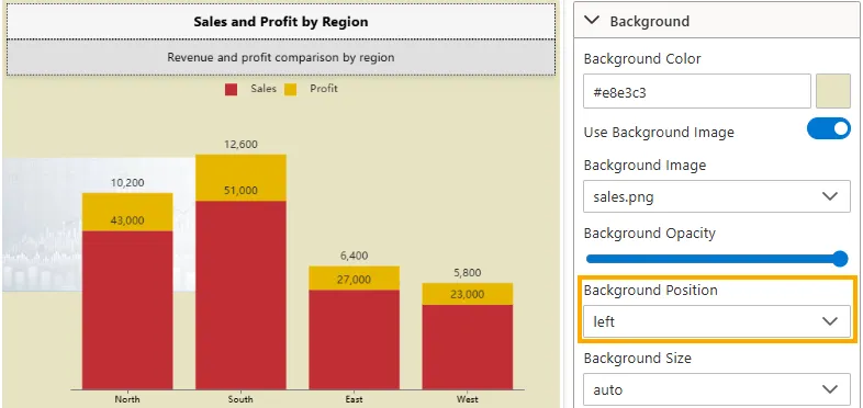
-
Center -> Aligns the background image to the center.
-
Right -> Aligns the background image to the right edge.
-
Top -> Aligns the background image to the top edge.
-
Bottom -> Aligns the background image to the bottom edge.
-
Input Type: Dropdown (Left, Center, Right, Top, Bottom)
-
Impact: Ensures the background image is positioned according to design and layout needs.
-
-
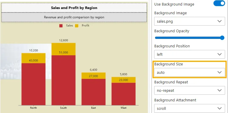
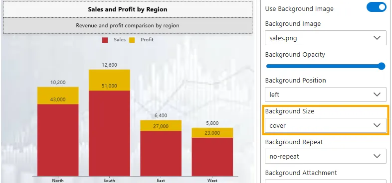
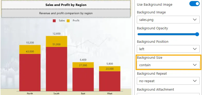
Background Size
Controls the scaling of the background image within the widget.
-
Auto -> Displays the image in its original size without scaling.
-
Cover -> Scales the image to cover the entire area of the widget. No empty space is left, but parts of the image may be cropped.
-
Contain -> Scales the image so that the entire image fits inside the widget area. No cropping occurs, but this may leave empty space around the edges.
-
Input Type: Dropdown (Auto, Cover, Contain).
-
Impact: Determines how the background image adapts to different widget sizes.
-
-
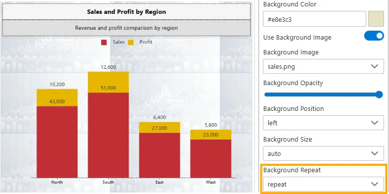
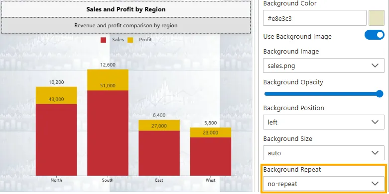
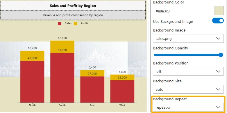
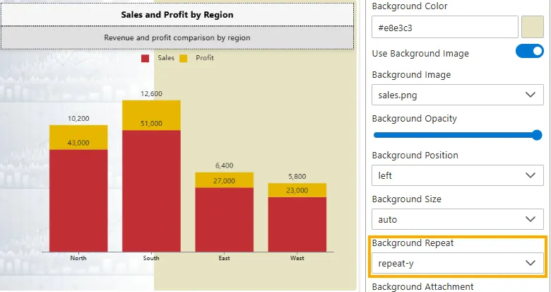
Background Repeat
Controls whether and how the background image repeats if it is smaller than the widget area.
-
No-repeat -> The background image is shown once only, without repeating.
-
Repeat -> The background image tiles both horizontally and vertically to cover the entire widget.
-
Repeat-x -> The background image repeats only horizontally (along the x-axis).
-
Repeat-y -> The background image repeats only vertically (along the y-axis).
-
Input Type: Dropdown (No-repeat, Repeat, Repeat-x, Repeat-y).
-
Impact: Allows background images to either remain single, fully tiled, or repeat along one axis, depending on design needs.
-
-
Background Attachment
Defines how the background image behaves when the widget or dashboard is scrolled.
-
Scroll -> The background image moves along with the page as you scroll. (Default)
-
Fixed -> The background image stays fixed in place while the content scrolls, creating a parallax effect.
-
Local -> The background image scrolls within the widget’s content area only (not with the entire page).
-
Options: Dropdown (Scroll, Fixed, Local).
-
Impact: Controls whether the background is tied to the widget, the page, or remains static.
-
-
Border Properties
The Border properties allow you to customize the outline of the widget or its sections. These settings define whether borders are visible, their color, width, style, and roundness (radius). Borders help improve separation, emphasis, and overall design clarity.
Below are the properties available for customizing the widget border:
-
Enable Border
Toggles the visibility of the widget border.
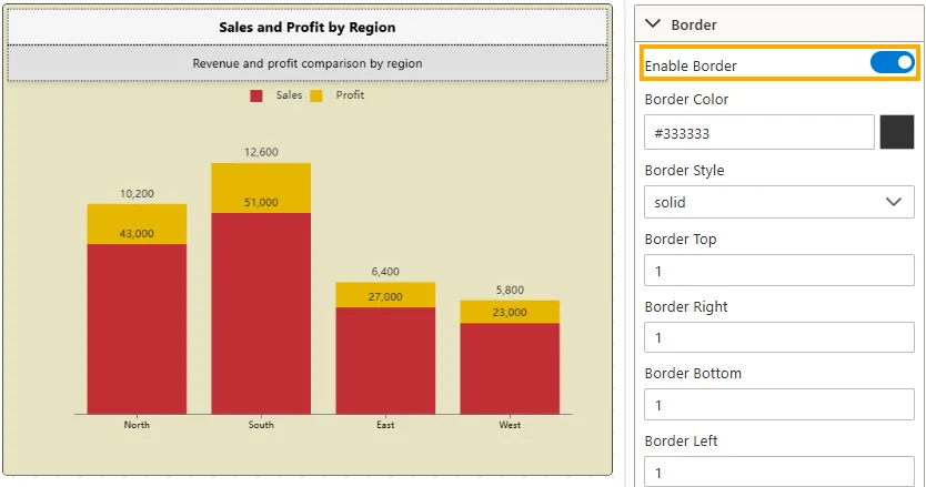
- Input Type: Toggle switch (On/Off)
- Impact: When disabled, no border will be visible regardless of other border settings. When enabled, border styling properties apply.
- Example: Border disabled -> widget blends seamlessly into the background. Border enabled -> widget appears framed.
-
Border Color
Defines the color of the border.
- Input Type: Hex code or Color Picker (e.g.,
#000000= Black). - Impact: Matches the widget border with the dashboard theme.
- Example: Border color set to #000000 (black) makes the border clearly visible.
- Input Type: Hex code or Color Picker (e.g.,
-
Border Style
Adjusts the visual style of the border line.
- Input Type: Dropdown
- Options: None, Solid, Dashed, Dotted, Double, Groove, Ridge, Inset, Outset
- Impact: Allows creative variation, from simple solid borders to 3D effects.
- Example: Dashed border creates a light separation effect.
-
Border Top / Bottom / Left / Right
Controls the thickness of each side of the widget border.
- Input Type: Numeric field (px values)
- Impact: Defines the visibility and emphasis of the widget frame by controlling the border on each side.
- Example: All sides set to 2px -> creates a balanced rectangular border around the entire widget.
-
Border Radius
Defines the roundness of the corners of the widget.
- Input Type: Numeric field (px or %)
- Impact: Rounds widget corners for softer designs. High radius values create pill or circle shapes.
- Example: Border radius 10px → slightly rounded corners. 50% → circular/elliptical frame.
-
Border Top Left / Top Right / Bottom Left / Bottom Right Radius
Controls the roundness of individual corners.
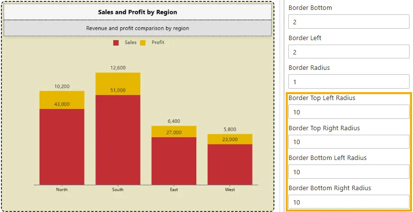
- Input Type: Numeric field (px)
- Impact: Customizes corner roundness individually for unique designs.
- Example: Only Top Left Radius = 10px → creates a single rounded corner while others remain sharp.
-
Extra Label
The Label Settings section provides options to configure and style an Extra Label that can be attached to widgets.
It allows you to control the label’s visibility, text, position, interactivity, linking, styling, and association with specific widgets.
Below are the properties available for customizing the Extra Label:
-
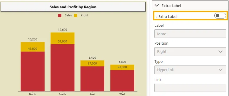
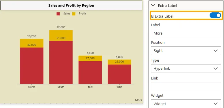
Is Extra Label
Controls whether the Extra Label is displayed with the widget.
-
Disabled -> The label does not appear, and all its related settings are ignored.
-
Enabled -> The label is visible and displayed according to its configured properties.
-
Visibility: Toggle switch (On/Off)
-
Default: Disabled (Off)
-
Impact: Lets you quickly add or remove labels without deleting their settings.
-
Example: In a Sales Chart, enabling Extra Label shows the default label text “More” beside the chart; disabling it hides the label.
-
Label
Defines the text content displayed as the Extra Label.
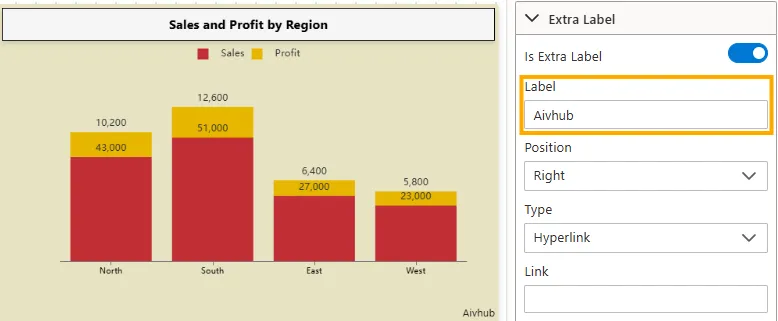
- Input Type: Text Input (String).
- Impact: Displays custom label text.
- Example Values:
"Aivhub".
-
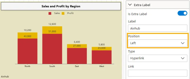
Position
Defines where the Extra Label is aligned relative to the widget.
-
Left -> Places the label on the left side of the widget.
-
Center -> Places the label in the center of the widget.

-
Right -> Places the label on the right side of the widget.

-
Input Type: Dropdown (Left, Center, Right)
-
Impact: Ensures the Extra Label is positioned according to design and layout needs.
-
Type (Label Interactivity & Rendering)
Defines how the label behaves and is rendered on the widget.
-
Hyperlink -> Makes the label clickable and opens a URL in a new tab.
-
Popover -> Displays additional information or content when the user clicks the label.
-
Same Location -> Keeps the label fixed in its original position without triggering popups or navigation.
-
Input Type: Dropdown (Hyperlink, Popover, Same Location)
-
Impact: Determines the interactivity and rendering behavior of the label within the widget.
Link
Specifies the URL to navigate to when the label is a hyperlink.
- Input Type: Text Input (URL string)
- Requirement: Enabled only if Type = Hyperlink
- Expected Format: Full valid URL (with protocol)
- Example Values:
https://www.aivhub.com/https://example.com/docs/my-internal-page
Widget
Indicates the widget the Extra Label belongs to.
- Input Type: Dropdown / Select
- Impact: Ensures the label is linked to the correct widget.
- Example Values:
"Sales and Profit by Region""User Activity Dashboard""Revenue Chart"
Padding
Controls the spacing between the label and either its own border or the widget it is attached to.
- Input Type: Text Input (px only)
- Impact: Improves readability and visual alignment.
- Example Values:
5px→ Equal spacing on all sides10px 20px→ 10px top/bottom, 20px left/right5px 10px 20px 5px→ Top = 5px, Right = 10px, Bottom = 20px, Left = 5px
-
General Settings
Controls widget visibility, filtering, and layout.
- Do Not Filter: Toggle (On/Off)
- Hide Menu / Clear Filter / Data Download / Annotation / Analysis / Filter Info: Toggle switches
- Device Visibility: Toggle switches per device (Mobile / Tablet / Desktop)
- Padding / Margin: Numeric fields
- Z-Index: Numeric field
- Impact: Ensures widget behaves as required across devices and dashboard context.
- Example: Widget hidden on mobile but visible on desktop.
-
Widget Refresh Settings
Defines how and when widgets update data.
- Auto Refresh: Toggle switch (On/Off)
- Refresh Interval: Numeric field (seconds/minutes)
- Manual Refresh Only: Toggle switch (On/Off)
- Show Refresh Button: Toggle switch (On/Off)
- Last Refreshed Timestamp: Display field
- Sync With Dashboard Refresh: Toggle switch (On/Off)
- Impact: Ensures data is up-to-date and consistent with dashboard refresh cycles.
- Example: Auto refresh every 5 minutes with refresh button visible.
Summary
The Widget Settings panel provides extensive control over widget styling, behavior, and responsiveness. By configuring titles, subtitles, backgrounds, borders, shadows, labels, and refresh cycles, users can tailor widgets to deliver the right information in the right format, across all devices and use cases.