How to Filter Data and Switch Tabs Using a Custom Column in the Table Widget
Introduction
The Filter & Tab Switch feature allows users to create an interactive Table Widget column that not only filters data dynamically but also automatically switches to another tab — for example, from a Table View to a Chart View to visualize filtered results instantly.
This feature enhances interactivity and provides a seamless data exploration experience for end-users.
Key Highlights
-
Interactive Filtering:
Click on any table cell value to apply a filter automatically. -
Auto Tab Navigation:
Instantly redirects users from Tab 1 (Table View) to Tab 2 (Chart View). -
Dynamic Visualization:
Charts update in real time based on filtered data. -
Conditional Styling:
Displays values below5000in red and5000 or abovein green.
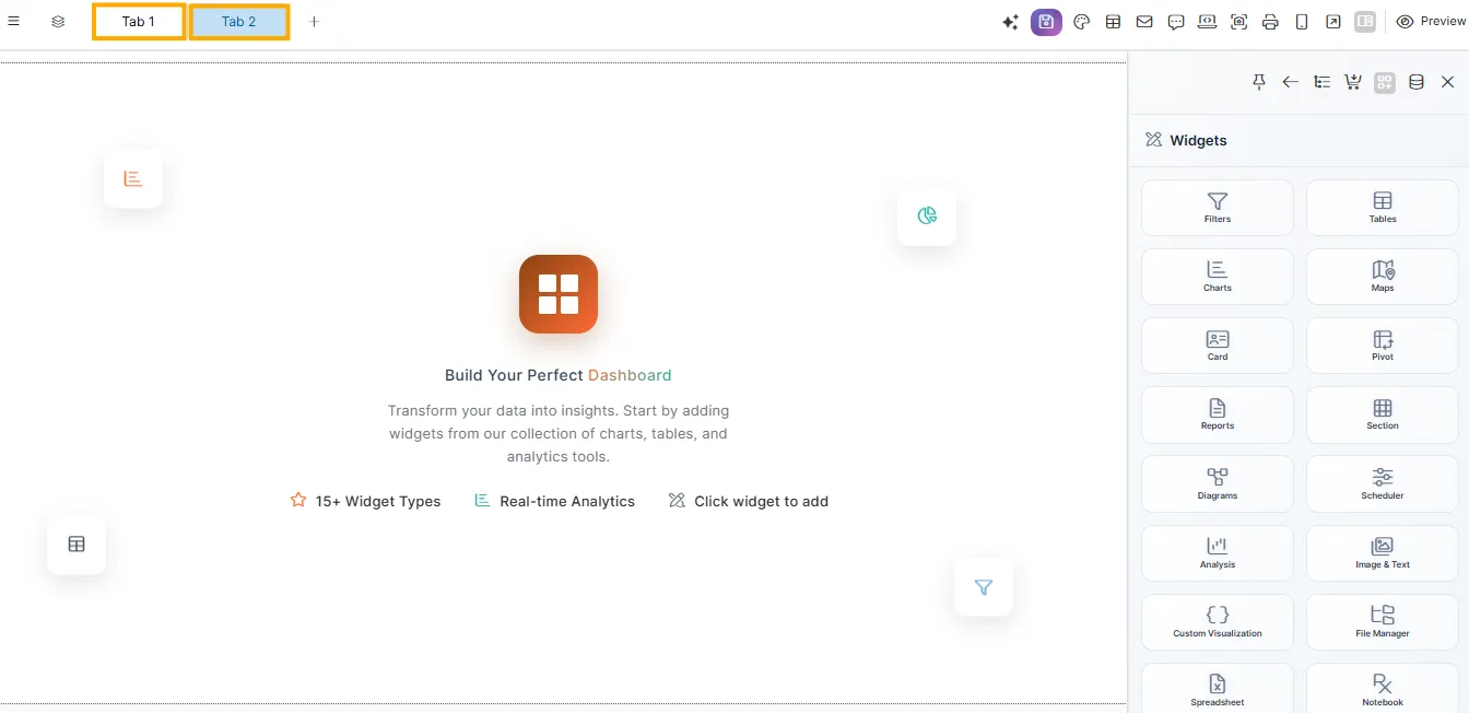
Step 1: Create and Manage Tabs
Create Two Tabs
Before adding tabs, ensure you have already created your visualization.
If not, refer to How to Create a Viz for setup steps.
By default, Tab 1 is automatically created.
-
Click the ➕ icon next to Tab 1 to add Tab 2.
-
Double-click each tab label to rename them as:
-
Tab 1 →
Table View -
Tab 2 →
Chart View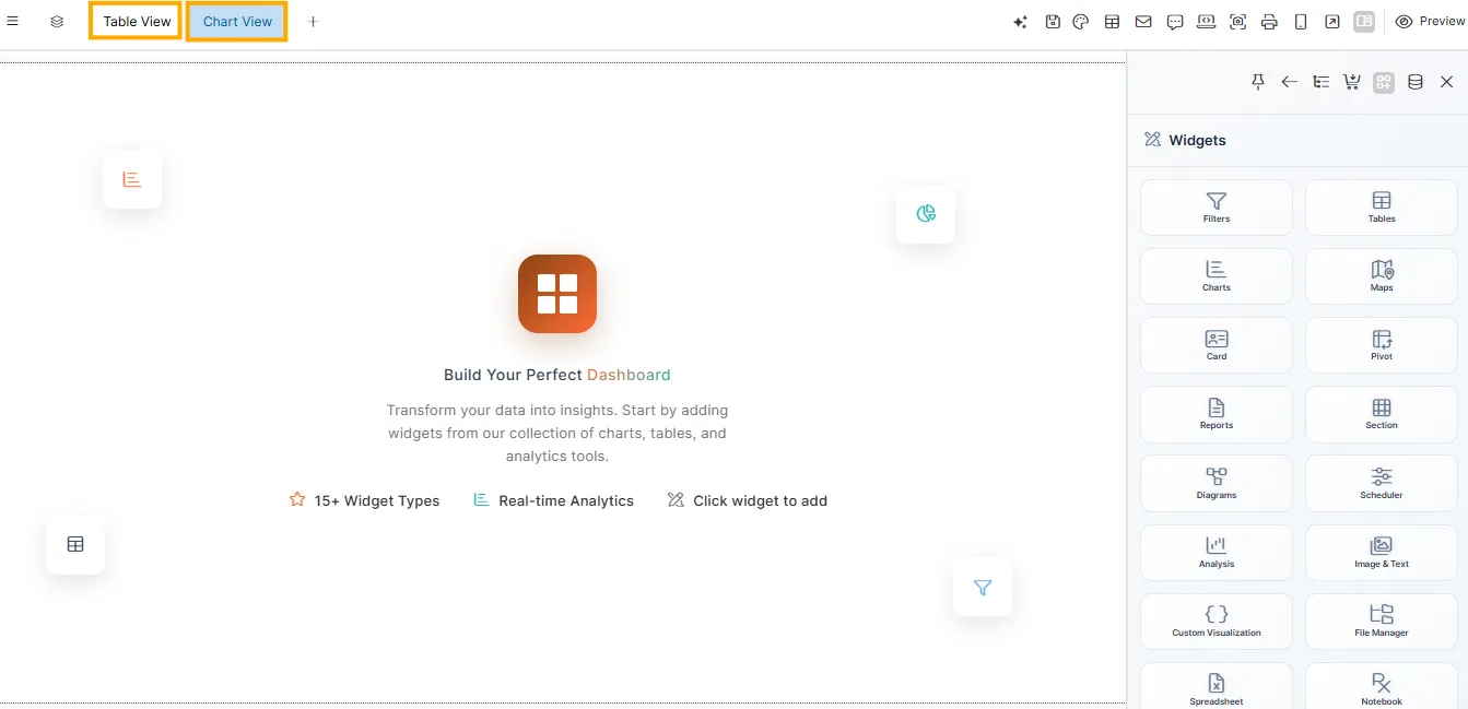
-
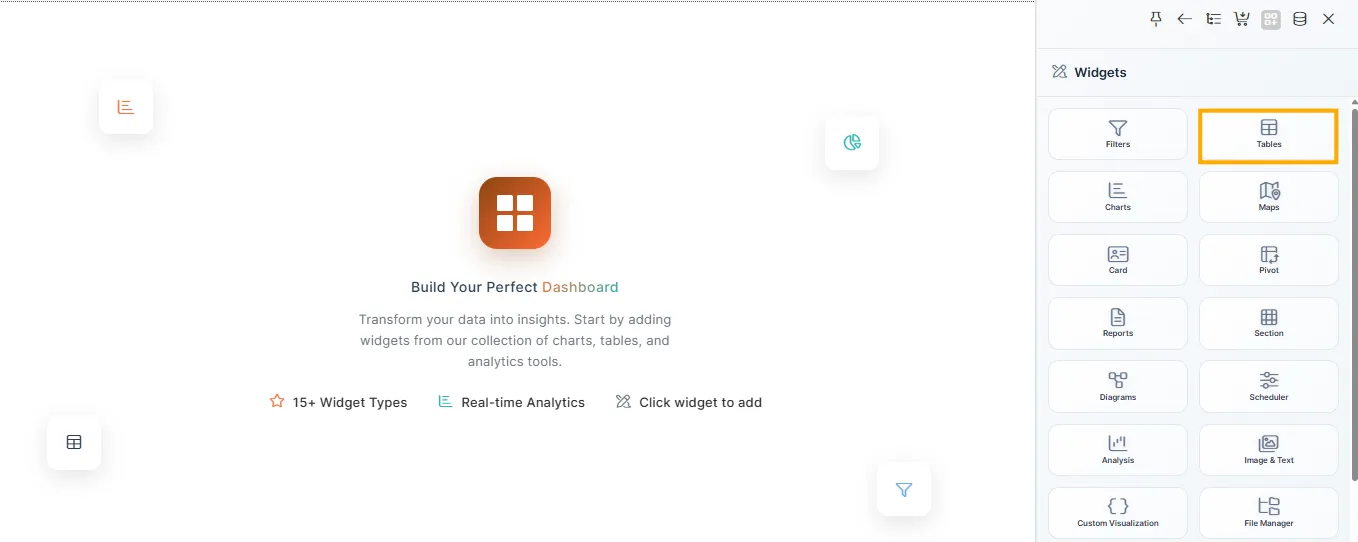
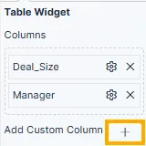
Step 2: Configure the Table Widget in Tab 1
Add a Table Widget
-
Click the Table Widget icon from the right panel.
-
Select the dataset (e.g.,
11-7-25_CRM_sales_data). -
From Available Columns, drag and drop fields such as
ManagerandDeal_Sizeinto the Columns section.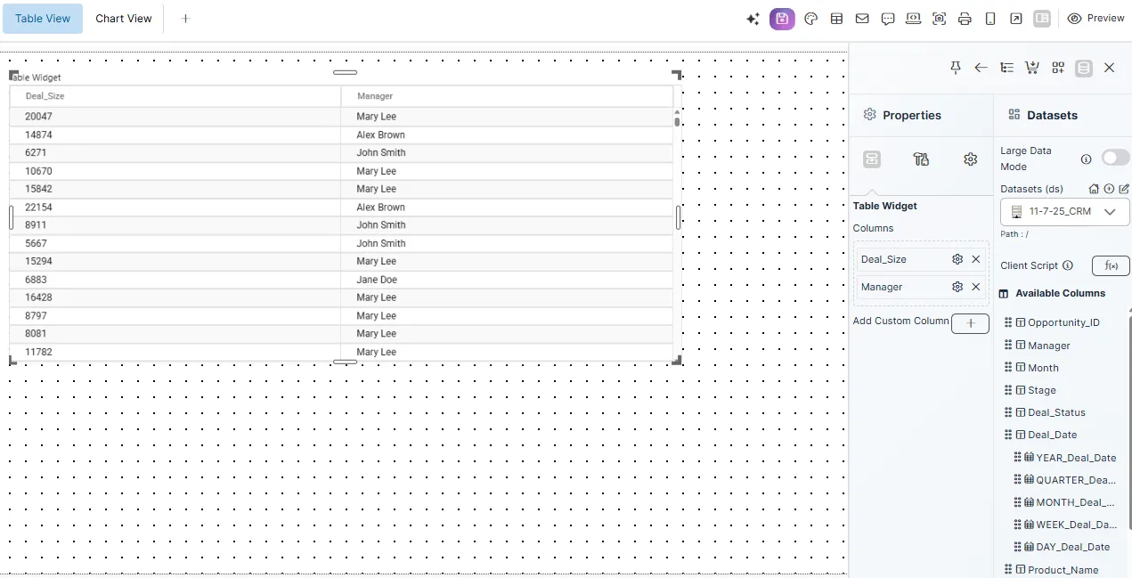
Step 3: Add an Interactive Custom Column
Create a Custom Column
-
Click the ➕ icon next to the Columns section.
-
In the popup:
- Name it
Interactive_Deal_Size. - Select
Deal_Sizeas the source column. - Condition: Is Not Null.
- Paste the following code into the Code Editor:
var value = parseFloat("{{Deal_Size}}");
var color = value < 5000 ? "#FF0000" : "#008000";

return '<div style="cursor:pointer; color:' + color + ';" onclick="window.viz.changeFilter([{filterName: \'Deal_Size\', filterValue: \'" + value + "\'}]); window.viz.changeTab(1);">' + value + '</div>';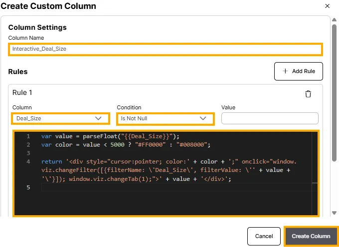
- Name it
-
Click Run Script, then Create Column.
Code Explanation
- Displays
Deal_Sizeas a clickable, color-coded value. - Below 5000: Red
- 5000 and above: Green
- On click:
- Applies a filter on
Deal_Size. - Switches to Tab 2 using
window.viz.changeTab(1).
- Applies a filter on
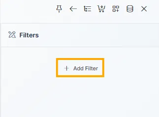
Step 4: Add and Configure the Filter for Deal_Size
Configure the Filter
-
Click the Filters icon on the right panel.
-
Click ➕ Add Filter.
-
Choose Filter Type → Textbox.
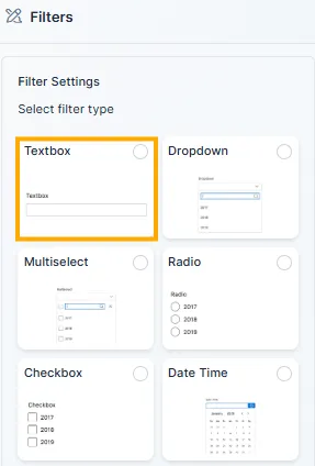
-
Click Next, then set:
- Source:
11-7-25_CRM_sales_data - Link:
Deal_Size - Filter Name:
Deal_Size - Placeholder:
Search by Deal Size - Default Value: Optional
- Filter Event:
On Change
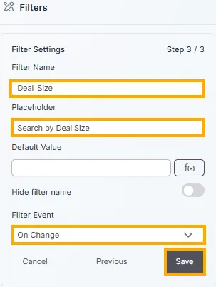
- Source:
-
Click Save.
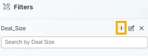
-
Click the ➕ button next to the filter to add it to the canvas.
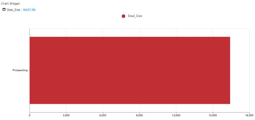
Step 5: Configure the Chart in Tab 2
-
Switch to Tab 2 (Chart View).
-
Add a Chart Widget from the right panel.
-
Choose chart type — Bar, Line, or Column.
-
Configure axes:
- X-Axis:
Stage - Y-Axis:
Deal_Size
- X-Axis:
-
Use the same dataset —
11-7-25_CRM_sales_data.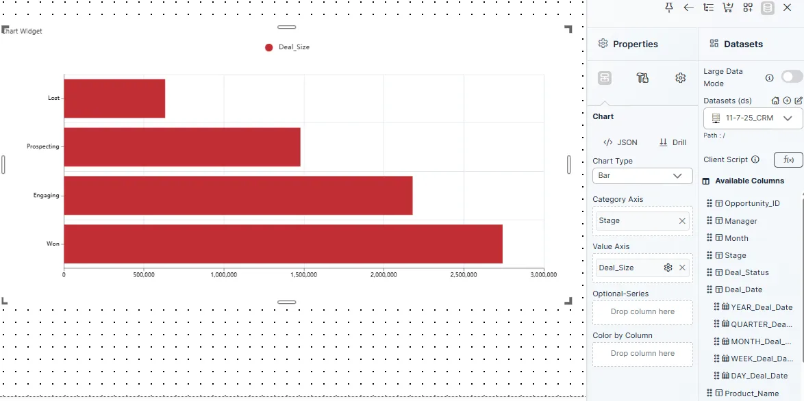
Step 6: Publish the Chart
-
Click Publish (top-right corner).
-
The chart becomes visible on the dashboard and updates dynamically whenever the filter changes.
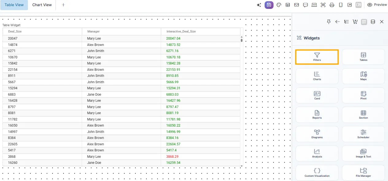
Final User Experience
From the end-user perspective:
- They view Tab 1 (Table View).
- Click on a
Deal_Sizevalue in the Interactive_Deal_Size column. - Instantly:
- The
Deal_Sizefilter is applied. - The view switches to Tab 2 (Chart View).
- The chart updates automatically based on the filter.
- The
Summary
The Filter & Tab Switch feature adds smart interactivity to dashboards by linking table actions with visual insights.
With just one click, users can filter data, view specific results, and automatically switch between tabs for a dynamic and intuitive experience — all without any manual configuration during runtime.