Series
Introduction
The Series Properties allow you to configure and customize individual data series within your chart. A series represents a group of related data points (e.g., Sales by Product Category or Revenue by Quarter). These settings provide granular control over how each series is displayed.
Purpose
To define the visual representation and behavior of one or more data series in a chart, enabling detailed customization and multi-series comparisons.
Series Properties
Click to view Series Properties
-
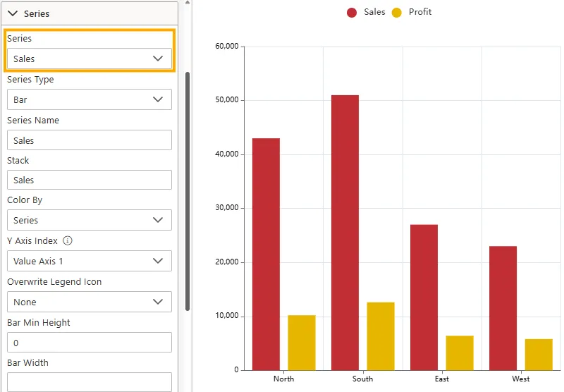
Series
-
Use this dropdown to choose which series you want to configure.
-
When charts have multiple series (e.g., Sales, Profit), each can be styled individually.
-
-
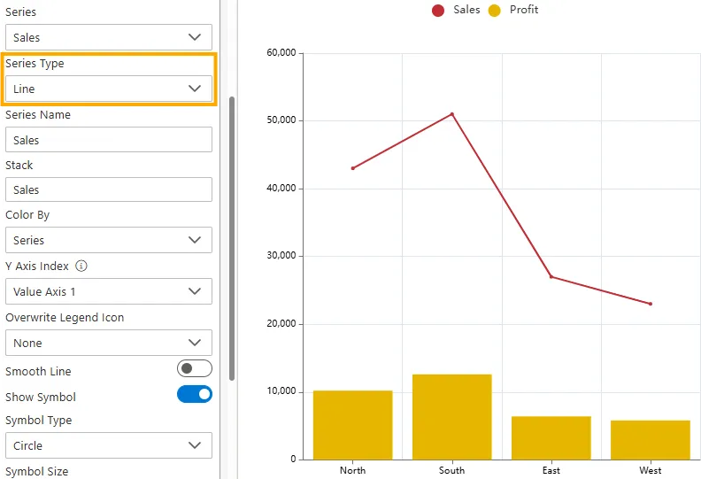
Series Type
-
Sets the chart type for the selected series.
-
Options may include Bar, Column, Line, Area, Scatter, etc.
-
-
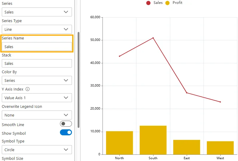
Series Name
-
Defines the name of the selected series (e.g., Sales, Profit).
-
This name appears in the legend and tooltips.
-
-
Stack
- Groups multiple series into the same stack, allowing values to be layered on top of each other instead of shown separately.
- Useful for comparing contributions (e.g., Sales and Profit stacked to show total business impact).
To configure stacking for multiple series:
-
Enable Stacking in General Properties
-
In the General Properties section, turn the Stack toggle ON.
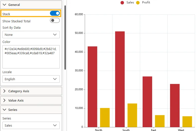
-
-
Configure Sales Series
-
Expand the Series section.
-
In the Series dropdown, select Sales.
-
In the Stack field, type Total.
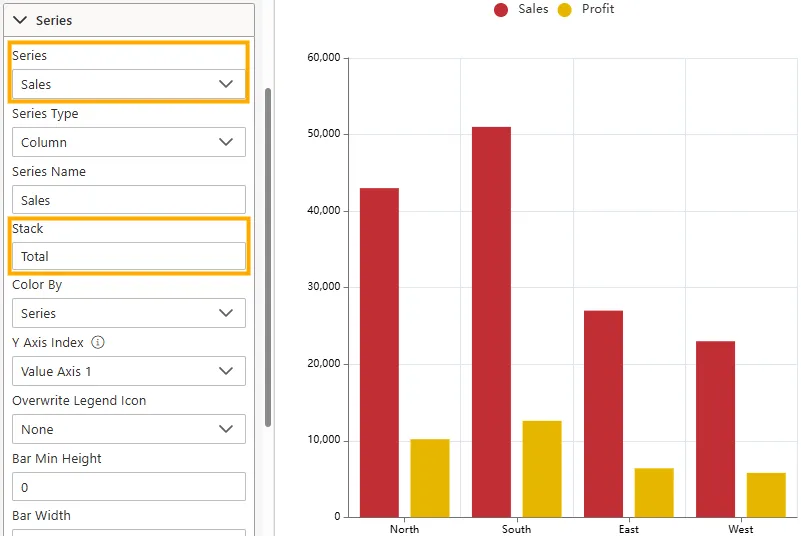
-
-
Configure Profit Series
-
Change the Series dropdown to Profit.
-
In the Stack field, type Total.
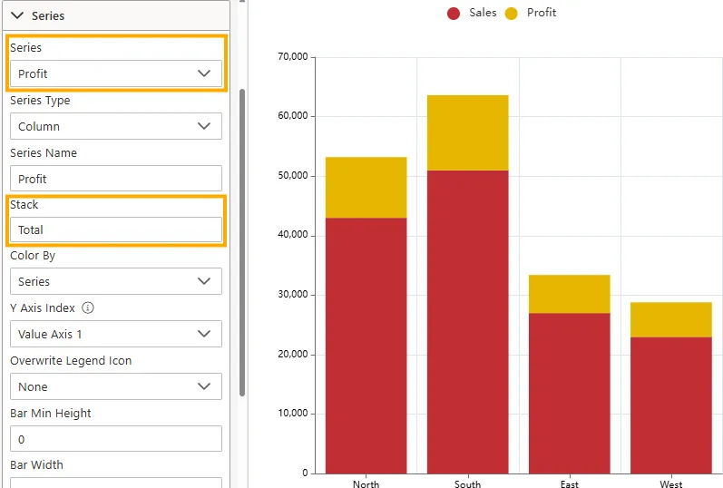
-
-
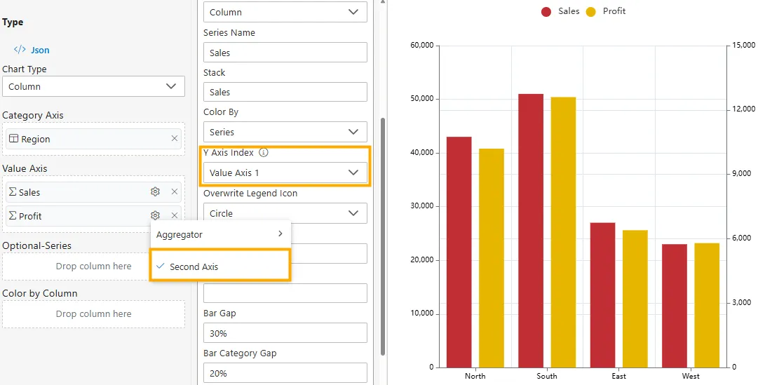
Y Axis Index
- Assigns a series to either the primary (left) Y-axis or a secondary (right) Y-axis.
- Useful when measures have very different scales (e.g., Sales vs Profit) so both can be visualized clearly.
How to Use:
- In the Value Axis panel, locate the measure (e.g., Sales or Profit).
- Click the
 icon next to the measure.
 - From the dropdown, select Second Axis.
- This assigns the series to the secondary Y-axis (appearing on the right).
- To revert, click Second Axis again -> the series will move back to the primary Y-axis.
Example
If Sales ranges from 20,000–50,000 and Profit from 5,000–12,000, putting both on the same Y-axis makes Profit appear too small. Assigning Profit to the Second Axis gives it its own scale, making trends more visible.
-
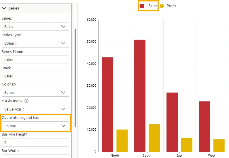
Overwrite Legend Icon
- Customizes the shape of the legend icon for the selected series.
- Helps distinguish series visually in the legend.
- Options: None, Circle, Rect, RoundRect, Triangle, Diamond, Pin, Arrow, Line, Square
Example
Changing the Sales legend icon to Square makes it distinct from Profit, which may retain the default Circle. This improves clarity in identifying series quickly.
-
Bar Width (Bar/Column Charts Only)
Defines the thickness of bars.
-
Input Type: Numeric value (pixels or percentage).
-
Impact: Wider bars emphasize values; thinner bars fit more categories.
-
- Bar Gap (Bar/Column Charts Only)
Controls the spacing between bars in the same group (e.g., Laptops vs. Smartphones in Electronics).
- Line Style (Line/Area Charts Only)
Adjusts how lines are drawn for a series.- Solid, Dashed, Dotted.
- Marker (Line/Scatter/Area Charts)
Sets the shape of data point markers.
Options: Circle, Square, Triangle, Diamond, Custom.
- Color
Assigns a custom color to the selected series for clear distinction.
- Label Settings (Expand to view options)
Configure how data labels appear on the series:- Show/Hide Labels.
- Position: Top, Inside, Outside, Center.
- Font Style: Color, Size, Weight, and Family.
- Stacking
Enables stacking for series in bar/column/area charts.- None → Series are plotted independently.
- Normal → Values stack on top of each other.
- Percent → Stacks normalized to percentages.
- Smooth (Line/Area Charts)
Applies smoothing to curves, making the series appear less angular.
Configuration Steps
Using the RevenueProfit.ds dataset:
- Category Axis →
RegionorQuarter - Value Axis →
RevenueandProfit(two numeric columns) - Optional Series →
Year(to compare trends across multiple years)
Use Cases
Series customization enhances how data is compared and analyzed. Examples include:
| Use Case | Example | Why It Helps |
|---|---|---|
| Sales Comparison | Separate Online vs. Retail sales with distinct colors | Quickly identify performance differences. |
| Multi-Year Trends | Display each year as its own series | Makes it easy to compare across time. |
| Stacked Analysis | Use stacked bars to show contribution of subcategories | Visualizes proportions within totals. |
Business Questions Answered
- How do Revenue and Profit compare across regions?
- Which regions have higher profitability ratios (Profit vs. Revenue)?
- How do these values trend across quarters or years?
Summary
The Series Properties provide full control over how each dataset is rendered. By adjusting type, width, gaps, markers, colors, and labels, you can make comparisons clear and ensure your visualization communicates insights effectively.